WORKS

Explore MASOU DESIGN’s graphic design works, including packaging design, catalog design, DM design, poster design, brand advertising visuals, and real-world brand applications. We approach each graphic design project through brand positioning, product features, usage scenarios, layout hierarchy, and visual communication, helping brands create clear, refined, and scalable visual materials. Graphic design is not only about producing a single printed piece, but about shaping a consistent brand impression across packaging, catalogs, campaigns, exhibitions, social media, and sales materials.

Graphic Design Works|Packaging, Catalog, and Brand Visual Case Studies

LOVAMO|The Aesthetics from Eyes to Fingertips

Lovamo is built around the idea of salon culture, positioned as a refined beauty brand that combines eyelash styling, artistic expression, and lifestyle aesthetics. More than offering eye beauty services, the brand aims to turn every delicate detail into an experience of care, comfort, and renewed confidence. The brand identity system reinterprets the visual language of an eyelash salon through a more complete and distinctive design approach. The logo combines the curve of lifted eyelashes, the outline of a fingernail, and a central human figure, symbolizing the extension of beauty from the eyes to the fingertips. It also reflects the brand’s focus on details, posture, and self-care. The overall design moves away from the overly commercial and standardized image often seen in eyelash brands. Instead, it brings in a softer atmosphere inspired by art, spa culture, and the warmth of home. Through gentle visual elements and a layered sensory brand image, Lovamo presents a professional yet approachable personality. Beauty is no longer only an outer touch-up, but a quiet return of confidence from the eyes, fingertips, and inner self.
Miss seesaw|Beauty Superpower|Brand Advertising Visual and Motion Banner Design

Making product features visible in a fun and memorable way. MASOU DESIGN created the “Beauty Superpower” visual series and banner designs for Miss seesaw, transforming product features into creative elements such as cars, fire extinguishers, watering cans, and protective shields. Without directly claiming product effects, the visuals use a more intuitive and playful approach to communicate product impressions and make the brand experience more memorable.

JS Logistics|Bear-Hearted Appliance Installation|Brand Identity Design

A memorable bear identity that turns appliance installation into a warmer and more trustworthy service experience. MASOU DESIGN created the brand identity and visual system for JS Logistics by transforming the founder’s friendly, steady, and thoughtful personality into “Bear Heart,” a character-based brand symbol. Through the bear logo, warm yellow brand color, appliance installation service icons, vehicle applications, and animated visuals, the brand message was simplified into one clear and recognizable image. Instead of trying to communicate every service detail at once, the identity helps customers remember JS Logistics through a sense of friendliness, reliability, and care.

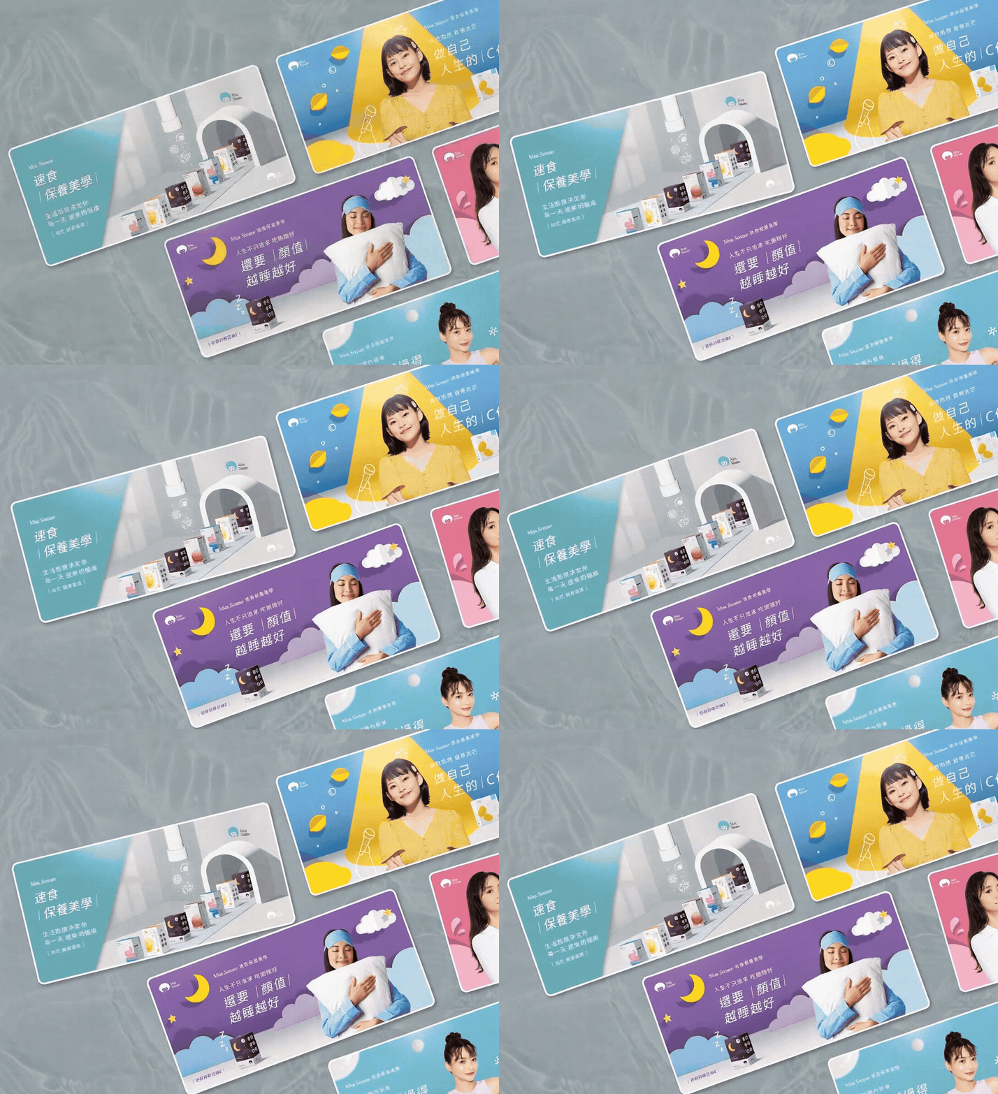
Miss seesaw|Fast Beauty Aesthetics|Brand E-commerce Visual Design

Lifestyle shapes the way beauty grows every day. MASOU DESIGN created the annual key visual series for Miss Seesaw under the concept of “Fast Beauty Aesthetics,” helping the brand build a stronger visual communication system for its e-commerce website, product pages, and digital marketing materials. The project transformed product features from skincare and functional food into a younger, lighter, and more dynamic visual language. Through paper-cut style backgrounds, vivid colors, product scenarios, and creative visual metaphors, the series communicates product impressions in a playful and approachable way without directly claiming product effects, making the brand more memorable in an e-commerce context.

Han He Xi Instant Cuisine|Tainan Banquet Heritage|Brand Identity and Packaging Design

At a time when many brands pursue modified typography and geometric logos, calligraphy became one of Han He Xi’s most distinctive brand assets. MASOU DESIGN created the brand identity and packaging design for Han He Xi Instant Cuisine, starting from Tainan banquet culture, the craftsmanship of a traditional Taiwanese banquet chef, and family recipe memories. Through a calligraphic wordmark, portrait illustration, handwritten recipe elements, and modern layout design, the brand communicates not only warmth and story, but also stronger recognition, product appeal, and brand personality in the frozen ready-to-eat food market.

AROS|A Romantic Fruit Cocktail Brand Design with a British Spirit

AROS is a cocktail brand that brings together fresh Taiwanese fruits and the spirit of British cocktail culture. MASOU DESIGN worked on the brand planning, verbal identity, visual identity, and overall brand image to create a fashionable, romantic, and refined cocktail brand system. The brand design is built around the contrast between freshly harvested Taiwanese fruits and classic British cocktail culture. It combines vivid fruit flavors with an elegant, polished, and celebratory drinking mood. Through the logo, color system, packaging visuals, and brand tone, AROS becomes more than a packaged cocktail product — it creates a relaxed, stylish, and memorable drinking experience made for moments of celebration.

ACETECK|Hydraulic Cylinder Brand Identity Design

ACETECK is a B2B industrial brand specializing in hydraulic cylinder manufacturing, serving logistics equipment, industrial machinery, and various mechanical systems. This brand identity design project is built around the ideas of precision, power, and stability, transforming the initial letter A into a visual symbol inspired by hydraulic cylinder structure. Through logo design, corporate identity, department icons, uniforms, catalog design, and factory signage applications, MASOU DESIGN helped ACETECK build a clearer and more consistent B2B industrial brand identity. The new visual system supports the brand across its website, exhibitions, catalogs, and international market communication, creating a professional impression of precision manufacturing and reliable industrial quality.

VELO OEM Products Guide

MASOU DESIGN created the design and layout for the VELO OEM Products Guide. For this nearly 100-page catalog, we adopted a minimalist design approach to reflect the brand’s commitment to product innovation and environmental responsibility. Through clean layouts, clear product series markers, and a consistent editorial system, the guide became not only a product showcase, but also a more intuitive and practical brand communication tool.

X’MONSTER|Absolute Reliability

Some brand identities are not created for a single launch. They are designed to be used, maintained, and remembered over time. X’Monster is a long-term safety protection brand we have worked with for more than 15 years. From the original brand identity design to later extensions across websites, catalogs, product visuals, and market communication materials, this project has never been just a one-time design case. It is a visual system that has continued to grow with the brand. “Absolute Reliability” represents more than a brand statement for X’Monster. It reflects the core value the brand wants to communicate in the safety protection industry: reliability, stability, professionalism, and trust. This work is not only about showing the brand design itself, but also about how a consistent visual language, clear product communication, and long-term design applications can help a brand build stronger recognition in its market.

Nu Skin|TR-90 Restart Your Life Plan

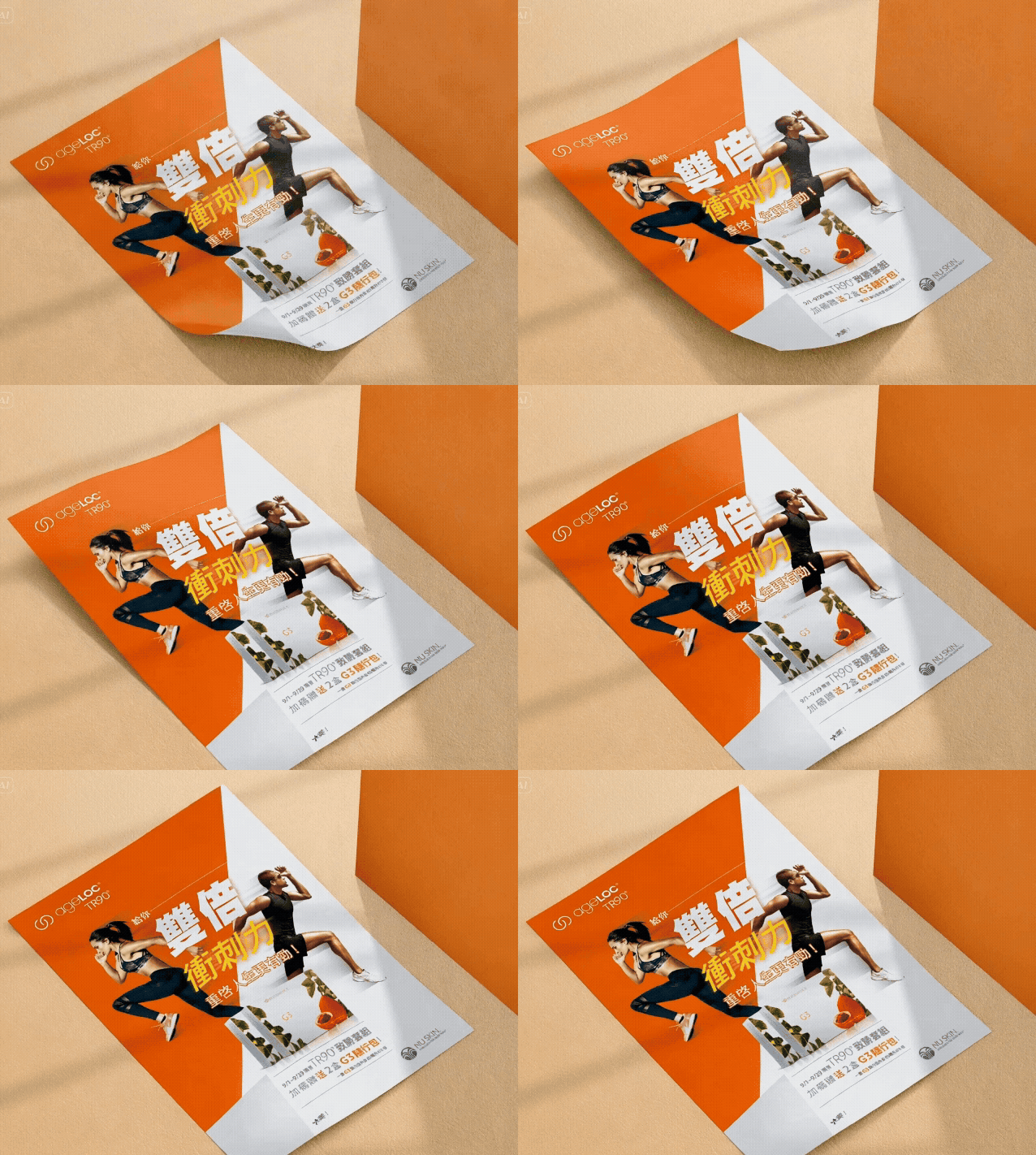
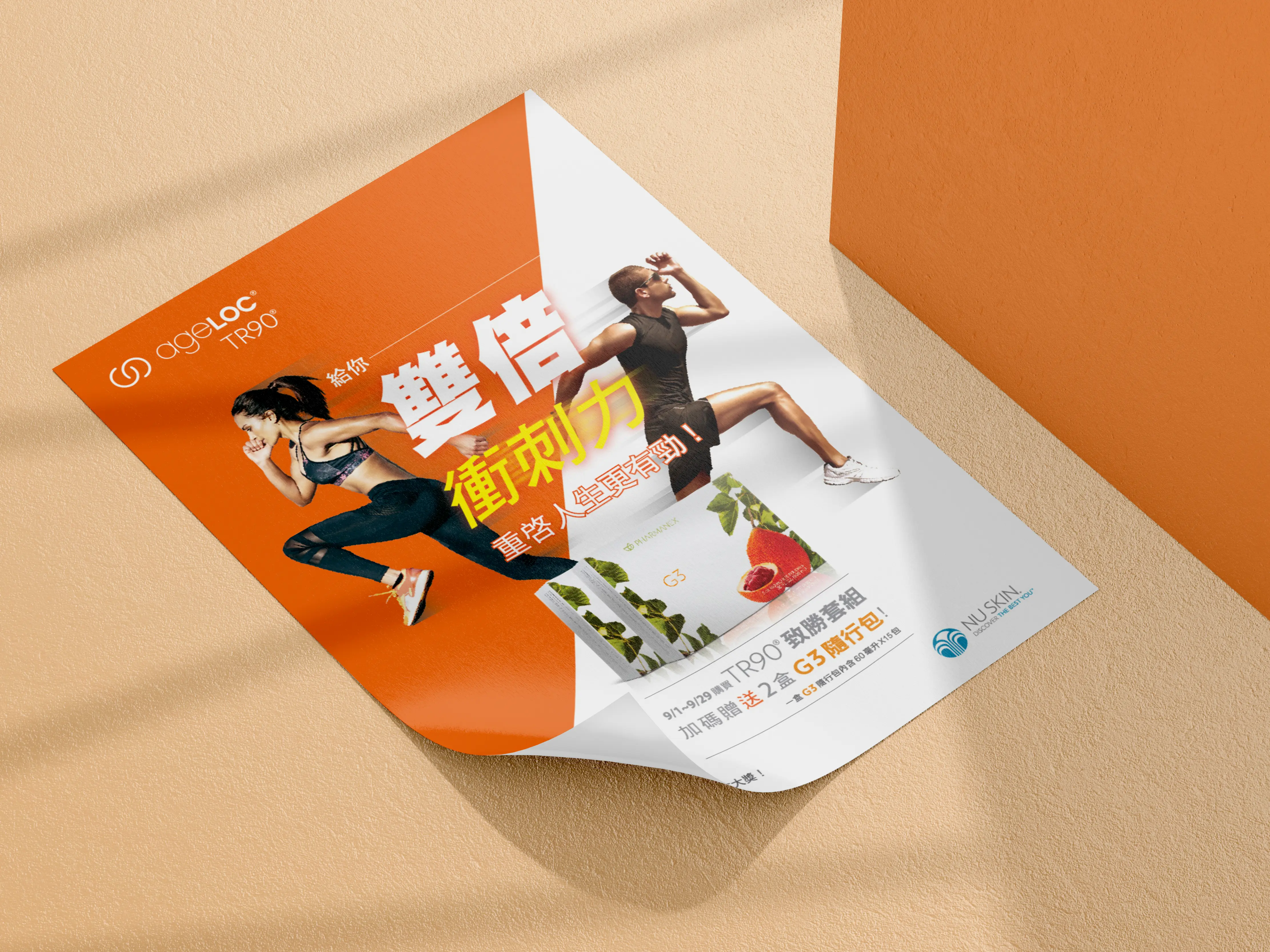
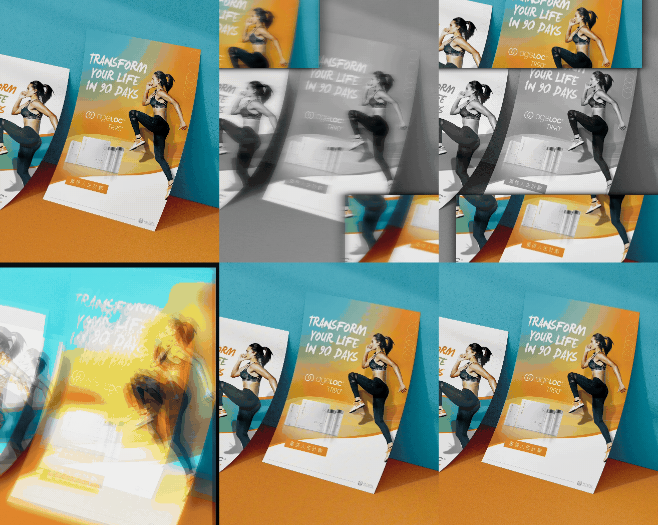
Some event key visuals are not only created to look attractive. They need to help the entire campaign stay recognizable across different media. MASOU DESIGN created the event key visual design for Nu Skin’s “TR-90 Restart Your Life Plan,” developing a visual system that could be extended across DM materials, flags, table boards, banners, and on-site event applications. From the campaign theme and brand tone to model selection, color direction, and visual consistency, the design was built to support a clear and unified event identity. The idea of “Restart Your Life” carries a sense of change, action, and a new beginning. For this reason, the key visual was not only about presenting product or campaign information. It was designed to create a stronger visual rhythm, a clear focal point, and a positive brand atmosphere that could immediately communicate the energy of the event. For large-scale brand events, visual consistency is especially important. Every touchpoint, whether printed DM, event flags, table displays, or large-format banners, needs to feel like part of the same campaign while staying aligned with Nu Skin’s international brand image. The focus of this project was therefore not just to create one key visual, but to build a flexible visual direction that could remain clear, consistent, and memorable across different formats and applications. For us, this collaboration with Nu Skin was not only an event key visual design project, but also an important experience in brand guideline application, project management, and campaign visual extension. A strong key visual should allow an event to communicate its message the moment it is seen.

NuSkin|338 Event Key Visual Extension Design

NuSkin’s “338 Event” was a key visual extension design project following the TR-90 Restart Your Life Plan campaign. The name “338” plays with a Taiwanese phonetic expression that suggests “getting slimmer together,” giving the campaign a lighter, friendlier, and more memorable tone while still connecting to the theme of health management and body transformation. The focus of this project was to extend the campaign key visual across different media and on-site applications, including promotional banners, DM materials, flags, table displays, and hanging posters. Through consistent color usage, model selection, layout rhythm, and campaign visual language, the “338 Event” maintained clear brand recognition and a lively campaign atmosphere across different formats and touchpoints.