
2026.05.28
Miss seesaw|Fast Beauty Aesthetics|Brand E-commerce Visual Design
Lifestyle shapes the way beauty grows every day. MASOU DESIGN created the annual key visual series for Miss Seesaw under the concept of “Fast Beauty Aesthetics,” helping the brand build a stronger visual communication system for its e-commerce website, product pages, and digital marketing materials. The project transformed product features from skincare and functional food into a younger, lighter, and more dynamic visual language. Through paper-cut style backgrounds, vivid colors, product scenarios, and creative visual metaphors, the series communicates product impressions in a playful and approachable way without directly claiming product effects, making the brand more memorable in an e-commerce context.

Miss seesaw|Fast Beauty Aesthetics|Brand E-commerce Visual Design
Miss seesaw “Fast Beauty Aesthetics” is an e-commerce visual and advertising banner design project built around health and beauty product communication. MASOU DESIGN used the idea of “fast beauty” to create a visual language that feels quick, intuitive, playful, and easy to understand, combining product packaging, live-action models, paper-cut illustrations, motion elements, and e-commerce page applications.
Instead of directly describing product effects, this project translates each product feature into a visual scene. From production lines, boxing gloves, pipe-like structures, reversed hourglasses, runway stages, lemons, peaches, moons, and stars, every banner uses playful metaphors and motion to make the product impression easier to understand and more memorable within the e-commerce experience.
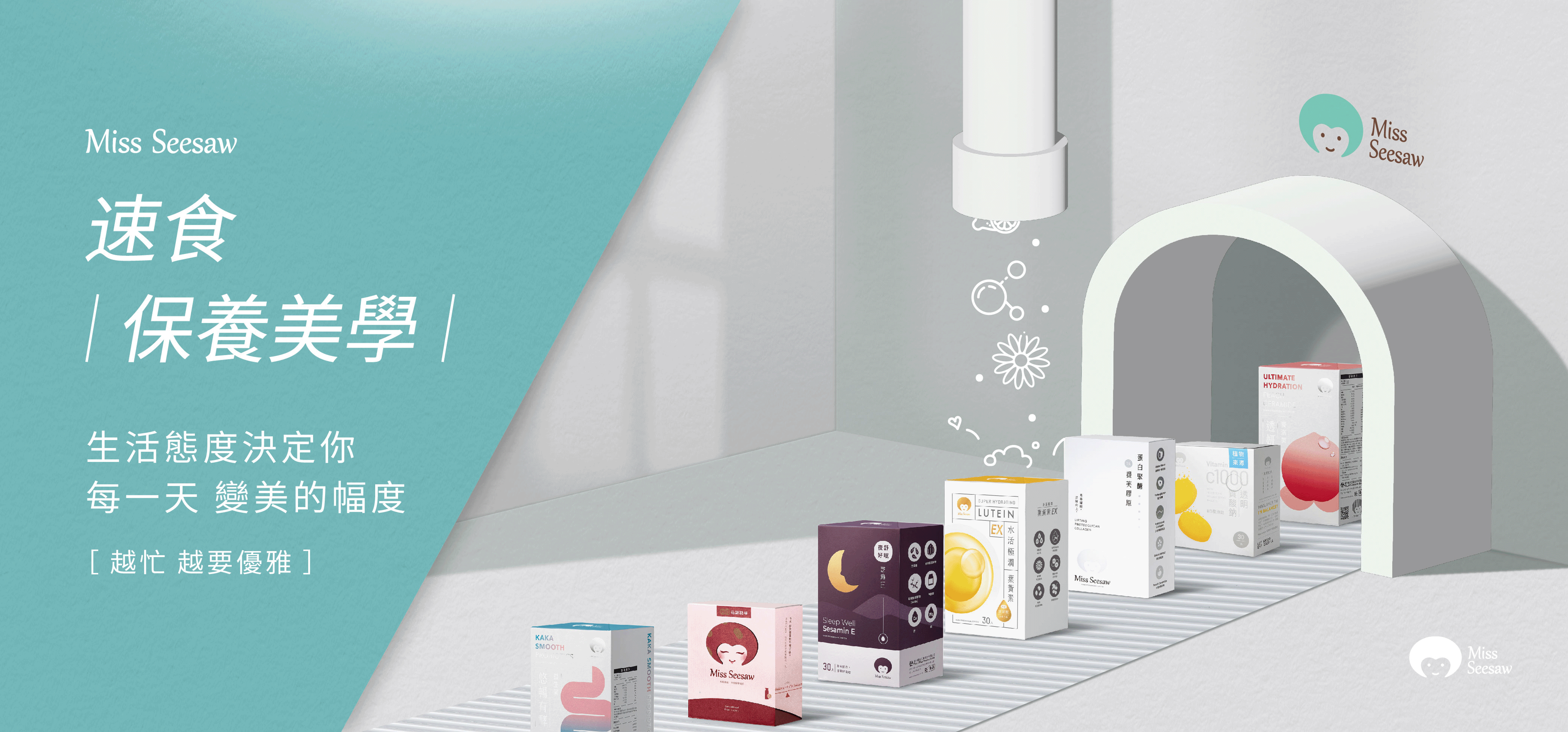
Creating a Series Identity through an Illustrated Fast Beauty Production Line
The main visual uses an illustrated production line as the core idea, making the products feel like ready-to-serve beauty essentials surrounded by health, energy, and beauty-related elements. This visual language turns health products from static packaging into a campaign system that can be understood, expected, and extended across different product lines.
Each banner in the series places a live-action model in the foreground, while paper-cut illustrations and motion elements support the product story in the background. This creates a balance between human warmth, product recognition, and playful campaign identity.
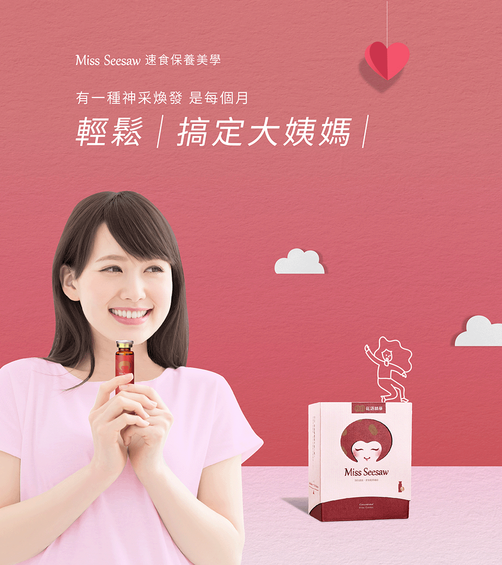
Turning Monthly Care Communication into a Playful Boxing Glove Scene
This banner uses a boxing glove to knock away the monthly period character, turning a sensitive feminine care topic into a humorous and easy-to-understand visual metaphor. The live-action model and product packaging stay in the foreground, helping viewers quickly connect the product with the scene.
The design allows the product message to feel less rigid and more memorable, using illustration and motion to create a lighter tone for e-commerce banner communication.
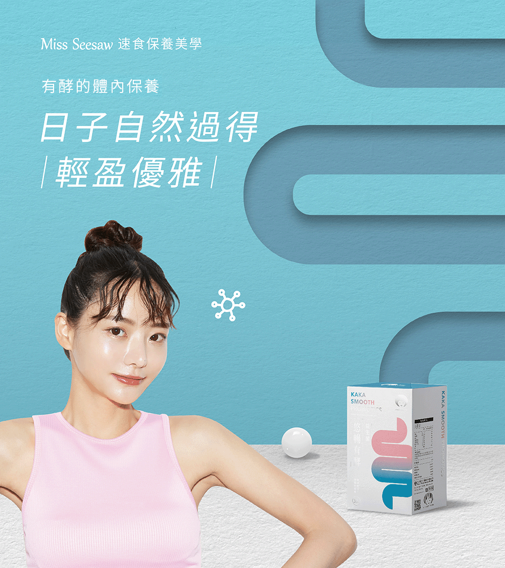
Using Pipes and Rolling Spheres to Make the Probiotic Impression Intuitive
For the probiotic product, we used a pipe-like paper-cut structure and rolling three-dimensional spheres to create a sense of flow and movement. Rather than directly describing product effects, the banner uses pathway, motion, and rhythm to make the product impression more intuitive.
This helps the product communicate more through visual storytelling than text-heavy explanation, while keeping the playful and recognizable style of the overall Fast Beauty Aesthetics campaign.
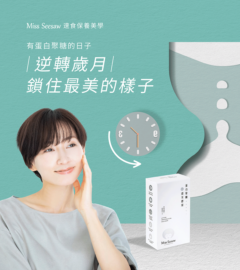
Using a Reversed Hourglass and Clock to Express a Time-Related Beauty Impression
The proteoglycan visual uses a reversed hourglass and a backwards clock as the main metaphor. Time, beauty, and care are translated into a more imaginative scene instead of relying only on product photography and explanatory text.
Through motion banner design, time becomes part of the visual rhythm, giving the product concept more storytelling potential for campaign pages, e-commerce pages, and social media materials.
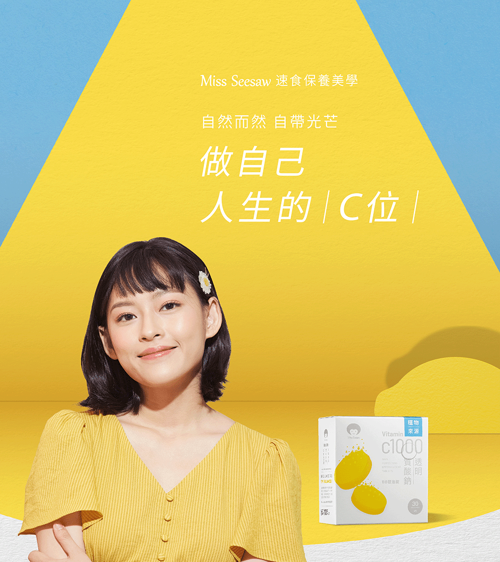
Putting the Product on a Runway to Make C1000 the Center of Attention
The C1000 sodium hyaluronate banner uses the idea of “taking the center position in life.” A runway stage and falling lemon elements make the product feel like the main character, connecting the visual with confidence, brightness, and self-expression.
The falling lemon motion adds rhythm to the banner and gives the product a refreshing and vivid impression, making it more memorable than a standard product-focused layout.
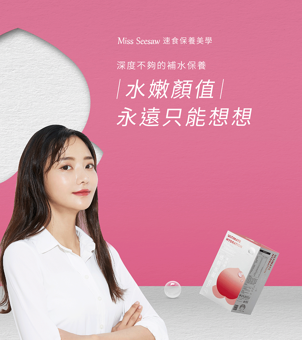
Using Peaches and Water Spray Elements to Communicate a Fresh Hydration Impression
The hydrating beauty product visual uses a paper-cut peach behind the product and water spray motion around it. The scene communicates a refreshing and moist impression in a direct visual way, while still keeping the playful style of the Fast Beauty Aesthetics series.
Instead of explaining the product through long copy, the banner combines water, peach, motion, product packaging, and model imagery into a complete e-commerce visual experience.
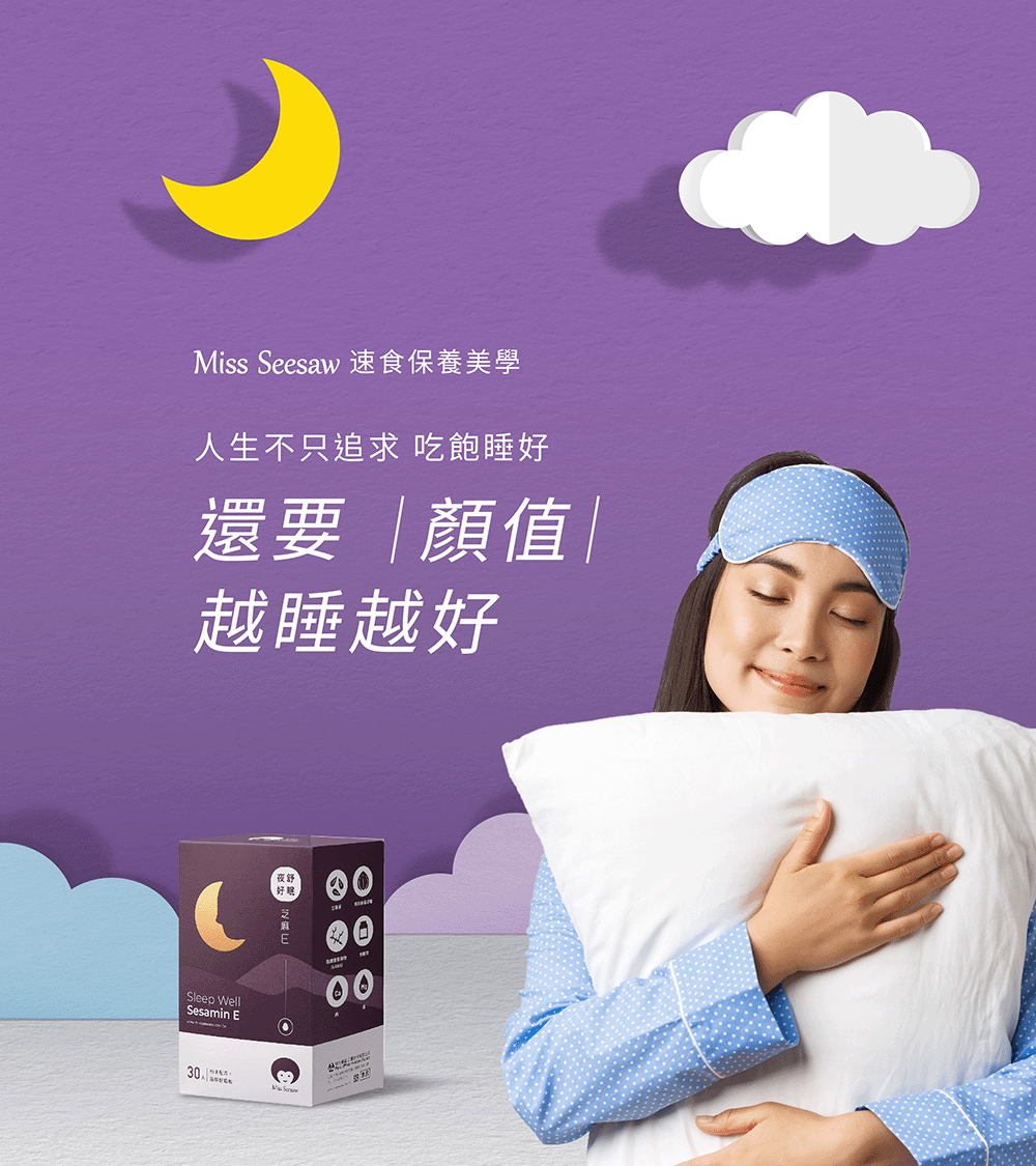
Creating a Nighttime Beauty Scene with the Moon, Clouds, and Stars
This sleep-related beauty banner uses a paper-cut nighttime scene with a moon, clouds, and falling stars. The visual makes the product impression softer and more emotional, placing the product inside a lifestyle moment rather than presenting it as a standalone pack shot.
The live-action model, product packaging, and nighttime illustration elements work together to create a clear and gentle e-commerce banner scene, completing the campaign series with a warm and memorable visual tone.
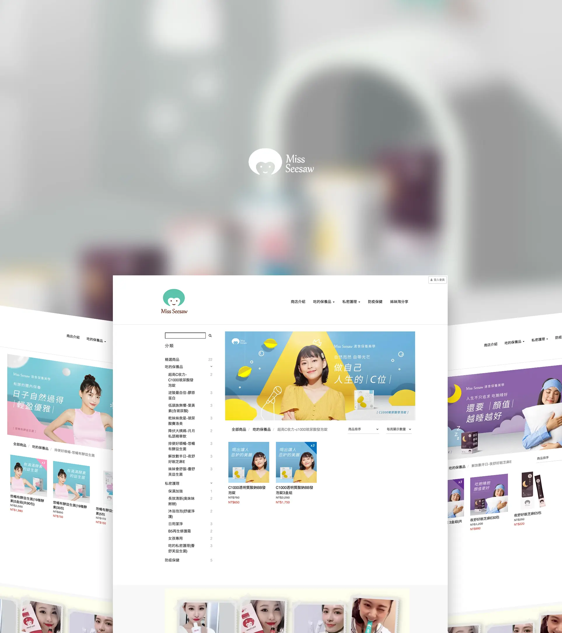
Building a Scalable E-Commerce Campaign Visual from Hero Banner to Web Mockup
From the main visual to product banners and web mockups, the Fast Beauty Aesthetics series maintains a consistent paper-cut illustration style, live-action model structure, and product-character logic. Each banner has its own product theme, while the entire series still feels like one unified campaign.
Through this brand e-commerce visual design project, Miss seesaw’s product features were transformed into a clearer, more playful, and more e-commerce-friendly visual language. The result is not only a set of banners, but a campaign visual system that can extend across sales pages, campaign pages, and social media materials.
✦ Planning health brand advertising visuals, e-commerce banner design, or motion visual design? Talk to us about your brand project.
✦ Browse our portfolio to see more brand design, advertising visual, and website design projects.
✦ Return to the homepage to learn how we help brands build clearer visual identity and digital experiences.