WORKS

works 頁面的敘述

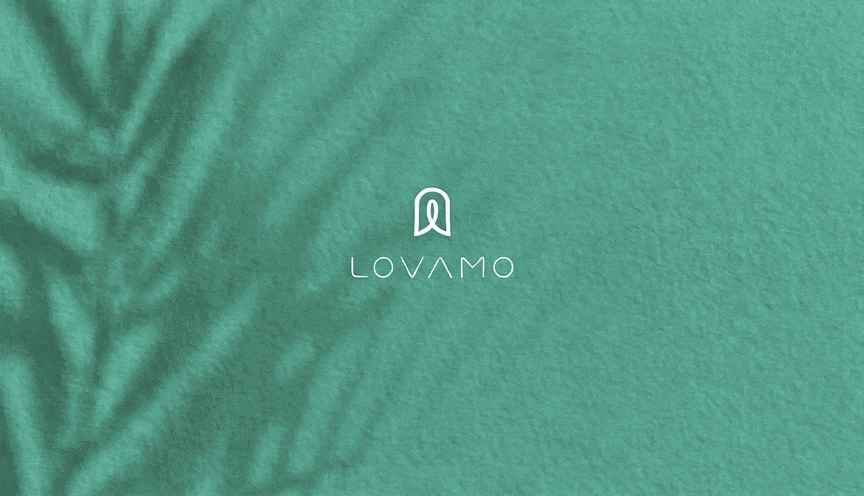
LOVAMO|The Aesthetics from Eyes to Fingertips

Lovamo is built around the idea of salon culture, positioned as a refined beauty brand that combines eyelash styling, artistic expression, and lifestyle aesthetics. More than offering eye beauty services, the brand aims to turn every delicate detail into an experience of care, comfort, and renewed confidence. The brand identity system reinterprets the visual language of an eyelash salon through a more complete and distinctive design approach. The logo combines the curve of lifted eyelashes, the outline of a fingernail, and a central human figure, symbolizing the extension of beauty from the eyes to the fingertips. It also reflects the brand’s focus on details, posture, and self-care. The overall design moves away from the overly commercial and standardized image often seen in eyelash brands. Instead, it brings in a softer atmosphere inspired by art, spa culture, and the warmth of home. Through gentle visual elements and a layered sensory brand image, Lovamo presents a professional yet approachable personality. Beauty is no longer only an outer touch-up, but a quiet return of confidence from the eyes, fingertips, and inner self.

OVEZO

OVEZO

AROS | JUST ENJOY

AROS is a cocktail brand that brings together fresh Taiwanese fruits and the spirit of British cocktail culture. Masou Design worked on the brand planning, verbal identity, visual identity, and overall brand image for AROS, shaping a brand system that feels fashionable, romantic, refined, and slightly aristocratic. Rather than simply presenting the flavor of the drink, the brand was designed to communicate a lifestyle attitude: open the bottle freely, enjoy the moment fully. For the brand language, we built the concept around the contrast between “freshly harvested Taiwanese fruits” and “classic British cocktail culture.” The former represents freshness, sweetness, acidity, richness, and local character; the latter carries a sense of elegance, precision, nobility, and timeless taste. Together, they create the unique personality of AROS: vivid and fruity, yet polished and elegant. The visual identity follows this same spirit. Through romantic details, refined curves, translucent colors, and a lively party atmosphere, AROS was shaped into a cocktail brand with a strong sense of fashion and memorability. From the logo and color system to packaging visuals and brand tone, every detail was designed around the ideas of effortless romance, distinctive flavor, and the desire to open a bottle right away. AROS is not just a packaged cocktail product. It is a brand experience that creates a mood, a drinking scene, and a memorable first impression — fresh, elegant, playful, and made for moments of celebration.

ACETECK|KEEP GOING WELL ,KEEP GOING ACETECK

ACETECK is a B2B industrial brand specializing in hydraulic cylinder manufacturing, serving logistics equipment, industrial machinery, and various mechanical applications. In this brand identity project, we transformed the initial letter “A” into a visual interpretation of a hydraulic cylinder cross-section. The central axis represents the piston rod and precision internal structure, while the outer form echoes the cylinder body, mechanical support, and industrial strength. Built around the ideas of precision, power, and stability, the logo uses sharp geometric cuts and forward-moving lines to express the motion, extension, and continuous operation of a hydraulic cylinder. Rather than creating a purely decorative symbol, we designed the identity as a product-related visual code — one that helps customers immediately connect ACETECK with hydraulic cylinder manufacturing, strict quality testing, and reliable industrial performance. Through this brand identity system, ACETECK gains a clearer and more professional visual language for use across its website, catalog, exhibitions, and international market communication.

InventAI Brand Identity Design