
2026.05.20
Ovezo|Eco Yoga Mat Lifestyle Brand Design
Ovezo is a lifestyle brand centered on eco-friendly materials, active living, and pure aesthetics. Starting from material choices, the brand explores how sports and wellness products can support a healthier lifestyle while reducing reliance on plastics and chemical materials, offering a more earth-friendly and everyday alternative. The visual identity is built around the symbol “O,” extending into ideas of breathing, circulation, reset, oxygen, the earth, and a more mindful material cycle. Through minimal design, white space, paper texture, embossing, and refined layout details, Ovezo presents sustainability not as a loud slogan, but as a quiet and deliberate lifestyle expression across its products, website, and everyday use.
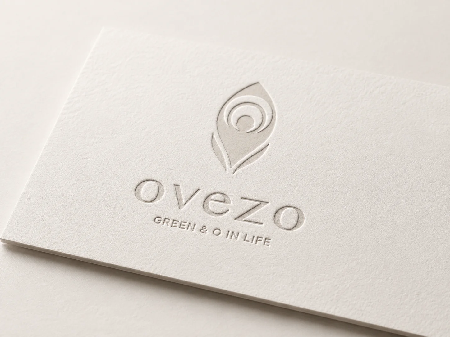
Building a pure and restrained active lifestyle brand from eco-friendly materials
Ovezo is a lifestyle brand centered on eco-friendly materials, yoga, active living, wellness, and pure aesthetics. Starting from material choices, the brand explores how yoga mats and sports products can support a healthier lifestyle while becoming a more earth-friendly and everyday alternative.
For Ovezo’s brand design, environmental sustainability and healthy movement were translated into a quiet, restrained, and consistent visual system. Instead of relying on overly strong colors or decorative elements, the identity uses minimal composition, white space, tactile materials, and refined layout order to create a calm yet recognizable brand experience.
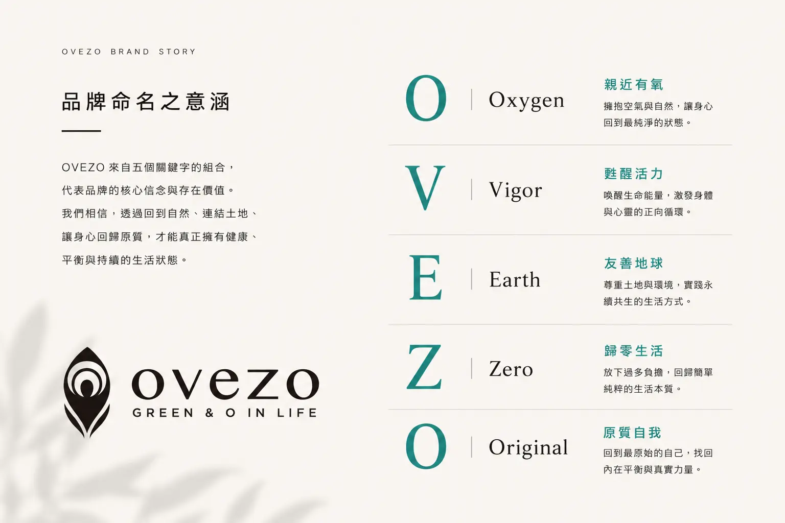
Using the symbol “O” to express breathing, circulation, and reset
Ovezo’s visual identity is built around the symbol “O,” extending into ideas of breathing, circulation, reset, oxygen, the earth, and a more mindful material cycle. The symbol is not only the starting point of the brand name. It also reflects the state of returning to the body through yoga and movement, while expressing the brand’s attention to materials, environment, and everyday lifestyle choices.
The visual language stays clean, open, and understated. Rather than turning sustainability into a direct slogan, Ovezo communicates its value through materials, proportion, light, and layout. Some brands do not need to speak loudly; when the attitude is clear enough, quietness can become the stronger memory point.
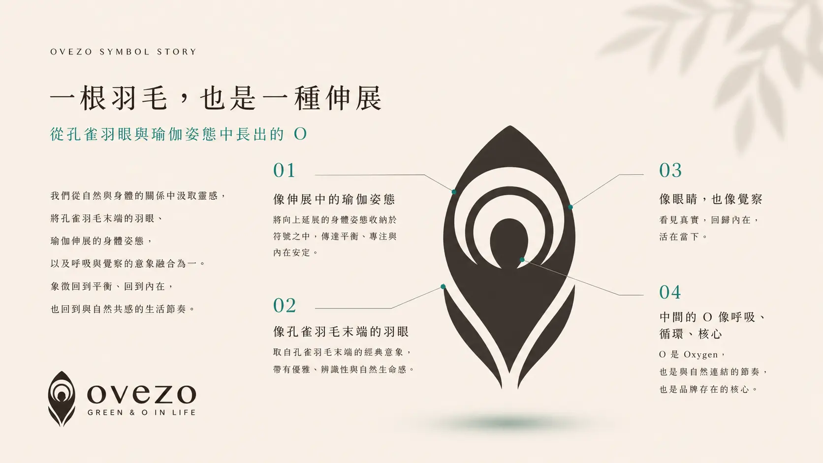
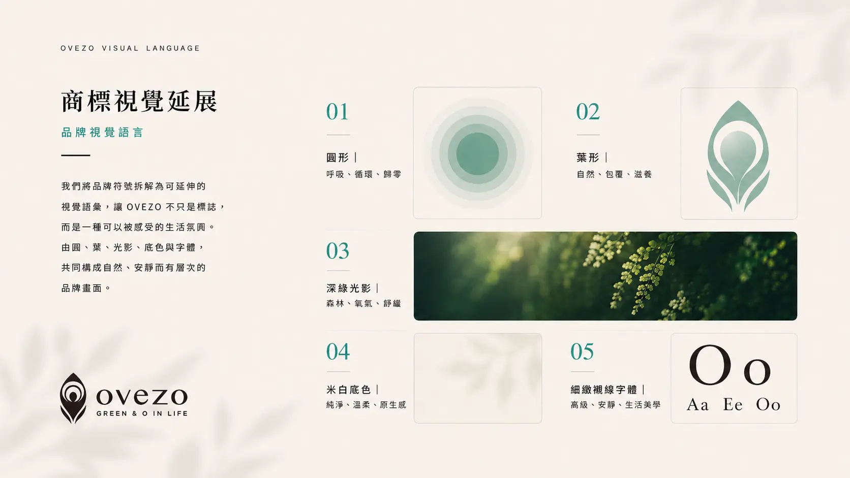
Creating visual order through minimal design and material details
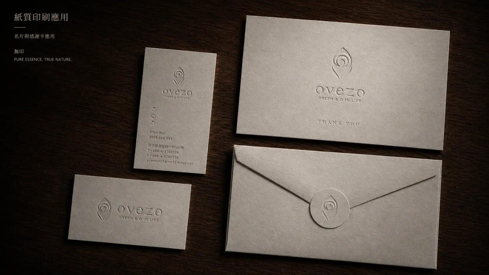
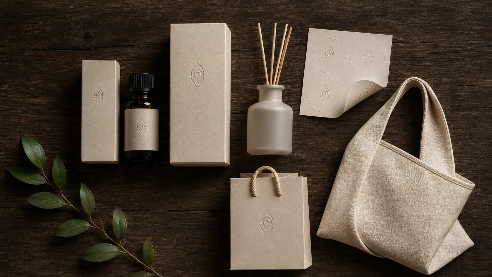
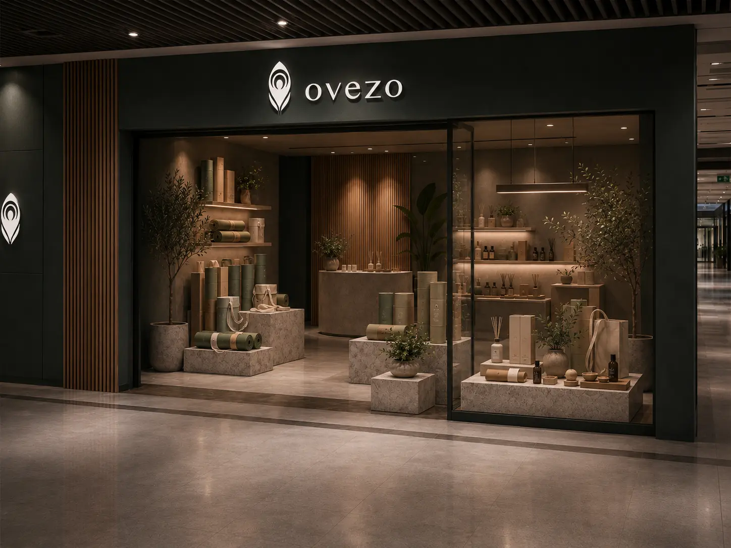
The Ovezo brand application follows a minimal and subtractive design direction. Generous white space, restrained colors, refined typography, paper texture, and embossing allow the brand to build recognition through touch, light, and material details. The goal is not to make the layout look empty, but to let the purity of the brand, the eco-friendly materials, and the lifestyle aesthetics become easier to feel.
For a brand centered on sustainability and yoga lifestyle, the design does not need excessive decoration. The more natural, clean, and everyday the brand wants to feel, the more carefully the visual density and design intensity need to be controlled. This allows Ovezo to maintain a consistent brand atmosphere across its website, printed materials, packaging, and other touchpoints.
Letting sustainability become part of every brand touchpoint
Ovezo does not communicate sustainability through repeated large slogans. Instead, the brand idea appears in quieter details: the texture of paper, the light and shadow of embossing, the breathing space of the layout, and the consistency between product visuals and website experience. When the brand message is pure, the design needs to stay restrained, because unnecessary decoration can make a quiet brand feel too forced.
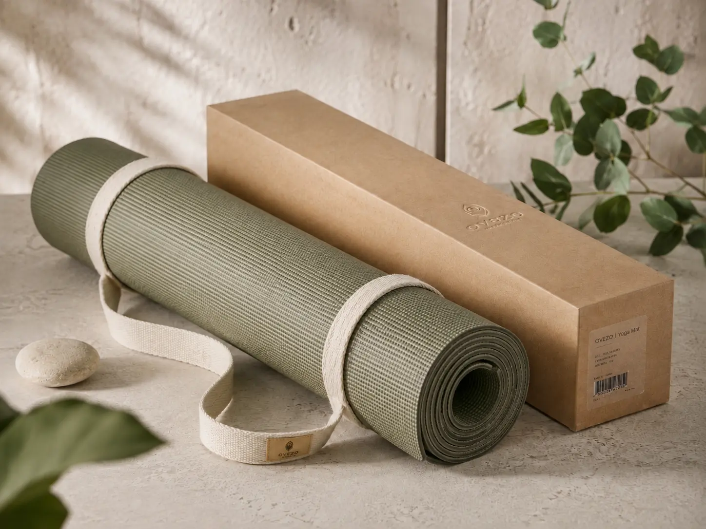
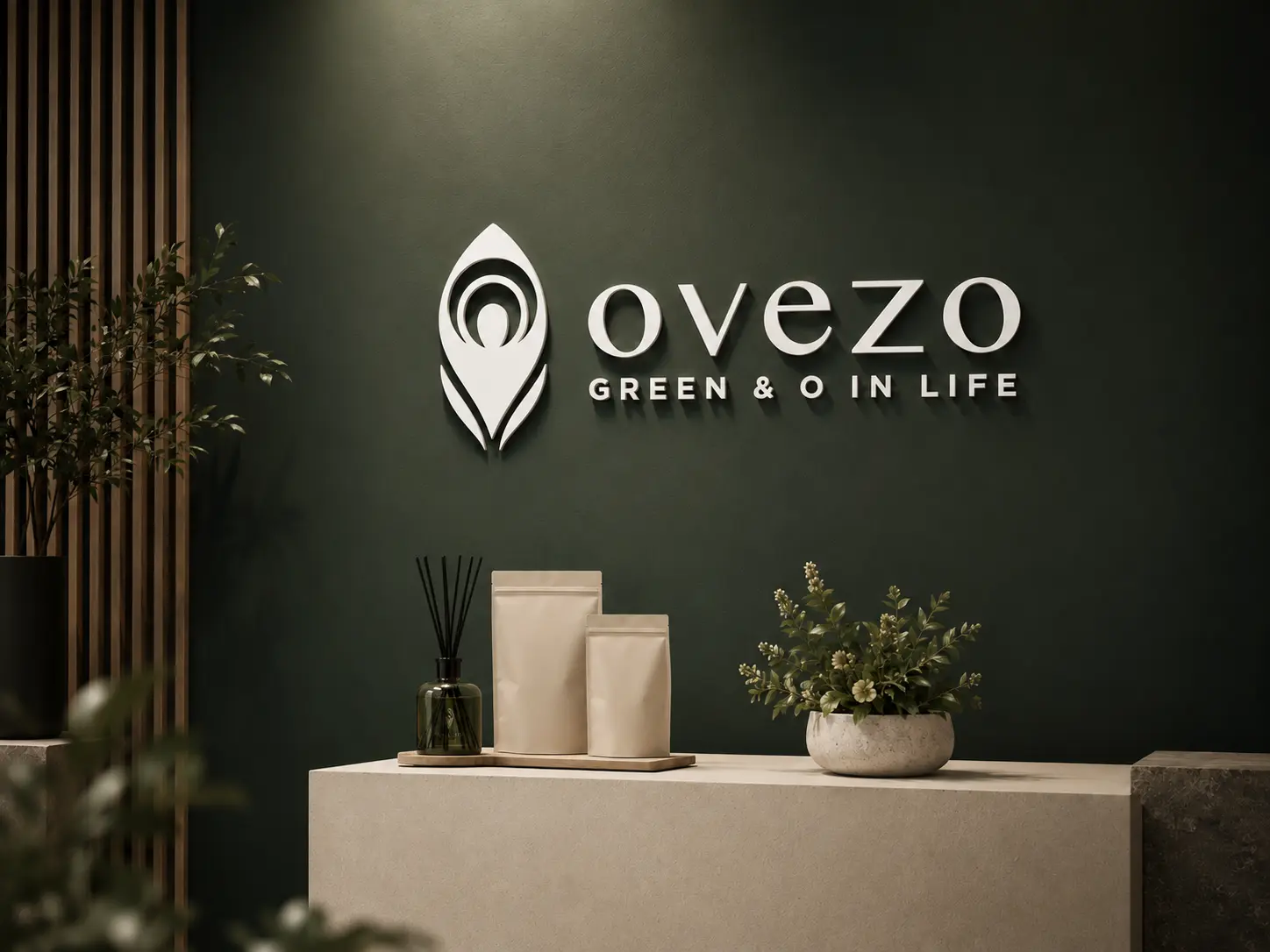
Material details, white space, and visual order become the main memory points of the brand. This design language makes Ovezo more than an eco yoga mat brand. It becomes a calm, rational, and deliberate lifestyle choice, bringing sustainability from a concept into products, website presentation, and everyday use.
✦ Talk to us about your branding, website, or visual design project.
✦ View more works in branding, website, and visual design.
✦ Back to home to learn how we help brands build clearer design communication.