
2026.05.19
Da Dun Huang|Hot Pot Branding and Eastern Food Therapy Visual Identity
Da Dun Huang is a hot pot brand built around Eastern food therapy culture, precious ingredients, nourishment, and a refined dining experience. The visual identity combines symbolic elements such as the “ingredient treasure cabinet,” the hexagonal Black Tortoise pattern, and the twelve-petal chrysanthemum, transforming ideas of longevity, wellness, premium ingredients, and Eastern aesthetics into a distinctive brand language. The overall design uses a palette of golden brown, deep reddish purple, and warm ivory, supported by delicate linework, lattice patterns, custom brand typography, and extended restaurant applications. From the identity system to storefront visuals, menu design, packaging, and brand touchpoints, Da Dun Huang presents a calm, elegant, and premium hot pot brand image rooted in Eastern culinary culture.
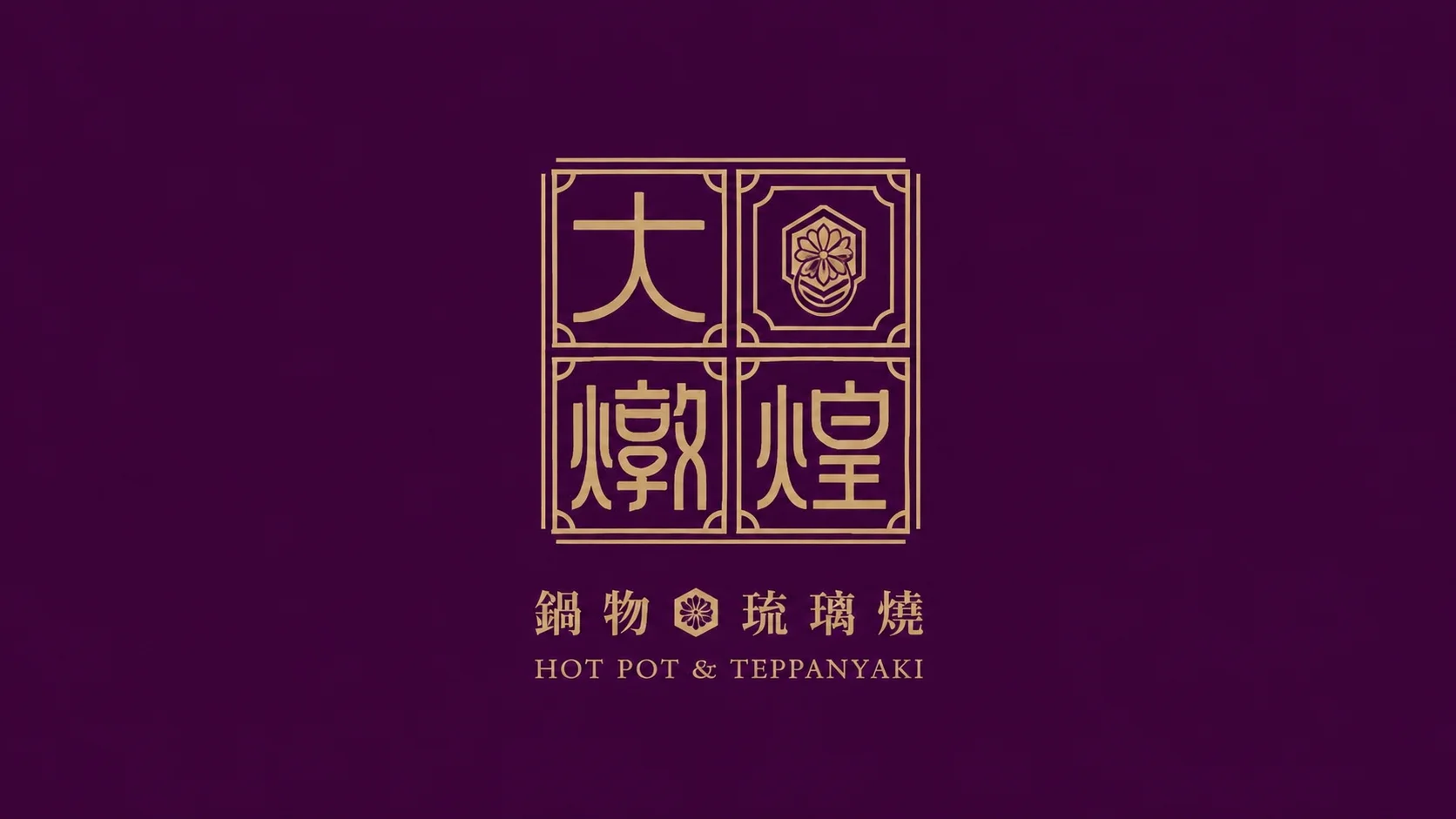
Da Dun Huang Hot Pot|A brand identity built around the Eastern ingredient treasure cabinet
Da Dun Huang Hot Pot is a restaurant brand rooted in Eastern food therapy culture, precious ingredients, nourishment, and a refined dining experience. Rather than presenting hot pot only as a meal, the brand identity was designed to create a stronger sense of ingredient value, cultural depth, and dining ritual.
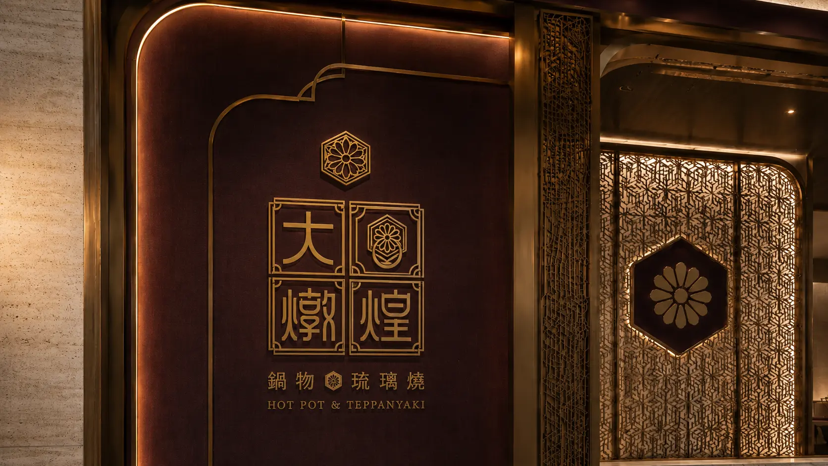
The visual concept centers on the idea of an “Eastern ingredient treasure cabinet.” Symbolic elements such as the hexagonal Black Tortoise pattern, the twelve-petal chrysanthemum, lattice motifs, and delicate linework were translated into a distinctive brand language. With a palette of golden brown, deep reddish purple, and warm ivory, Da Dun Huang presents a calm, elegant, and premium hot pot brand image.
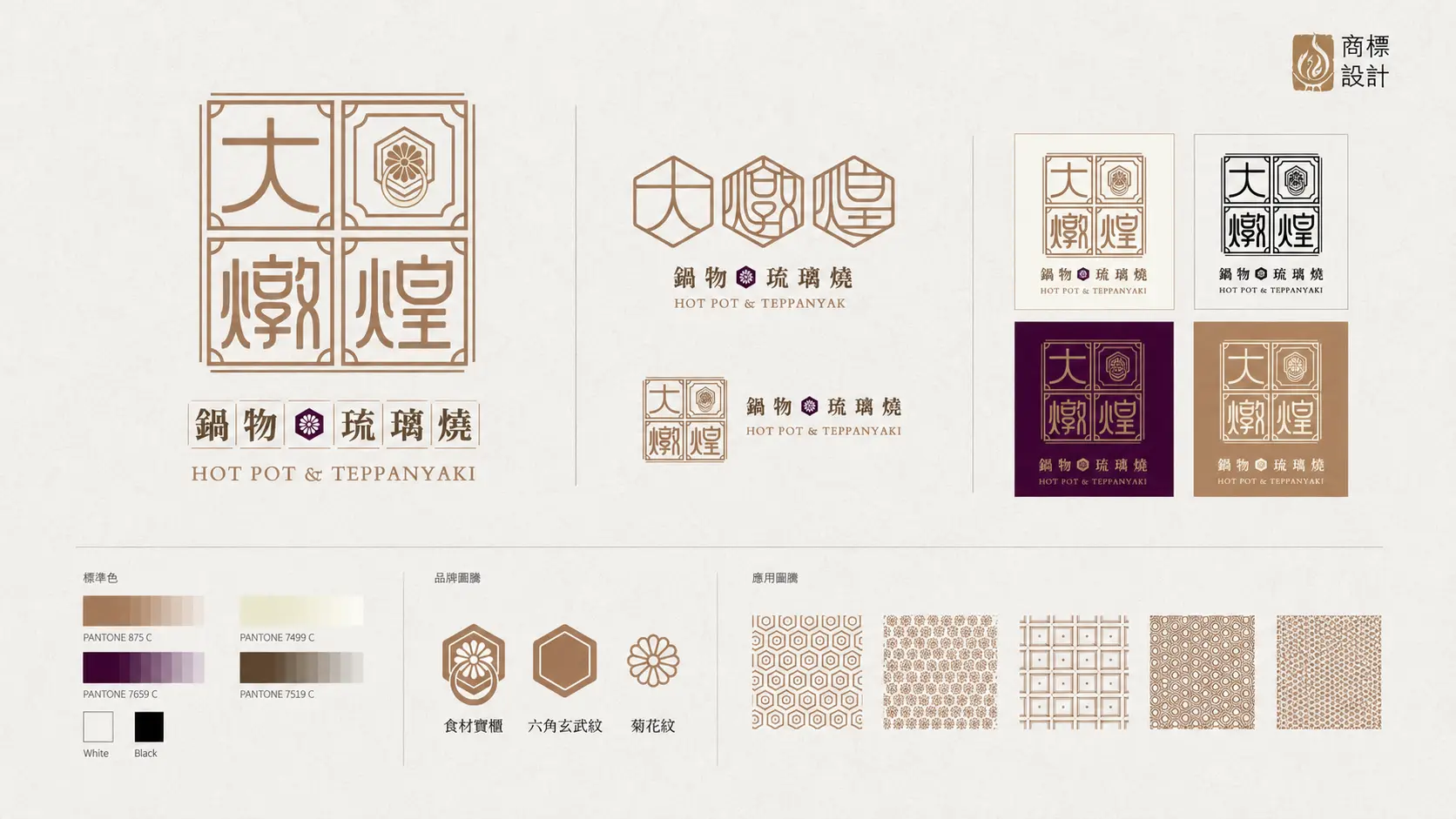
Building a memorable Eastern food therapy identity through symbolic visual elements
The brand symbols of Da Dun Huang are not decorative elements added only for atmosphere. They were developed from Eastern food therapy and dining culture. The “ingredient treasure cabinet” represents carefully selected and preserved ingredients, while also echoing the depth of hot pot broth and the value of premium dining. The hexagonal Black Tortoise pattern suggests protection, longevity, and stability, while the twelve-petal chrysanthemum brings a sense of refinement, elegance, and Eastern banquet culture.
These ideas were transformed into the brand identity, supporting graphics, and extended visual applications. The result is not just a restaurant that looks premium, but a hot pot brand with its own cultural memory and recognizable visual system. Many restaurant brands can look beautiful; fewer can build symbols that people actually remember.
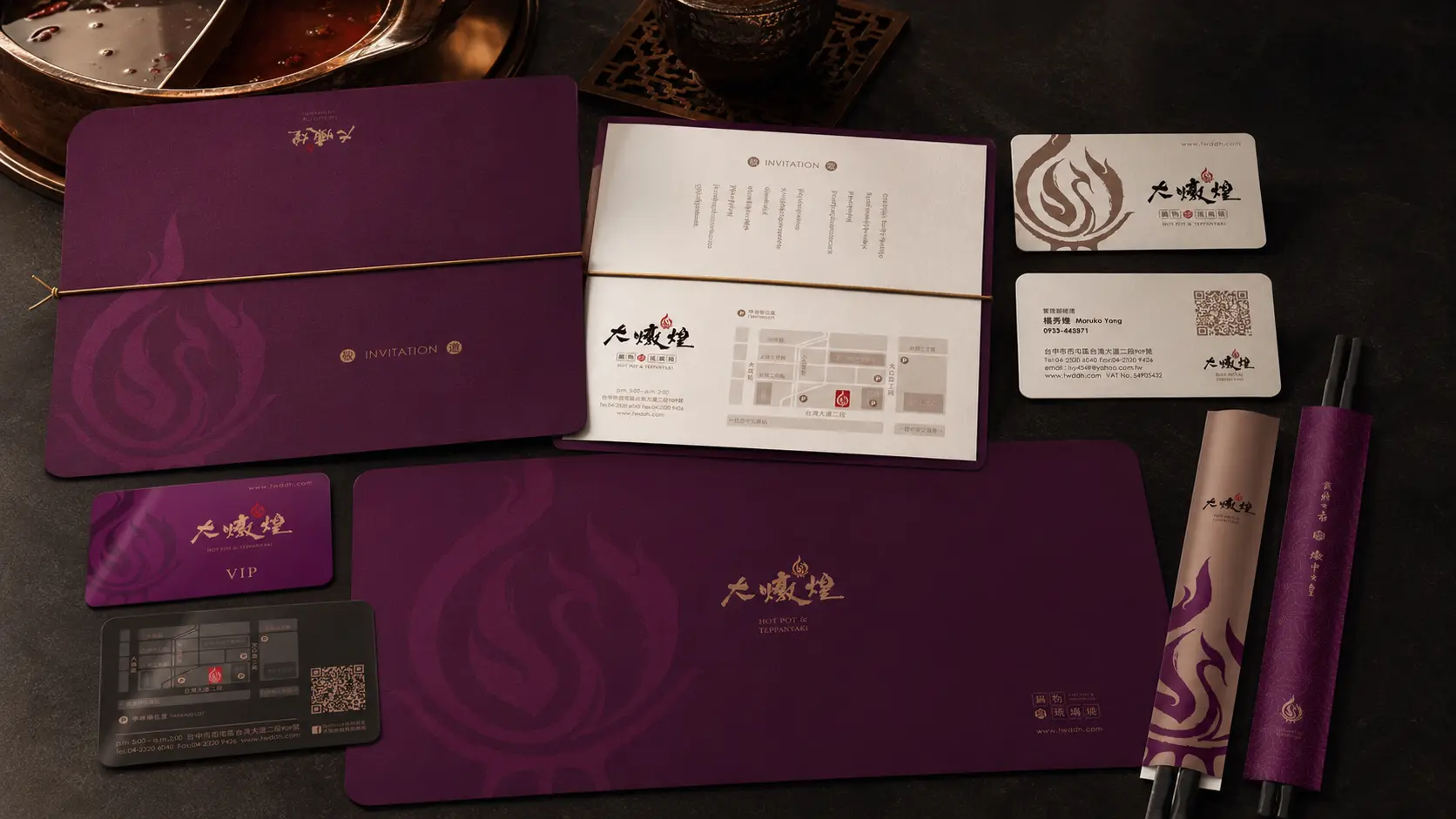
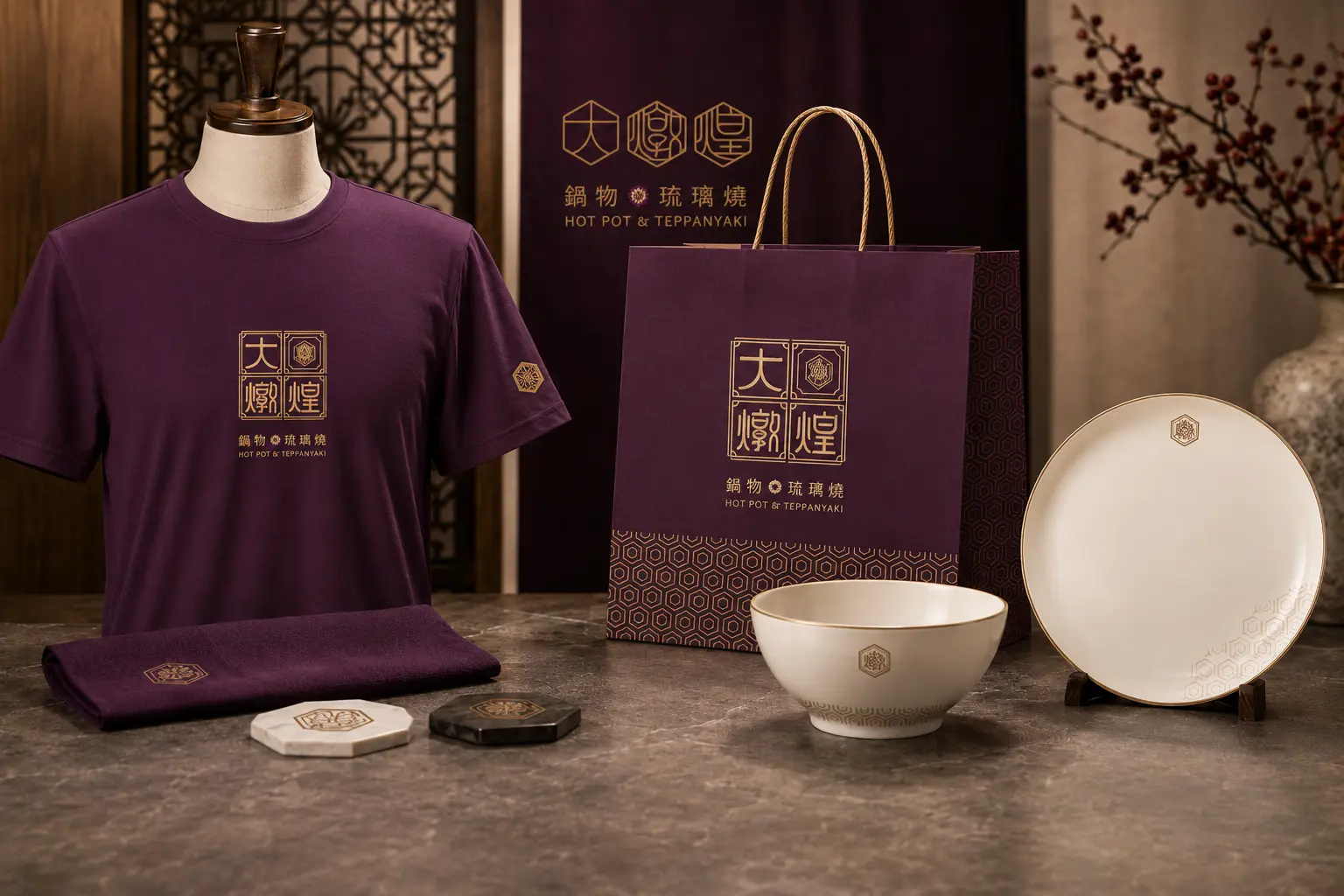
Extending a premium restaurant atmosphere through color, linework, and brand applications
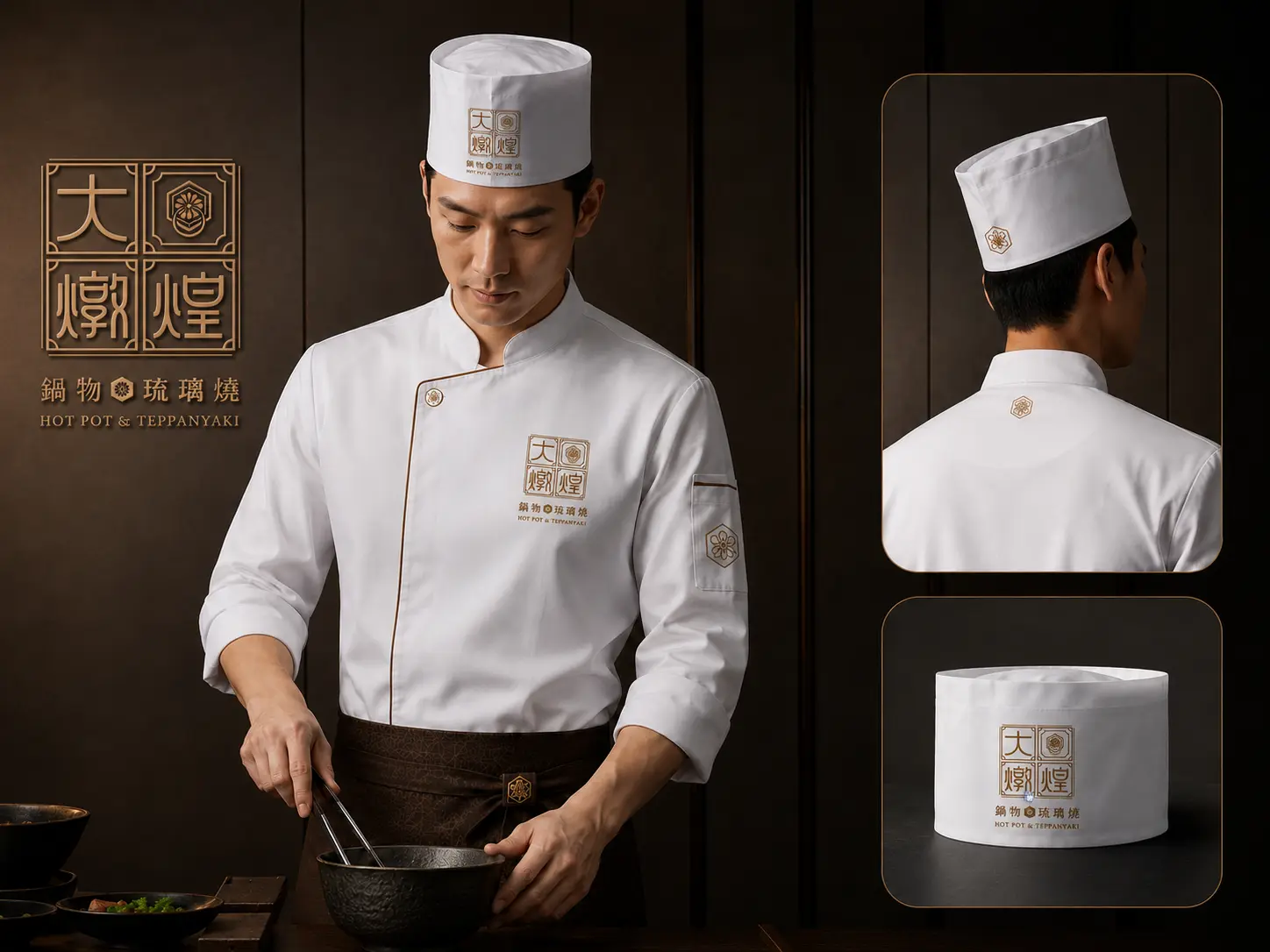
The Da Dun Huang visual system uses golden brown, deep reddish purple, and warm ivory as its core color palette. Instead of adopting overly bright or generic restaurant visuals, the brand was designed to feel composed, elegant, and textural. Golden brown brings out the value of premium ingredients, deep reddish purple creates a mature and layered Eastern dining atmosphere, while warm ivory balances the overall system with clarity and refinement.
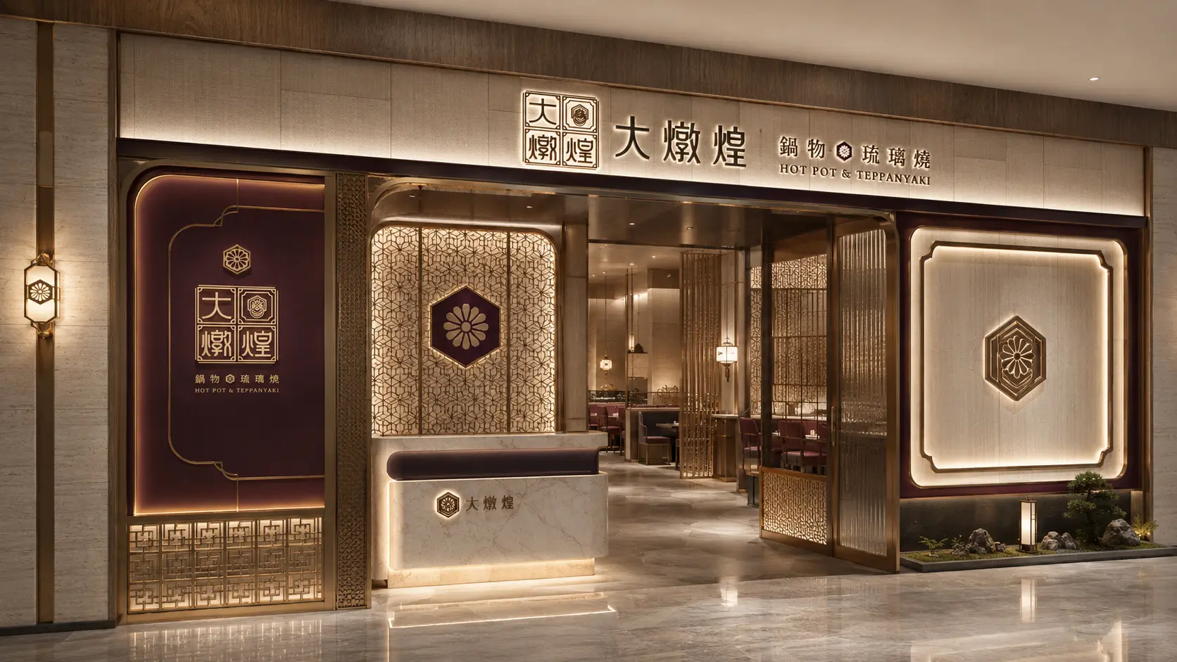
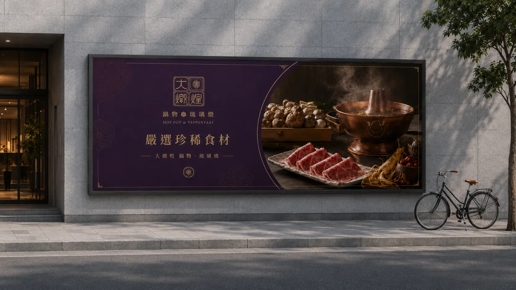
Delicate linework and lattice-inspired patterns were extended across menus, storefront visuals, packaging, tableware, and spatial applications. This allows the identity to move beyond a logo and become a complete restaurant brand experience, helping Da Dun Huang maintain a consistent sense of quality across different customer touchpoints.
From brand identity to restaurant touchpoints, creating a complete hot pot brand experience
Restaurant branding is not only about creating a logo. It is about shaping how people feel when they see the storefront, open the menu, touch the packaging, or enter the dining space. For Da Dun Huang, symbolic graphics, color, typography, and visual applications were organized into a cohesive system that turns Eastern food therapy culture into a more contemporary and memorable restaurant experience.
For this brand, the “Eastern ingredient treasure cabinet” is not just a descriptive phrase. It becomes a design method that connects ingredient value, cultural symbolism, visual identity, and restaurant applications. Through this approach, Da Dun Huang builds a clearer sense of recognition and premium positioning in a competitive hot pot market.
✦ Talk to us about your branding, website, or visual design project.
✦ View more works in branding, website, and visual design.
✦ Back to home to learn how we help brands build clearer design communication.