
2026.10.16
YC GROUP Brand Identity Design|Transforming Manufacturing Expertise into a Global Brand
With more than 70 years of manufacturing expertise, YC GROUP has evolved from a Taiwan-based hand tool manufacturer into an international enterprise supported by global production resources, R&D capabilities, and an integrated supply chain. As the group expanded across markets and brands, it required a unified identity capable of communicating its manufacturing strength, professional expertise, and global vision. YCGROUP品牌手冊_1002V1 MASOU DESIGN developed a comprehensive corporate brand identity system covering brand strategy, visual identity, logo structure, color, typography, digital applications, and physical brand touchpoints. The new system transforms YC GROUP’s strengths in precision manufacturing, innovation, customization, and international collaboration into a clear and consistent brand experience.
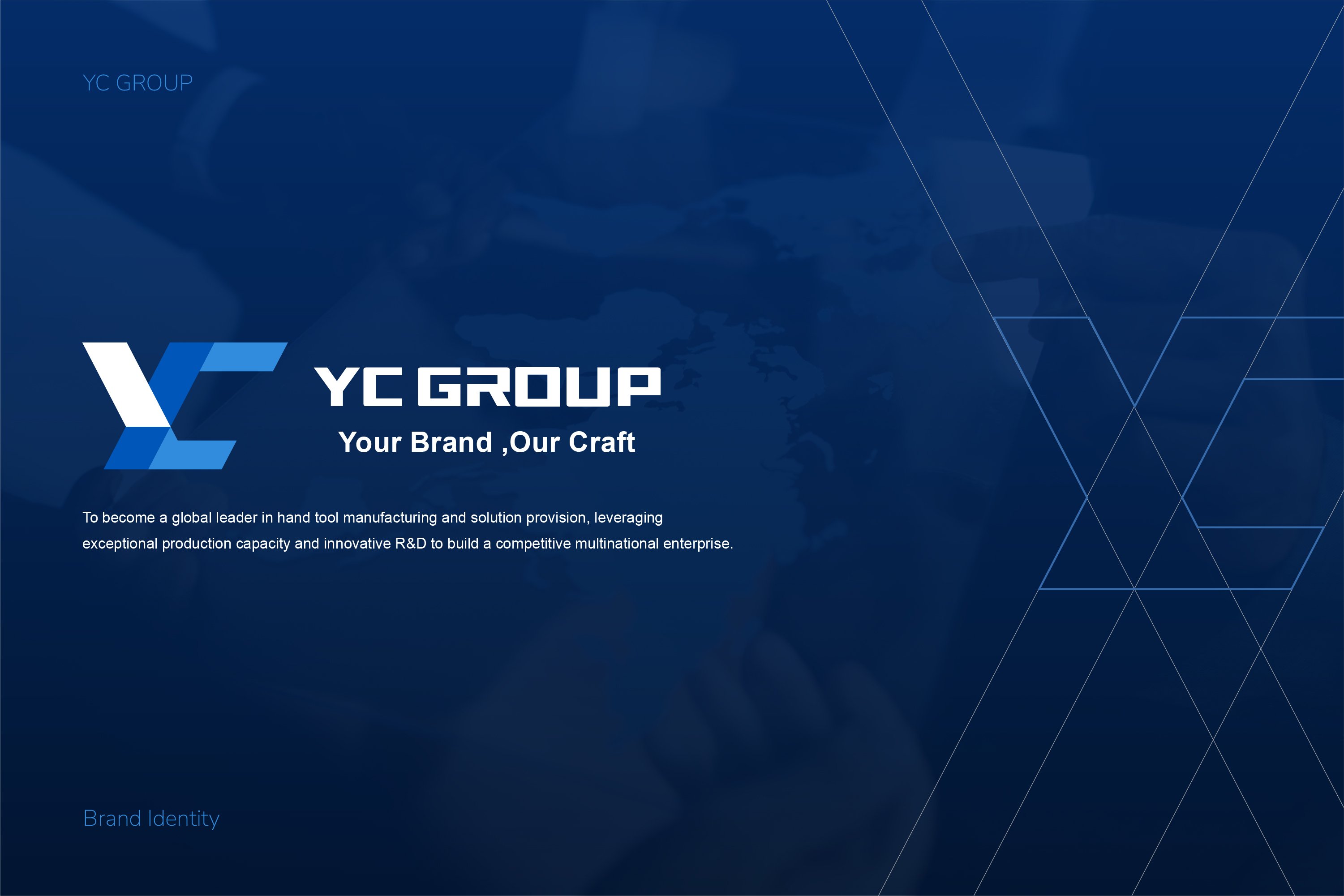
From Manufacturing Strength to Brand Competitiveness
YC GROUP’s brand foundation is built around four core values: Precision, Innovation, Collaboration, and Customization.
Its vision is to become a global leader in hand tool manufacturing and solution provision, strengthening international competitiveness through advanced production capabilities and continuous R&D innovation. At the same time, smart manufacturing, environmental sustainability, and corporate social responsibility form an important part of the group’s long-term development. Its mission further focuses on precision manufacturing, customized services, R&D efficiency, and professional collaboration, with the goal of becoming a trusted strategic partner for clients worldwide.
In terms of brand positioning, YC GROUP is more than a hand tool manufacturer. It is an integrated solution provider that brings together precision production, innovative design, multinational supply chain resources, and professional R&D capabilities. By coordinating production resources across Taiwan, mainland China, and Thailand, together with its affiliated brands, YC GROUP has built the manufacturing and service capabilities needed to support European, North American, and global markets.
For this reason, the brand strategy does not position YC GROUP as a decorative or consumer-oriented brand. Instead, it returns to the company’s true competitive strengths:
Precision
Representing decades of accumulated manufacturing expertise and uncompromising quality standards.
Innovation
Transforming R&D capabilities and smart manufacturing into the driving force behind continuous brand growth.
Collaboration
Connecting multinational production, R&D, and supply chain resources through professional cooperation.
Customization
Responding to the diverse needs of industries and global clients with tailored solutions.
These principles also reflect the corporate values defined in the CIS system — Integrity, Pragmatism, Professionalism, and Innovation — together with the brand slogan:
“Your Brand, Our Craft.”
Logo Design & Structure|Building Precision, Stability, and Forward Momentum Through Geometric Form
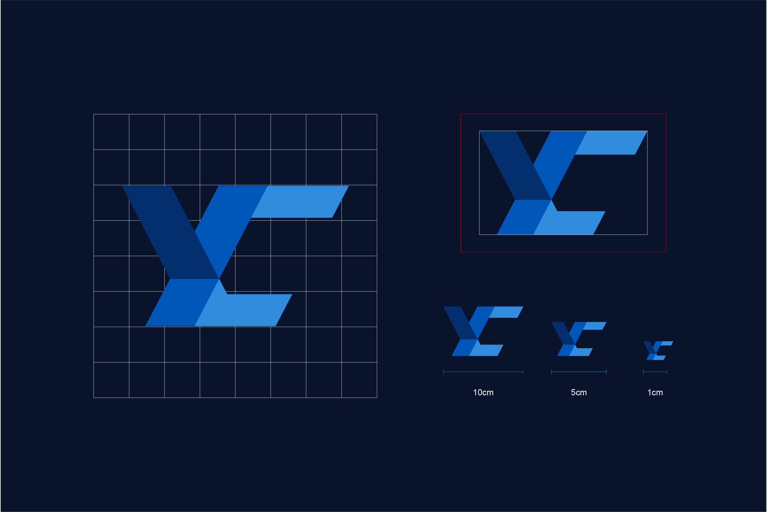
From a visual perspective, the logo is constructed through sharp yet stable diagonal lines that form the initials YC. The interlocking geometric structure creates a distinctive identity with a strong sense of industrial manufacturing and technology. Its directional lines also suggest forward movement, allowing the mark to communicate not only the stability and reliability of the manufacturing industry, but also YC GROUP’s continued growth and international expansion.
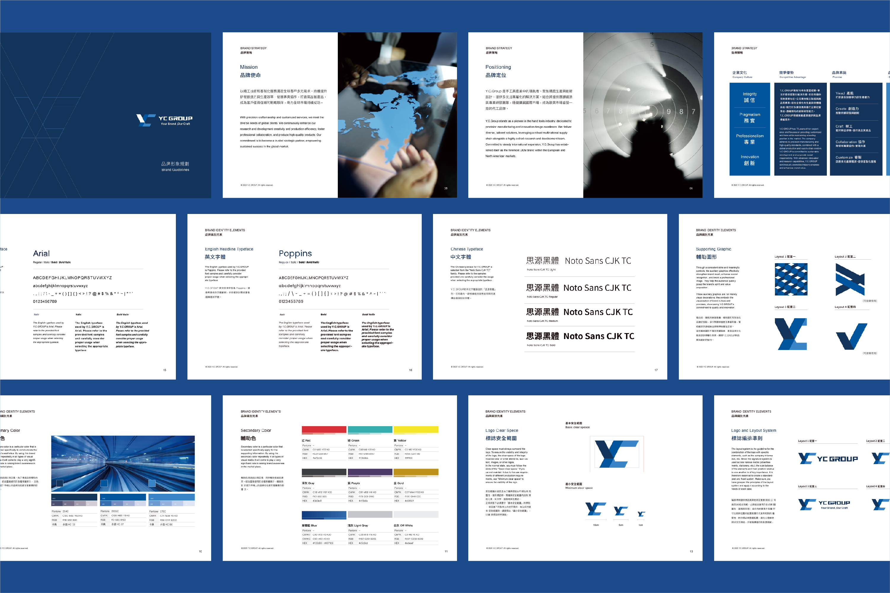
The visual identity system uses deep blue, primary blue, and bright blue as its core colors. Within the CIS guidelines, these are defined as Pantone 294C, 2935C, and 279C. The layered blue palette conveys professionalism, technology, and modernity, while also forming the visual foundation for the brand’s website, signage, and broader corporate applications.
Beyond the logo itself, we established a complete system for clear space, minimum spacing, and logo arrangements to ensure that YC GROUP maintains consistent visibility, proportion, and recognition across advertising, stationery, signage, and applications of different scales.
For typography, Poppins, Arial, and Noto Sans CJK TC are used to define a clear bilingual system for English and Chinese communications. This allows the brand to maintain a rational, professional, and consistent visual language across international communication, digital interfaces, and corporate documents.

Website & Digital Applications|Extending the Brand Identity into a Complete Digital Experience
Once a corporate brand identity has been established, the real challenge is not simply making the logo look good, but ensuring that the entire identity system works consistently across different applications and touchpoints.
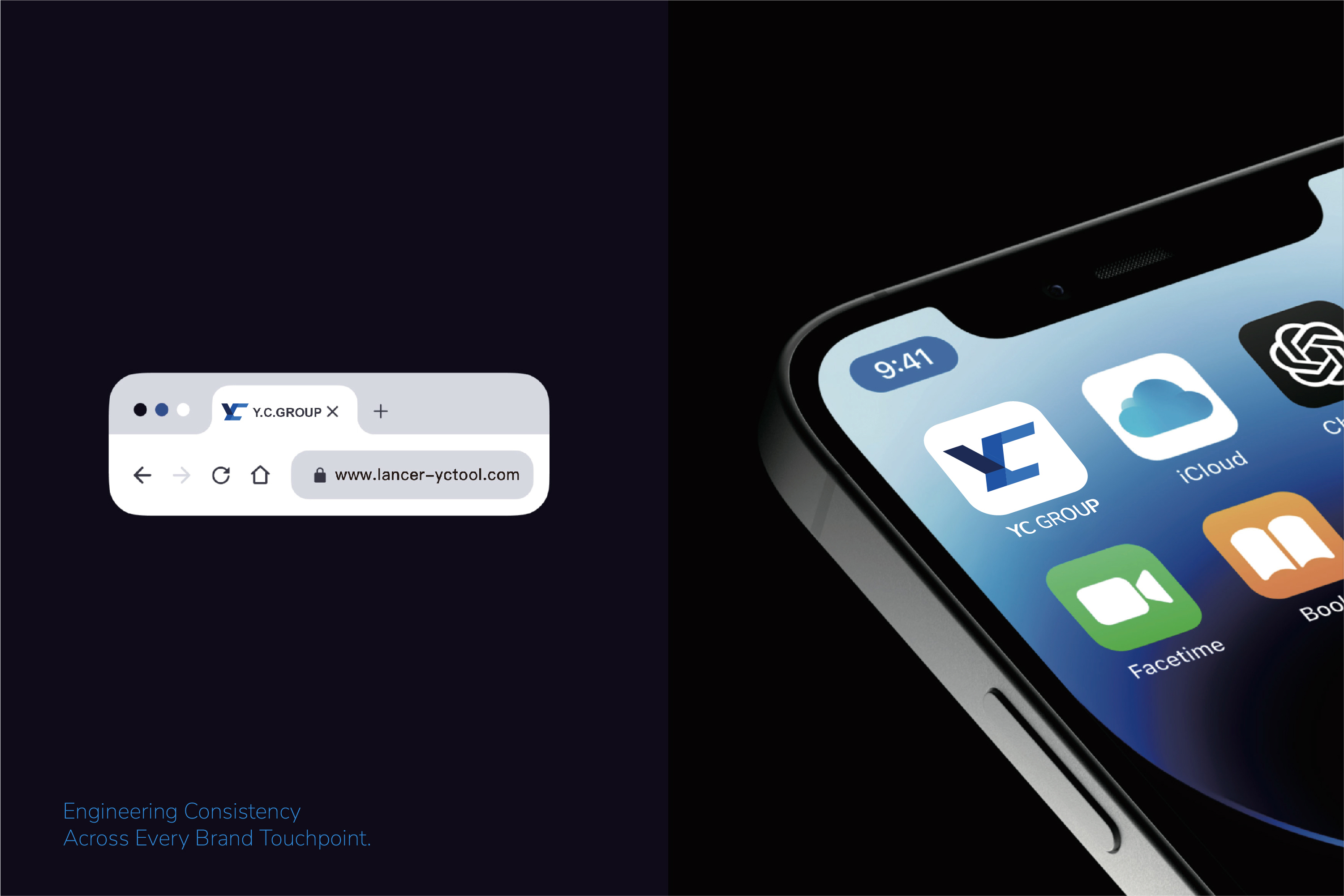
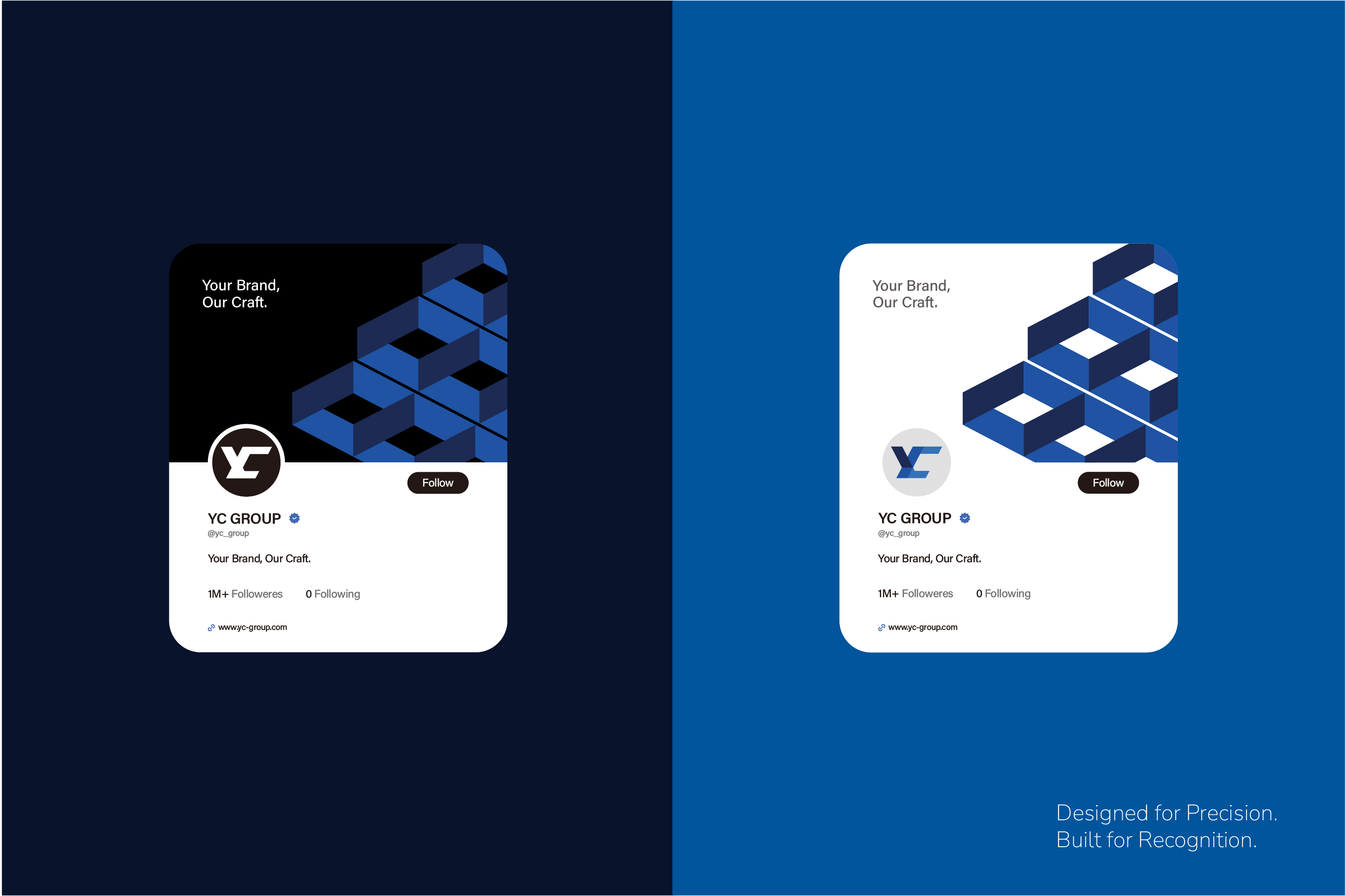
For YC GROUP’s website and digital applications, MASOU DESIGN extended the brand’s deep blue and bright blue palette together with its geometric visual language, translating the company’s manufacturing capabilities, global presence, R&D strength, and product information into a clear and structured digital experience.
Rather than following the information-heavy approach often seen on traditional industrial websites, the visual design uses generous whitespace, corporate imagery, disciplined layouts, and a clear information hierarchy to create a more refined browsing experience suited to an international B2B brand.
Buttons, headings, imagery, color usage, and layout proportions across the digital interface continue the principles established in the CIS system, allowing the brand identity to extend naturally into the website UI/UX instead of treating brand design and website design as two separate visual systems.
This reflects one of MASOU DESIGN’s key principles in corporate branding and website design:
A brand identity should not stop at the logo. It should become a shared design language across every digital touchpoint.
Physical Brand Applications|Building a Consistent Identity from the Factory Entrance to Everyday Business
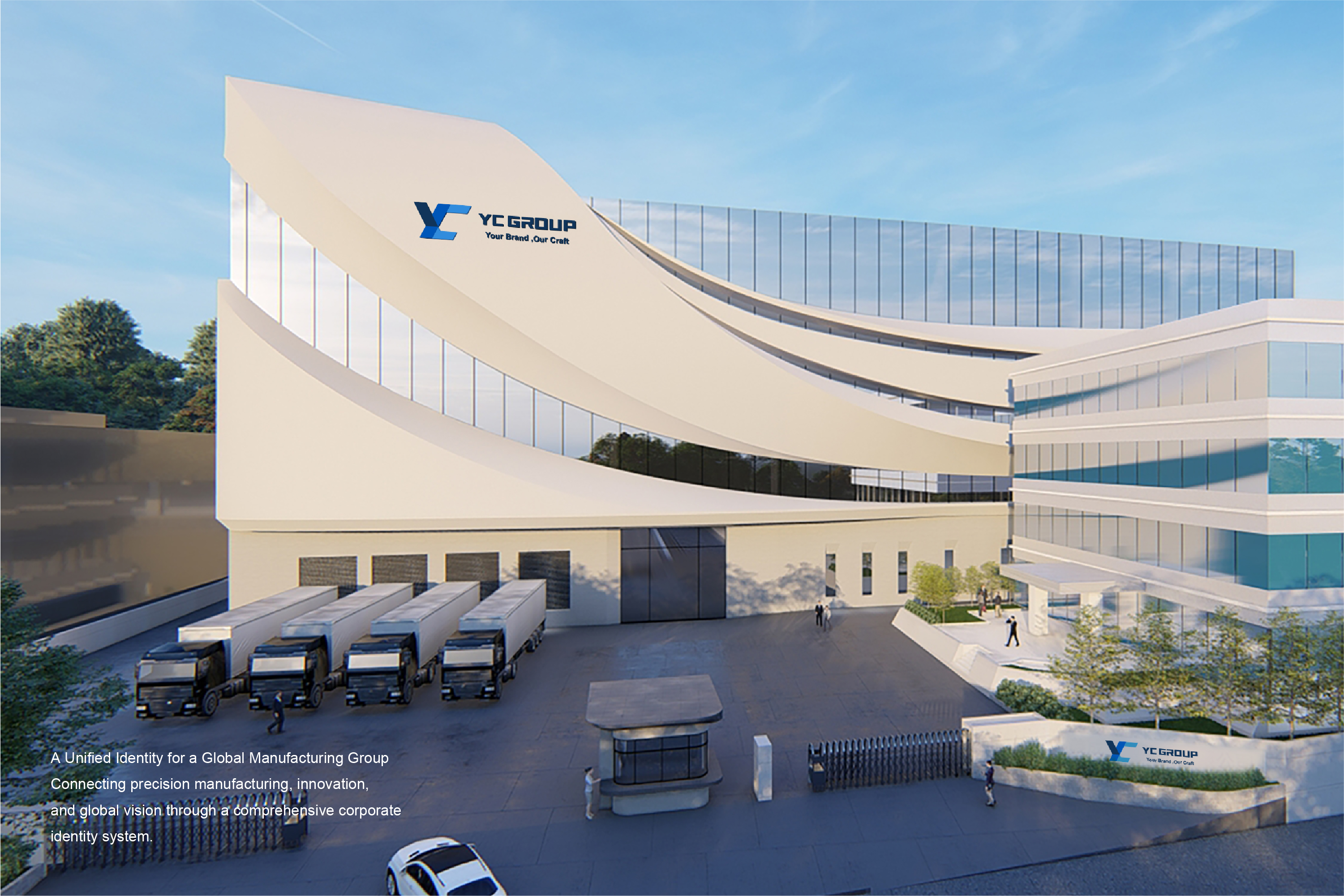
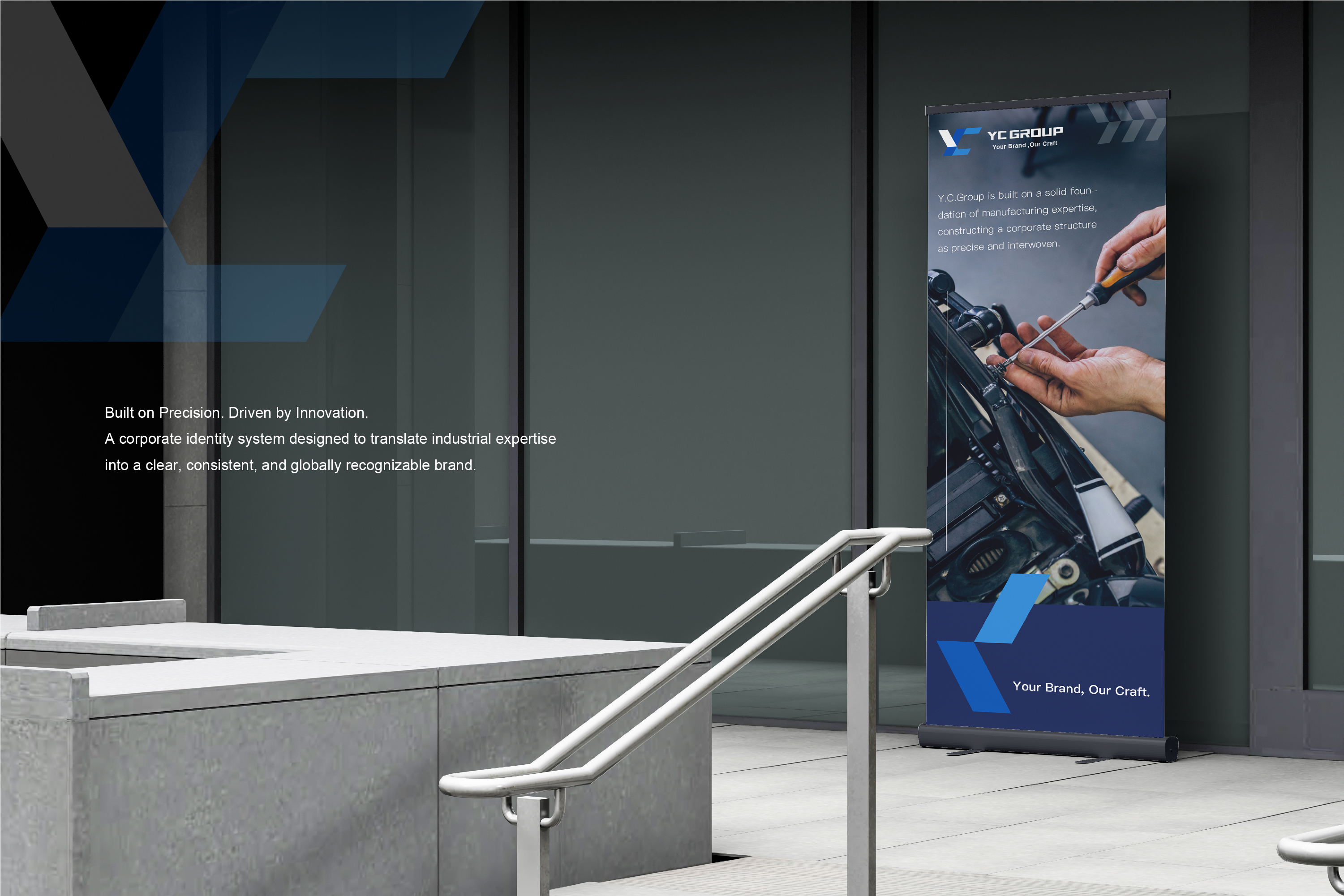
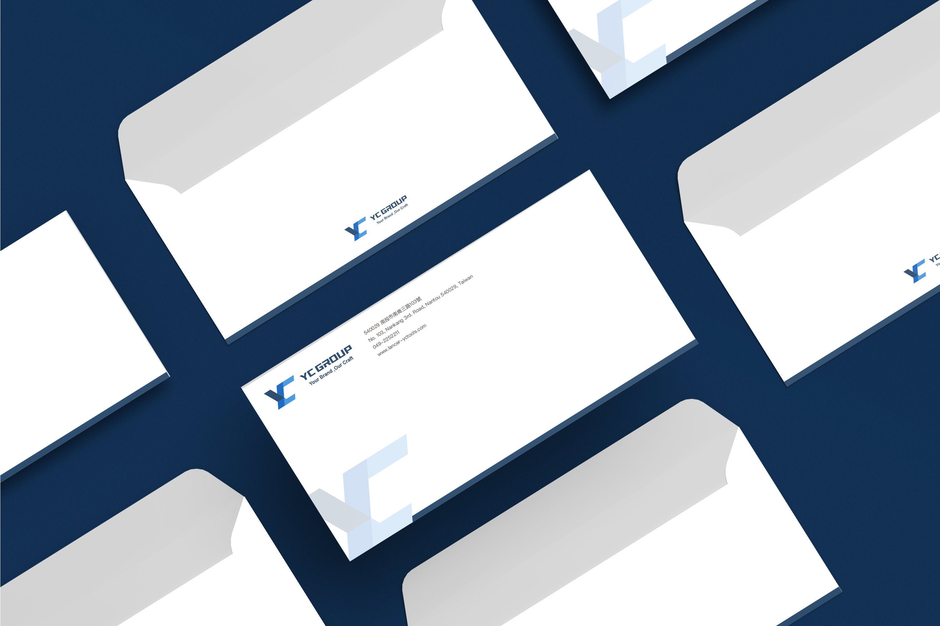
The brand system extends beyond digital applications into the physical environment, including factory exteriors, corporate signage, large-format display boards, roll-up banners, envelopes, and other printed materials.
For factory signage and large-scale exterior applications, the logo must remain highly recognizable from a distance. The visual system therefore follows principles of simplicity, strong scale, and high contrast, allowing YC GROUP to maintain a clear and confident corporate presence within the architectural environment.
Roll-up banners and exhibition materials use the brand’s blue palette, imagery, and structured information hierarchy to create a visual system suitable for trade shows, business presentations, and communication with international clients.
Envelopes and other corporate stationery further extend the identity into everyday business touchpoints. From logo placement and typography to address information and color proportions, each application follows a consistent set of brand guidelines.
The supporting graphic system established within the CIS also allows the brand to build recognition without relying on an oversized logo in every layout. Through geometric forms, brand colors, and a consistent visual rhythm, the identity can remain recognizable across a wide range of applications. These supporting graphics serve not merely as decorative elements, but as a visual expression of YC GROUP’s brand culture and commitments to quality and innovation.
From large-scale factory signage to a single piece of corporate stationery, every touchpoint follows the same visual logic. This consistency is what transforms individual applications into a complete and coherent corporate brand identity.
CIS Brand Experience|Building a Corporate Identity System Designed for Long-Term Growth
YC GROUP’s brand transformation goes far beyond a simple logo update.
The real challenge of this project was to translate decades of manufacturing expertise, multinational production resources, and R&D capabilities into a brand that could be understood more clearly by the global market.
MASOU DESIGN began with brand strategy, redefining the brand positioning, corporate values, logo system, color palette, typography, and supporting graphics. The identity was then extended across the website, digital interfaces, factory signage, exhibition systems, and corporate printed materials, ensuring a consistent brand experience across different environments and media.
From Manufacturing Expertise to Corporate Brand Identity, and from the factory floor to the global marketplace, YC GROUP ultimately established more than a refreshed corporate image. It created a scalable brand system capable of evolving with the business, extending across multiple touchpoints, and supporting international communication.
For MASOU DESIGN, a complete Taichung branding project is not simply about creating an attractive logo. It is about connecting brand strategy, corporate identity design, website design, and physical applications to build a long-term, consistent, and recognizable brand asset.
From Manufacturing Strength to Brand Strength.
Turning manufacturing expertise into visible brand competitiveness.