
2026.05.26
Han He Xi Instant Cuisine|Tainan Banquet Heritage|Brand Identity and Packaging Design
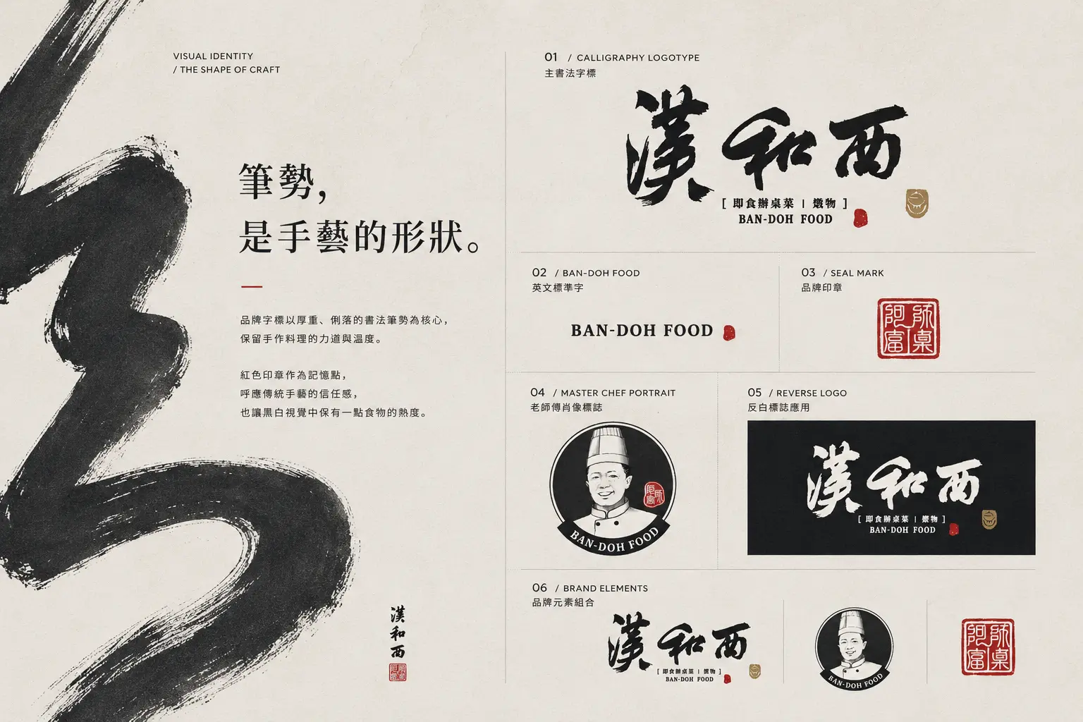
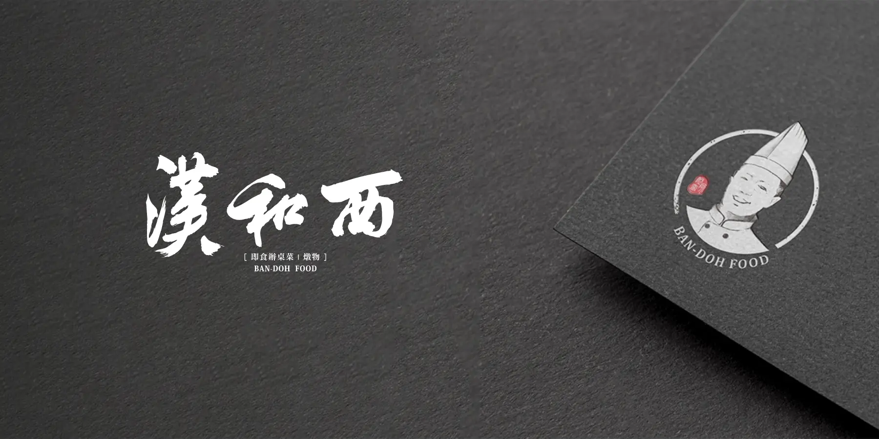
At a time when many brands pursue modified typography and geometric logos, calligraphy became one of Han He Xi’s most distinctive brand assets. MASOU DESIGN created the brand identity and packaging design for Han He Xi Instant Cuisine, starting from Tainan banquet culture, the craftsmanship of a traditional Taiwanese banquet chef, and family recipe memories. Through a calligraphic wordmark, portrait illustration, handwritten recipe elements, and modern layout design, the brand communicates not only warmth and story, but also stronger recognition, product appeal, and brand personality in the frozen ready-to-eat food market.
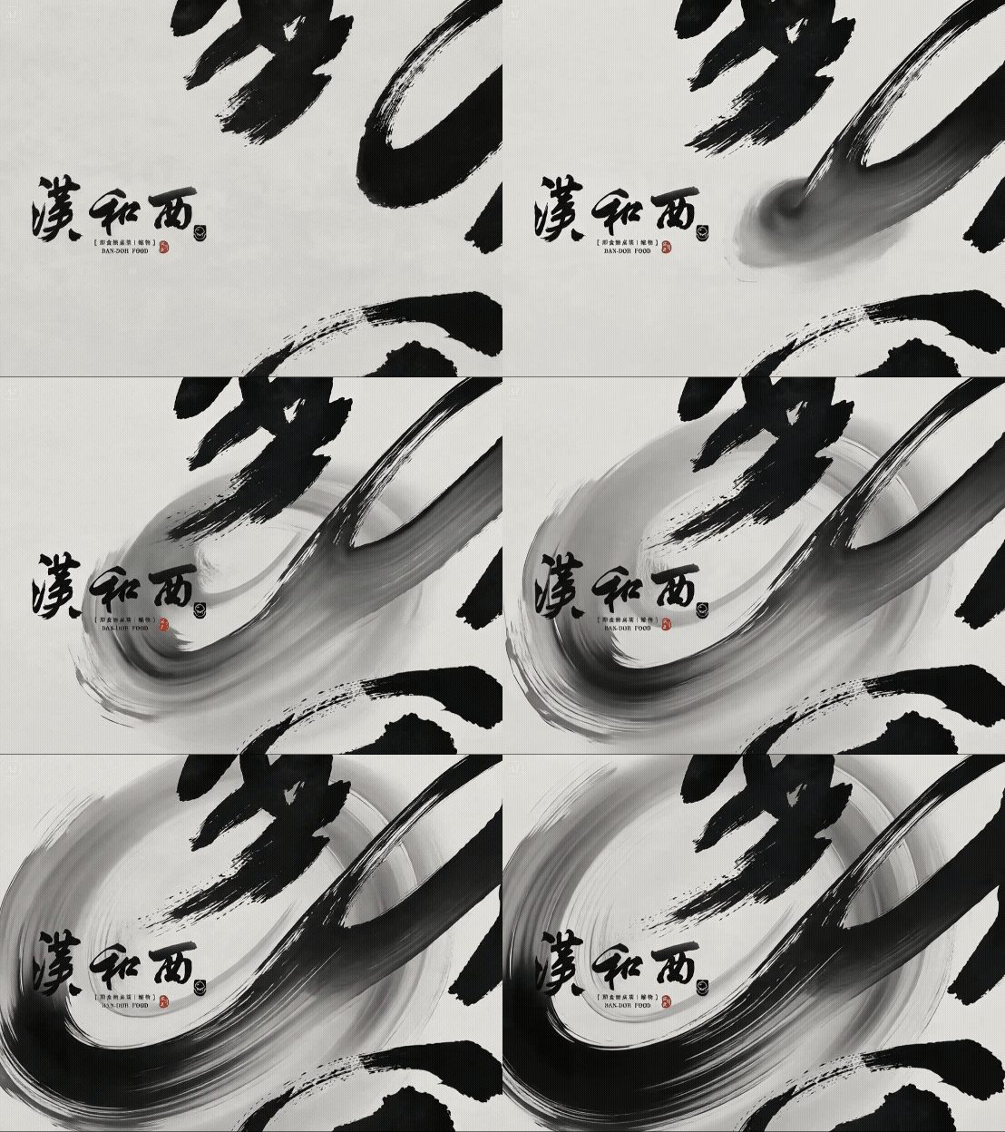
Han He Xi Instant Cuisine|Tainan Banquet Heritage|Brand Identity and Packaging Design
At a time when many brands pursue modified typography and geometric logos, calligraphy became one of Han He Xi’s most distinctive brand assets. MASOU DESIGN created the brand identity and packaging design for Han He Xi Instant Cuisine, starting from Tainan banquet culture, the craftsmanship of a traditional Taiwanese banquet chef, and family recipe memories.
Through a calligraphic wordmark, portrait illustration, handwritten recipe elements, and modern layout design, the brand communicates not only warmth and story, but also stronger recognition, product appeal, and brand personality in the frozen ready-to-eat food market.
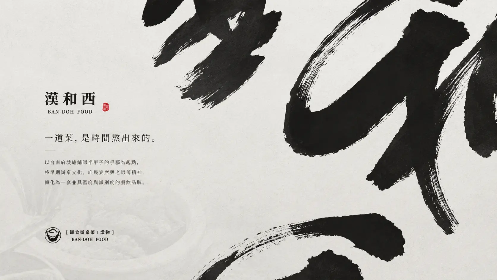
Using a Calligraphic Wordmark as the Strongest Memory Point
Instead of choosing an overly geometric logo, Han He Xi returns to the cultural texture of Taiwanese cuisine. The calligraphic wordmark carries handcraft, energy, and warmth, reminding people of banquet dishes, traditional chef skills, and recipes passed down through generations.
For a frozen ready-to-eat food brand, the identity needs to communicate both convenience and flavor. More importantly, it needs to reassure consumers that the product is not just factory-made food, but a cuisine brand with origin, craftsmanship, and food memories.
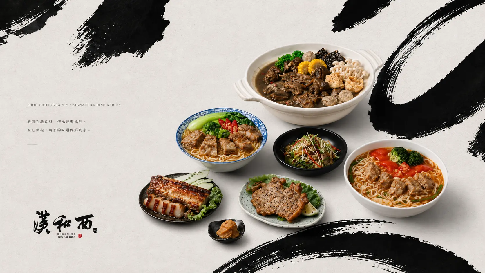
Extending Brand Warmth from Banquet Culture and Food Photography
Han He Xi’s brand story comes from Tainan banquet culture and the cooking experience of a traditional Taiwanese banquet chef. The visual identity needed to feel traditional, but also had to present a strong product image for modern retail and online sales.
Through food photography, brand colors, and layout rhythm, the dishes become the visual focus of the brand. This allows consumers to feel familiar with Taiwanese banquet cuisine while also understanding that Han He Xi is a carefully organized and modern ready-to-eat food brand.
Turning the Traditional Chef Portrait into a Brand Icon
For a food brand, trust often comes from knowing who made the food and where the flavor comes from. We transformed the image of the traditional banquet chef into a brand icon, allowing the portrait to become more than decoration — it becomes a symbol of story, skill, and culinary credibility.
Together with the calligraphic wordmark and handwritten recipe elements, the chef icon connects craftsmanship, family flavor, and banquet culture, giving the frozen food packaging a stronger sense of memory, warmth, and brand personality.
Balancing Traditional Flavor with Modern Frozen Food Packaging
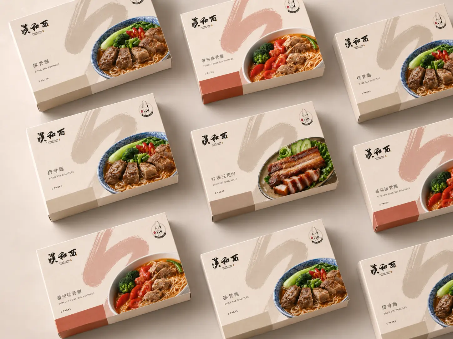
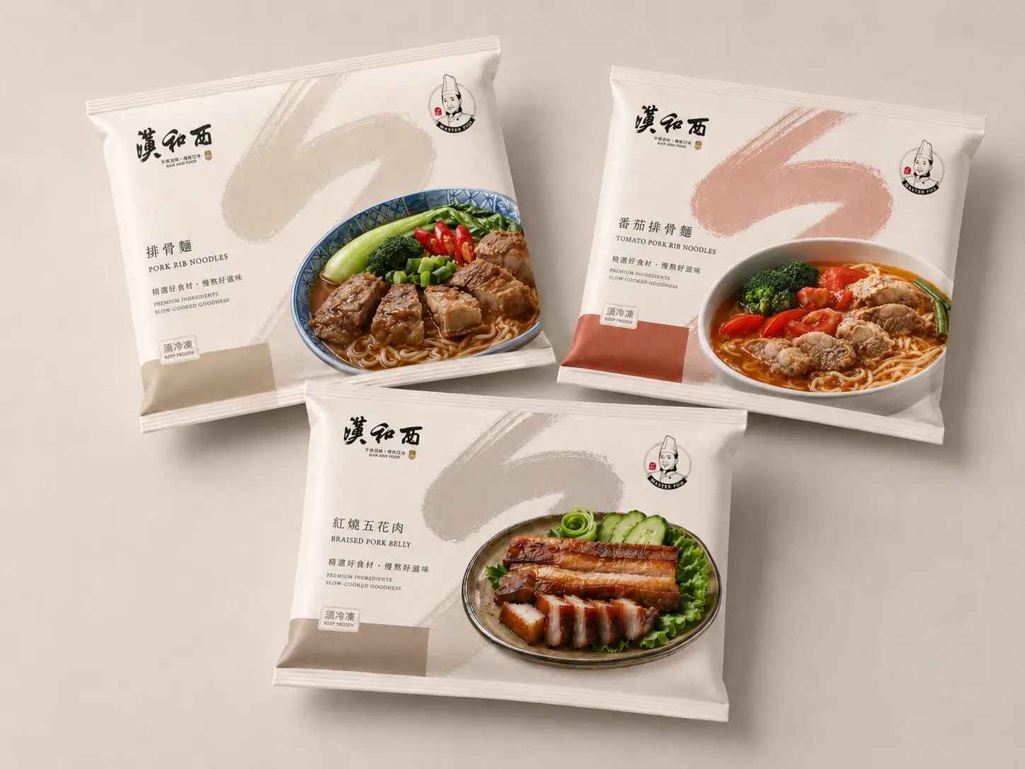
Han He Xi’s packaging design needed to work across frozen food displays, e-commerce sales, and at-home heating scenarios. The packaging could not rely only on nostalgia. It also needed clear product information, stable visual hierarchy, and strong shelf recognition.
In the outer box design, we retained the emotional quality of the calligraphic wordmark and banquet culture while using a modern layout to organize product information. This allows the brand to stay recognizable across freezer displays, delivery packaging, and online product pages.
Creating a Consistent Food Brand Identity from Packaging to Business Cards
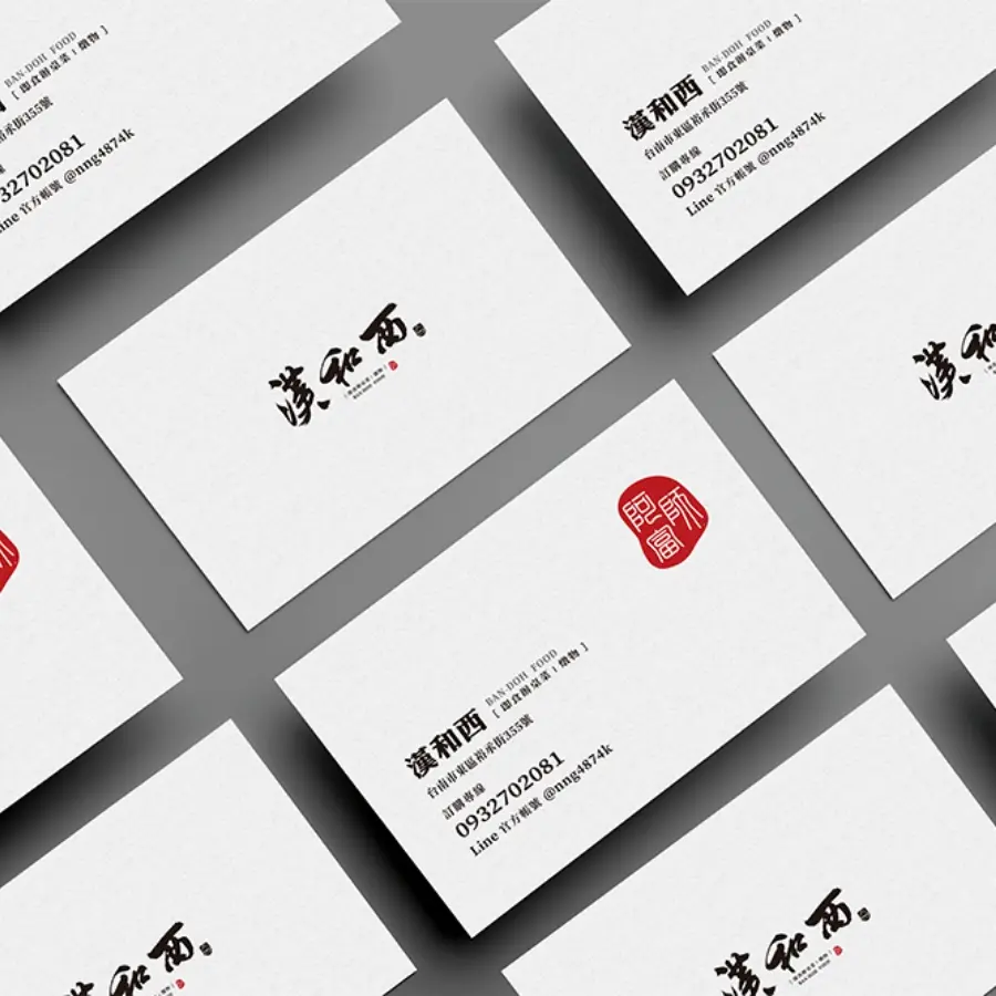
As the brand extends from product packaging to business cards, retail communication, and business touchpoints, the identity system needs to maintain a consistent tone. Han He Xi continues the calligraphic wordmark, chef portrait, and red seal-inspired visual memory across its brand applications.
Through this brand identity and packaging design project, Han He Xi connects Tainan banquet culture, traditional chef craftsmanship, and the modern ready-to-eat food market, allowing traditional cuisine to be preserved, repackaged, and communicated through a clearer brand system.
✦ Planning a food brand design, frozen food packaging design, or brand identity system? Talk to us about your brand project.
✦ Browse our portfolio to see more brand design, packaging design, and website design projects.
✦ Return to the homepage to learn how we help brands build clearer visual identity and digital experiences.