2026.05.20
ACETECK|Hydraulic Cylinder Brand Identity Design
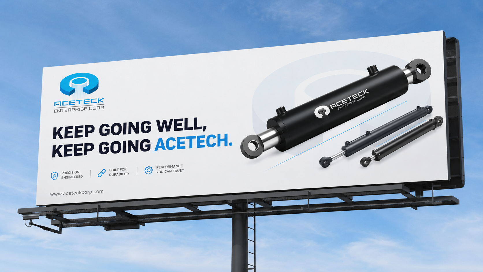
ACETECK is a B2B industrial brand specializing in hydraulic cylinder manufacturing, serving logistics equipment, industrial machinery, and various mechanical systems. This brand identity design project is built around the ideas of precision, power, and stability, transforming the initial letter A into a visual symbol inspired by hydraulic cylinder structure. Through logo design, corporate identity, department icons, uniforms, catalog design, and factory signage applications, MASOU DESIGN helped ACETECK build a clearer and more consistent B2B industrial brand identity. The new visual system supports the brand across its website, exhibitions, catalogs, and international market communication, creating a professional impression of precision manufacturing and reliable industrial quality.
Creating a Hydraulic Cylinder Brand That Communicates Technology and Trust at First Glance
ACETECK is a B2B industrial brand specializing in hydraulic cylinder manufacturing, serving logistics equipment, industrial machinery, and various mechanical systems. For this type of manufacturing brand, identity design is not only about appearance. It also needs to help customers quickly understand the brand’s technical capability, quality standards, and industrial expertise.
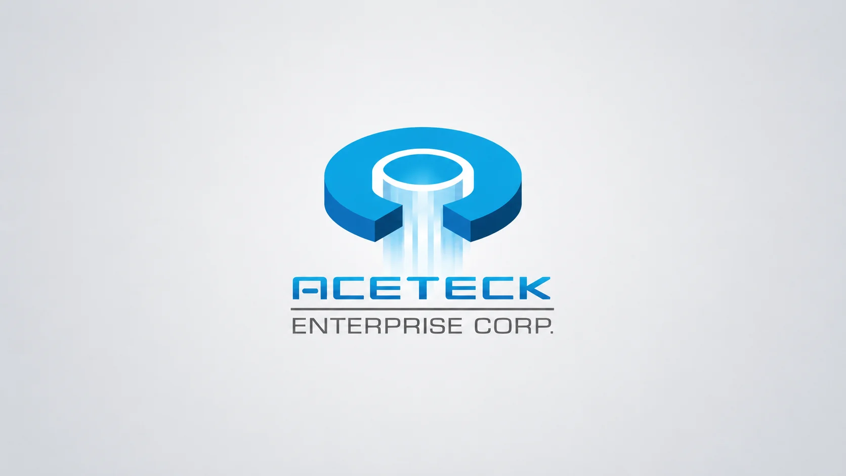
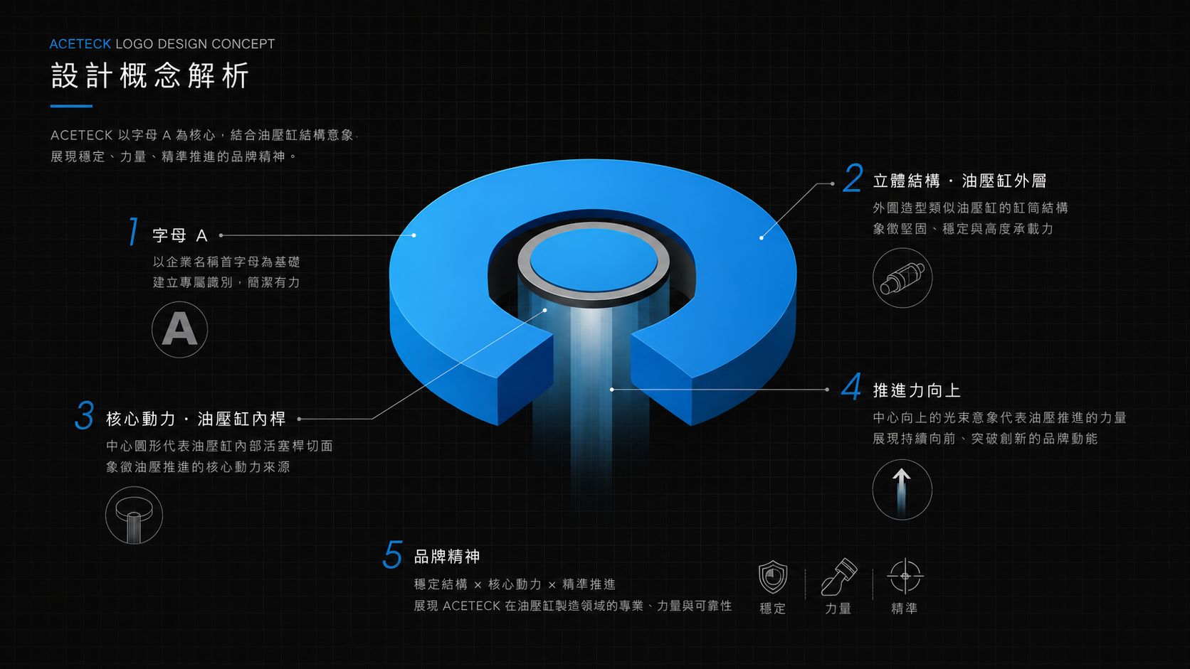
In this brand identity project, MASOU DESIGN used the initial letter “A” as the core concept and transformed its structure into a visual interpretation of a hydraulic cylinder cross-section. The central axis represents the piston rod and precision internal structure, while the outer form echoes the cylinder body, mechanical support, and stable output.
Turning the Letter A into the Product Language of a Hydraulic Cylinder
The ACETECK logo is not a purely decorative letterform. It transforms the letter “A” into a product-related visual code inspired by hydraulic cylinder structure and mechanical cross-section details. The central vertical axis symbolizes the piston rod, precision movement, and stable output, while the geometric outer form reflects the cylinder body, metal components, and industrial support.
Built around the ideas of precision, power, and stability, the identity uses sharp geometric cuts, forward-moving lines, and industrial forms to express the motion, extension, and continuous operation of a hydraulic cylinder. The result is a logo that connects directly to ACETECK’s manufacturing expertise and product quality.
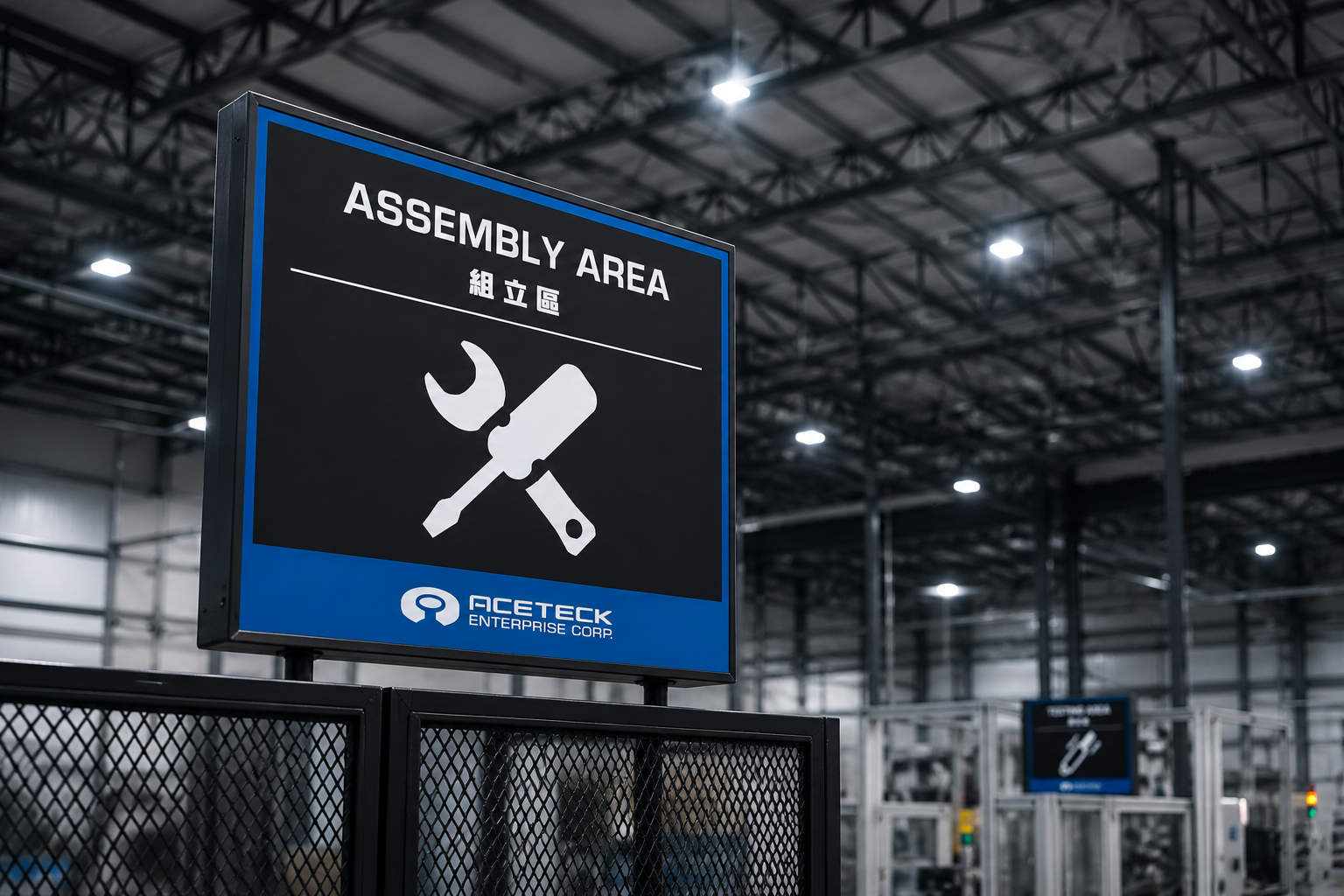
Factory Department Identity Also Needs a Clear Brand System
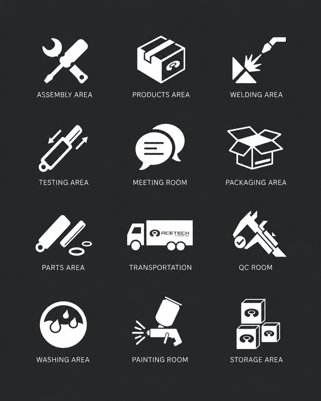
For manufacturing companies, brand identity appears not only on websites, business cards, or catalogs. It also extends into factory spaces, department management, production processes, and visitor routes. For ACETECK, we developed a department icon system that allows the visual identity to expand into assembly, testing, storage, and other factory areas.
These icons follow the same geometric and industrial design language as the logo. They support clearer information recognition while making the internal factory environment feel more consistent. When a brand identity enters the real workspace, it becomes more than an external image — it becomes a visual system used in daily operation.
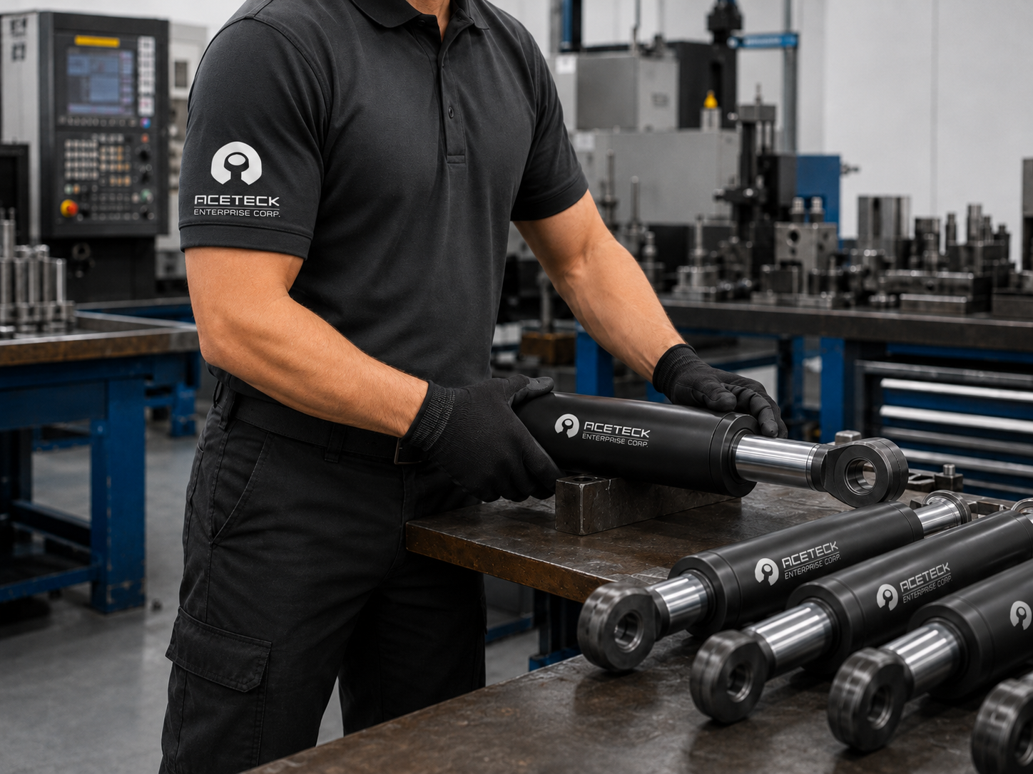
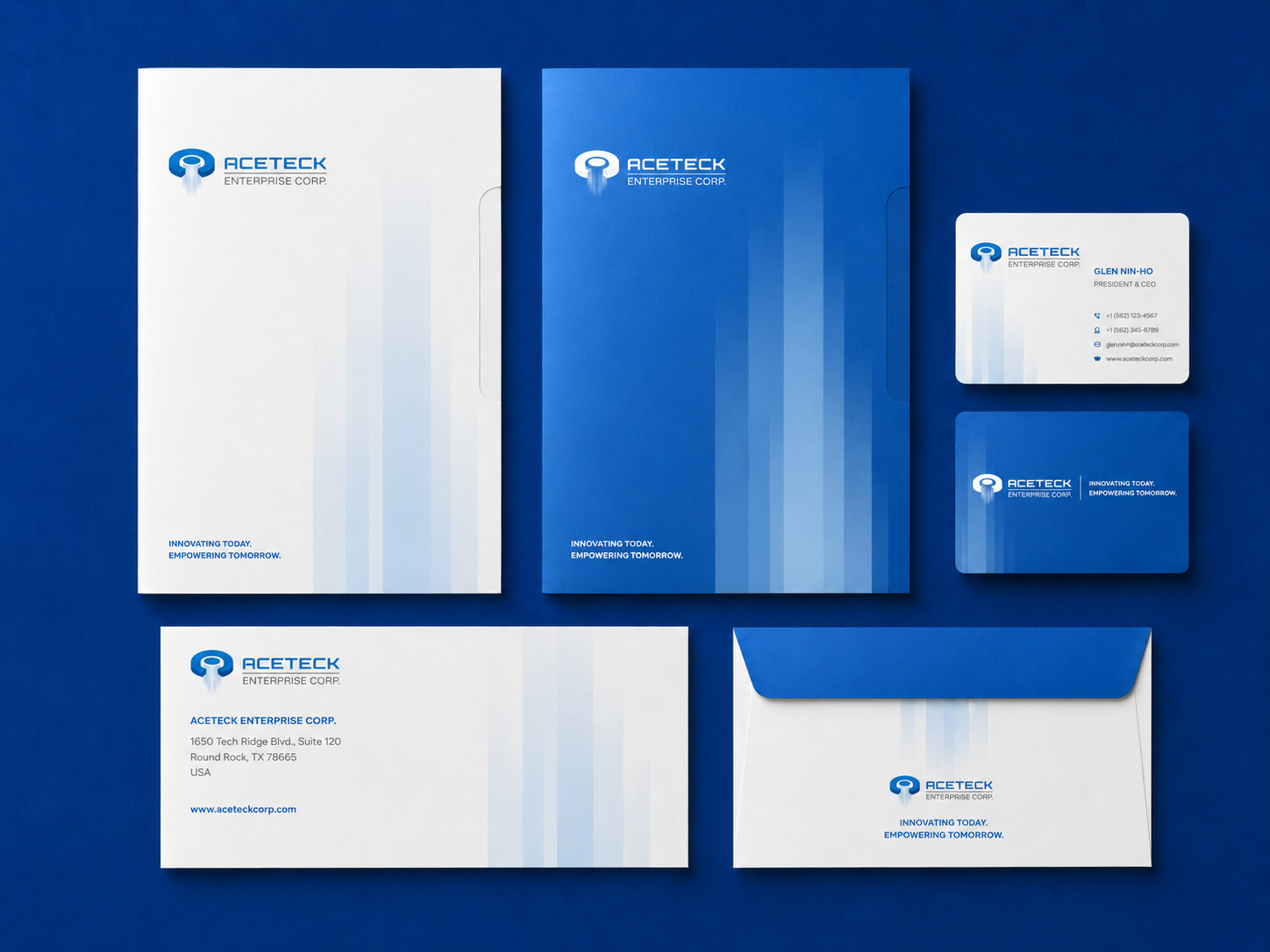
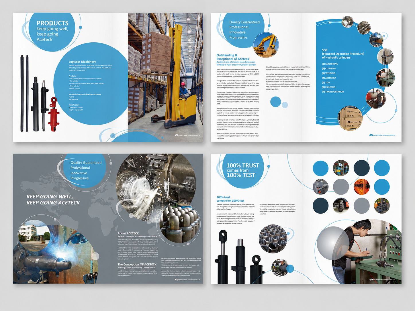
Building a Professional Impression Across Uniforms, Stationery, and Catalogs
The trust of a B2B industrial brand is built through many small details. Customers encounter the brand through staff uniforms, business cards, stationery, product catalogs, factory signage, and the overall experience during visits or meetings. Therefore, the ACETECK identity system was extended into uniforms, corporate stationery, and catalog design.
Instead of treating these applications as separate design items, we designed them to communicate one consistent brand impression: precision manufacturing, stable output, strict quality testing, and reliable industrial performance. Through consistent typography, colors, geometric lines, and layout structure, ACETECK maintains a clear and professional tone across every customer touchpoint.
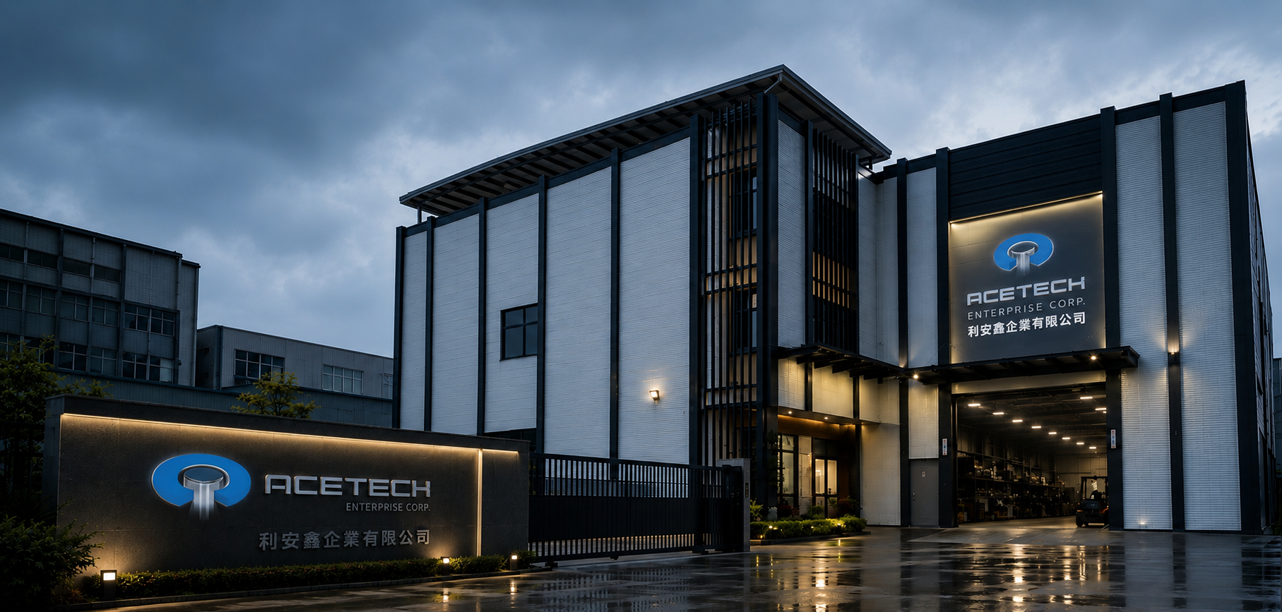
Extending the Manufacturing Brand from Factory Site to International Communication
Through this brand identity redesign, ACETECK’s visual image shifts from functional factory communication to a more recognizable B2B industrial brand system. From logo design and concept explanation to department icons, uniforms, stationery, catalogs, and exterior signage, every application follows the same brand logic.
For ACETECK, brand identity is not only about making the company look more complete. It helps customers understand what the brand represents: precision manufacturing, reliable output, strict testing, and professional industrial quality. When the logo can communicate product characteristics and the visual system can support real-world applications, the brand becomes a foundation for building trust in the B2B manufacturing market.
✦ Planning an industrial brand identity, B2B brand design, or corporate visual system? Talk to us about your brand project.
✦ Browse our portfolio to see more brand design, website design, and UI/UX projects.
✦ Return to the homepage to learn how we help brands build clearer visual identity and digital experiences.