2026.05.20
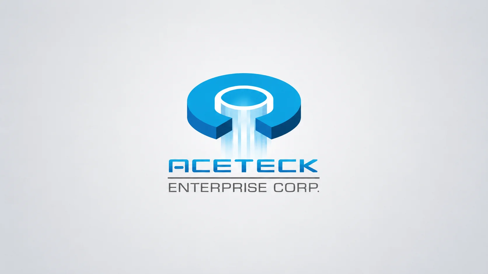
ACETECK|油壓缸製造品牌識別設計
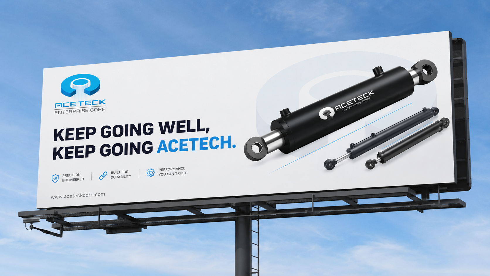
ACETECK 是專注於油壓缸製造的 B2B 工業品牌,服務範圍涵蓋物流設備、產業機械與各類工業系統。本次品牌識別設計以「精密、動力、穩定」作為核心方向,將品牌字首 A 轉化為具有油壓缸結構意象的視覺符號,讓商標能傳達製造技術、產品信任與工業品牌專業度。 鮭魚設計透過品牌標誌、企業識別系統、部門 icon、制服、型錄與場域應用,協助 ACETECK 建立更清楚一致的 B2B 工業品牌形象,讓油壓缸製造品牌在網站、展覽、型錄與國際市場溝通中,都能展現穩定、精密且值得信任的品牌印象。 ACETECK is a B2B industrial brand specializing in hydraulic cylinder manufacturing, serving logistics equipment, industrial machinery, and various mechanical systems. This brand identity design project is built around the ideas of precision, power, and stability, transforming the initial letter A into a visual symbol inspired by hydraulic cylinder structure. Through logo design, corporate identity, department icons, uniforms, catalog design, and factory signage applications, MASOU DESIGN helped ACETECK build a clearer and more consistent B2B industrial brand identity. The new visual system supports the brand across its website, exhibitions, catalogs, and international market communication, creating a professional impression of precision manufacturing and reliable industrial quality.
讓油壓缸製造品牌,一眼就看得出技術與信任
ACETECK 是專注於油壓缸製造的 B2B 工業品牌,產品應用於物流設備、產業機械與各類工業系統。對這類製造品牌而言,品牌識別不只是外觀造型,而是需要讓客戶快速理解品牌的技術能力、品質標準與產業專業度。
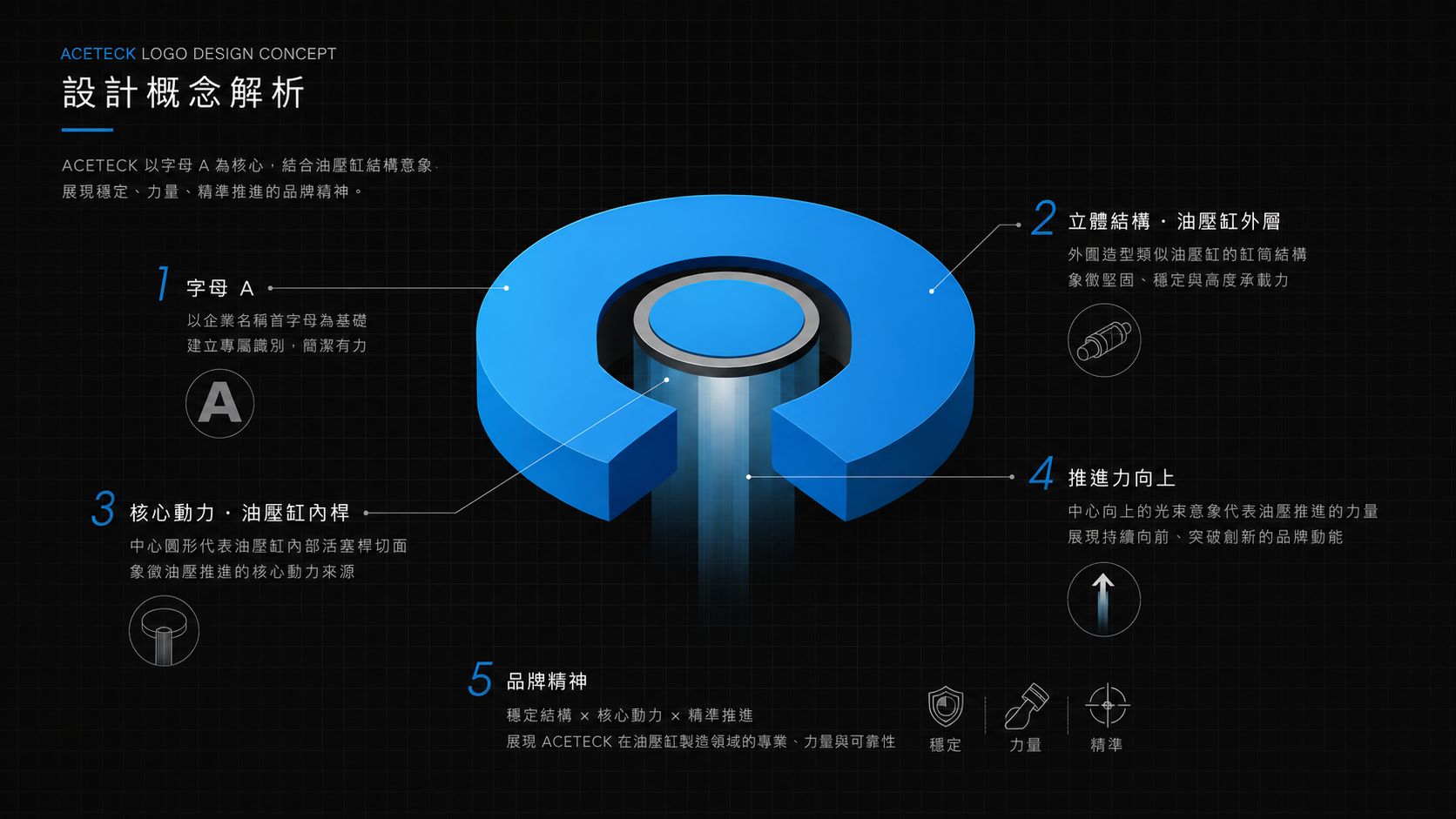
這次品牌識別設計以 ACETECK 的品牌字首「A」作為核心出發點,將字母結構轉化為油壓缸的解剖意象。A 字中央的軸心象徵油壓缸內部的活塞桿與精密結構,外部輪廓則呼應缸體、機械支撐與穩定輸出,讓商標不只是品牌名稱的縮寫,也成為產品技術的視覺化表現。
從 A 字結構,轉化出油壓缸的產品語言
ACETECK 的品牌標誌不是單純把字母 A 做造型變化,而是把 A 字結構轉化為油壓缸剖面、活塞桿與機械支撐的視覺語言。中央垂直軸心代表油壓缸的推動結構與精密輸出,兩側幾何輪廓則呼應缸體、金屬切面與穩定支撐。
整體識別語言以「精密、動力、穩定」作為設計核心。透過俐落的幾何切面、向前延伸的速度感與工業線條,讓標誌呈現油壓缸推動、伸縮與持續運作的印象,也呼應 ACETECK 在製造品質、測試標準與技術支援上的專業態度。
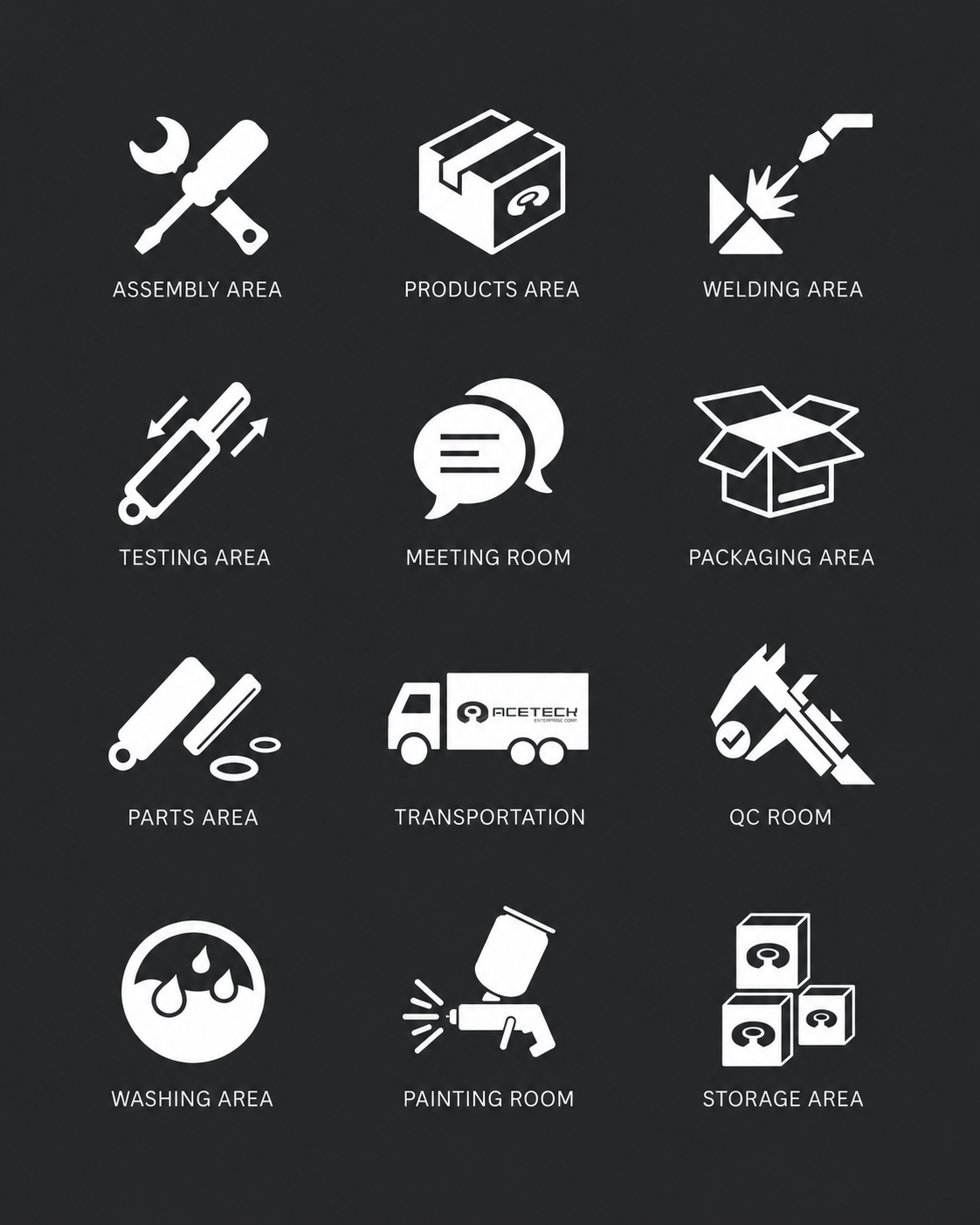
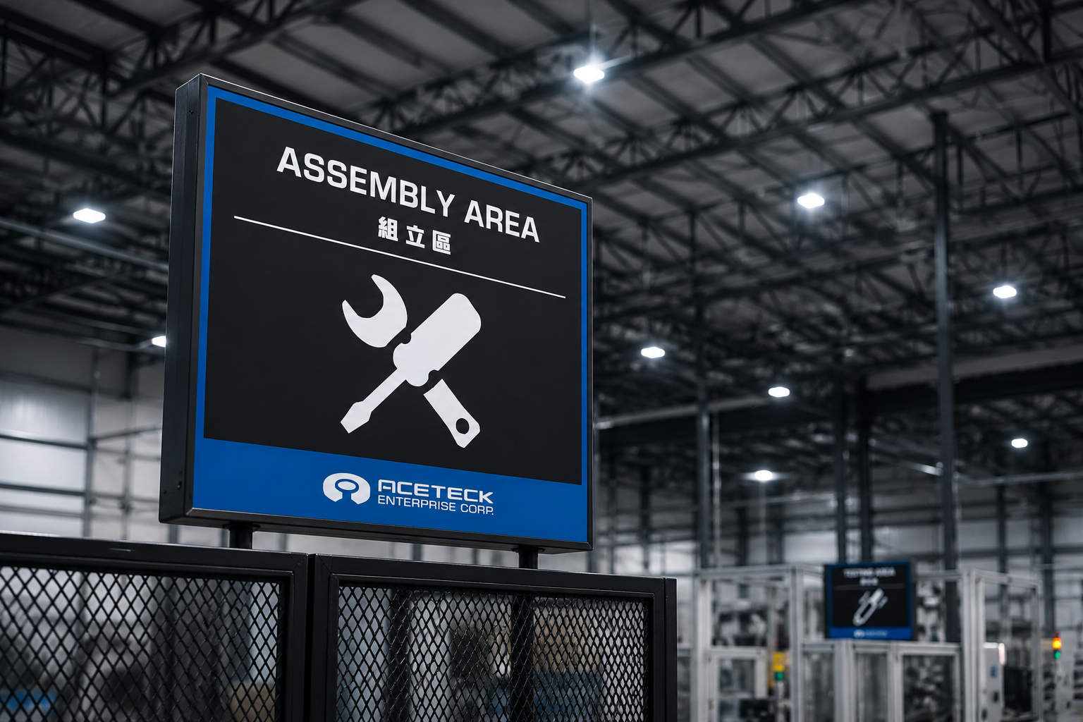
工廠裡的部門識別,也需要一套清楚的品牌系統
對製造型企業來說,品牌不只出現在網站、名片或型錄上,也會延伸到工廠內部、部門管理、作業流程與客戶參訪動線。因此,我們為 ACETECK 建立部門識別 icon 系統,讓品牌視覺能從主標誌延伸到組立、檢測、倉儲與不同工作區域。
這些 icon 延續品牌的幾何語彙與工業線條,不只是輔助資訊辨識,也讓工廠內部的視覺溝通更有一致性。當品牌識別能進入實際場域,企業形象就不只是對外展示,而會成為日常營運中可被看見、被使用的品牌系統。
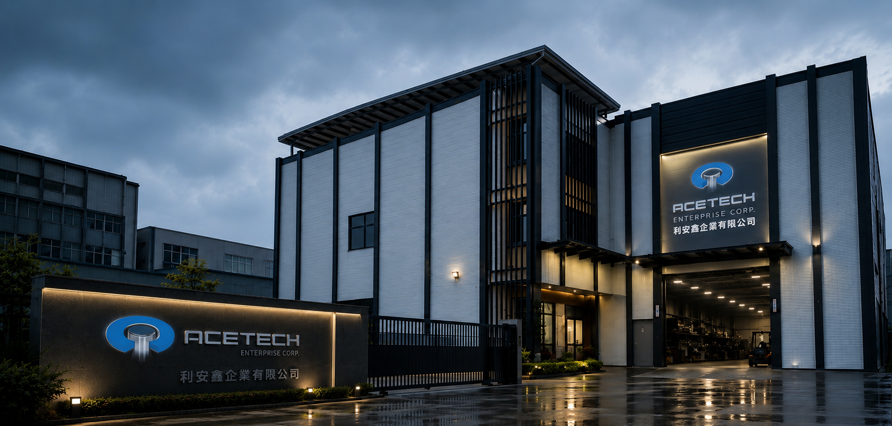
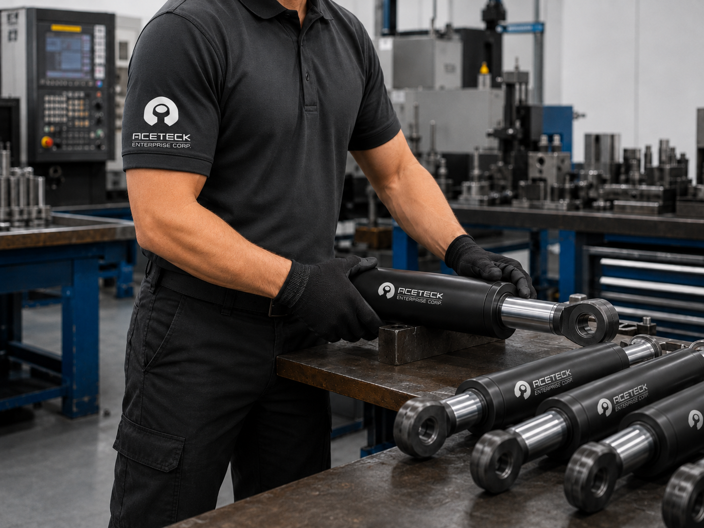
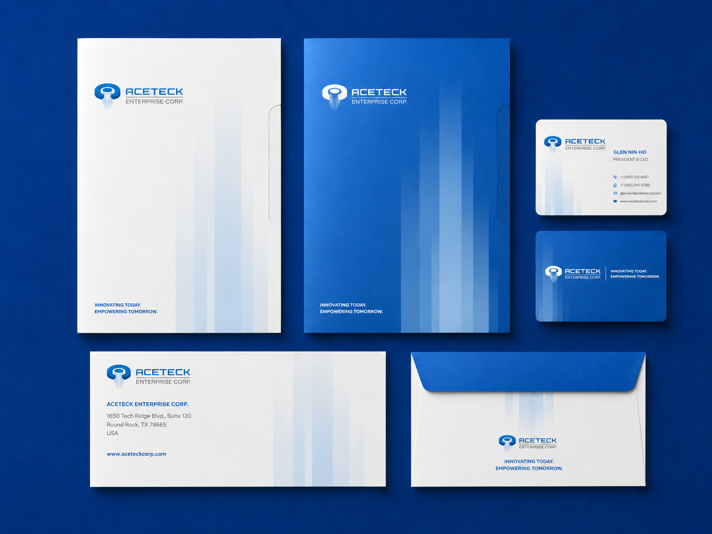
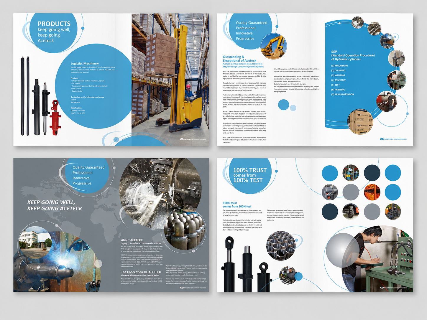
從制服到文具,讓每一次接觸都維持專業印象
B2B 工業品牌的信任感,往往來自很多細節的累積。客戶看到的不只是商標本身,也包含員工制服、名片信封、產品型錄、工廠招牌與實際接待過程中的整體感受。因此,ACETECK 的品牌識別系統也延伸到制服設計、企業文具與產品型錄。
我們希望這些應用不是分散的設計物件,而是共同傳達同一個品牌印象:精密製造、穩定輸出、嚴格測試與值得信任的工業品質。透過一致的字體、色彩、幾何線條與版面秩序,讓 ACETECK 在不同接觸點中都能維持清楚且專業的品牌語氣。
讓製造品牌從工廠現場,延伸到國際市場溝通
透過這次品牌重塑,ACETECK 的視覺形象從傳統製造廠的功能性溝通,轉化為更具辨識度的 B2B 工業品牌系統。從商標設計、概念解析、部門 icon、制服文具、型錄到工廠外部招牌,每一個應用都延續同一套品牌邏輯。
對 ACETECK 來說,品牌識別不只是讓企業看起來更完整,而是協助客戶更快理解它所代表的產品能力與製造價值。當商標能說明產品特性,當視覺系統能支撐實際應用,品牌就能成為 B2B 製造企業在市場中建立信任的重要基礎。
✦ 想規劃工業品牌識別、B2B 品牌設計或企業形象系統,和我們聊聊你的品牌想法。
✦ 瀏覽 作品總覽,看看更多品牌設計、網站設計與 UI/UX 案例。
✦ 返回 首頁,了解我們如何協助品牌建立更清楚的視覺識別與數位體驗。