2026.05.26
AROS|英倫微醺的水果調酒品牌設計
AROS 是一款結合台灣在地水果與英式雞尾酒精神的調酒品牌。鮭魚設計從品牌企劃、品牌語彙、視覺識別到整體形象規劃,協助 AROS 建立一套兼具時尚感、浪漫氣息與英倫優雅的酒品品牌系統。 本次品牌設計以「台灣鮮採水果」與「英式調酒文化」作為核心對比,將新鮮、酸甜、奔放的水果風味,融合優雅、精緻、帶有派對感的英倫調酒印象。透過品牌標誌、色彩系統、包裝視覺與溝通語氣,讓 AROS 不只是呈現酒品風味,更建立出輕鬆開瓶、盡興享受的微醺飲酒場景。 AROS is a cocktail brand that brings together fresh Taiwanese fruits and the spirit of British cocktail culture. MASOU DESIGN worked on the brand planning, verbal identity, visual identity, and overall brand image to create a fashionable, romantic, and refined cocktail brand system. The brand design is built around the contrast between freshly harvested Taiwanese fruits and classic British cocktail culture. It combines vivid fruit flavors with an elegant, polished, and celebratory drinking mood. Through the logo, color system, packaging visuals, and brand tone, AROS becomes more than a packaged cocktail product — it creates a relaxed, stylish, and memorable drinking experience made for moments of celebration.
AROS|英倫微醺的水果調酒品牌設計
AROS 是一款結合台灣在地水果與英式雞尾酒精神的調酒品牌。鮭魚設計從品牌企劃、品牌語彙、視覺識別到整體形象規劃,協助 AROS 建立一套兼具時尚感、浪漫氣息與英倫優雅的酒品品牌系統。
本次品牌設計以「台灣鮮採水果」與「英式調酒文化」作為核心對比,將新鮮、酸甜、奔放的水果風味,融合優雅、精緻、帶有派對感的英倫調酒印象。透過品牌標誌、色彩系統、包裝視覺與溝通語氣,讓 AROS 不只是呈現酒品風味,更建立出輕鬆開瓶、盡興享受的微醺飲酒場景。
從台灣水果與英式調酒文化,建立品牌的第一層印象
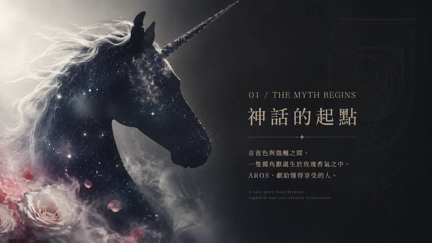
AROS 的品牌核心不是單純包裝一款酒,而是把飲酒時的情緒、場景與風味想像一起設計出來。台灣水果帶來鮮明、酸甜、奔放與在地感;英式調酒文化則帶有優雅、節制、經典與精緻感。兩者交會後,形成 AROS 獨有的品牌個性。
因此,在品牌語氣與視覺方向上,我們讓 AROS 保有水果調酒的輕盈與甜美,同時加入英倫貴族感、派對氛圍與時尚酒品的精緻度,讓消費者在第一眼看見品牌時,就能感受到它的浪漫、微醺與盡興。
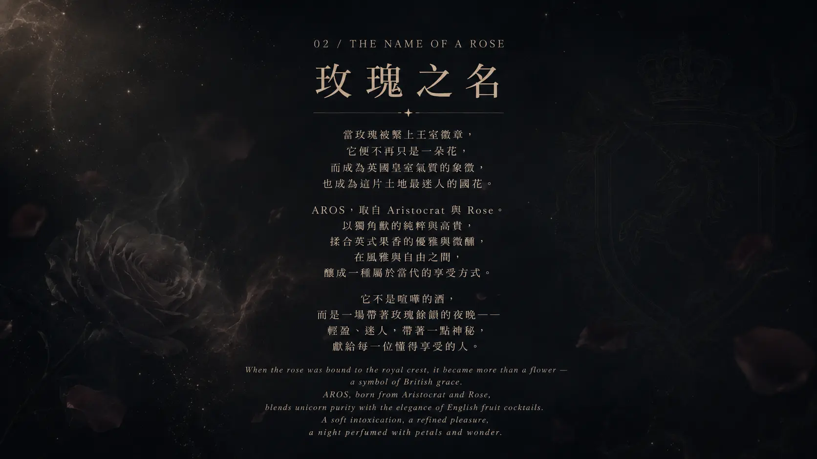
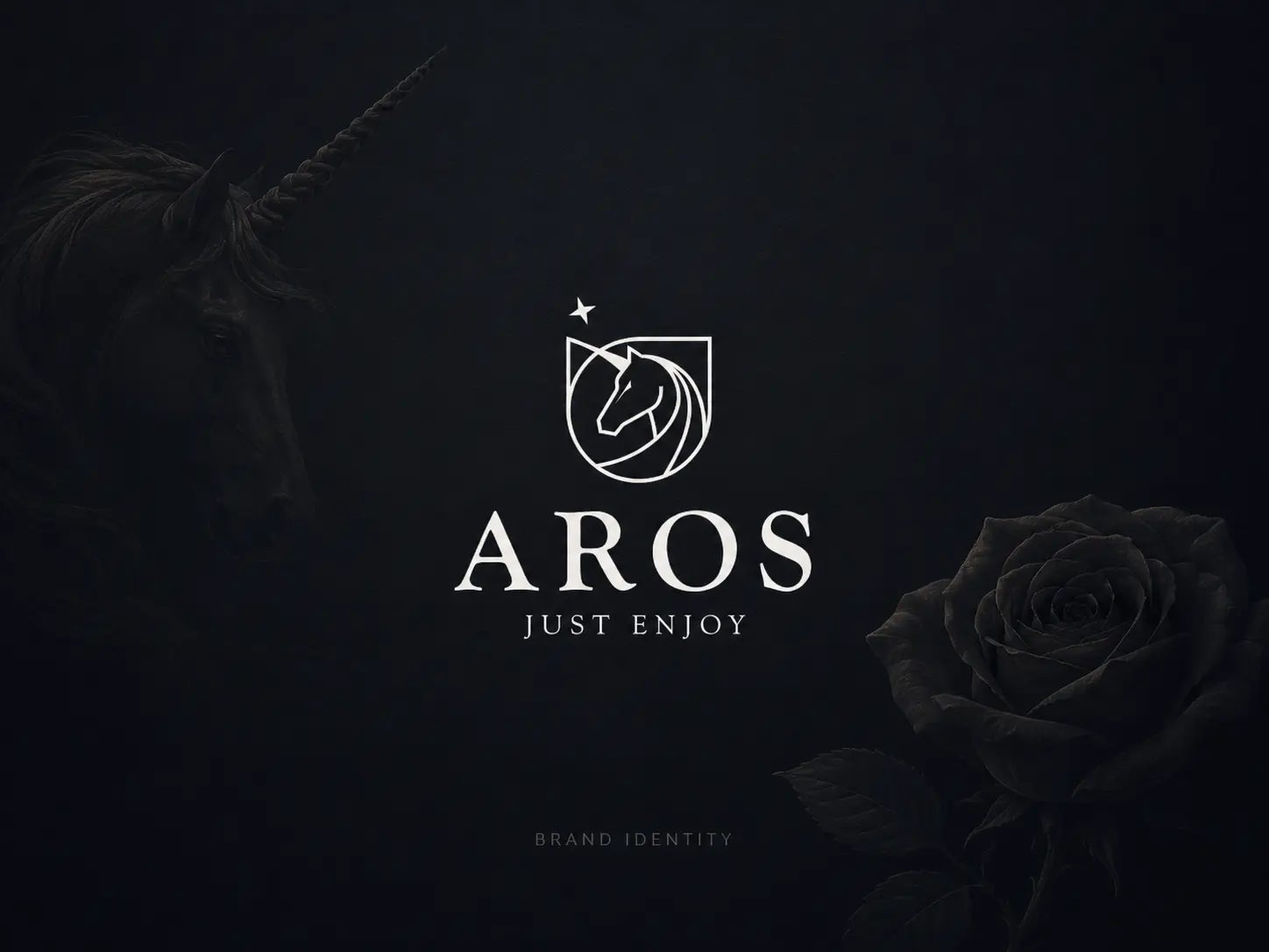
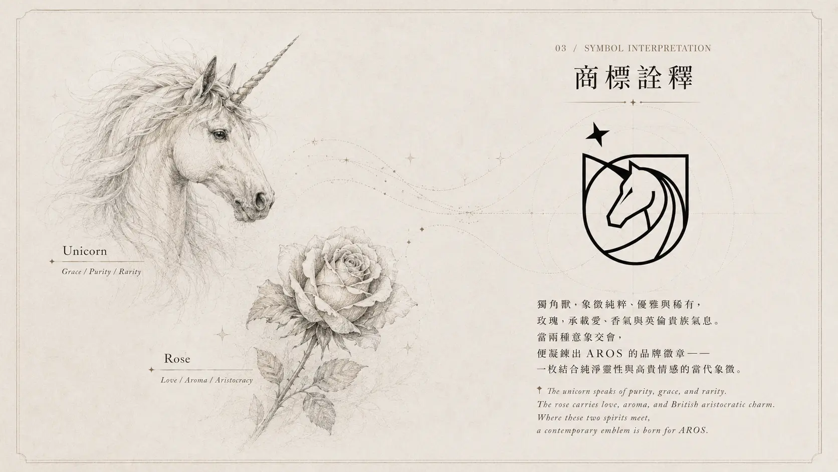
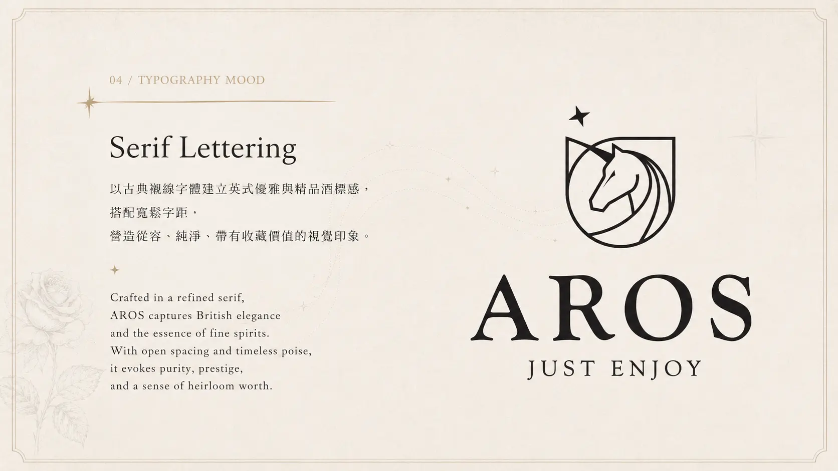
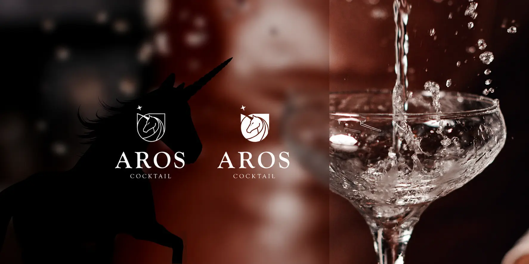
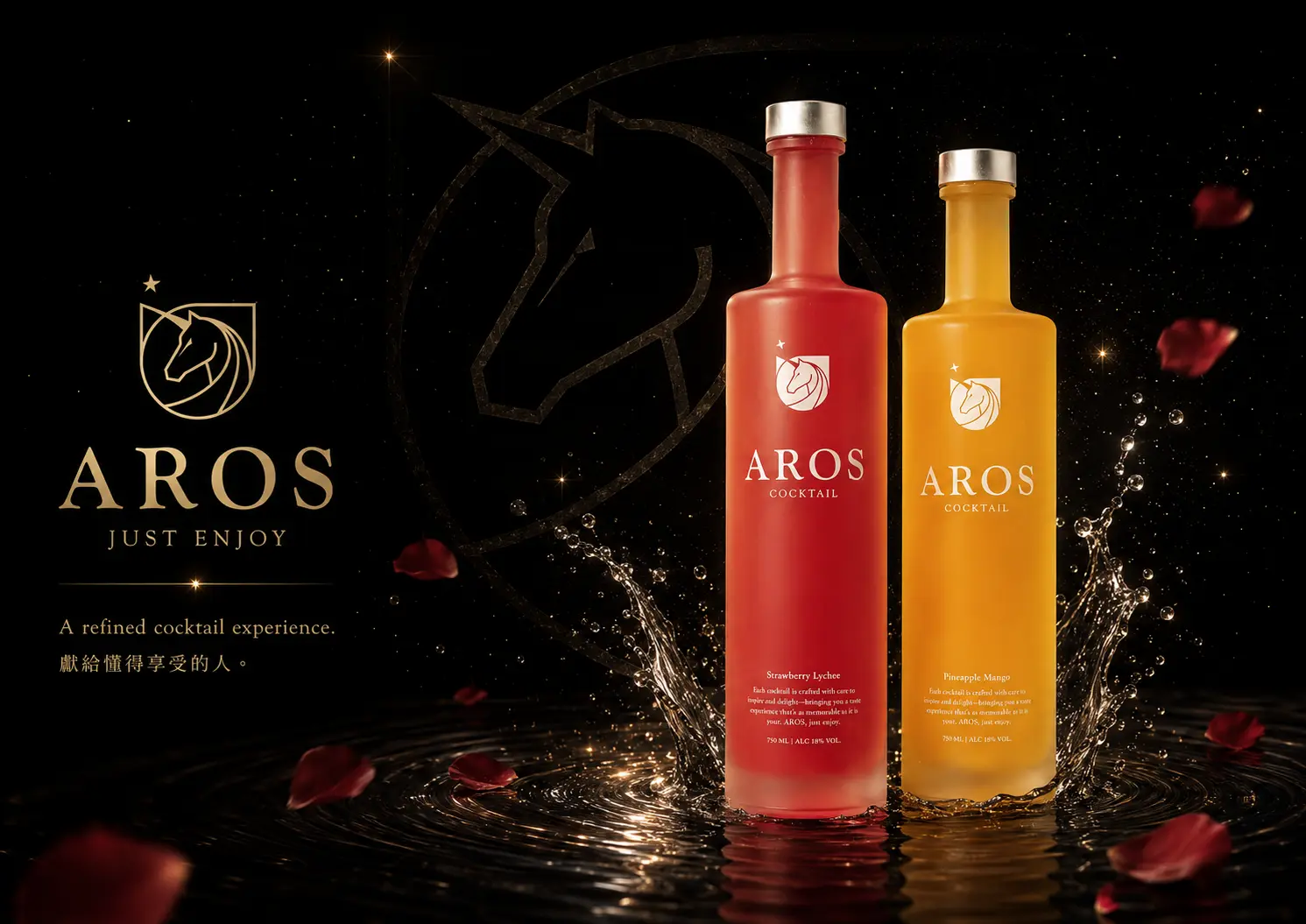
以玫瑰與獨角獸,轉化出浪漫而高辨識度的商標符號
在商標設計上,AROS 以玫瑰與獨角獸作為主要視覺元素。玫瑰象徵浪漫、香氣、女性化氣質與酒品的柔美風味;獨角獸則帶有神話感、純粹性、貴族氣息與想像力。兩者結合後,讓品牌不只停留在「水果調酒」的產品描述,而能延伸出更鮮明的品牌故事。
這樣的符號設計,也讓 AROS 在包裝、廣告、展售現場與社群溝通中更容易被記住。它不只是酒標上的裝飾,而是能代表品牌氣質的核心識別。
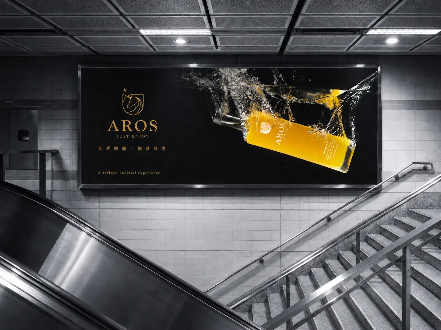
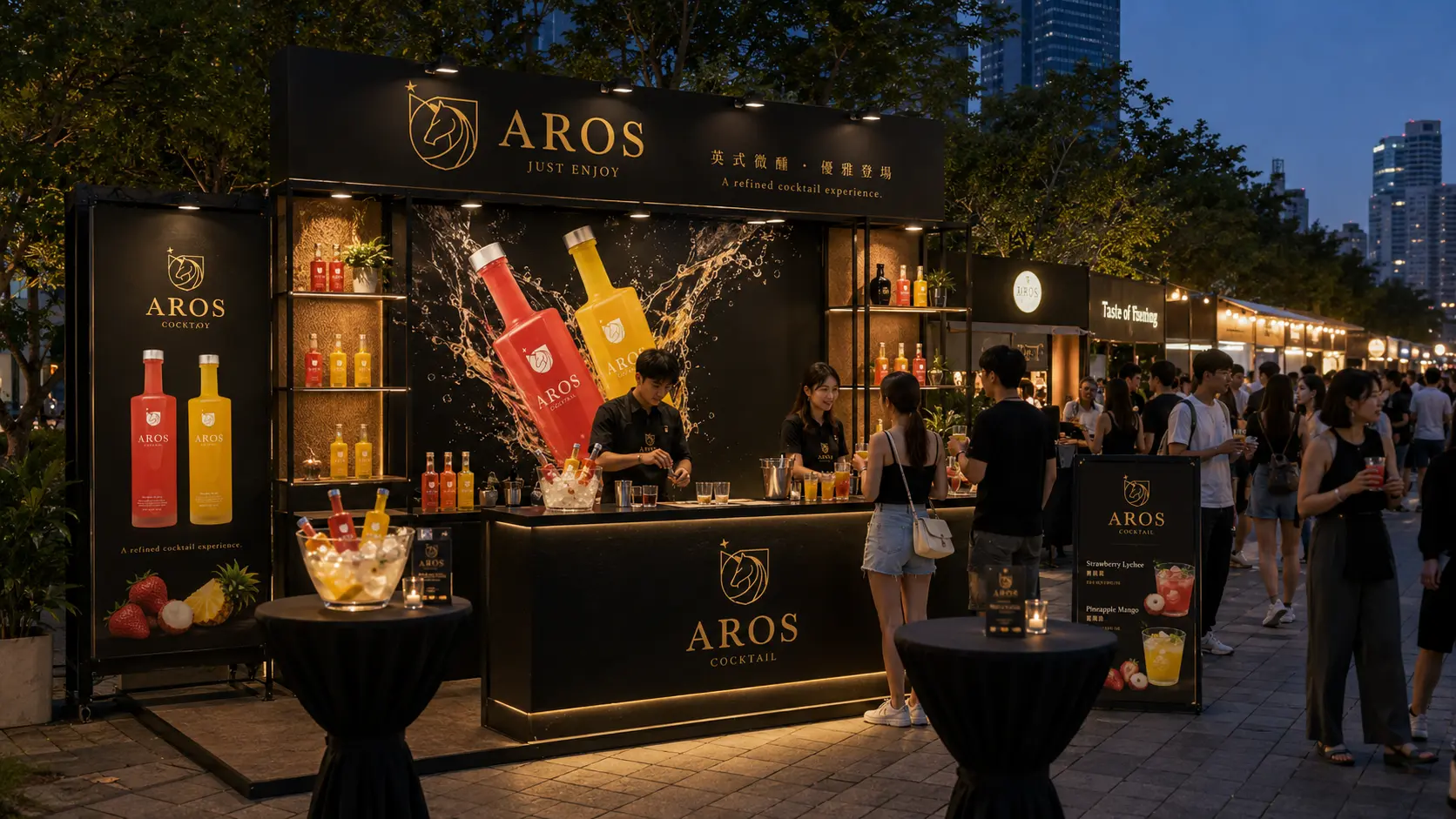
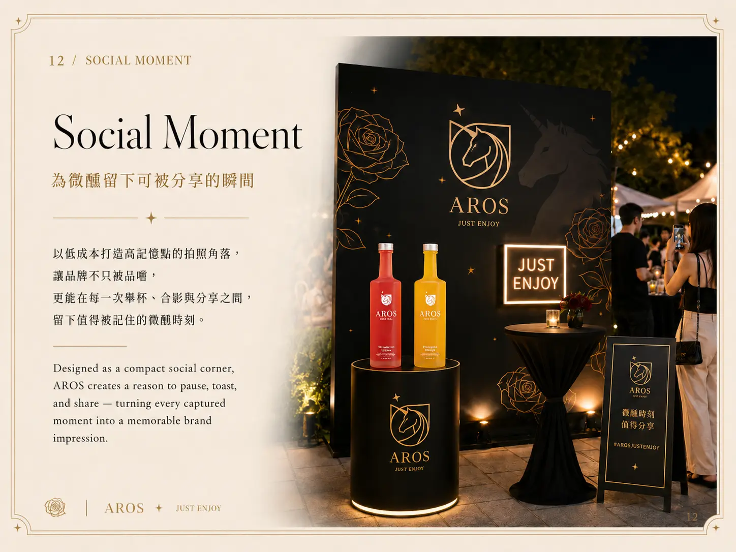
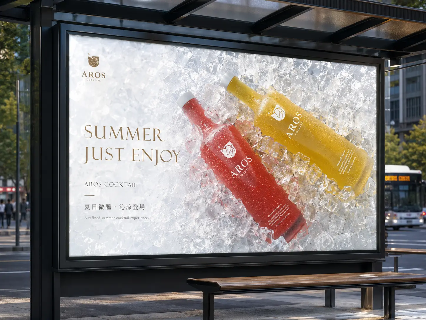
從品牌識別到城市廣告,放大 AROS 的時尚酒品印象
AROS 的品牌形象需要能出現在不同通路與場景中,從酒瓶包裝、展售攤位到城市戶外廣告,都要維持一致的視覺印象。因此,我們將品牌識別延伸到地鐵廣告、公車站廣告與展售應用,讓品牌在大面積曝光時,也能保有浪漫、精緻與派對感。
透過高辨識度的商標符號、鮮明的色彩層次與酒品形象照,AROS 能在生活場景中被快速辨認,也能讓消費者自然聯想到開瓶、微醺、聚會與慶祝時刻。
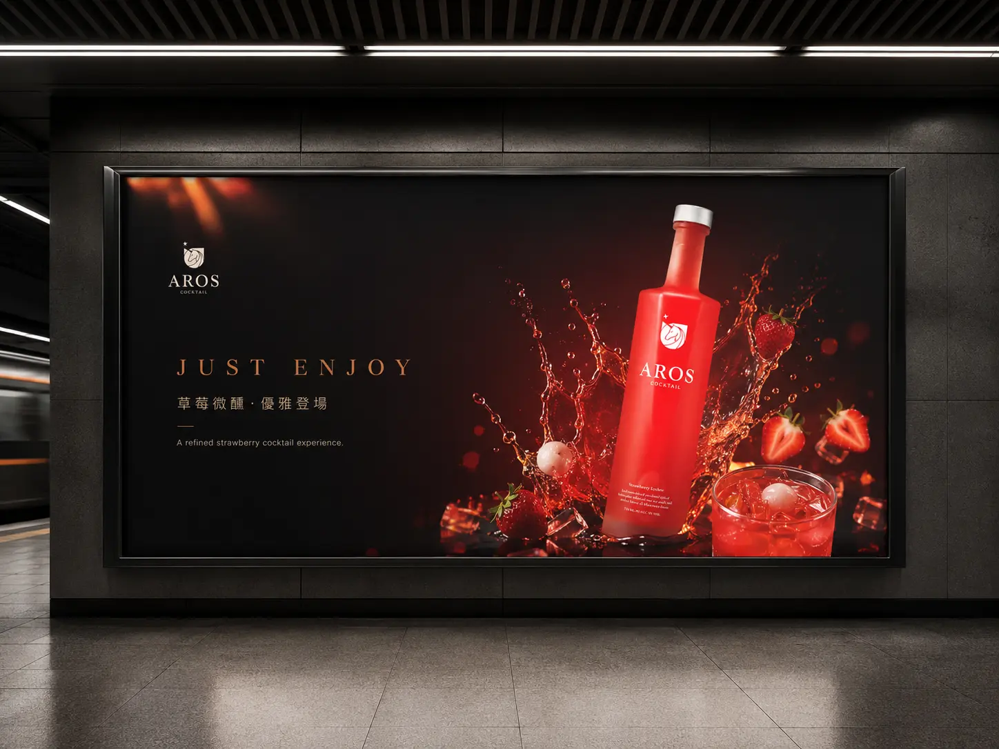
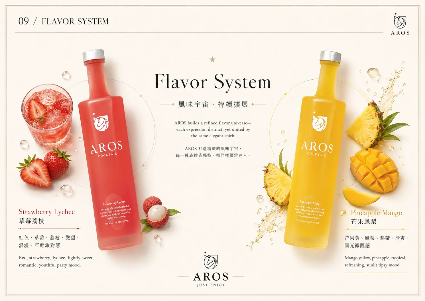
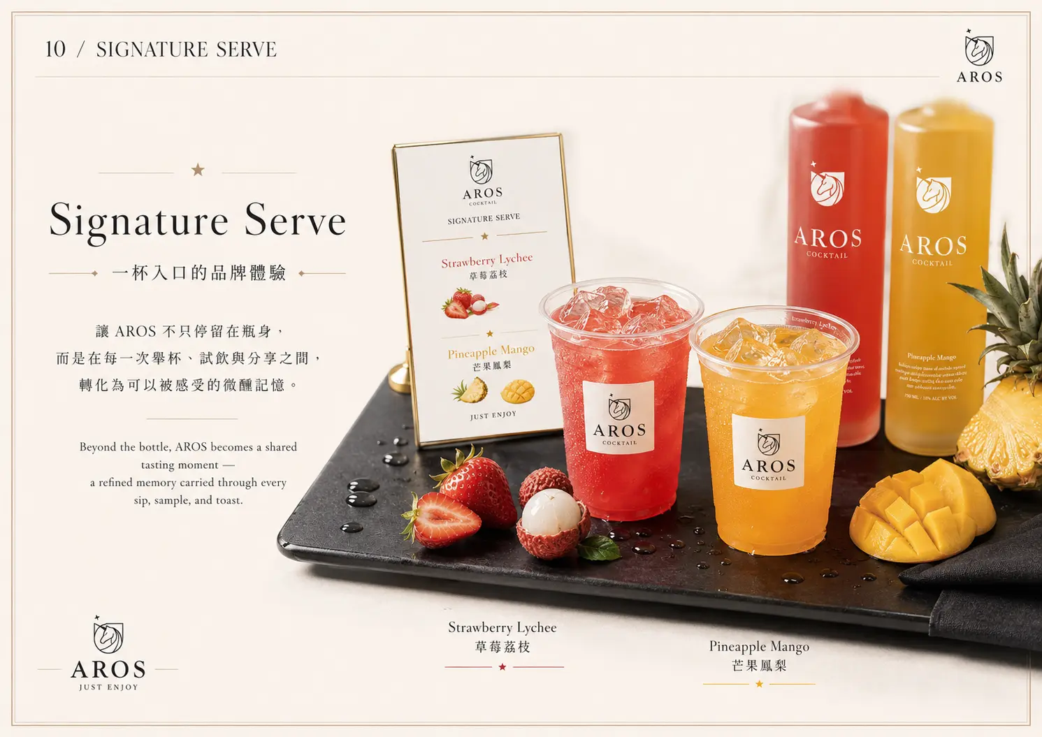
讓包裝與商品形象,說出水果調酒的風味層次
對調酒品牌來說,包裝不只是容器設計,也會直接影響消費者對風味的想像。AROS 的瓶身設計以品牌識別為基礎,結合不同口味的色彩與視覺表現,讓每一款酒品都能呈現自己的風味個性。
從瓶身、杯子、外包裝到情境形象照,我們希望讓 AROS 呈現出「可被想像的味道」。消費者不需要喝下第一口,也能從色彩、材質、畫面氛圍與包裝語氣,感受到水果的酸甜、調酒的優雅,以及適合聚會分享的輕鬆情緒。
建立一個可被感受、可被想像,也可被記住的飲酒場景
AROS 的品牌設計不只是替產品做包裝,而是替品牌建立一個能被感受的飲酒場景。它有台灣水果的鮮明風味,也有英式調酒的優雅輪廓;它可以是派對裡的一杯酒,也可以是日常中讓人想放鬆片刻的微醺選擇。
透過這次品牌設計,AROS 從產品風味、品牌語彙、視覺識別、包裝設計到廣告應用,都建立出一致的品牌印象。讓消費者在第一眼看見 AROS 時,就能感受到它的時尚、甜美、浪漫與盡興。
✦ 想規劃酒品品牌設計、食品飲品包裝設計或品牌識別系統,和我們聊聊你的品牌想法。
✦ 瀏覽 作品總覽,看看更多品牌設計、包裝設計與網站設計案例。
✦ 返回 首頁,了解我們如何協助品牌建立更清楚的視覺識別與數位體驗。