
2026.08.24
Sun Mood Chinese Medicine Clinic Branding|Modern Chinese Medicine Brand Identity & Clinic Spatial Design
Sun Mood Chinese Medicine Clinic is built around a contemporary interpretation of traditional Chinese medicine, translating its cultural depth into a refined and modern visual language. From brand identity and printed applications to medicine packaging, clinic exterior, and spatial experience, deep green tones, warm neutrals, generous whitespace, and refined typography create a cohesive brand system that balances professionalism, calmness, and approachability.
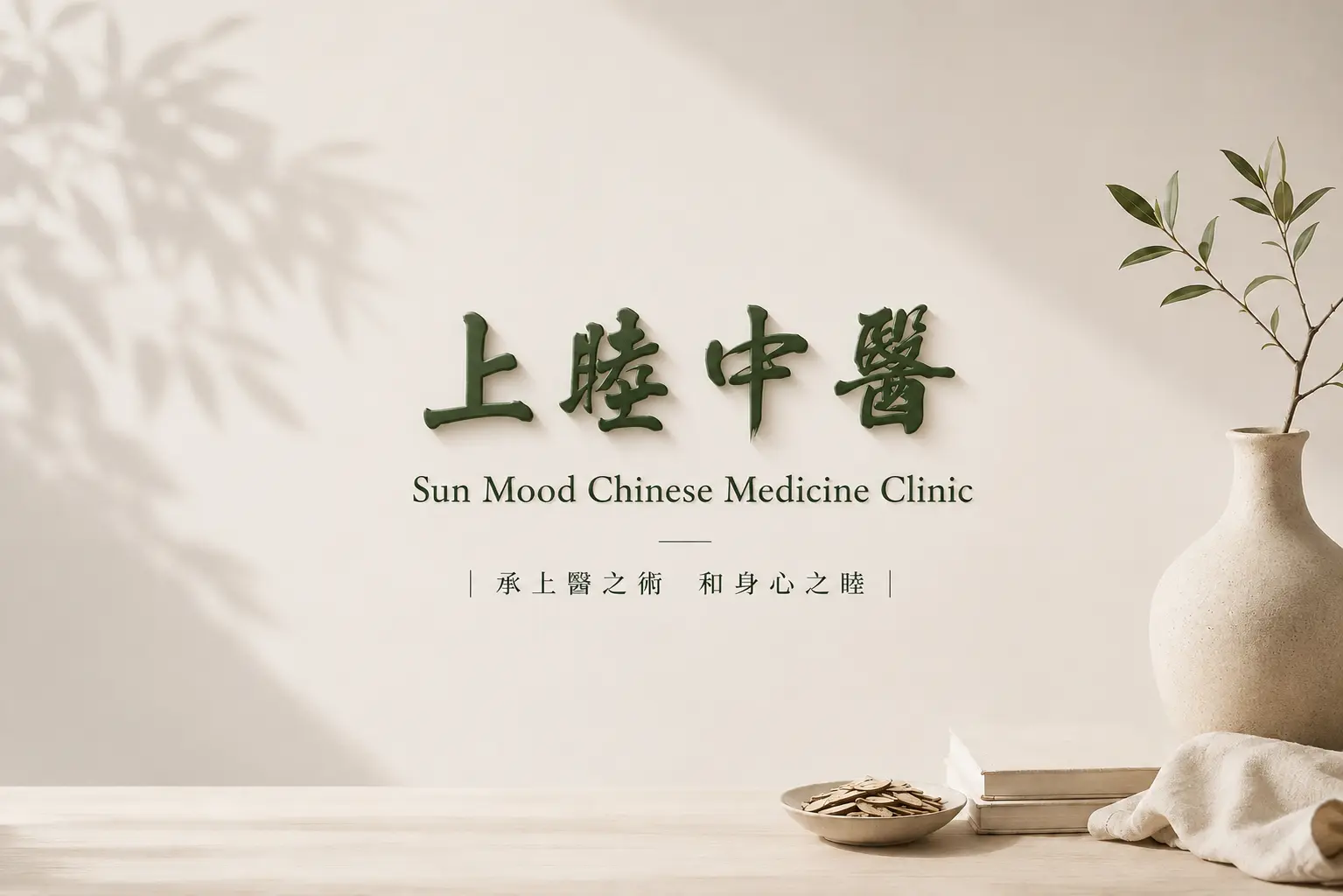
Shang Mu Chinese Medicine Clinic | Reinterpreting the Professionalism and Warmth of Traditional Chinese Medicine through Modern Brand Design
The brand design for Shang Mu Chinese Medicine Clinic is built around the idea of “Modern Chinese Medicine,” redefining the relationship between traditional medical expertise and contemporary lifestyle aesthetics. The brand aims to preserve the depth and trust associated with traditional Chinese medicine while reducing the heaviness and distance often found in conventional medical environments, creating a more approachable identity that fits modern life.
The visual system is defined by deep green, warm beige and generous white space, combined with clear information hierarchy and refined material details to create a calm, professional and approachable brand presence. The identity extends beyond the logo into business cards, medicine packets, pharmacy bags, the clinic exterior and interior environment, allowing patients to experience a consistent brand impression from the moment they first encounter the clinic through consultation, treatment and medication pickup.
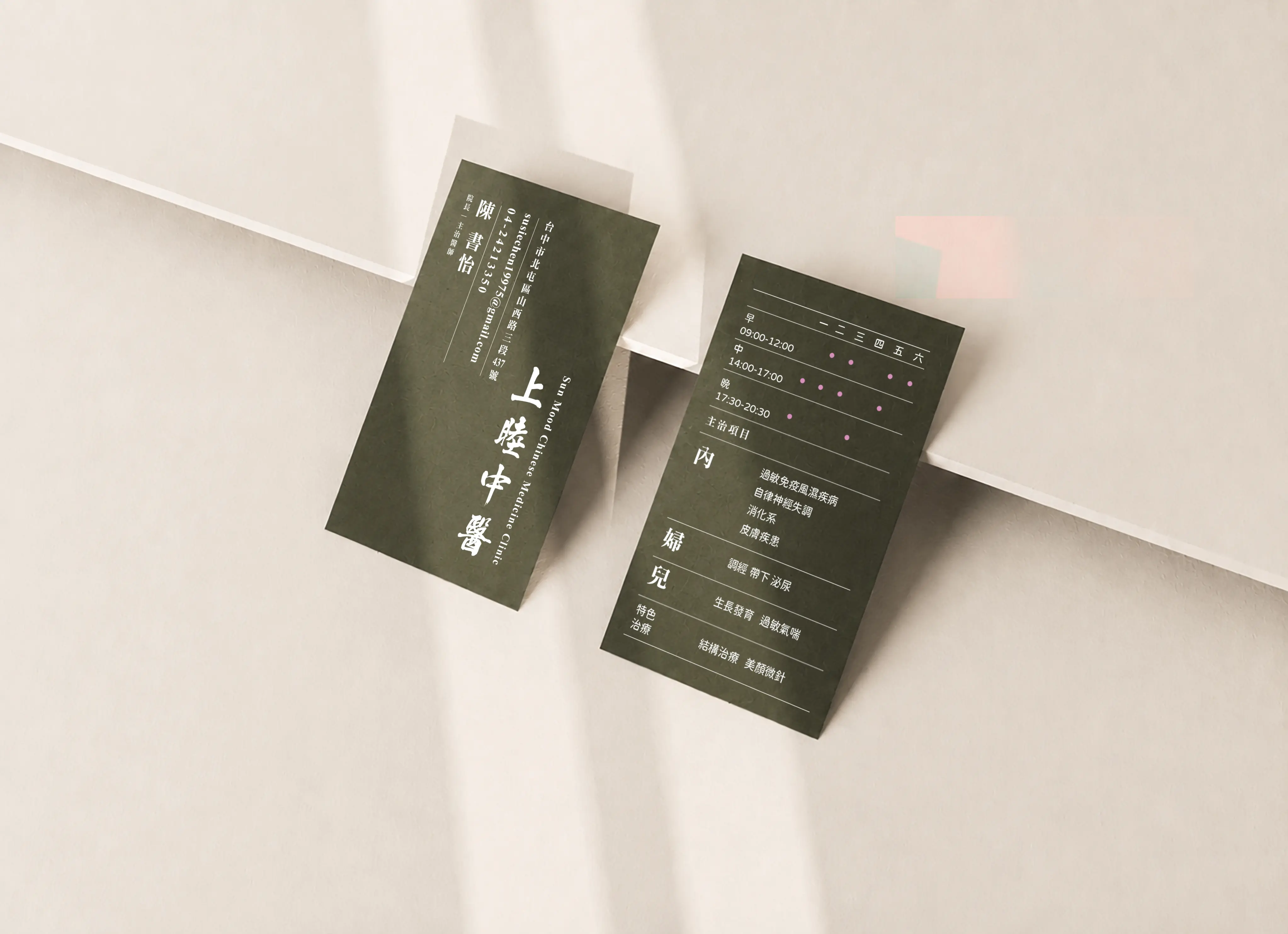
Business Card Design | Building a Professional Brand Impression from the First Physical Touchpoint
A business card is one of the most direct physical touchpoints between the clinic, its patients and professional partners. Rather than adding decorative elements, the design focuses on information hierarchy, proportion and white space, allowing the brand to communicate clarity and professionalism within a limited format.
Deep green continues the calm and grounded character of the Shang Mu brand, while warm white typography establishes a clear hierarchy between the clinic name, physician information, contact details and treatment information. Careful control of type scale, line spacing and layout ensures efficient reading while preserving enough visual breathing room.
The business card therefore becomes more than an information carrier. It is one of the most everyday extensions of the brand identity system, continuously communicating professionalism, refinement and trust through each exchange and interaction.
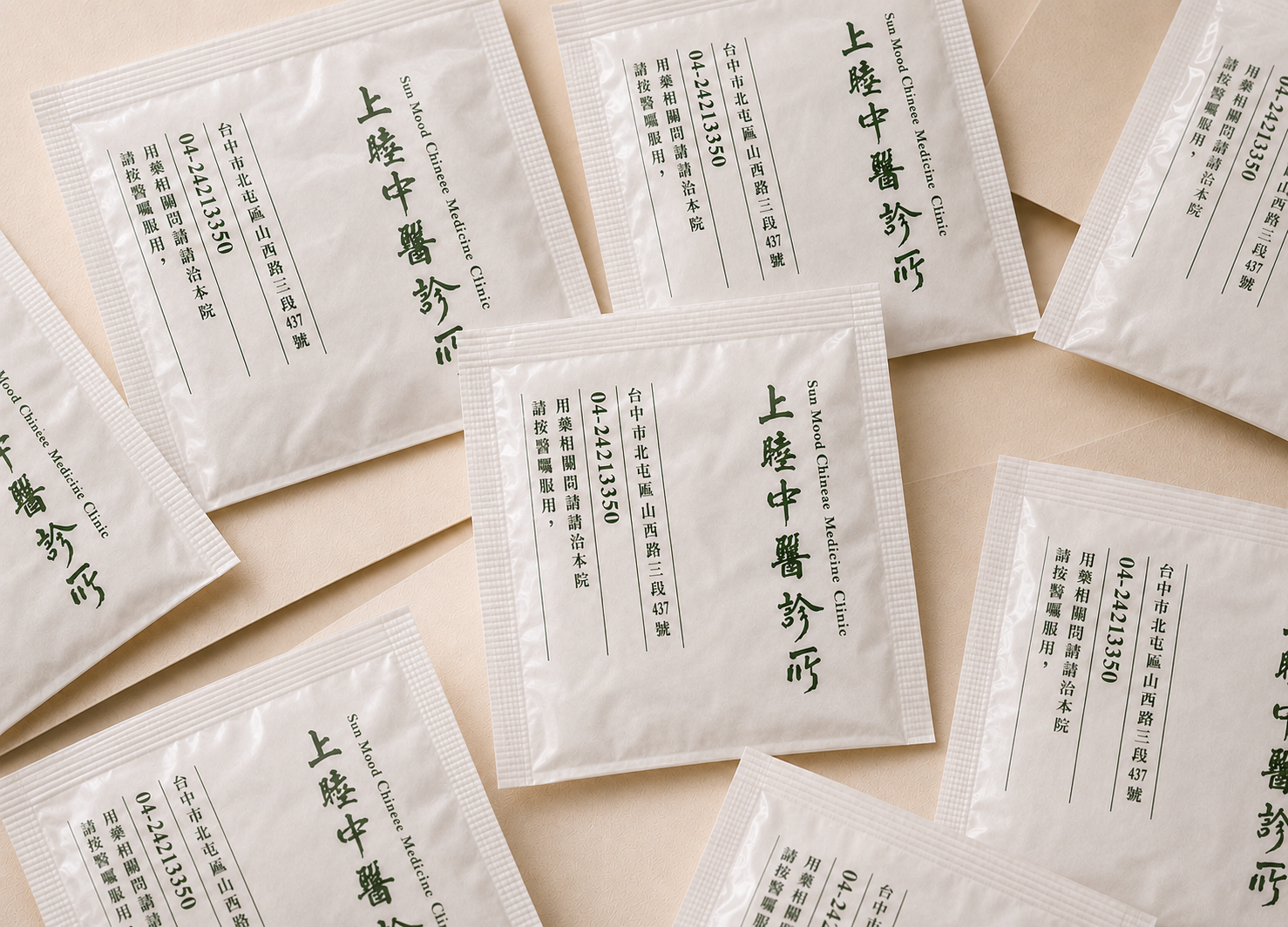
Medicine Packet Design | Extending a Consistent Brand Language into Everyday Medical Use
Medicine packets remain in the patient’s daily life even after leaving the clinic, so their design needs to balance readability, practical use and brand identity. Rather than focusing purely on visual appearance, the priority is to organize a large amount of medical information in a clear, structured and easy-to-understand way.
The layout organizes the clinic name, English brand name, contact information and medication instructions through a simple information structure, while monochrome deep green printing continues the overall visual identity. Typography, proportion and white space follow the same brand rules, allowing even everyday disposable packaging to maintain a clean and consistent visual quality.
When brand design enters objects that patients use every day, the brand no longer exists only in promotional images or physical spaces. It continues to be experienced and remembered through every interaction, reading and use.
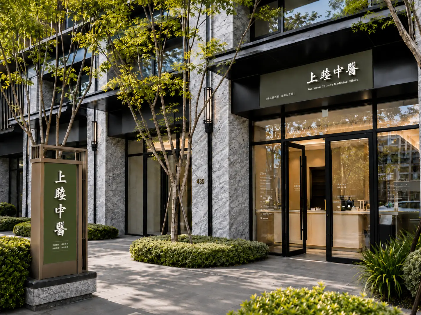
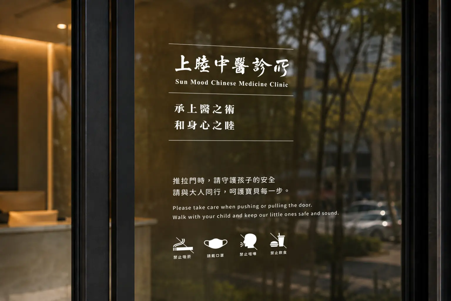
Clinic Exterior Identity | Integrating Brand Language Naturally into the Physical Environment
When brand identity extends from graphic applications into a physical environment, the design needs to consider more than individual visual elements. Building proportions, viewing distance, materials, surrounding context and information legibility all become part of the overall system. The exterior identity of Shang Mu Chinese Medicine Clinic is designed around simplicity, stability and clear recognition, allowing the logo, logotype and English brand name to integrate naturally into the building facade.
Deep green and neutral tones continue the overall brand design while working in harmony with glass, stone, wood and planting elements. The visual approach avoids overly commercial expression, giving the clinic enough presence within the streetscape while preserving the calmness and trust expected from a medical environment.
Exterior information and wayfinding are also organized according to real viewing conditions, allowing essential treatment and clinic information to be understood quickly without disrupting the architecture’s spacing and rhythm. The brand is therefore not simply applied to the building surface, but gradually becomes part of the complete spatial experience.
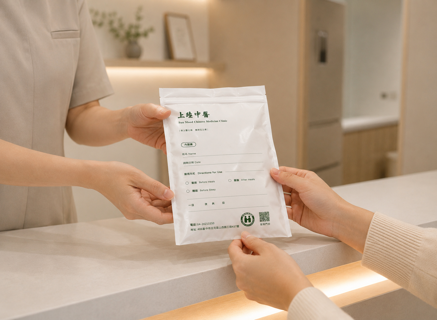
Pharmacy Bag Design | Extending Brand Warmth through the Final Stage of the Patient Journey
Medication pickup is the final stage of a clinic visit and an important physical interaction before the patient leaves. The pharmacy bag therefore serves not only as packaging for medicine, but also as the final touchpoint connecting professional medical care with everyday personal care.
The design continues the warm beige and deep green brand palette, organizing medication information through a clear visual hierarchy while using white space, material texture and brand elements to reduce the institutional and clinical feeling often associated with traditional medical packaging. The overall design avoids unnecessary visual intensity and instead creates a natural balance between information, usability and brand character.
When the pharmacy bag is handed to the patient, it carries more than medicine and instructions. It also communicates reassurance, care and attention. These subtle design details become some of the most tangible expressions of warmth within the overall medical brand experience.
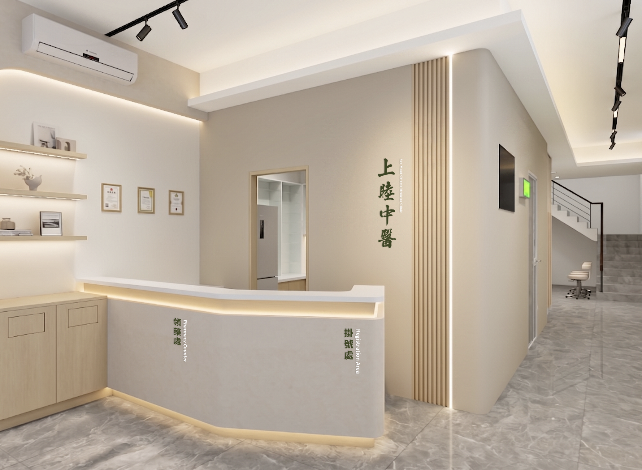
Interior Atmosphere | Transforming Brand Identity into an Environment that Can Be Experienced
A complete brand experience goes beyond logos and graphic applications. It also needs to become part of the physical environment and the way people feel within it. The interior atmosphere of Shang Mu Chinese Medicine Clinic continues the brand’s warm and grounded visual language through natural materials, soft lighting, generous white space and greenery, creating a medical environment distinct from the conventional clinic experience.
From the exterior into the interior, colors, materials and brand identity follow the same design logic. Without relying on excessive decoration, patients can intuitively experience a consistent brand character. The space is not simply a place where treatment happens, but an environment that transforms the brand philosophy into something that can be physically experienced.
From Brand Identity to Spatial Experience, Building a Complete and Consistent Modern Chinese Medicine Brand
The brand design for Shang Mu Chinese Medicine Clinic was not developed as a collection of separate design items. Instead, professionalism, stability, warmth and modernity form a shared foundation for a visual identity system that can extend consistently across graphic applications, medical materials and physical environments.
From the logo and typography to brand colors, business cards, medicine packets, pharmacy bags, clinic exterior and interior environment, every touchpoint follows the same visual logic. Through a complete Chinese medicine brand design and clinic identity system, the traditional depth of Chinese medicine is preserved while being reinterpreted in a cleaner, more refined and contemporary way.
✦ Planning a Chinese medicine brand, clinic identity or healthcare brand image? Talk to us about your brand design project.
✦ Explore more Brand Design Projects featuring brand identities, logos and visual systems.
✦ Learn more about our Brand Design Services and how we help brands build clearer and more consistent market recognition.