
2026.08.12
Pei Li Pharmaceutical | Health Supplement Packaging Design
Packaging design for Pei Li Zhuang and Pei Li Ming, combining product positioning, color identity, functional graphics and clear information hierarchy to balance pharmaceutical credibility with modern consumer appeal.
Pei Li Pharmaceutical | Translating Pharmaceutical Expertise into Modern Health Supplement Packaging Design
For this health supplement packaging project, MASOU DESIGN translated Pei Li Pharmaceutical’s long-established pharmaceutical expertise into a visual language that feels more relevant to today’s consumer market. The design balances professional credibility with clear product recognition, allowing each product to retain its functional and pharmaceutical foundation while presenting a cleaner, more contemporary brand image.
From product colors and graphic concepts to information hierarchy and series consistency, we reorganized the way consumers read and recognize the packaging. Each product can be quickly distinguished on shelves and in everyday use while maintaining a coherent and reliable Pei Li brand presence.
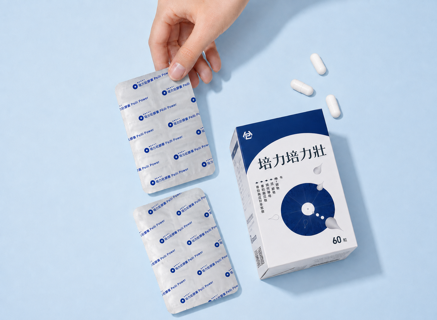
Pei Li Zhuang | Building a Strong Visual Identity for Men’s Daily Vitality
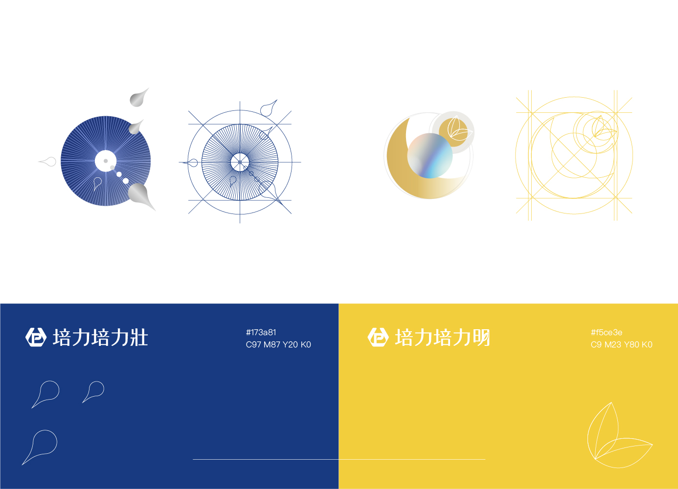
Pei Li Zhuang is positioned as a daily vitality supplement for men. A deep blue color palette establishes a calm yet powerful product identity, while a radial circular graphic converging toward the center transforms the ideas of energy concentration, replenishment and continuous output into an intuitive visual language.
Metallic silver-gray details and flowing graphic elements introduce a sense of technology and precision. Instead of relying on the heavy and aggressive visual language often associated with men’s health products, the packaging creates a cleaner, more rational and contemporary product image.
The information layout places the product name and primary function at the first level of the reading hierarchy, while ingredients, nutritional information and supporting product details are organized into a clear visual structure. This allows the packaging to maintain strong shelf recognition while remaining practical and easy to read.
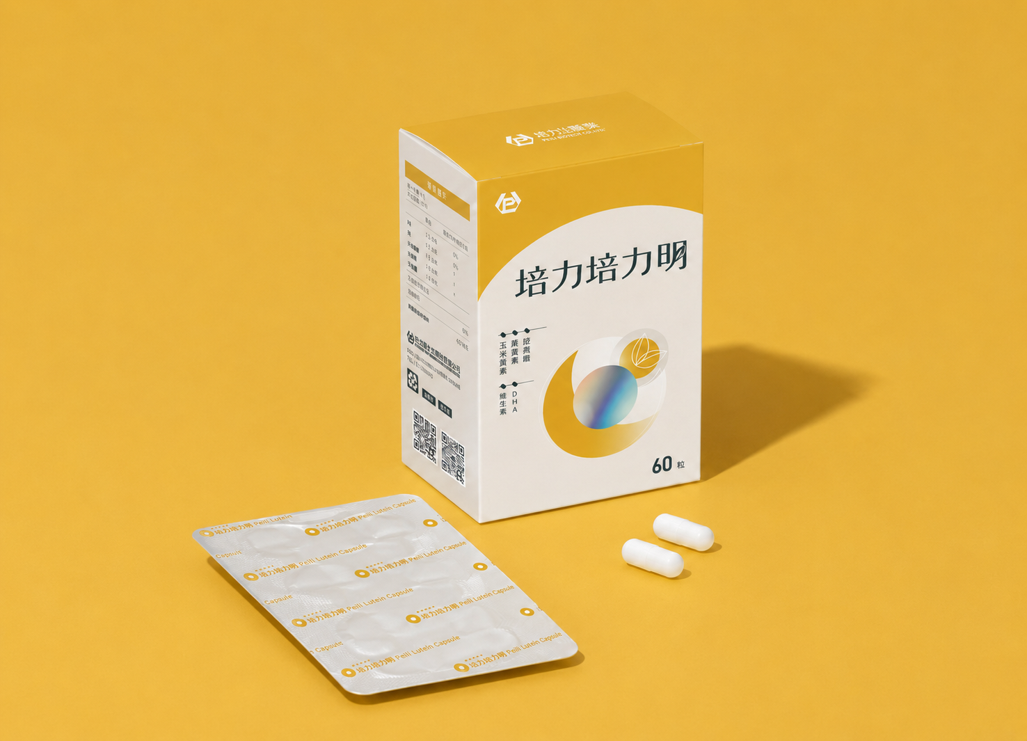
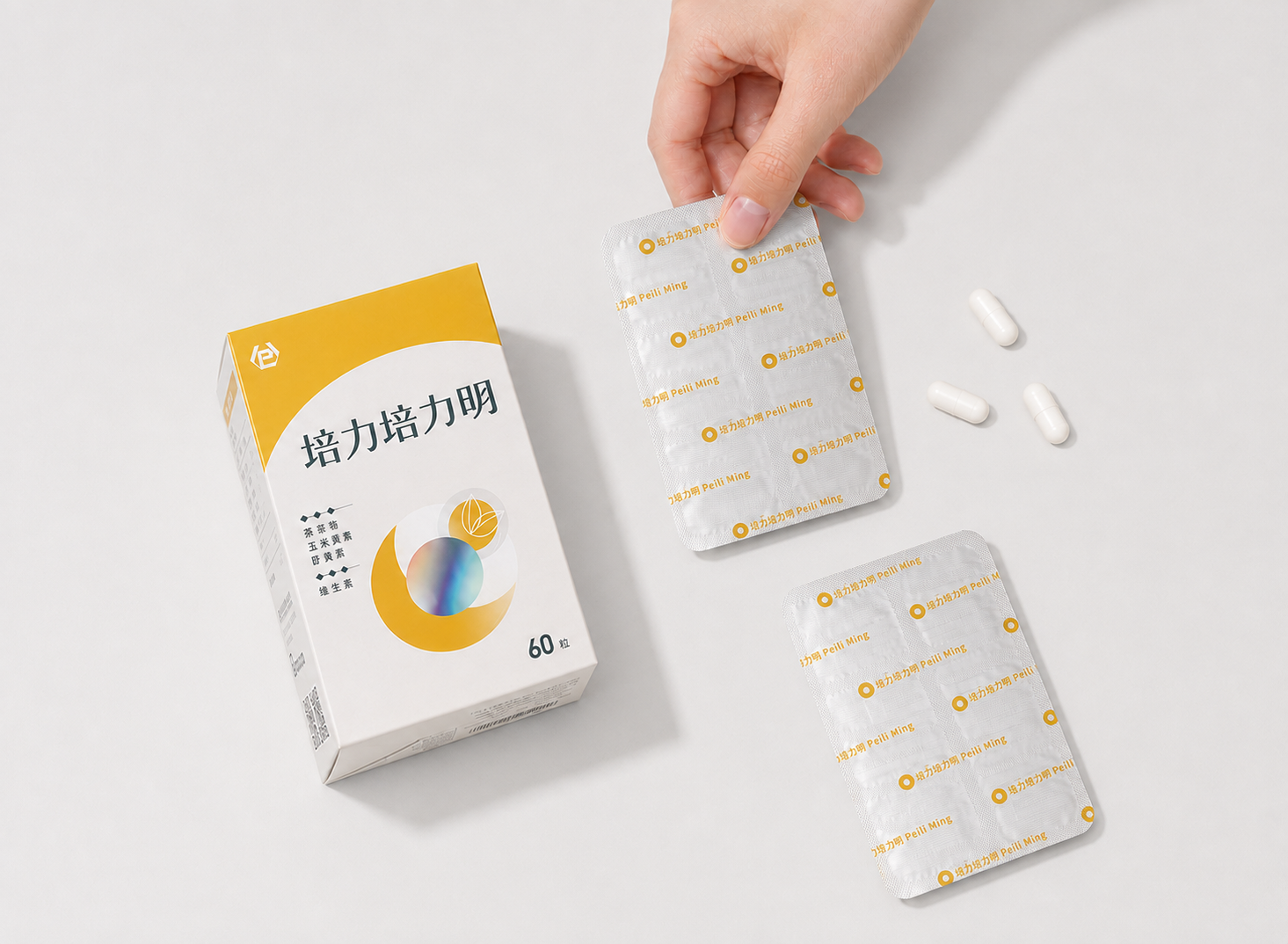
Pei Li Ming | Expressing Everyday Eye Care through Clarity, Hydration and Botanical Visuals
Pei Li Ming is developed around lutein-based eye care, using a bright and highly recognizable yellow as its primary product color. Transparent rings, crystal-like spheres and botanical line elements translate ideas of clarity, hydration and everyday eye care into a lighter and more approachable visual language.
The glossy gradient sphere at the center creates the primary visual focus, while the surrounding circular structure suggests associations with the eye, light and protective layers. Compared with the concentrated energy and strength of Pei Li Zhuang, Pei Li Ming presents a brighter, softer and more lifestyle-oriented product character.
While maintaining the professional foundation expected of a functional health supplement, refined color, material expression and information hierarchy reduce the clinical distance often associated with traditional pharmaceutical packaging, helping the product fit more naturally into the modern wellness market.
Product Series Packaging | Creating a Clear and Consistent Health Supplement Visual System
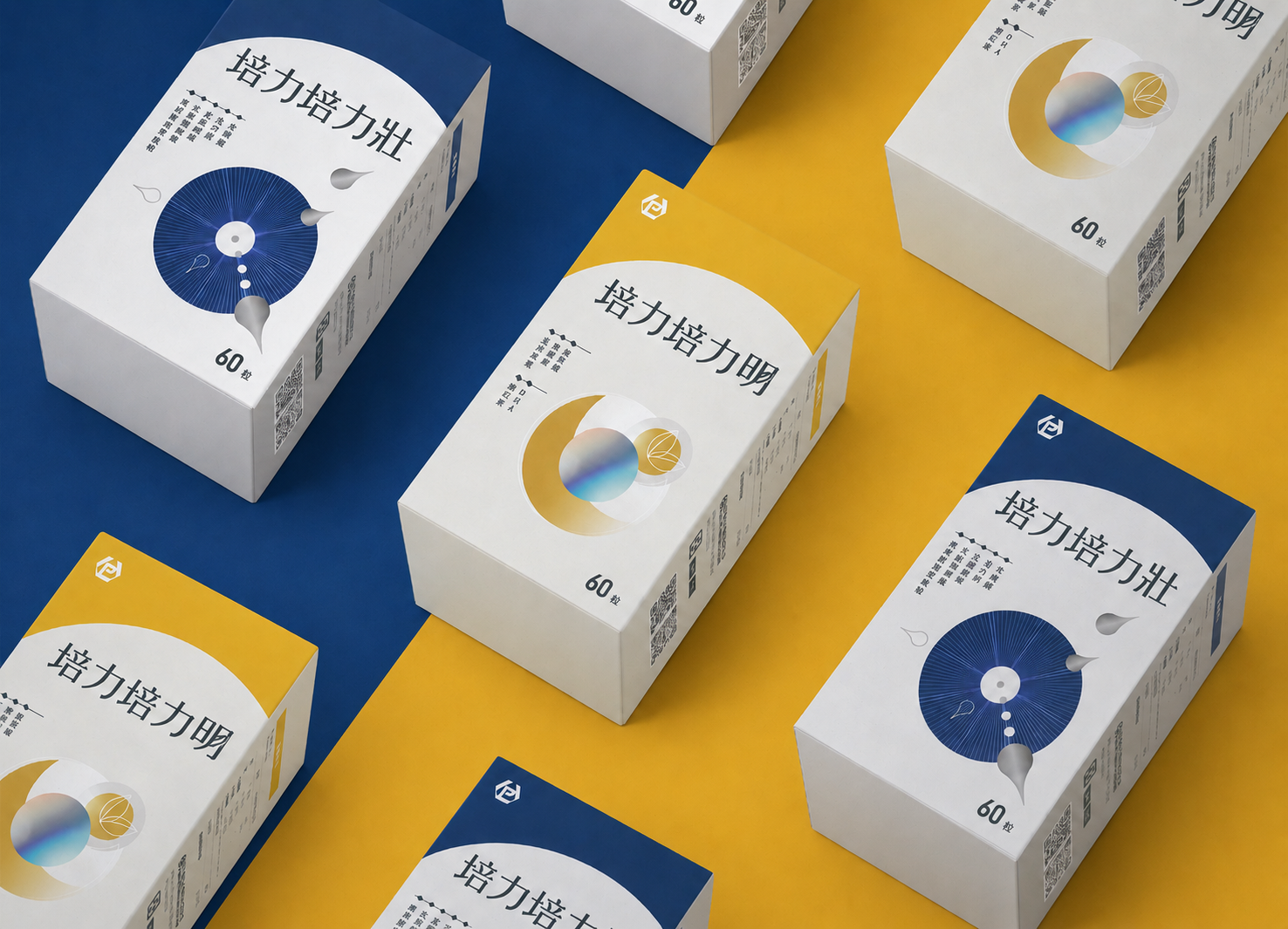
Although Pei Li Zhuang and Pei Li Ming respond to different health needs, the series retains a consistent brand logo, white base, circular composition, information hierarchy and packaging proportions. This allows each product to maintain its own distinctive character while remaining clearly recognizable as part of the same Pei Li product family.
The contrasting deep blue and yellow color systems further distinguish the functional positioning of each product, helping consumers quickly identify differences even from a distance or within a multi-product retail display.
From the front and side panels of the outer packaging to the printed aluminum foil inside, the same visual system is carried throughout the complete product experience. Brand recognition therefore extends beyond the outer box and continues through every interaction after the package is opened.
The project aims to find a balance between the professional credibility of a pharmaceutical company and the visual appeal expected from a contemporary health and wellness brand. Rather than treating packaging simply as a carrier of functional information, the design builds a more distinctive, refined and scalable visual system that helps the products remain recognizable over time.
✦ Planning health supplement packaging, product visuals or a brand identity? Talk to us about your design project.
✦ Explore more Graphic Design Projects featuring packaging, catalog, promotional and brand visual design.
✦ Return to the Home Page to explore more branding and visual design services from MASOU DESIGN.