
2026.07.16
PAMUVA | Skincare Visual & EDM Design
Visual and EDM design for PAMUVA 33 Cleansing Gel and 55 Hydrating Serum, developed around the distinct positioning and benefits of each product. Through differentiated color systems, water-inspired imagery, structured information hierarchy and consistent brand elements, the series communicates cleansing, hydration, repair and skin stability while maintaining a cohesive PAMUVA visual identity.
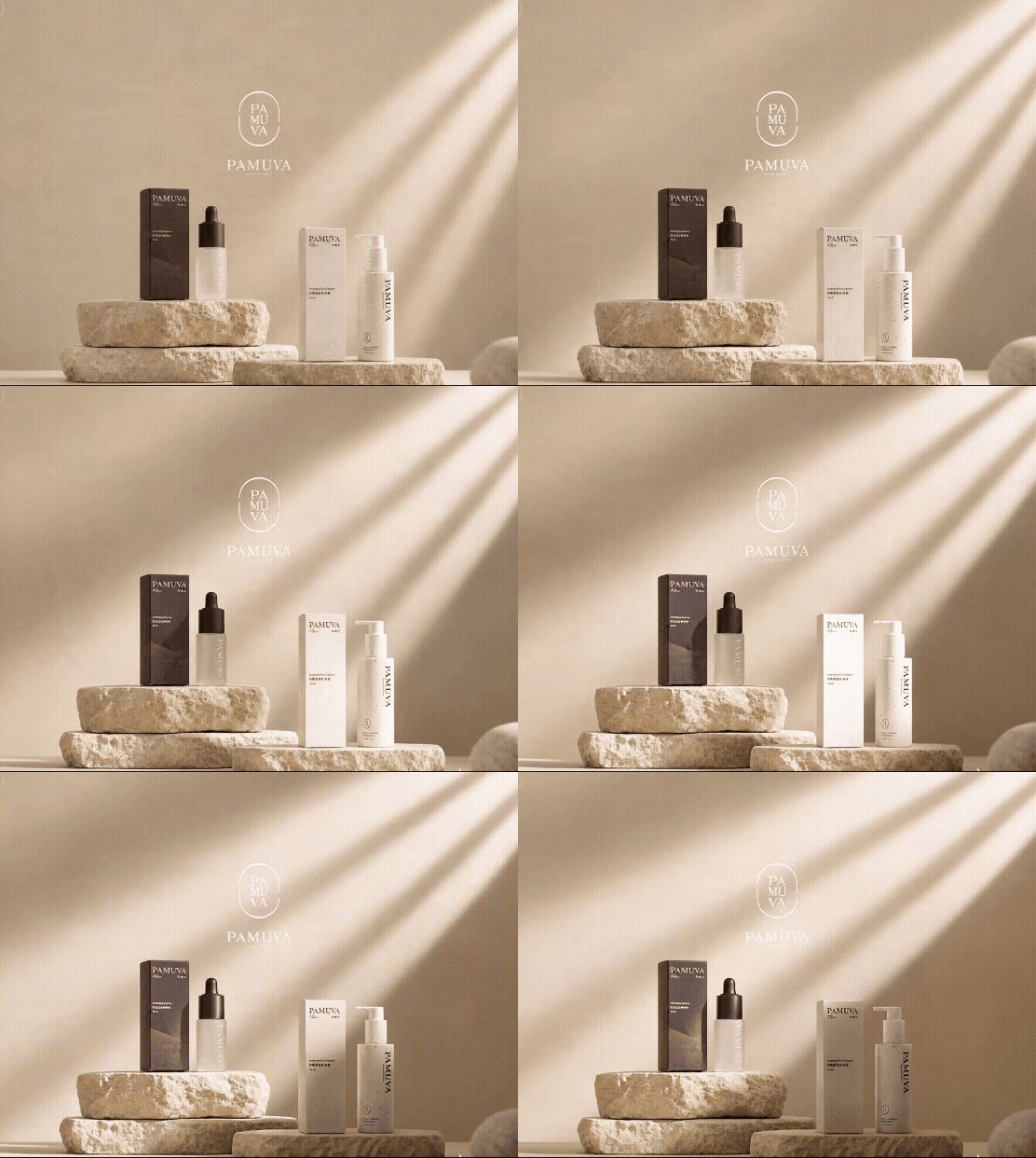
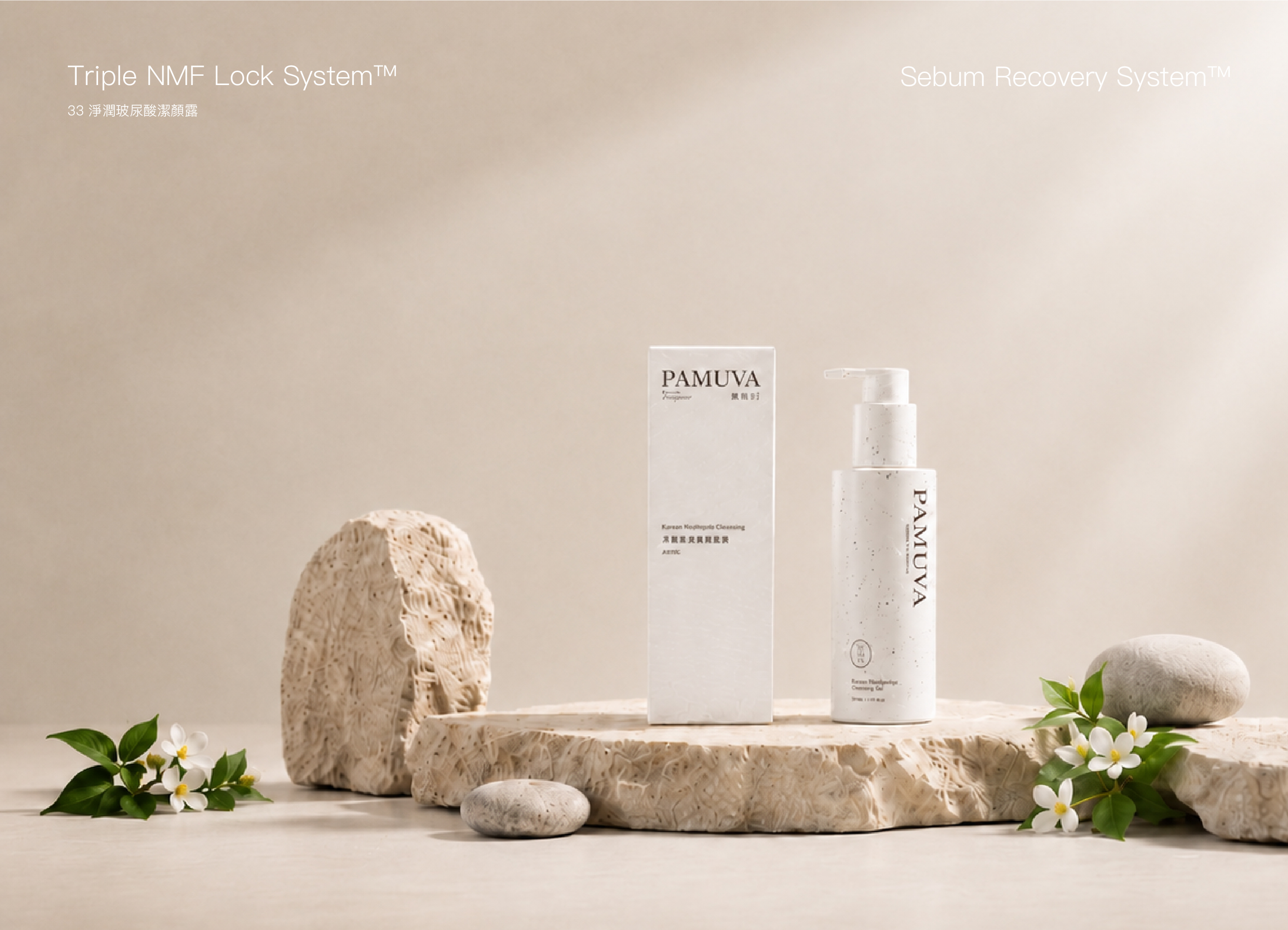
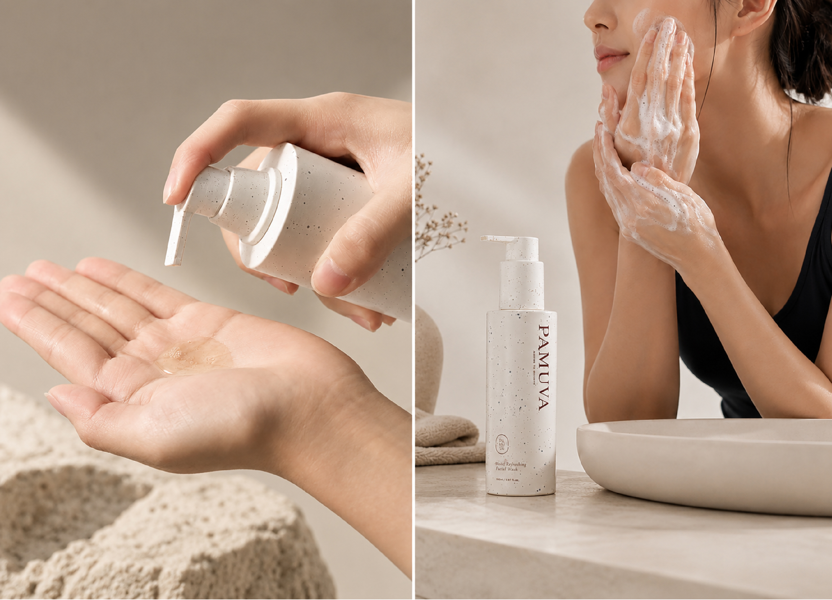
33 Hyaluronic Acid Cleansing Gel | Product Positioning and Visual Design for Oily, Sensitive Skin
33 Hyaluronic Acid Cleansing Gel is designed for oily, sensitive and dehydrated skin conditions commonly affected by Taiwan’s hot and humid climate. It integrates cleansing, hydration and barrier care into the daily cleansing routine. The formula combines hyaluronic acid, xylitol, moisture-locking ingredients, Korean heartleaf extract and niacinamide B3 to remove excess oil and impurities while helping maintain essential moisture and skin comfort.
The visual communication begins with the product positioning itself. Rather than focusing only on freshness and cleanliness, the design also emphasizes hydration, barrier care and oil-water balance after cleansing, allowing the product benefits and visual identity to be understood within one coherent system.
3×3 Repair Science | Organizing Product Benefits through “3-Minute Cleanse, 3-in-1 Care”
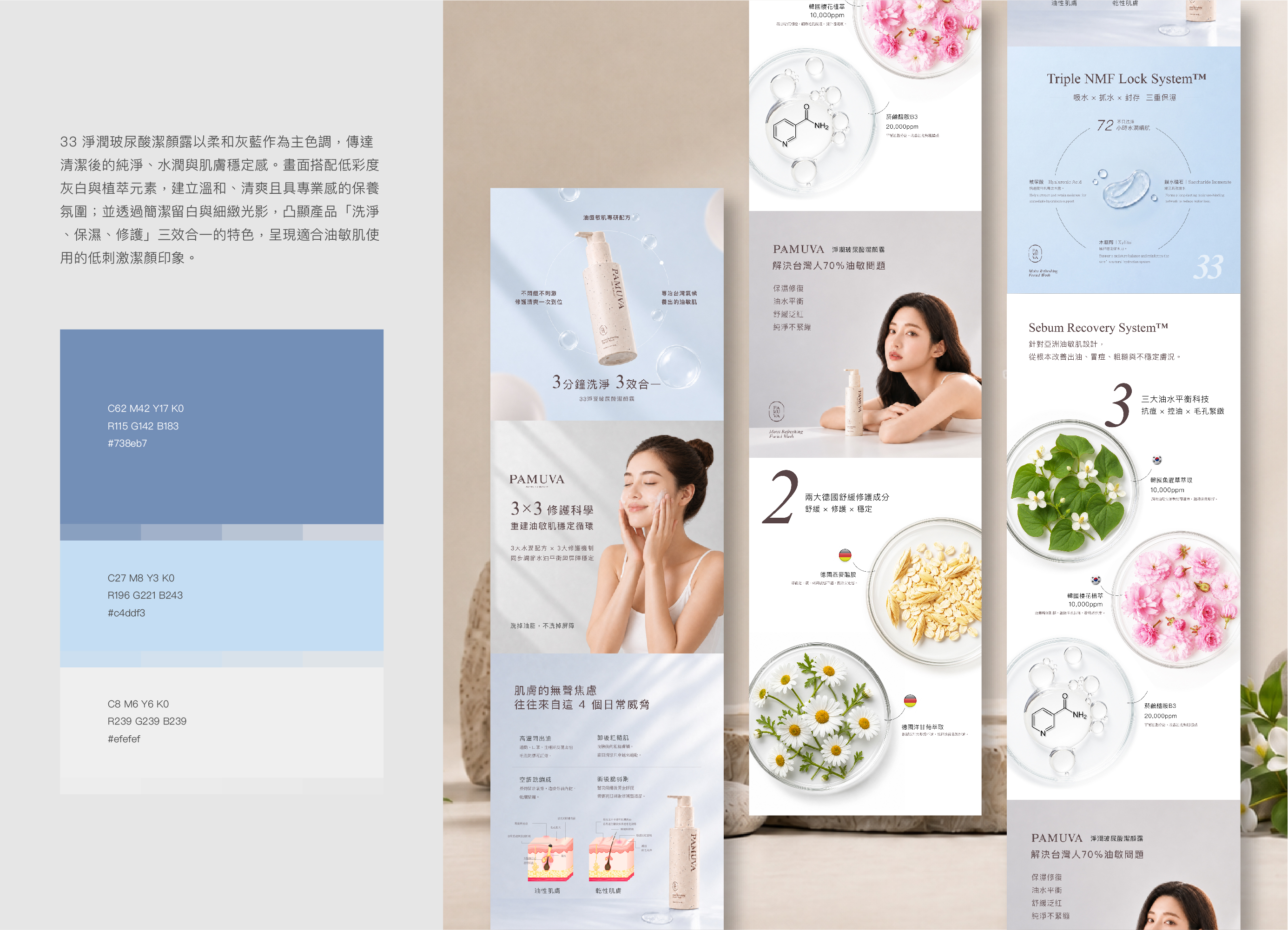
The EDM uses “3-Minute Cleanse, 3-in-1 Care” as its central communication concept, organizing the product benefits into three key areas: cleansing, hydration and barrier care. The content begins with common concerns associated with oily and sensitive skin, then introduces the triple moisturizing system, oil-water balance and key botanical ingredients, helping consumers quickly understand the product’s main functions.
Large numerals, concise headings, circular modules and ring-shaped graphics create a clear reading rhythm. More complex formulation concepts are reorganized into visual information that is easier to read, understand and remember, while preventing functional details from overwhelming the overall composition.
Freshness and Barrier Care in One Step | A Clear Gray-Blue Visual Language for Cleansing, Hydration and Balance
The key visual is built around a transparent gray-blue palette, using soft gradients, translucent bubbles, watery textures and a floating product composition to communicate purity, hydration and refreshing balance. The circular lines at the center echo the “3×3” product concept while also suggesting moisture circulation and the gradual return of skin stability.
Typography continues PAMUVA’s existing brown brand palette, introducing a warmer contrast against the cool gray-blue background. This preserves brand recognition while preventing the overall image from feeling overly cold or clinical, creating a skincare visual that feels cleaner, softer and more approachable.
55 Luminous Hydrating Serum | Product Positioning Built around Hydration, Repair and Skin Stability
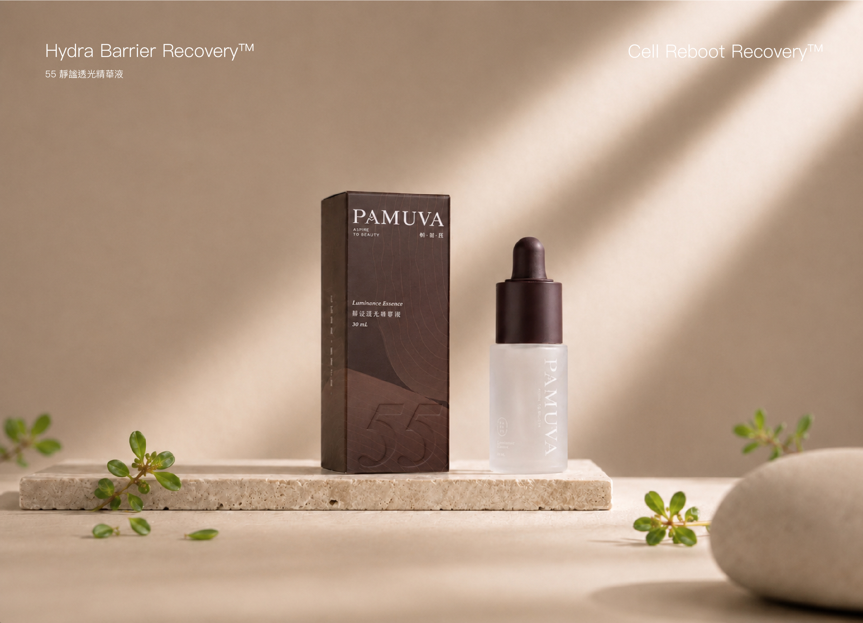
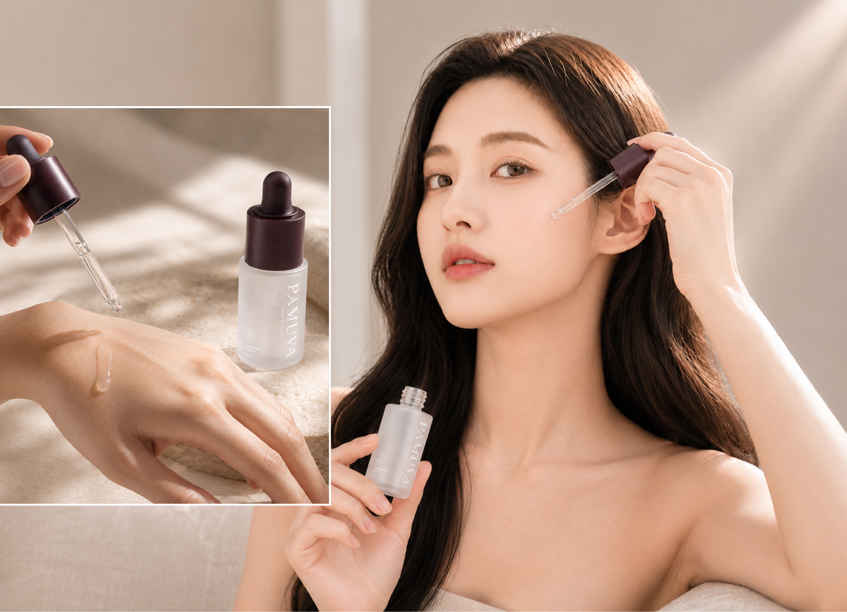
55 Luminous Hydrating Serum focuses on hydration, repair and maintaining skin stability, providing daily serum care for dryness, dehydration, dullness and sensitive or unstable skin conditions. Its lightweight, water-like texture and moisturizing concept extend the product beyond simple hydration toward soothing, protection and the maintenance of healthy-looking radiance.
In the product communication, serum care is transformed into a daily restorative ritual. Instead of focusing only on ingredients and functional claims, the narrative begins with how the skin feels, allowing hydration, repair, protection and renewed stability to form a complete and easily understood skincare journey.
A Sense of Repair Within Reach | Using Visual Storytelling to Show the Journey from Hydration to Stability
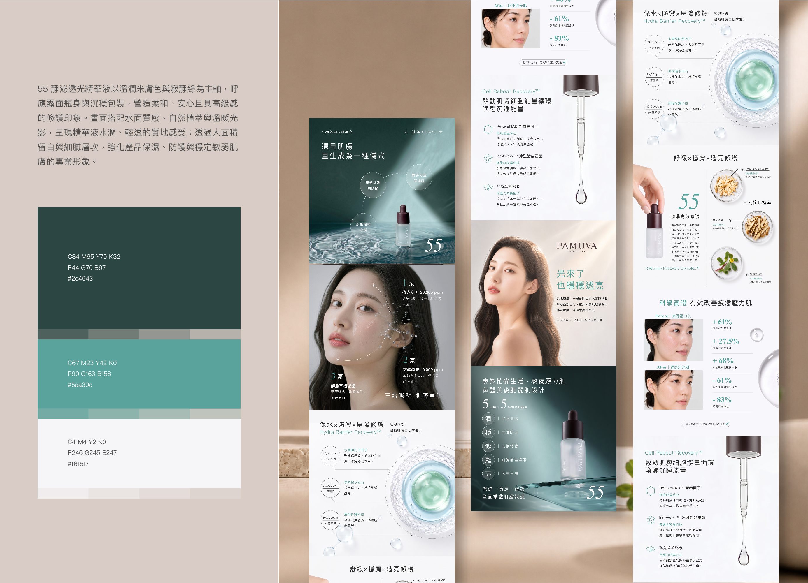
The EDM uses “When Skin Meets Renewal, Regeneration Becomes a Ritual” as its central narrative, organizing the product benefits into three directions: replenishing moisture, restoring skin feel and multidimensional protection. Instead of presenting a dense list of ingredients, the design uses sensory copy and clearly structured benefit points to guide consumers through the serum’s complete process from hydration and repair to improved skin stability.
Circular information modules are arranged along curved lines to create a continuous restorative path. This reading flow visually echoes the idea of skin gradually returning to a more stable condition, giving functional information a stronger sense of progression and storytelling.
A Moment of Renewal | Using Deep Teal to Express Hydration, Repair and Skin Radiance
The key visual uses deep teal as the primary atmosphere, combined with flowing water surfaces, expanding ripples and penetrating beams of light to portray skin gradually moving from dryness and stillness toward hydration and renewed radiance. The product stands at the center of the water, while the outward-moving ripples symbolize hydration, repair and a continuous cycle of skin stability.
The deep blue-green palette creates a calm, focused and premium skincare atmosphere, while forming a refined contrast with the dark brown bottle cap and PAMUVA’s existing brand colors. White typography and fine lines increase transparency and readability, allowing the overall visual to balance emotional atmosphere, product functionality and brand refinement.
Series Visual Integration | Developing Distinct Product Identities while Maintaining a Consistent PAMUVA Brand System
33 Hyaluronic Acid Cleansing Gel and 55 Luminous Hydrating Serum each develop a distinct visual language based on their different functions. The 33 series uses gray-blue tones to express cleansing, hydration and oil-water balance, while the 55 series uses deep blue-green to portray hydration, repair and the gradual restoration of skin stability.
Although the two products use different colors and visual scenarios, the series maintains PAMUVA’s overall identity through consistent circular graphic language, water-inspired elements, concise information hierarchy and signature brown tones. This allows each product to communicate a clear functional position while remaining recognizable as part of the same skincare system.
From product positioning and EDM information structure to the atmosphere of each key visual, the design goes beyond simply placing products into attractive imagery. Each visual direction is developed according to the formulation, function and usage context, allowing product benefits, sensory experience and brand personality to be communicated clearly from the first point of consumer contact.
✦ Planning skincare key visuals, EDM campaigns or product visual design? Talk to us about your design project.
✦ Explore more Graphic Design Projects featuring product visuals, packaging, EDM campaigns and brand design.
✦ Return to the Home Page to explore more branding and website design services from MASOU DESIGN.