2026.03.30
LOVAMO|The Aesthetics from Eyes to Fingertips
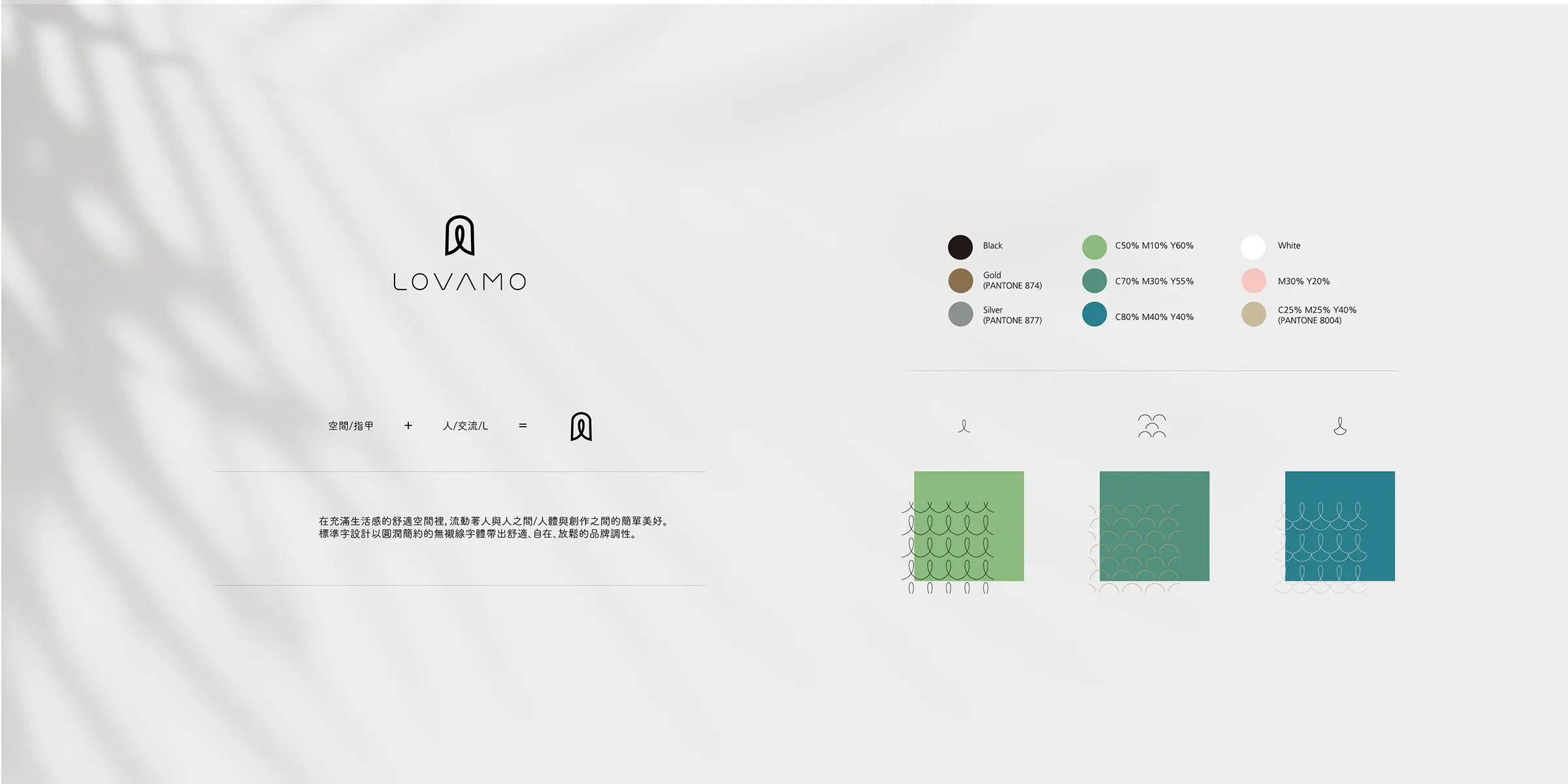
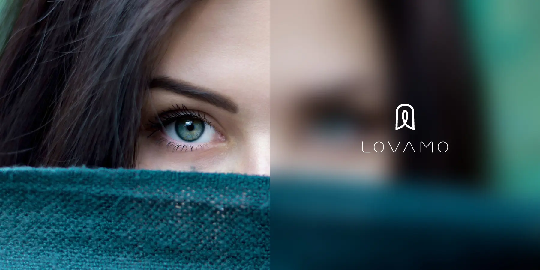
Lovamo is built around the idea of salon culture, positioned as a refined beauty brand that combines eyelash styling, artistic expression, and lifestyle aesthetics. More than offering eye beauty services, the brand aims to turn every delicate detail into an experience of care, comfort, and renewed confidence. The brand identity system reinterprets the visual language of an eyelash salon through a more complete and distinctive design approach. The logo combines the curve of lifted eyelashes, the outline of a fingernail, and a central human figure, symbolizing the extension of beauty from the eyes to the fingertips. It also reflects the brand’s focus on details, posture, and self-care. The overall design moves away from the overly commercial and standardized image often seen in eyelash brands. Instead, it brings in a softer atmosphere inspired by art, spa culture, and the warmth of home. Through gentle visual elements and a layered sensory brand image, Lovamo presents a professional yet approachable personality. Beauty is no longer only an outer touch-up, but a quiet return of confidence from the eyes, fingertips, and inner self.
```html
Lovamo|Reshaping the Brand Image of an Eyelash and Nail Salon from Eyes to Fingertips
Lovamo is an eyelash and nail salon brand in Taichung, built around beauty, personal care, and lifestyle aesthetics. The brand wanted to communicate more than beauty services. It aimed to express a delicate sense of beauty that extends from the eyes to the fingertips. For customers, eyelash and nail styling may seem like small details, yet they can precisely enhance one’s character, personal style, and everyday confidence.
In this branding project, MASOU DESIGN started from brand positioning, naming tone, logo design, brand identity, and visual system planning to help Lovamo clarify its core brand concept. Unlike a typical eyelash studio that only emphasizes techniques or service items, Lovamo needed a more refined salon image with warmth, professionalism, and a carefully designed aesthetic experience.
Using Softness and Ink as the Naming Concept to Build a Gentle Yet Layered Brand Voice
The Chinese word “Rou” in Lovamo’s name represents softness, calmness, and a relaxing service experience. It also reflects the professional confidence of eyelash and nail artists as they work with delicate details. This is not a loud or exaggerated kind of beauty, but a natural and lifestyle-oriented expression that helps customers reconnect with their own sense of confidence.
The word “Mo,” meaning ink, draws from the depth and subtlety of Eastern ink painting. The density, lines, and layers of lashes and fingertips resemble the way ink moves across paper, carrying both precision and softness. Through the name Lovamo, the brand preserves a feminine beauty language, an Eastern aesthetic, and a professional salon tone, creating a memorable identity that can naturally extend into a complete visual system.
Creating More Than an Eyelash Studio. Building a Salon Culture and Brand Experience.
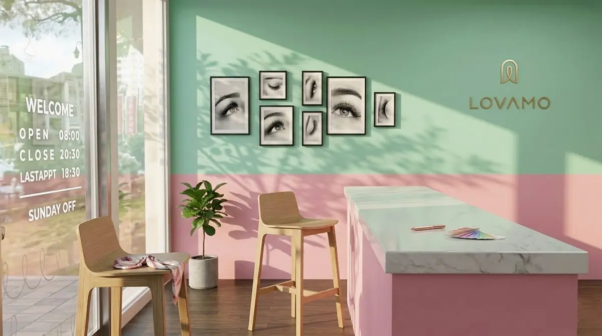
Traditional eyelash and nail brands are often operated as small studios or personal service businesses, making their visual image easily fall into a fixed or overly sweet style. Lovamo wanted to move beyond this impression by bringing the thinking of SPA, salon culture, and design aesthetics into the brand. Eyelash and nail services are not only treatments. They can also become a calming, caring, and confidence-restoring lifestyle experience.
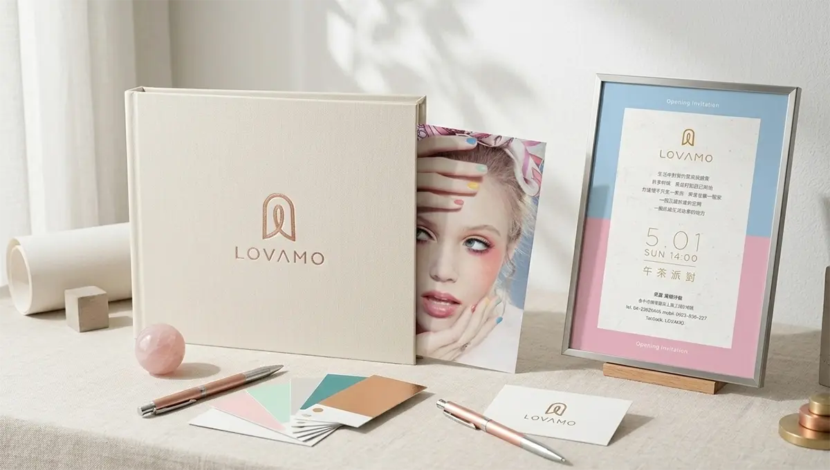
Therefore, in the brand identity design process, we did not only focus on the logo and visual symbol. We also considered how the brand could remain consistent across the space, services, social media, printed materials, and customer touchpoints. From customer flow and seating to lighting, scent, and background music, every detail affects how people perceive the brand. A good eyelash salon brand identity should help customers feel the same sense of calm, care, and aesthetic consistency from the first visual impression to the in-store experience.
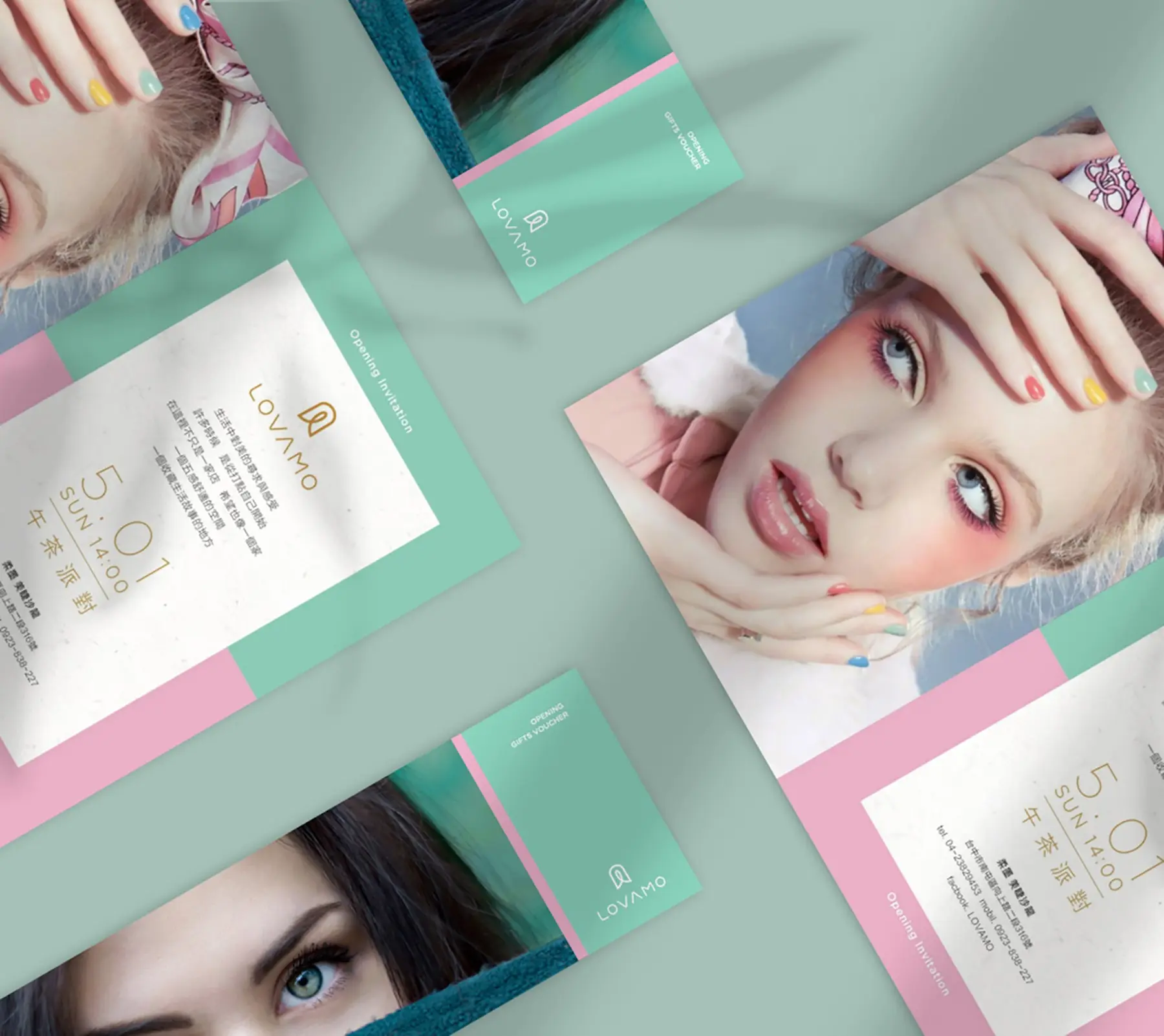
From Brand Identity to Visual Applications, Making Beauty Visible through Details
Eyelash and nail services rely heavily on detail, so Lovamo’s branding also needed to build quality through subtle visual decisions. Every lash and nail design is adjusted according to the customer’s eye shape, hand shape, personality, occasion, and lifestyle. This reflects the brand’s core belief: beauty is not a single standard. It is a personal expression that should respond to each individual’s condition and story.
In the visual system planning, we aimed to express a brand personality that is professional without being cold, and gentle without feeling weak. Through the logo, color palette, typography, image tone, and brand applications, Lovamo’s identity was organized into a more consistent system. Whether customers encounter the brand through social media, storefront visuals, business cards, booking information, or printed materials, they can feel the same delicate and recognizable brand atmosphere.
Good Eyelash Salon Branding Turns Professional Service into Brand Trust
The Lovamo branding project was not only about creating a beautiful logo for an eyelash salon. It was about helping the brand organize its service philosophy, customer experience, aesthetic tone, and market positioning into a long-term brand identity system. When a brand can clearly express what it values, who it is for, and what kind of experience it provides, customers can remember it more easily among many eyelash and nail salons.
For MASOU DESIGN, the value of branding is not only visual beauty. It is about using naming, logo design, visual identity, and brand application planning to make the brand core easier to understand. Lovamo’s concept of beauty from eyes to fingertips was ultimately translated into a Taichung eyelash salon brand image that feels gentle, professional, and highly recognizable.
✦ Talk to us about your beauty salon branding, eyelash salon brand identity, or logo design project.
✦ View more works in branding, logo design, and visual identity design.
✦ Back to home to learn how we help brands build clearer market recognition.
```