
2026.06.01
Eumer|Soft Botanical Beauty for Skincare
Skincare design is not only about explaining ingredients and benefits. It is also about creating a feeling that helps people understand the brand at first glance. Eumer focuses on botanical care, hydration, and daily skin recovery. Through a softer and more refined visual language, the product information is reorganized into a clean, elegant, and premium brochure style. The overall design uses open white space, delicate lines, soft colors, natural flowers, and product still-life compositions. These elements reduce visual clutter and create a smoother reading experience, allowing each product to stand out clearly while presenting a more high-end skincare image.
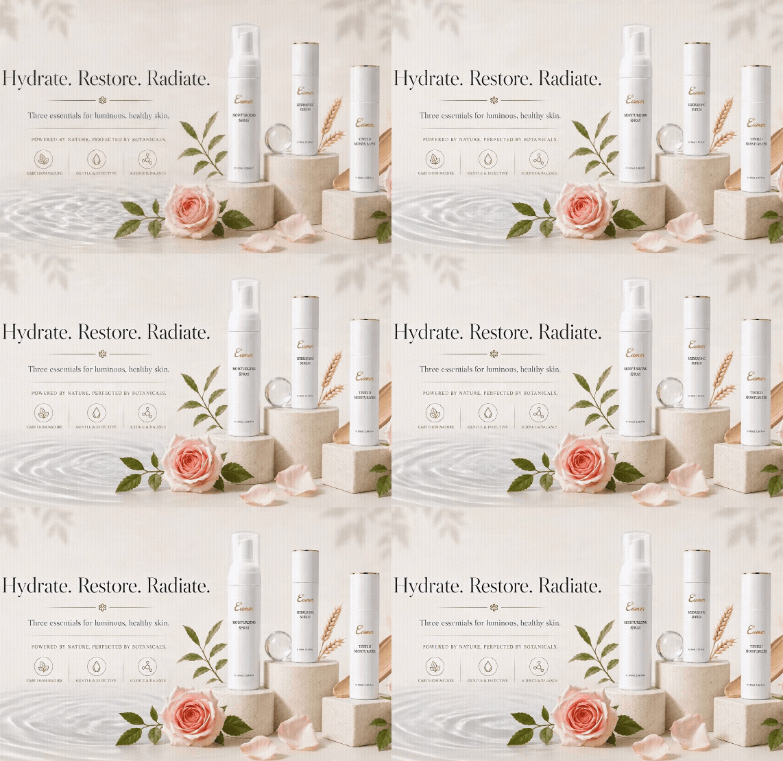
Turning skincare information into a softer and more refined brand experience
Skincare design is not only about explaining ingredients and benefits. It is also about creating a feeling that helps people understand the brand at first glance. Eumer focuses on botanical care, hydration, and daily skin recovery. Through a softer and more refined visual language, the product information is reorganized into a clean, elegant, and premium brochure style.
The overall design uses open white space, delicate lines, soft colors, natural flowers, and product still-life compositions. These elements reduce visual clutter and create a smoother reading experience, allowing each product to stand out clearly while presenting a more high-end skincare image.
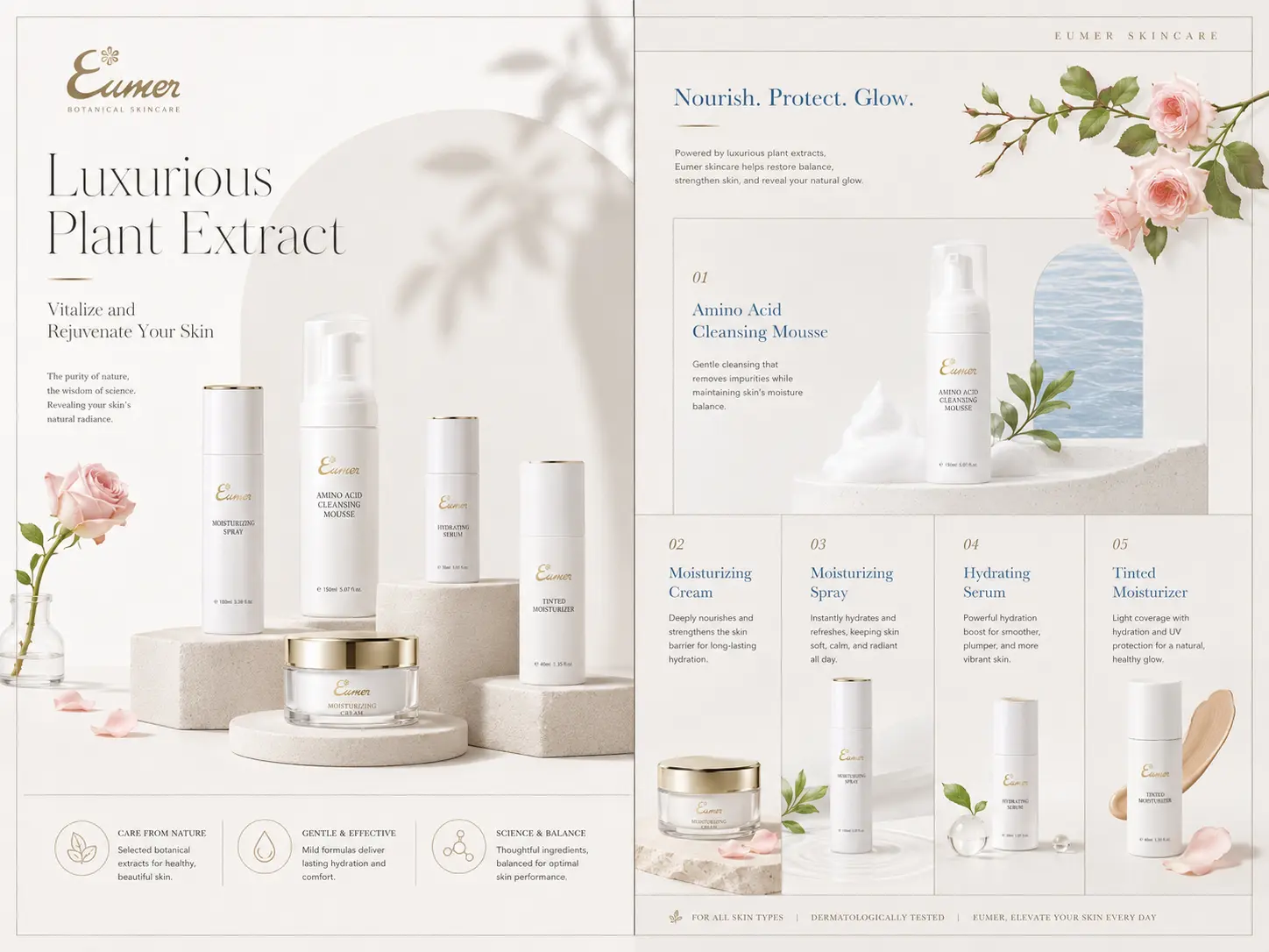
Using white space and refined typography to create a clearer reading rhythm
Skincare brochures often need to explain many things at once: ingredients, benefits, product features, usage, and brand messages. When everything tries to speak at the same time, the layout can easily become too crowded. For Eumer, we used a more restrained information hierarchy and a cleaner editorial rhythm to help readers understand the products step by step.
With delicate lines, soft tones, and balanced white space, the design does not need excessive decoration to look refined. Instead of filling every corner, the layout gives the information room to breathe. For a skincare brand, this visual clarity also communicates a sense of purity, comfort, and trust.
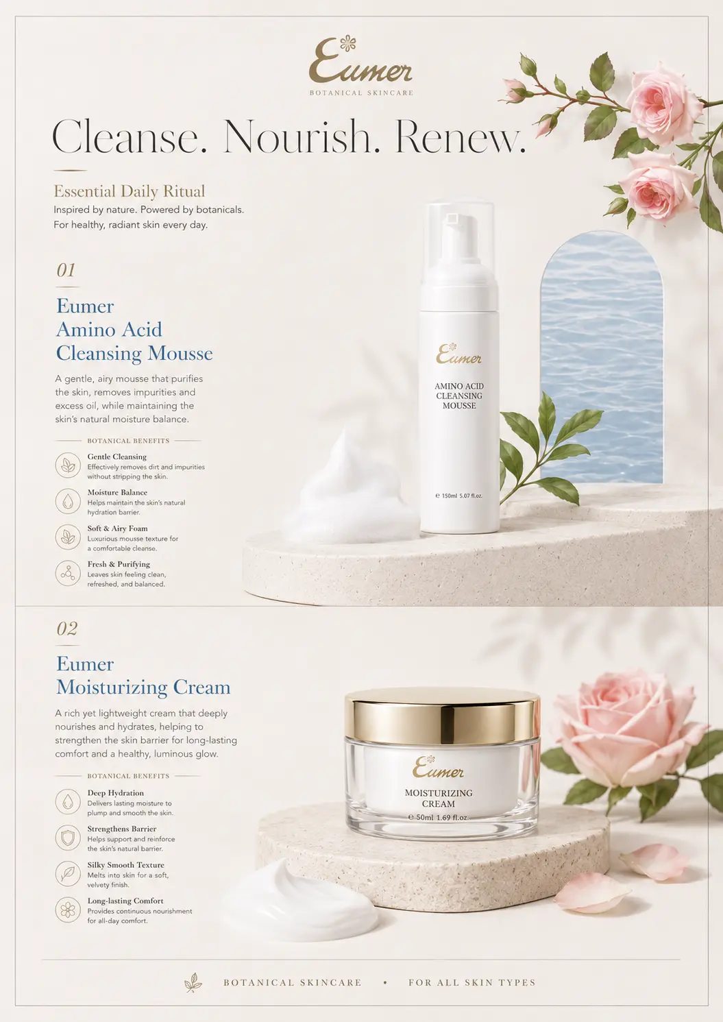
Building a botanical skincare image through natural flowers and soft light
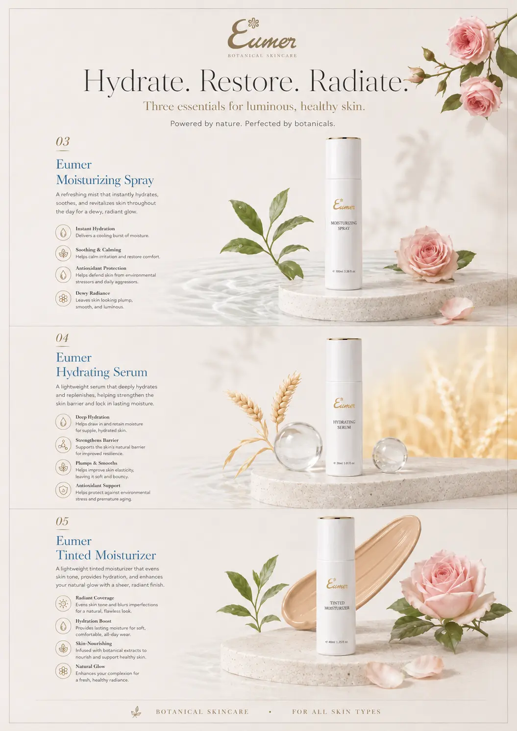
Since Eumer is built around botanical care, hydration, and daily recovery, the visual direction needed to feel gentle rather than overly clinical or visually heavy. Natural flowers, soft lighting, and product still-life compositions were used to create a calm and delicate impression, while keeping the products as the main focus of each layout.
In this way, the brochure becomes more than a product catalog. It becomes an extension of the brand experience. From content structure and image placement to the overall color tone, the design helps users read with ease, understand the products more clearly, and remember Eumer as a refined botanical skincare brand.
✦ Talk to us about your branding, website, or visual design project.
✦ View more works in branding, website, and visual design.
✦ Back to home to learn how we help brands build clearer design communication.