WORKS

Through different forms of design work, we reveal how each brand becomes clearer and more defined. Through branding, website design, packaging, and visual communication, we help clients clarify brand positioning, content structure, product information, and key messages — turning scattered ideas into clearer, more trustworthy design outcomes.

Brand Design, Website Design, and E-commerce Website Case Studies

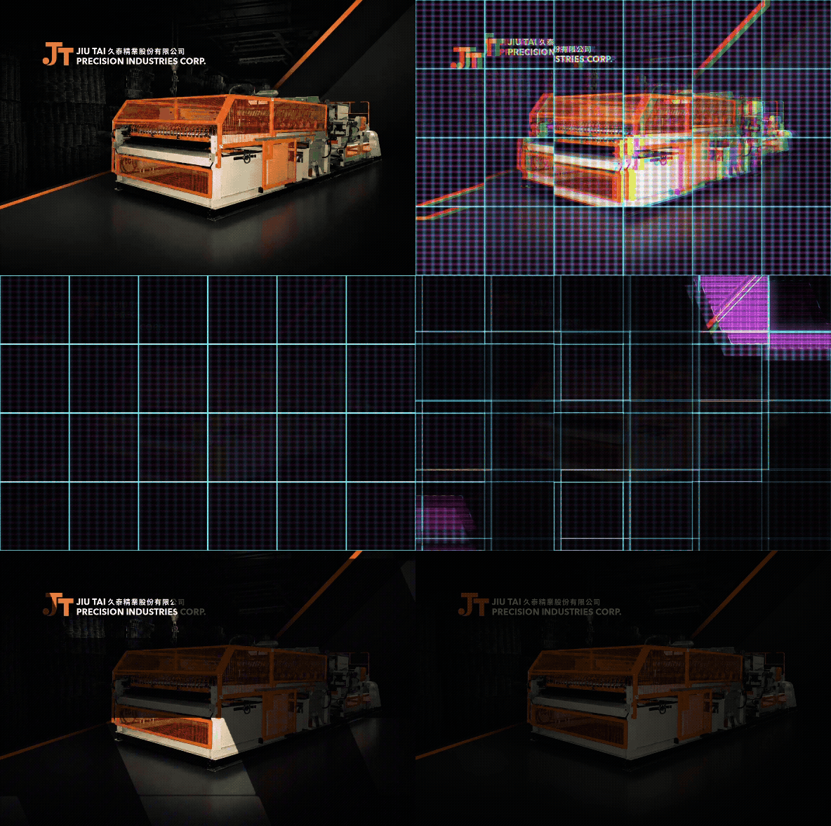
Jiandian Precision|ART & CRAFT IN PRECISION

Jiandian Precision website design centers on “ART & CRAFT IN PRECISION,” translating precision manufacturing, component processing, and craftsmanship into a clear and trustworthy digital brand image. MASOU DESIGN used clean layouts, steady visual rhythm, and structured content to help this B2B manufacturing brand present its technical capability, services, and professional value.

JS Logistics|Bear-Hearted Appliance Installation|Brand Identity Design

A memorable bear identity that turns appliance installation into a warmer and more trustworthy service experience. MASOU DESIGN created the brand identity and visual system for JS Logistics by transforming the founder’s friendly, steady, and thoughtful personality into “Bear Heart,” a character-based brand symbol. Through the bear logo, warm yellow brand color, appliance installation service icons, vehicle applications, and animated visuals, the brand message was simplified into one clear and recognizable image. Instead of trying to communicate every service detail at once, the identity helps customers remember JS Logistics through a sense of friendliness, reliability, and care.

Miss seesaw|Fast Beauty Aesthetics|Brand E-commerce Visual Design

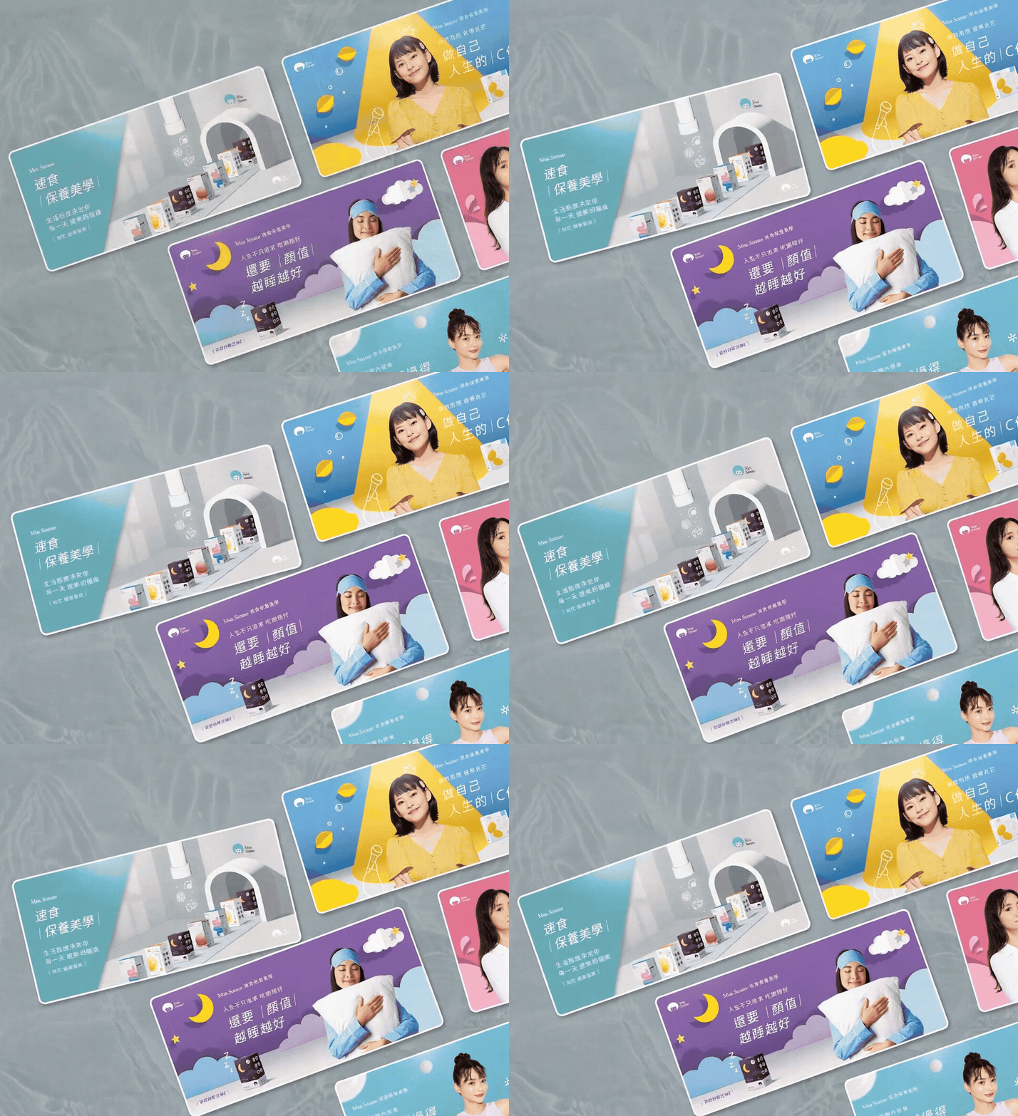
Lifestyle shapes the way beauty grows every day. MASOU DESIGN created the annual key visual series for Miss Seesaw under the concept of “Fast Beauty Aesthetics,” helping the brand build a stronger visual communication system for its e-commerce website, product pages, and digital marketing materials. The project transformed product features from skincare and functional food into a younger, lighter, and more dynamic visual language. Through paper-cut style backgrounds, vivid colors, product scenarios, and creative visual metaphors, the series communicates product impressions in a playful and approachable way without directly claiming product effects, making the brand more memorable in an e-commerce context.

Han He Xi Instant Cuisine|Tainan Banquet Heritage|Brand Identity and Packaging Design

At a time when many brands pursue modified typography and geometric logos, calligraphy became one of Han He Xi’s most distinctive brand assets. MASOU DESIGN created the brand identity and packaging design for Han He Xi Instant Cuisine, starting from Tainan banquet culture, the craftsmanship of a traditional Taiwanese banquet chef, and family recipe memories. Through a calligraphic wordmark, portrait illustration, handwritten recipe elements, and modern layout design, the brand communicates not only warmth and story, but also stronger recognition, product appeal, and brand personality in the frozen ready-to-eat food market.

AROS|A Romantic Fruit Cocktail Brand Design with a British Spirit

AROS is a cocktail brand that brings together fresh Taiwanese fruits and the spirit of British cocktail culture. MASOU DESIGN worked on the brand planning, verbal identity, visual identity, and overall brand image to create a fashionable, romantic, and refined cocktail brand system. The brand design is built around the contrast between freshly harvested Taiwanese fruits and classic British cocktail culture. It combines vivid fruit flavors with an elegant, polished, and celebratory drinking mood. Through the logo, color system, packaging visuals, and brand tone, AROS becomes more than a packaged cocktail product — it creates a relaxed, stylish, and memorable drinking experience made for moments of celebration.

ACETECK|Hydraulic Cylinder Brand Identity Design

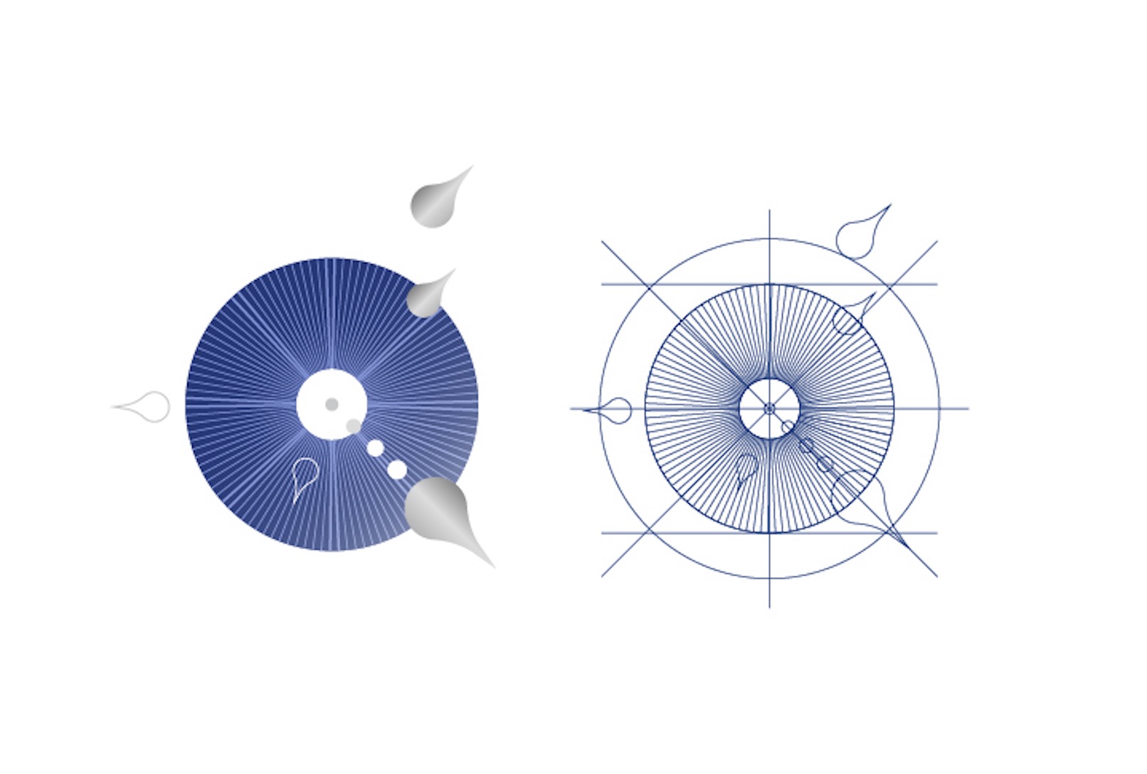
ACETECK is a B2B industrial brand specializing in hydraulic cylinder manufacturing, serving logistics equipment, industrial machinery, and various mechanical systems. This brand identity design project is built around the ideas of precision, power, and stability, transforming the initial letter A into a visual symbol inspired by hydraulic cylinder structure. Through logo design, corporate identity, department icons, uniforms, catalog design, and factory signage applications, MASOU DESIGN helped ACETECK build a clearer and more consistent B2B industrial brand identity. The new visual system supports the brand across its website, exhibitions, catalogs, and international market communication, creating a professional impression of precision manufacturing and reliable industrial quality.

WEITEH|A Deeper Sense of Flavor in Every Drop

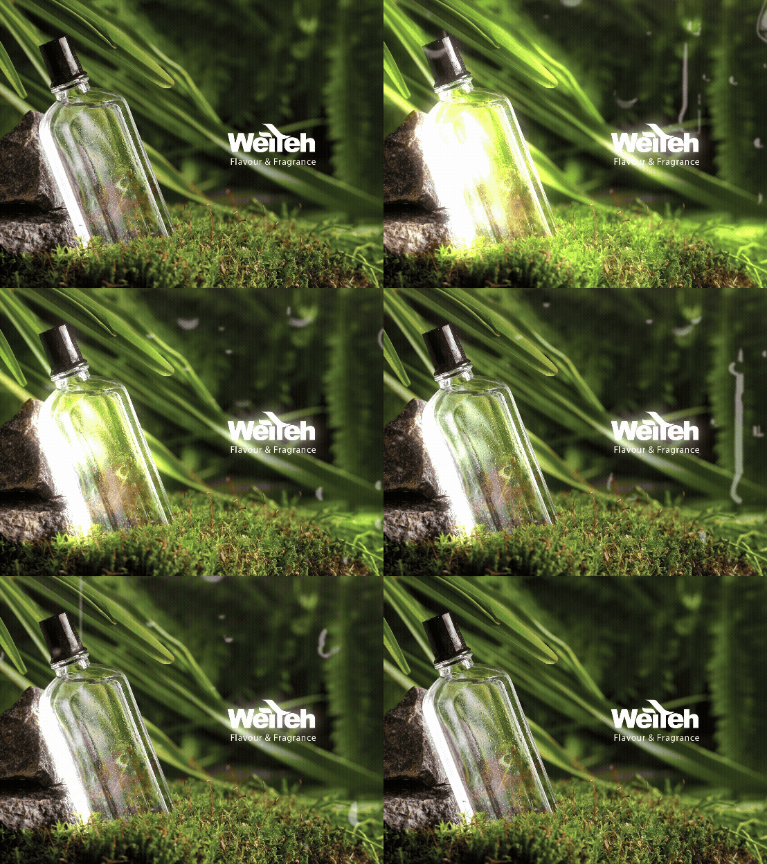
Helping one of Asia’s top three flavor manufacturers communicate its professional expertise through website design and copywriting. MASOU DESIGN created the website design and website copy for Vete Biotech, organizing the company’s half-century of flavor research experience, professional flavor development, customized services, and international market position into a clearer digital presentation. Through the website slogan “A Deeper Sense of Flavor in Every Drop,” we translated the precision, sensitivity, and craftsmanship behind flavor manufacturing into a more memorable communication language, helping the B2B website express stronger professionalism, clarity, and trust.


VELO OEM Products Guide

MASOU DESIGN created the design and layout for the VELO OEM Products Guide. For this nearly 100-page catalog, we adopted a minimalist design approach to reflect the brand’s commitment to product innovation and environmental responsibility. Through clean layouts, clear product series markers, and a consistent editorial system, the guide became not only a product showcase, but also a more intuitive and practical brand communication tool.

FuseConnect|APP Design and Development

MASOU DESIGN created the UI design and app development for FuseConnect, a mobile application designed for fiber fusion splicer engineers. The app helps users receive photo records and machine-generated data after each fusion splicing process, transforming technical information into clearer and more readable frontend content. Built with the Flutter framework, FuseConnect provides a clean interface, intuitive operation flow, wireless device connectivity, and practical data management features for engineering teams.

Swiss Krono|A Century of European Heritage

We created the website design and content presentation for Swiss Krono’s Taiwan representative, building a clear and refined digital experience based on the brand’s original European wood-based material identity and existing VI direction. Instead of creating a separate visual identity, the design respects Swiss Krono’s established brand style and translates it into a website structure with stronger consistency, recognition, and professional presence in the Taiwan market. The website was planned around clear product browsing and information delivery. Product details such as large-format boards, single boards, and full-surface panels are organized in a more accessible way, while the series-based classification system helps users quickly understand and compare collections such as Milo, Sigma, and Exclusive. Through a consistent visual rhythm, European-inspired layout style, and well-structured product information, the website strengthens Swiss Krono’s brand recognition while making the browsing experience clearer, more intuitive, and more aligned with the brand’s original identity.

ROPERS | RELIABLE TO THE CORE

ROPERS is a Taiwan-based professional rope brand founded in 1981, specializing in the manufacturing, assembly, and global supply of high-quality rope products. Its applications span outdoor leisure, commercial marine, industrial safety, fishery, aviation, and mining. The brand statement “RELIABLE TO THE CORE” communicates not only the strength and durability of its ropes, but also the brand’s commitment to precision manufacturing, material quality, and long-term reliability. For this project, we extended the ROPERS brand identity across business cards, product catalog design, and corporate stationery applications. The visual system centers on the logotype, preserving the brand’s industrial and professional character while using a striking fluorescent orange as the key visual color. The target-like “O” in the logo also reinforces the ideas of precision, reliability, and control. Through spot color printing, silver foil stamping, and transparent foil details, the printed materials give ROPERS a sharper, more refined, and more memorable presence in the B2B industrial market.

X’MONSTER|Absolute Reliability

Some brand identities are not created for a single launch. They are designed to be used, maintained, and remembered over time. X’Monster is a long-term safety protection brand we have worked with for more than 15 years. From the original brand identity design to later extensions across websites, catalogs, product visuals, and market communication materials, this project has never been just a one-time design case. It is a visual system that has continued to grow with the brand. “Absolute Reliability” represents more than a brand statement for X’Monster. It reflects the core value the brand wants to communicate in the safety protection industry: reliability, stability, professionalism, and trust. This work is not only about showing the brand design itself, but also about how a consistent visual language, clear product communication, and long-term design applications can help a brand build stronger recognition in its market.