
2026.10.07
Here For You|Senior Care & Aging in Place Website Design
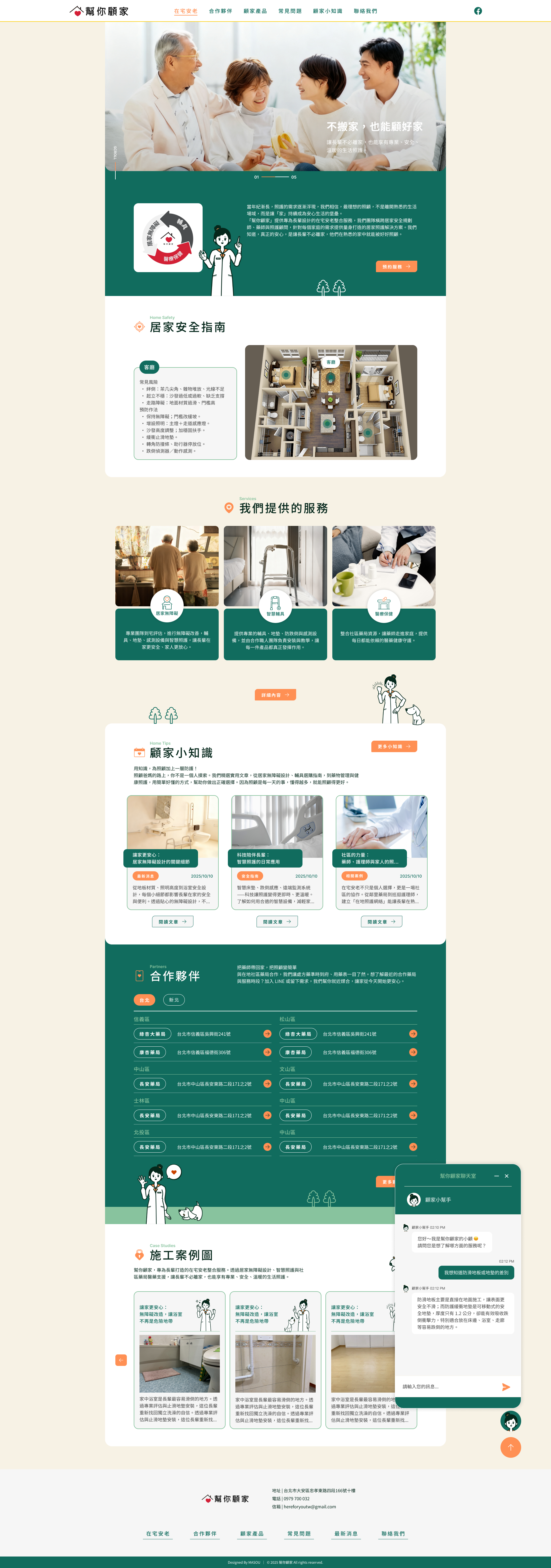
Building a Senior Care Brand Website That’s Easier to Understand and Use Centered on the concept of aging in place, Here For You brings together home accessibility solutions, smart assistive devices, healthcare services, and home safety products—helping older adults continue living in familiar surroundings with greater safety and peace of mind. MASOU Design restructured the overall digital experience through brand communication, information architecture, UI/UX design, character illustration, and SEO content planning. By organizing information across multiple areas of senior care into a clearer and more intuitive system, the website makes it easier for users to understand their options, find relevant information, and take the next step.
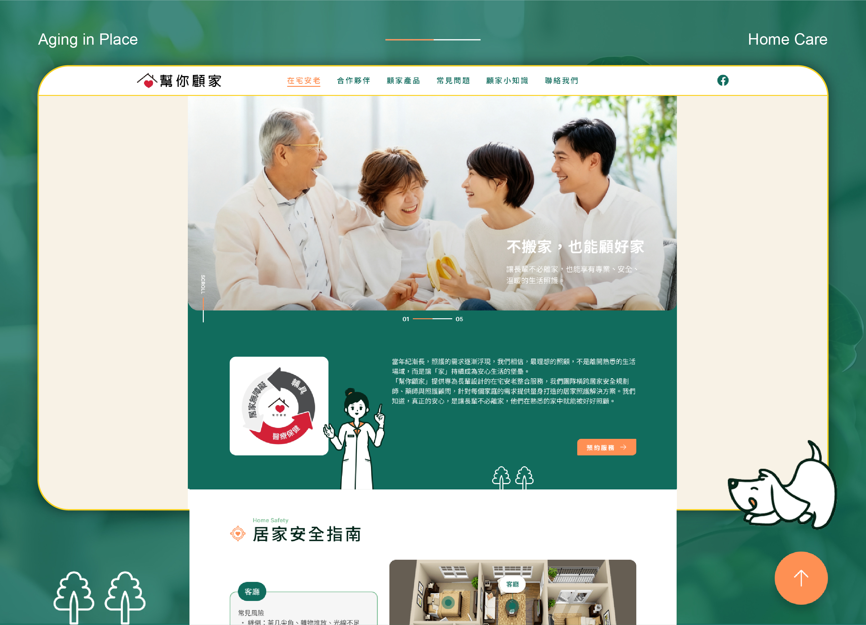
Reframing Complex Care Information Around Aging in Place
Senior care involves a wide range of professional considerations, including home safety, accessibility improvements, assistive devices, health management, and product selection. For families exploring these topics for the first time, the real challenge is often not a lack of information, but knowing where to begin.
Rather than simply reorganizing existing services, this senior care website design project started with the everyday situations users are most likely to face.
Can an older adult get out of bed safely? Is the bathroom prone to slips and falls? Is there enough lighting for nighttime movement? Can a wheelchair move smoothly through the home?
With “Stay at Home, Stay Well Cared For” as the core communication concept, we restructured the website around home accessibility, smart assistive devices, and healthcare services. The goal was to help users first understand their own living needs, then discover the most relevant solutions.
As a result, the website goes beyond brand presentation. It becomes an accessible starting point for families to better understand aging in place, senior home safety, and home care solutions.
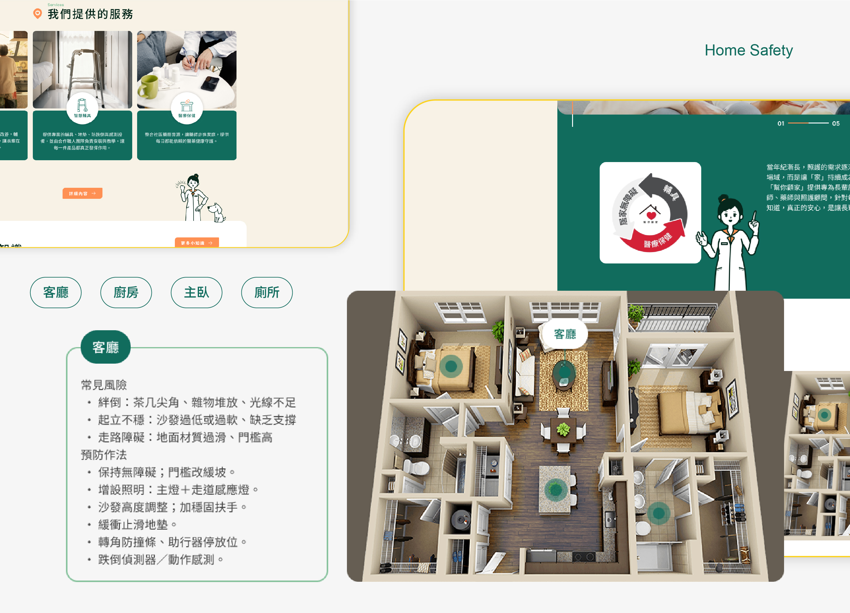
Making Home Safety Easier to Understand
For the website’s information architecture, we did not rely solely on service-based categories. Instead, we introduced familiar everyday spaces to help users understand senior care through the environments where safety issues actually occur.
On the homepage, we designed an interactive Home Safety Guide organized around key areas of the home, including the living room, master bedroom, kitchen, and bathroom.
By selecting a specific space, users can explore common safety risks and the corresponding prevention methods for that area.
For example, bathroom safety may involve slippery floors, insufficient support when standing up, or difficulties entering and exiting the space. In the bedroom, key concerns may include getting in and out of bed, nighttime lighting, and the route from the bedroom to the bathroom.
Through a simple Space → Risk → Prevention interaction flow, users can explore relevant information without needing to understand complex senior care or accessibility terminology first.
This UX approach transforms the website from a standard service introduction into a more practical home safety resource, helping families recognize potential risks and understand how to respond.
Using Brand Colors and Character Illustration to Make Care Feel More Approachable
Senior care websites can easily fall into the visual language of traditional healthcare—cool color palettes, generic stock photography, and an institutional atmosphere.
For Here For You, we wanted to retain a sense of professionalism while making the overall experience feel more approachable and human.
The visual identity is built around deep green, warm orange, and soft neutral tones.
Deep green communicates trust, health, and stability, while also connecting naturally with the idea of home and everyday living. Warm orange is used as an emotional and interactive accent across hearts, alerts, buttons, and character details, adding warmth to the interface. Large areas of soft beige and low-saturation neutrals help keep information-heavy pages calm and comfortable to read.
The visual direction can be summarized as:
Professional, but never cold.
Warm, but never overly sentimental.
Beyond the interface itself, we also developed a dedicated character illustration system for Here For You.
A female pharmacist serves as the primary brand character, supported by a range of poses, expressions, and everyday care scenarios, along with illustrations of older adults, pets, and home environments.
These illustrations are not simply decorative. They act as an important communication layer between the brand and its users, helping professional topics such as healthcare, senior care, and home safety feel more natural, friendly, and easier to understand.
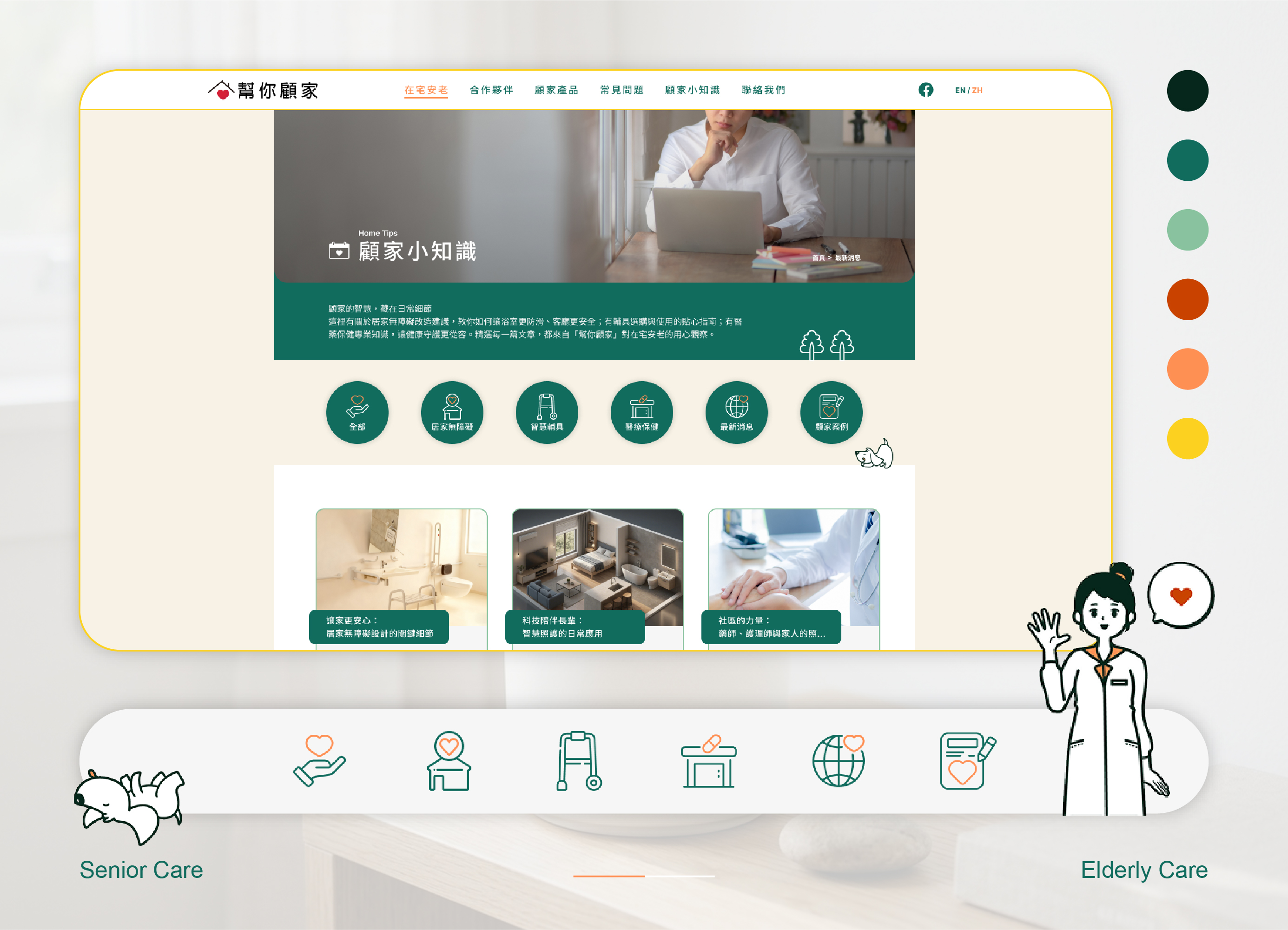
Creating a Consistent Brand Experience
The website UI extends the brand’s clean and approachable visual language through a consistent system of cards, content categories, icons, buttons, and reusable content modules. This helps different types of services, products, and educational content follow the same clear reading and interaction logic.
Navigation and category icons use a simple linear style, combined with the brand’s primary green and warm orange accents, allowing users to quickly distinguish key content areas such as:
Home Accessibility, Smart Assistive Devices, Healthcare, Latest News, and Care Stories.
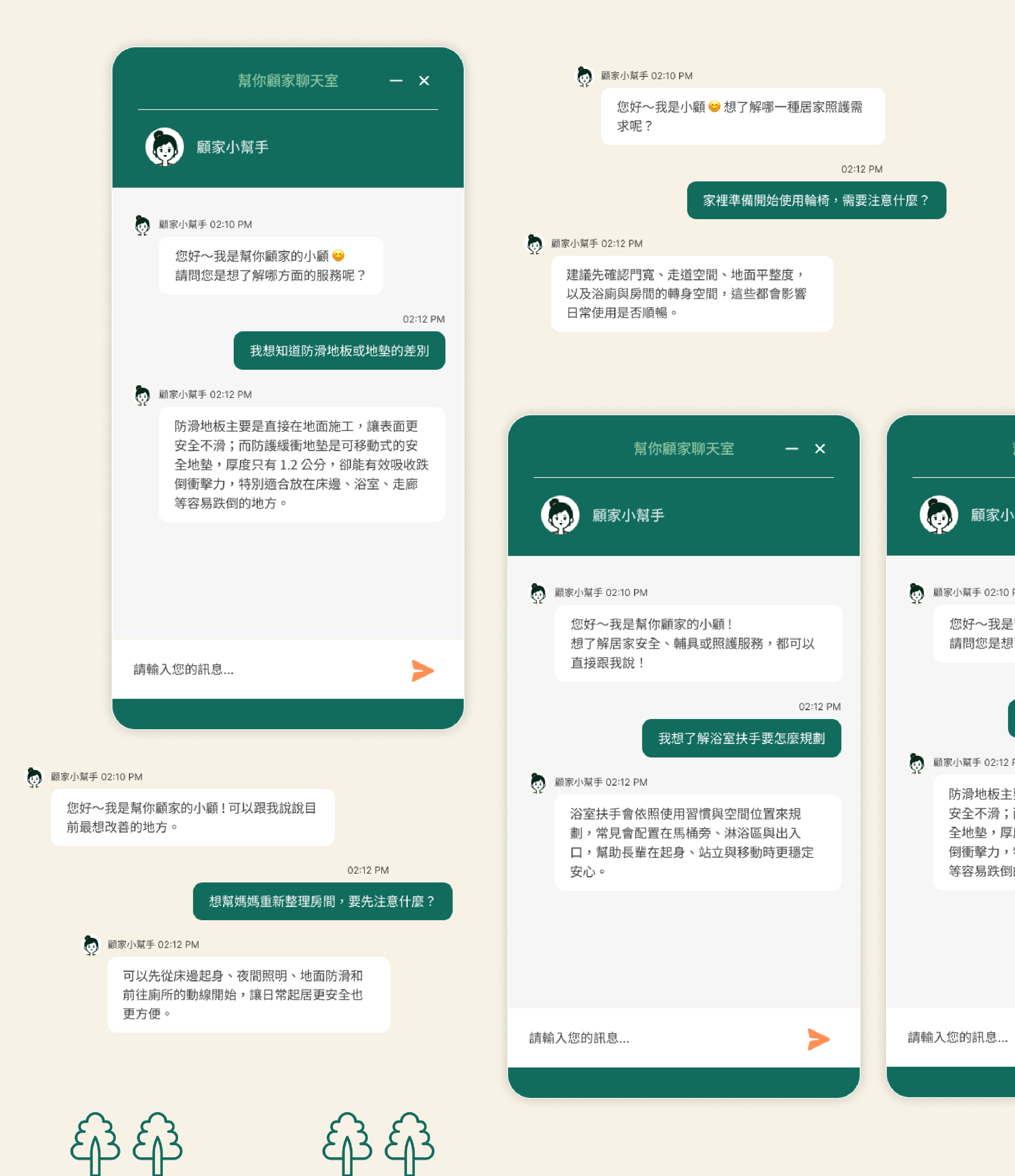
We also carried the pharmacist character into the website’s consultation experience.
Traditional customer service chat windows can often feel impersonal, so we transformed the chat entry point into a more approachable Here For You Assistant experience.
Users can ask practical questions such as:
“Where should bathroom grab bars be installed?”
“What’s the difference between anti-slip flooring and protective floor mats?”
“What should we consider when using a wheelchair at home?”
By turning customer support into a character-led conversation, the experience feels less like “contacting customer service” and more like “having someone to ask.”
This not only lowers the barrier to asking questions, but also extends the brand character from illustration into an actual conversational UX experience, creating a more consistent and human-centered senior care website.
Making Complex Care Choices Easier to Understand and Act On
The Here For You website brings together information that was previously spread across home modifications, smart assistive devices, healthcare services, and safety products, reorganizing it into a cohesive digital experience centered on aging in place.
From information architecture and the interactive Home Safety Guide to brand colors, character illustrations, chat-based consultation, product content, and SEO strategy, every design decision was guided by one core question:
How can we make care information easier to understand—and help users feel more confident taking the next step?
An effective senior care website is not simply about presenting information beautifully.
More importantly, professional care information needs to be easy to understand, easy to find, and clear enough to guide users toward the right action when support is needed.
That is the core value we set out to build through the Here For You website design.
At MASOU Design, we approach every project by connecting brand positioning, information architecture, UI/UX design, illustration, and SEO content strategy—creating websites that are not only visually engaging, but also easier to understand, easier to discover through search, and better equipped to support long-term brand growth.
▸ Learn more about our Website Design Services, or Contact Us.
▸ Browse our UI/UX & Digital Design Projects to explore more interface and digital platform design work.
▸ Return to the Homepage to discover more about our branding and website design services.