
2026.10.06
Black Bear Play|Brand IP & Website Design
Black Bear Play is an entertainment platform that brings together electronic games, live games, game introductions, strategy content, and game provider information within one digital experience. For this project, MASOU Design went beyond interface styling. We developed an integrated brand system that connects brand IP design, character development, website visual direction, and UI/UX components into one recognizable digital identity. The brand concept was built around the idea of “Black Bear Territory.” From this foundation, two core IP characters were developed: The Boss and The Guardian. The Boss represents intelligence, strategy, confidence, and control, while The Guardian represents strength, order, fairness, and protection. Together, they form a complementary character system that transforms a functional gaming platform into a distinctive brand world. The website extends this identity through a visual system based on purple, black, and gold, combined with character-driven imagery, gaming elements, cards, lighting effects, and modular interface components. The result is a gaming website that balances entertainment, brand recognition, content hierarchy, and usability.
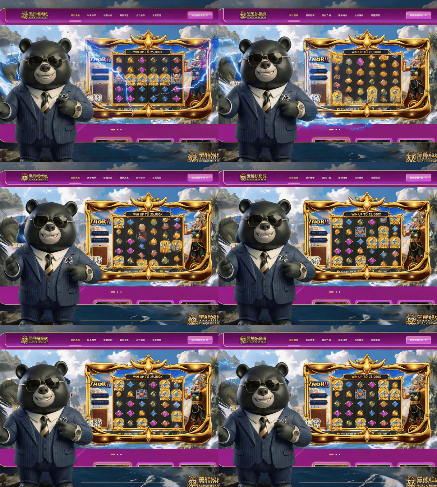
Building “Black Bear Territory” from a Gaming Platform
Many gaming websites focus heavily on promotional banners, game cards, and high-impact visuals. When every platform uses similar imagery, jackpot numbers, and saturated colors, it becomes difficult to build a memorable brand identity.
For Black Bear Play, MASOU Design approached the website as more than a gaming interface. Instead of using the characters simply as mascots, we first built a complete brand world around one core concept:
BLACK BEAR TERRITORY
The black bear represents more than the brand name. It symbolizes strength, awareness, intelligence, and a strong sense of territory.
From this idea, users are not simply entering a gaming platform—they are stepping into a branded world shaped by characters, rules, information, and gameplay.
The visual and brand language was built around four key values:
Strategy × Strength × Order × Protection
These principles became the foundation for the character IP design, website UI/UX, color system, card components, and overall visual direction.
Together, The Boss and The Guardian further define the brand through two complementary ideas: smart strategy and strong protection.
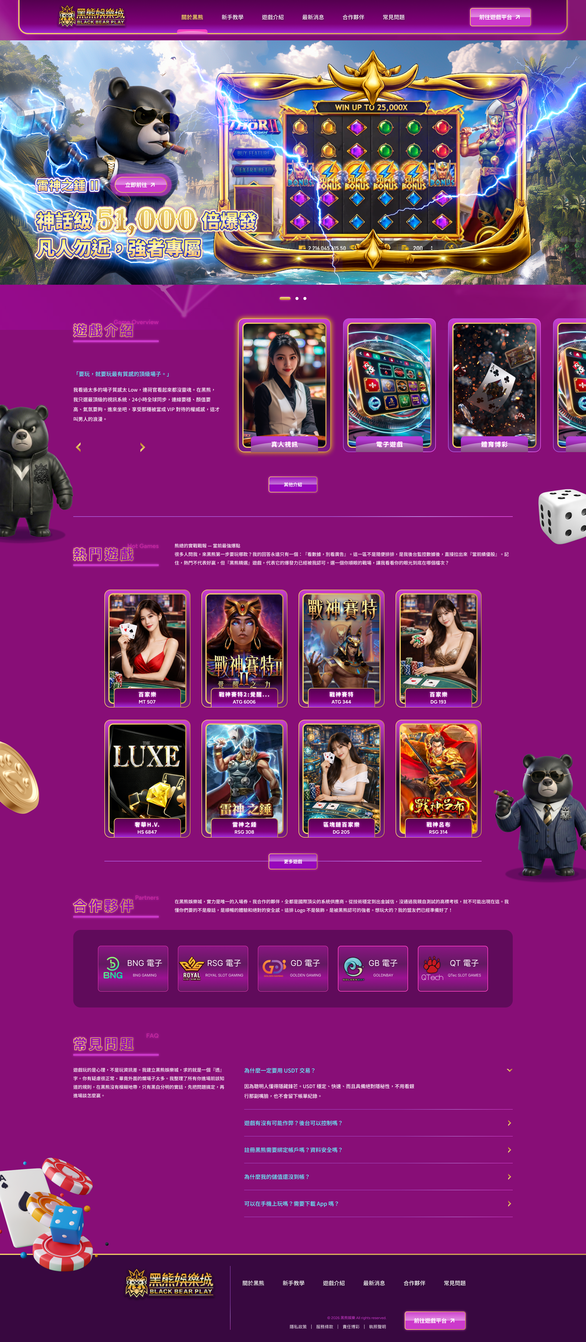
Bringing Brand, Games, and Content Together
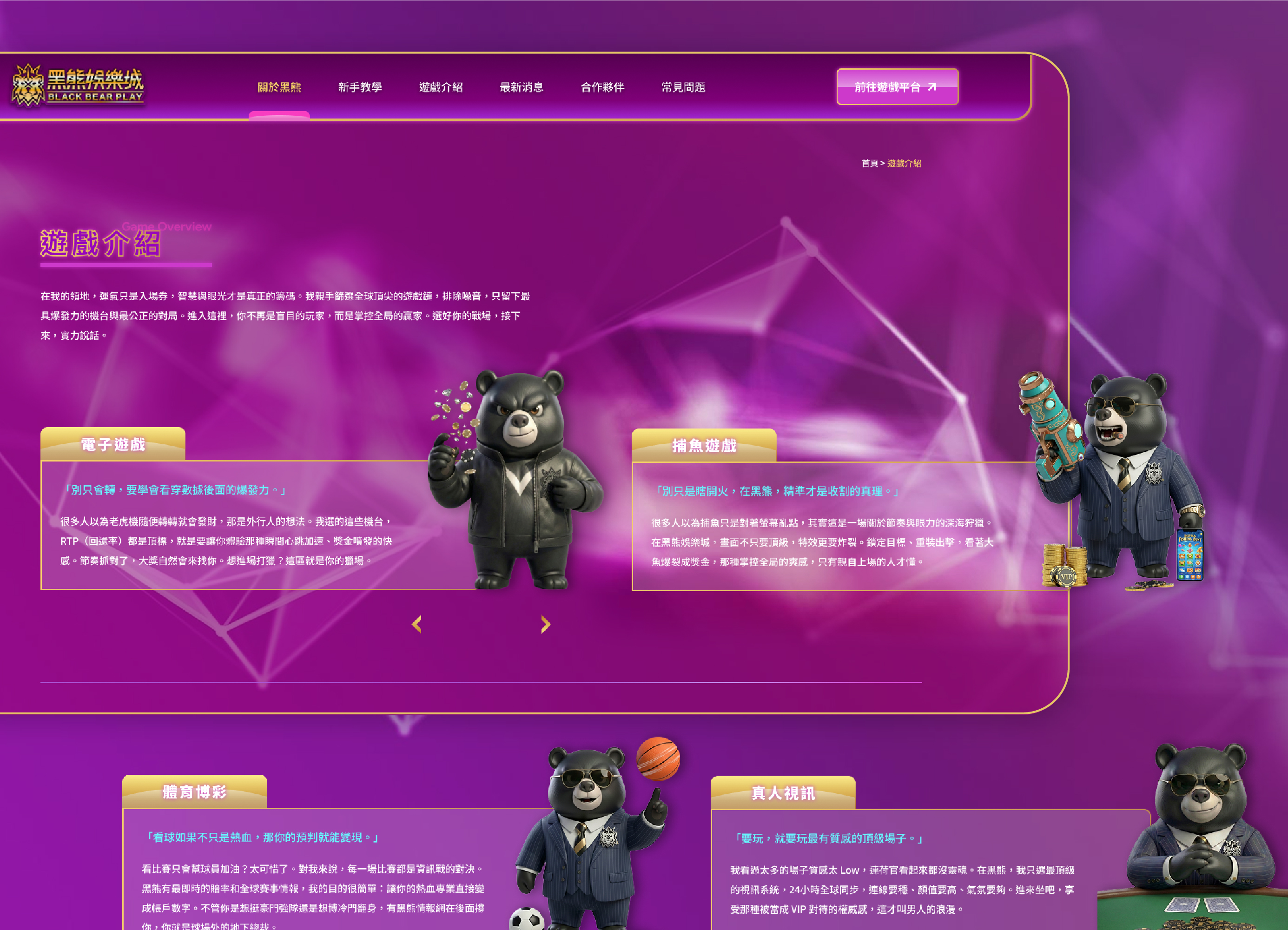
The Black Bear Play homepage needs to organize a large amount of content, including electronic games, live games, sports, fishing games, individual game pages, strategy guides, game providers, and FAQs.
The key design challenge was not simply making the homepage more visually exciting, but creating a clear reading flow within a content-heavy gaming website.
MASOU Design structured the homepage into clear layers:
The Hero section establishes the brand atmosphere and character identity.
Game categories help users quickly understand the platform.
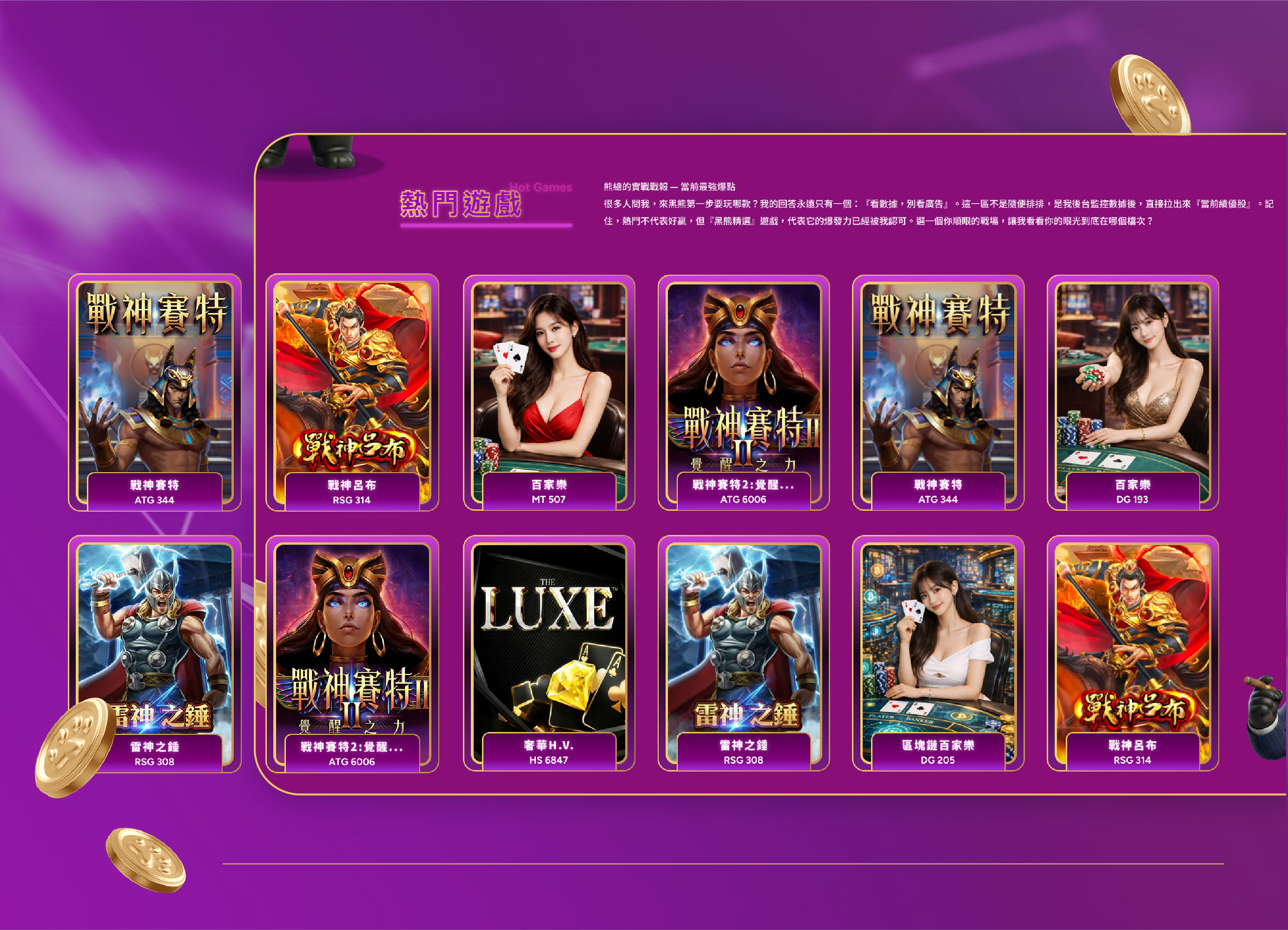
Popular titles are organized into a card-based browsing system.
Strategy content, game providers, and FAQs are introduced progressively afterward.
The overall information structure follows:
Brand Awareness → Game Categories → Game Selection → In-Depth Content → Brand Trust
This allows the homepage to deliver both entertainment value and effective website navigation.
Characters as the First Visual Impression
The homepage Hero is designed to do more than promote a single game.
We combine the Black Bear characters, game visuals, and bold headlines within the same composition to strengthen brand recognition while maintaining strong content appeal.
Even when featured games change over time, users can still recognize the brand through its characters, purple-and-gold color system, and consistent visual language.
That is the key difference between a branded gaming website and a temporary campaign banner:
The content can change, but the brand identity should remain.
Character IP Design Strategy
Character IP design is more than creating a mascot.
For MASOU Design, every character should answer three questions:
Who does the character represent?
What role does the character play?
How does the character communicate for the brand?
For Black Bear Play, we developed a dual-character IP system.
Both bears share the same brand DNA, but differ in personality, styling, behavior, tone of voice, and function. This allows the characters to become part of the website experience rather than remaining decorative elements in a logo or banner.
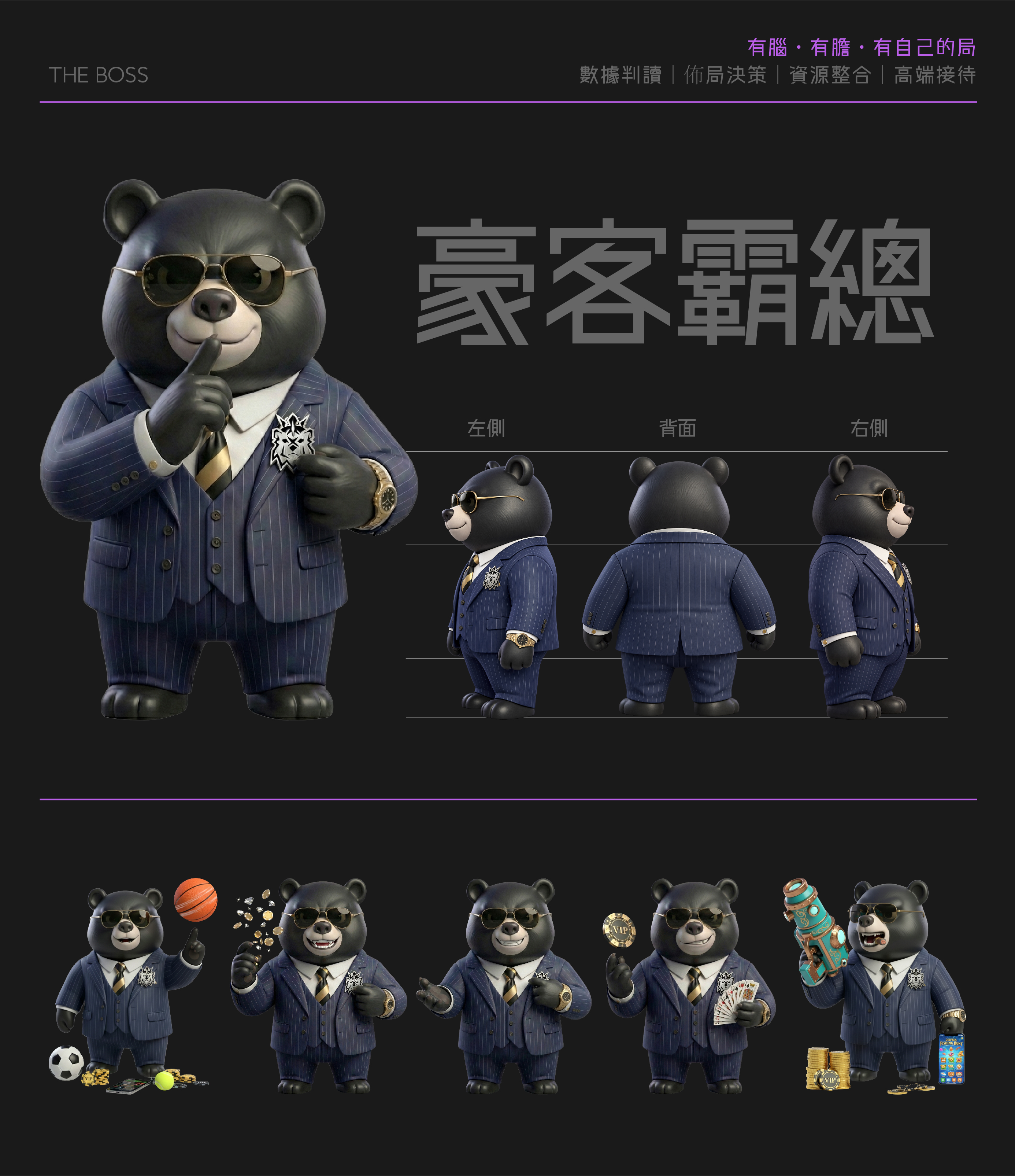
豪客霸總|THE BOSS
The embodiment of intelligence, strategy, and control
The Boss represents the strategic side of the Black Bear brand.
His dark pinstripe suit, gold accessories, aviator sunglasses, and composed posture create a mature, confident, and authoritative personality.
Role
Strategy Leader
Positioning
Strategic Thinker・Master of the Game
Core Traits
Calm・Calculated・Confident・Composed
Key Functions
Data Analysis・Strategic Planning・Resource Coordination
Belief
Think smart. Play bold. Own the game.
Rather than simply symbolizing wealth, The Boss represents a player who understands the situation and knows how to make the right choice.
Within the website, he is used across game recommendations, category pages, strategy content, and data-driven information, turning functional content into a more character-led brand experience.
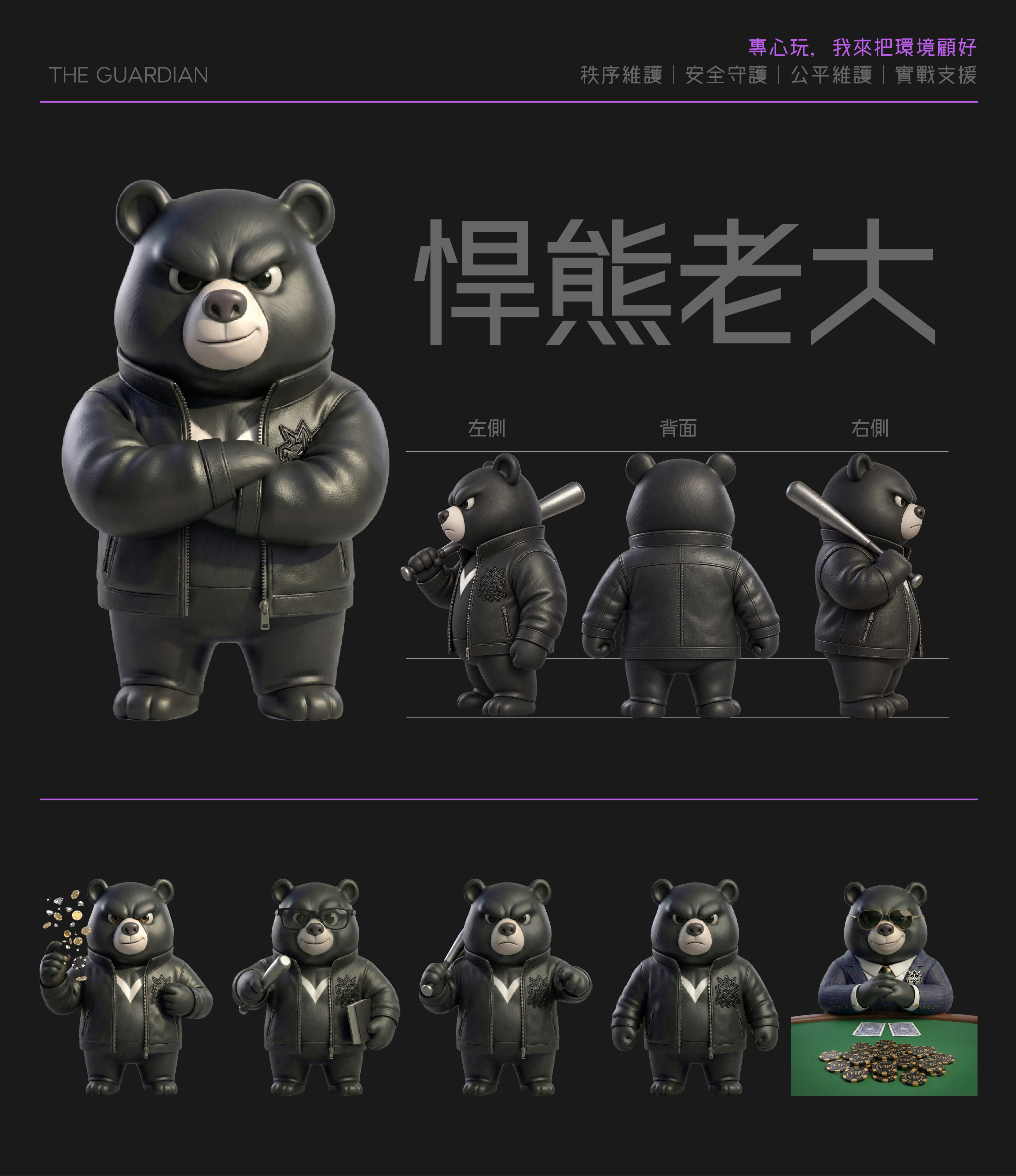
悍熊老大|THE GUARDIAN
The embodiment of strength, order, and protection
If The Boss reads the game, The Guardian protects the territory.
His black leather jacket, metal bat, Black Bear emblem, and stronger expression create a completely different visual identity.
Role
Order Guardian
Positioning
Guardian of Black Bear Territory
Core Traits
Strong・Decisive・Reliable・Loyal
Key Functions
Order Management・Security Protection・Fair Play
Belief
You focus on the game. I’ll protect the ground.
Together, The Boss and The Guardian form a complementary character system—one built around strategy and intelligence, the other around strength and protection.
This gives the Black Bear IP more than visual variety. Each character has a clear role within the brand and the overall gaming website experience.
Color System|Purple × Black × Gold
The Black Bear Play visual identity is built around three key colors: purple, black, and gold. Together, they create a distinctive gaming website design system that feels energetic, premium, and recognizable.
Purple|Entertainment & Digital Energy
Purple is the most recognizable background color across the website.
Its mix of entertainment, technology, nightlife, and stage-like atmosphere makes it ideal for presenting rich gaming visuals without feeling as heavy as a fully black interface.
By combining deep violet, bright purple, and magenta, we created clear visual layers for sections, highlights, and interactive states.
Black|Strength & Brand Identity
Black reflects the Black Bear identity and forms the visual foundation shared by both characters.
It reduces background noise, strengthens the premium mood, and gives game content and character imagery more visual impact.
Gold|VIP & Premium Value
Gold is used selectively rather than excessively.
It appears in borders, buttons, titles, badges, and key interactive elements, helping guide attention while adding a refined VIP feel.
Combined with purple and black, the gold accents create a strong and mature visual language for the Black Bear gaming brand.
UI System Design|Built for Scalable Growth
One of the biggest UI challenges for a gaming platform is that content keeps growing.
If every new game requires a new layout, the website quickly loses visual consistency. For Black Bear Play, MASOU Design created a reusable UI component system that can scale with future content while maintaining a unified gaming website design.
Game Card|Game Content System
Game Cards are among the most frequently used UI components across the website.
The information hierarchy focuses on:
Game Cover → Game Title → Category / Provider → Hover or CTA
By standardizing image ratios, corner radius, borders, purple-and-gold accents, and spacing, different game styles can still feel consistent within the same visual system.
Category Card|Quick Content Navigation
Live games, electronic games, sports, and fishing games are presented through larger visual category cards.
Compared with text-only navigation, image-based cards make categories easier to understand at a glance and support faster browsing across a content-heavy entertainment platform.
Button & CTA|Clear Interaction Hierarchy
CTA buttons continue the brand’s purple gradients, glow effects, and gold details, but not every action is given the same level of emphasis.
Primary CTAs receive the strongest visual treatment, secondary actions use reduced brightness, and text links remain clean and minimal.
This creates a clearer interaction hierarchy while preserving the energetic gaming atmosphere.
Borders, Glow & Decorative Elements
Glow effects, metallic borders, lines, and gaming-inspired details are treated as part of a consistent visual language rather than decoration alone:
Purple Glow → Interaction & Digital Energy
Gold Border → Emphasis & Premium Value
Dark Panels → Content Structure
Characters → Brand Personality
Chips, Dice & Cards → Gaming Atmosphere
By repeating these elements with consistent rules, the website maintains a recognizable brand identity even as content continues to expand.
Website Design × SEO|Building Content Pathways Beyond Visuals
Beyond brand visuals and character IP design, the Black Bear Play project was also planned for long-term content growth and SEO.
Instead of placing everything on the homepage, the website expands through dedicated content such as game introductions, individual strategy guides, RTP, Wild, Scatter, Free Spins, special features, and game provider pages.
The content structure follows a scalable path:
Category Pages → Game Introductions → In-Depth Guides → Related Content
For SEO-focused website design, the goal is not simply to place more keywords on the homepage. It is to create the right page for each search intent and make that content easy to discover.
At MASOU Design, we believe:
Visual design attracts users. Information architecture helps them find the right content.
For us, this project was more than a gaming website design.
The real challenge was integrating:
Brand Strategy, Character IP, Website Visuals, UI/UX, Content Architecture, and SEO
into one consistent system.
Starting from the concept of Black Bear Territory, we developed two distinct brand personalities through The Boss and The Guardian—one representing strategy and intelligence, the other strength and protection.
These character identities were then extended across the homepage, game cards, category interfaces, strategy content, and overall visual system.
Our goal was not to create a website that only feels exciting at first glance.
It was to build a brand experience recognizable through its characters, colors, interface, and tone of voice—even without the logo.
For MASOU Design, this is what brand website design means:
A great website does not simply place a brand into the interface—the entire user experience becomes the brand.
▸ Learn more about our Website Design Services, or Contact Us.
▸ Browse our UI/UX & Digital Design Projects to explore more interface and digital platform design work.
▸ Return to the Homepage to discover more about our branding and website design services.