WORKS

Through different forms of design work, we reveal how each brand becomes clearer and more defined. Through branding, website design, packaging, and visual communication, we help clients clarify brand positioning, content structure, product information, and key messages — turning scattered ideas into clearer, more trustworthy design outcomes.

Brand Design, Website Design, and E-commerce Website Case Studies

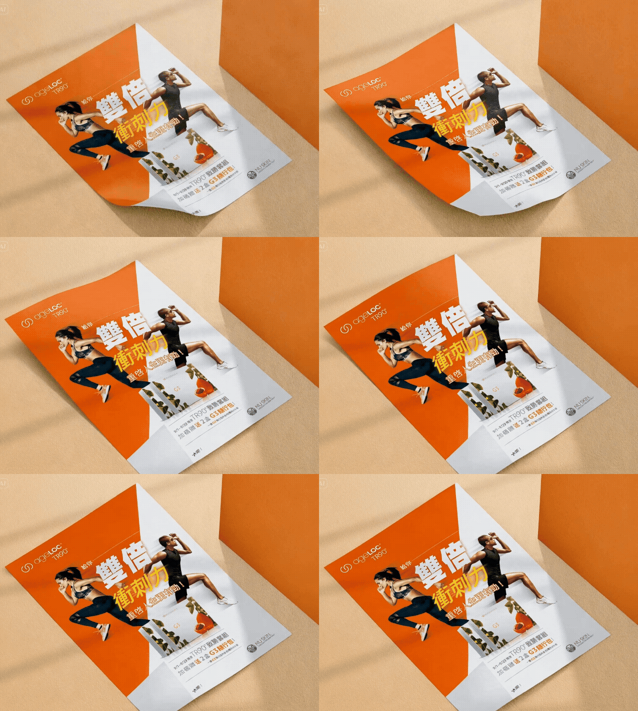
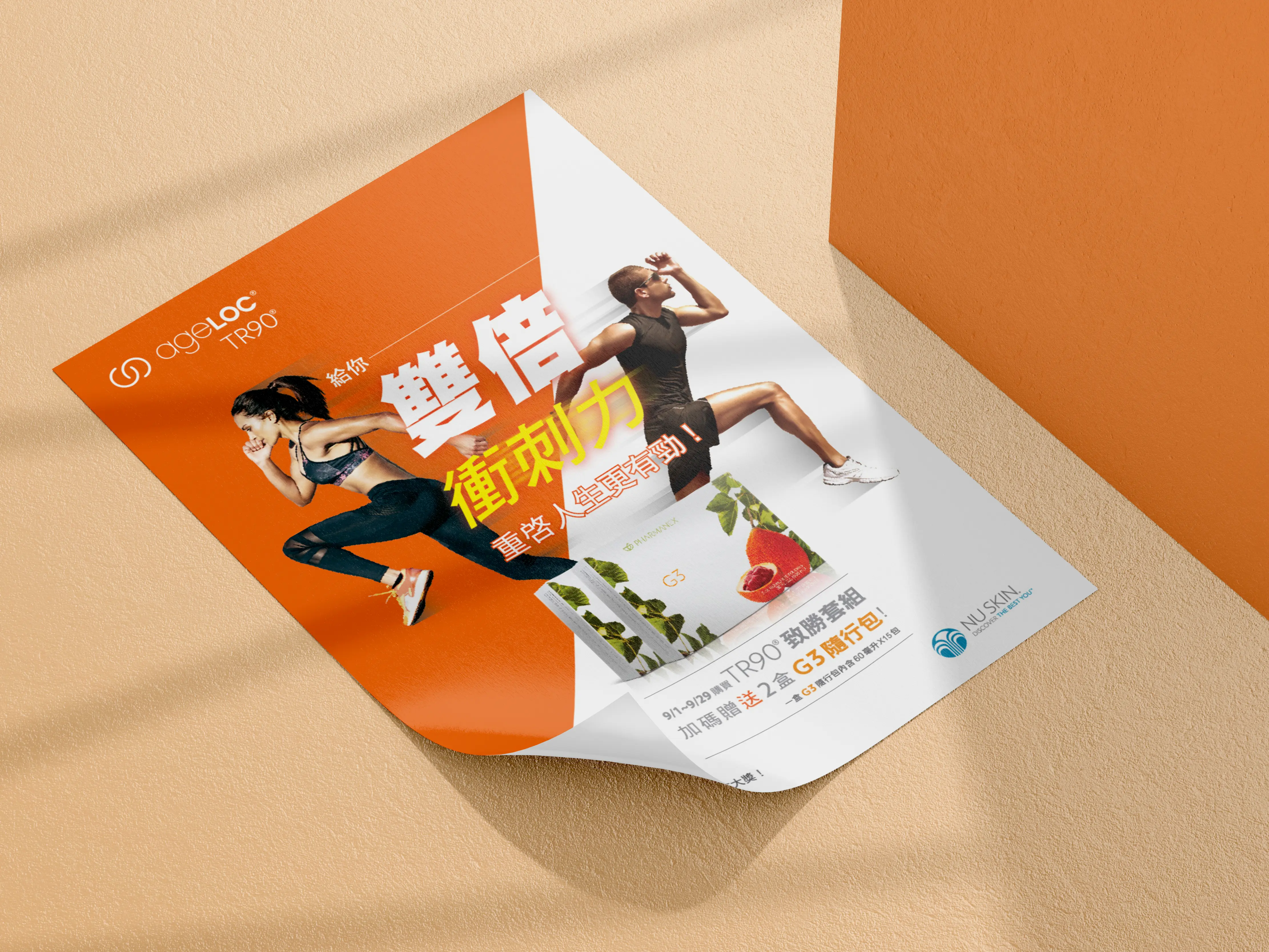
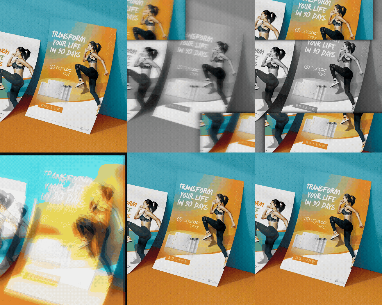
Nu Skin|TR-90 Restart Your Life Plan

Some event key visuals are not only created to look attractive. They need to help the entire campaign stay recognizable across different media. MASOU DESIGN created the event key visual design for Nu Skin’s “TR-90 Restart Your Life Plan,” developing a visual system that could be extended across DM materials, flags, table boards, banners, and on-site event applications. From the campaign theme and brand tone to model selection, color direction, and visual consistency, the design was built to support a clear and unified event identity. The idea of “Restart Your Life” carries a sense of change, action, and a new beginning. For this reason, the key visual was not only about presenting product or campaign information. It was designed to create a stronger visual rhythm, a clear focal point, and a positive brand atmosphere that could immediately communicate the energy of the event. For large-scale brand events, visual consistency is especially important. Every touchpoint, whether printed DM, event flags, table displays, or large-format banners, needs to feel like part of the same campaign while staying aligned with Nu Skin’s international brand image. The focus of this project was therefore not just to create one key visual, but to build a flexible visual direction that could remain clear, consistent, and memorable across different formats and applications. For us, this collaboration with Nu Skin was not only an event key visual design project, but also an important experience in brand guideline application, project management, and campaign visual extension. A strong key visual should allow an event to communicate its message the moment it is seen.

TEKTRO|Official Website Design

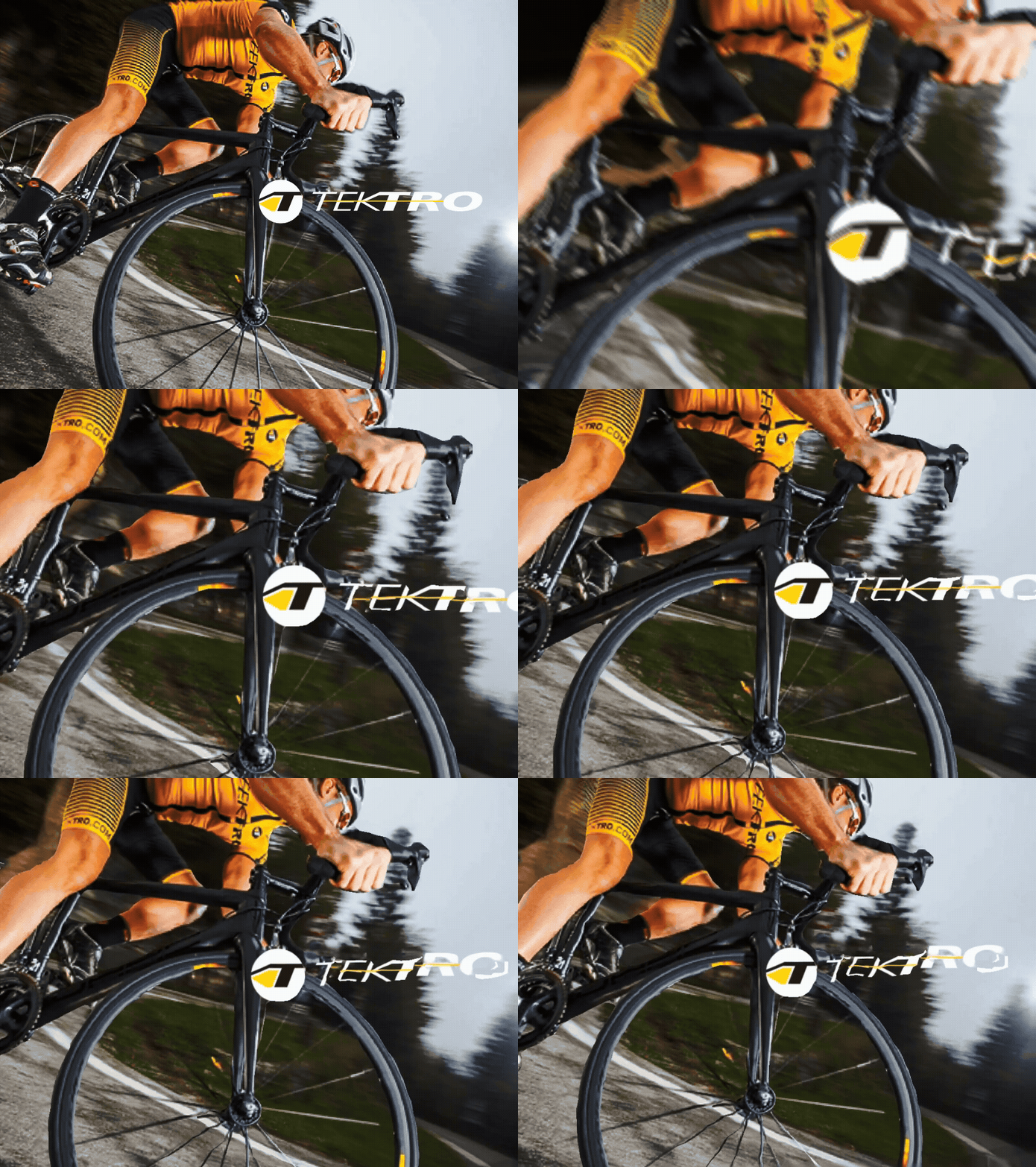
For a major brand’s official website, the challenge is not always about creating a complex visual design. It is about organizing a large amount of product information, internal opinions, and user browsing needs into a clear, manageable, and long-term website structure. As an important brand in bicycle brake systems and components, TEKTRO’s official website needed to present more than brand image. It also had to carry a large number of product models, product series, and application-based information. The focus of this website design project was to reorganize TEKTRO’s product information architecture so users could browse products by type, series, and usage needs. At the time of planning, one of the key challenges was the multi-category product structure. A product might not belong to only one category. It could also relate to different series, specifications, and application scenarios. For this reason, the website required a flexible information architecture that could support both backend product management and frontend browsing. Another major challenge was helping the brand integrate internal opinions through an external project team. A large corporate website often involves product, sales, marketing, and management perspectives, and each team may have different priorities. In this kind of project, the design team is not only responsible for visual execution. It also needs to help organize requirements, clarify priorities, and translate internal opinions into a website structure that users can understand. For a product-driven brand, an official website is more than a visual presentation. It is an important entry point for users to understand product lines, compare models, and build trust in the brand. The TEKTRO official website design focused on making a large product system and internal business needs more organized, helping the brand’s professional value become clearer through the website experience.

Yunqi Enterprise|Seeing Infinite Hope for the Earth|Corporate Website Design

Yunqi Enterprise is a factory specializing in eco-friendly plastic pellets. Although the company is not large in scale, the clean, stable, and professional corporate website design helped present the brand with the confidence and structure of a larger company. Built around the message “Seeing Infinite Hope for the Earth,” the website organizes the company’s environmental materials, resource recycling concept, and services into a clear digital structure. The focus of this website design project was to transform a factory-based and relatively technical industry into a brand communication experience that clients could understand more easily. Through advantage highlights, process explanation, icon design, and a clean visual rhythm, the website became more than a company profile. It became an important entry point for building trust, presenting professionalism, and improving the company’s corporate image.

NuSkin|338 Event Key Visual Extension Design

NuSkin’s “338 Event” was a key visual extension design project following the TR-90 Restart Your Life Plan campaign. The name “338” plays with a Taiwanese phonetic expression that suggests “getting slimmer together,” giving the campaign a lighter, friendlier, and more memorable tone while still connecting to the theme of health management and body transformation. The focus of this project was to extend the campaign key visual across different media and on-site applications, including promotional banners, DM materials, flags, table displays, and hanging posters. Through consistent color usage, model selection, layout rhythm, and campaign visual language, the “338 Event” maintained clear brand recognition and a lively campaign atmosphere across different formats and touchpoints.

FORMULA|OEM Bicycle Component Brand Website Design

FORMULA is an OEM-focused bicycle component brand specializing in wheel system parts, hubs, and related manufacturing solutions. The purpose of this brand website design was not only to display product categories, but also to organize the company’s manufacturing capability, product development experience, and customization services into a clearer digital structure for international clients. Designed from the perspective of an OEM supplier, the website uses brand introduction, product classification, technology content, and contact flow to support both brand presentation and business inquiries. For a manufacturing company built around OEM service and product expertise, the website works as more than an online catalog. It becomes an important touchpoint for building trust, communicating production capability, and creating opportunities for global collaboration.

TEKTRO|Bicycle Brake Group Corporate Website Design

TEKTRO has long focused on bicycle brake systems and component manufacturing, gradually evolving from a product-focused brand into a more complete group-level enterprise. This website design project was not simply a visual redesign of the official website. It responded to the company’s updated name, brand structure, and group-level corporate image, helping TEKTRO present its expertise in bicycle brake technology, product development, and the global market from a broader corporate perspective. In the website planning process, we reorganized the original product-brand website approach into a digital structure more suitable for a group corporate image. Through refined brand storytelling, product technology content, international awards, corporate strengths, and browsing flow, the website presents not only bicycle brake products, but also the scale, R&D capability, and long-term market trust of TEKTRO as a group-level company. This collaboration also reflects TEKTRO’s continued trust in MASOU DESIGN, allowing us to support the brand again through an important stage of website reconstruction and image upgrading.

Eumer|Soft Botanical Beauty for Skincare

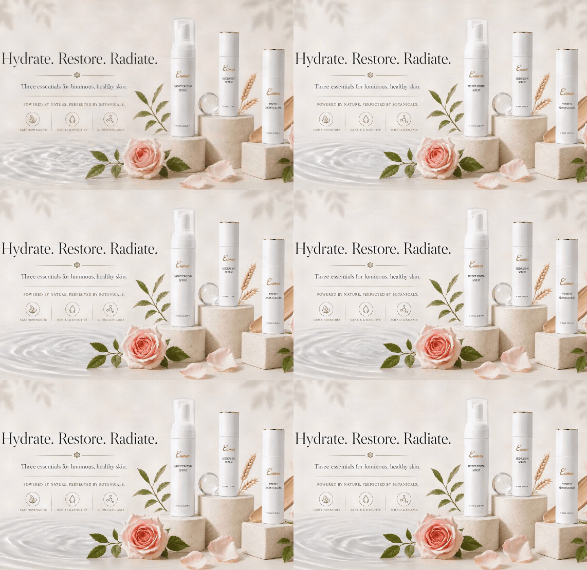
Skincare design is not only about explaining ingredients and benefits. It is also about creating a feeling that helps people understand the brand at first glance. Eumer focuses on botanical care, hydration, and daily skin recovery. Through a softer and more refined visual language, the product information is reorganized into a clean, elegant, and premium brochure style. The overall design uses open white space, delicate lines, soft colors, natural flowers, and product still-life compositions. These elements reduce visual clutter and create a smoother reading experience, allowing each product to stand out clearly while presenting a more high-end skincare image.

FORMAT|Premium Bicycle Brand Website Design

FORMAT is a bicycle brand positioned in the premium segment of the Russian market, known for its refined paintwork, upgraded specifications, and performance-oriented frame design. For this brand website design project, MASOU DESIGN focused on the speed, product details, and commercial photography of FORMAT’s bicycles, reorganizing the website’s visual rhythm and product presentation to communicate a more professional and distinctive brand image. In the website planning process, we translated FORMAT’s racing spirit, European design direction, and premium market positioning into a stronger digital brand experience. Through image selection, color grading, layout proportion, and product information hierarchy, the website presents more than bicycle products. It communicates the brand’s focus on performance, design, and riding experience while helping FORMAT build a clearer and more recognizable online identity.

Ovezo|Eco Yoga Mat Lifestyle Brand Design

Ovezo is a lifestyle brand centered on eco-friendly materials, active living, and pure aesthetics. Starting from material choices, the brand explores how sports and wellness products can support a healthier lifestyle while reducing reliance on plastics and chemical materials, offering a more earth-friendly and everyday alternative. The visual identity is built around the symbol “O,” extending into ideas of breathing, circulation, reset, oxygen, the earth, and a more mindful material cycle. Through minimal design, white space, paper texture, embossing, and refined layout details, Ovezo presents sustainability not as a loud slogan, but as a quiet and deliberate lifestyle expression across its products, website, and everyday use.

Da Dun Huang|Hot Pot Branding and Eastern Food Therapy Visual Identity

Da Dun Huang is a hot pot brand built around Eastern food therapy culture, precious ingredients, nourishment, and a refined dining experience. The visual identity combines symbolic elements such as the “ingredient treasure cabinet,” the hexagonal Black Tortoise pattern, and the twelve-petal chrysanthemum, transforming ideas of longevity, wellness, premium ingredients, and Eastern aesthetics into a distinctive brand language. The overall design uses a palette of golden brown, deep reddish purple, and warm ivory, supported by delicate linework, lattice patterns, custom brand typography, and extended restaurant applications. From the identity system to storefront visuals, menu design, packaging, and brand touchpoints, Da Dun Huang presents a calm, elegant, and premium hot pot brand image rooted in Eastern culinary culture.

Chunghwa Telecom InventAI|Dream Mover|Brand Design

InventAI is an AI brand design project built around the concept of “intelligent flow.” Through visual languages such as orbital movement, circulation, and an energy core, the identity redefines how an artificial intelligence brand can be expressed within the technology industry. The system uses dynamic geometry, a futuristic color palette, and a modular identity structure to create an AI brand with strong recognition, flexibility, and an international visual presence. Starting from the main brand identity, the project extends into sub-brand systems, ecosystem applications, brand guidelines, exhibition visuals, outdoor billboards, bus stop advertising, posters, roll-up banners, and digital interface applications. With “Dream Mover” as the central spirit, InventAI translates the movement, energy, and future imagination of AI technology into a more complete and scalable visual identity system.

Petour|Pet Social and Pet-Friendly Lifestyle App Design

Pets are more than companions. They can also become a natural starting point for people to connect, interact, and explore life together. Petour is a pet social and lifestyle exploration app centered around pet matching, companion discovery, and pet-friendly places. By integrating social interaction with everyday lifestyle information, the app helps users meet new pet friends while discovering more places they can enjoy with their pets. The overall interface uses a bright, playful, and friendly visual language. Soft colors, pet-inspired elements, and a clear user flow create an easy and enjoyable experience for users of different levels. From exploration and matching to sharing and interaction, Petour is not only a pet social tool, but also a digital platform that connects pet lovers with a more engaging pet-friendly lifestyle.