
WORKS

Explore how design ideas take shape through real projects. This portfolio brings together MASOU DESIGN work across brand identity, websites, e-commerce, graphic design and UI/UX. Each project responds to a different industry, product and stage of growth, turning business needs, content and visual direction into clear, distinctive and practical design outcomes.

Design Portfolio | Branding, Web, E-commerce & UI/UX Projects

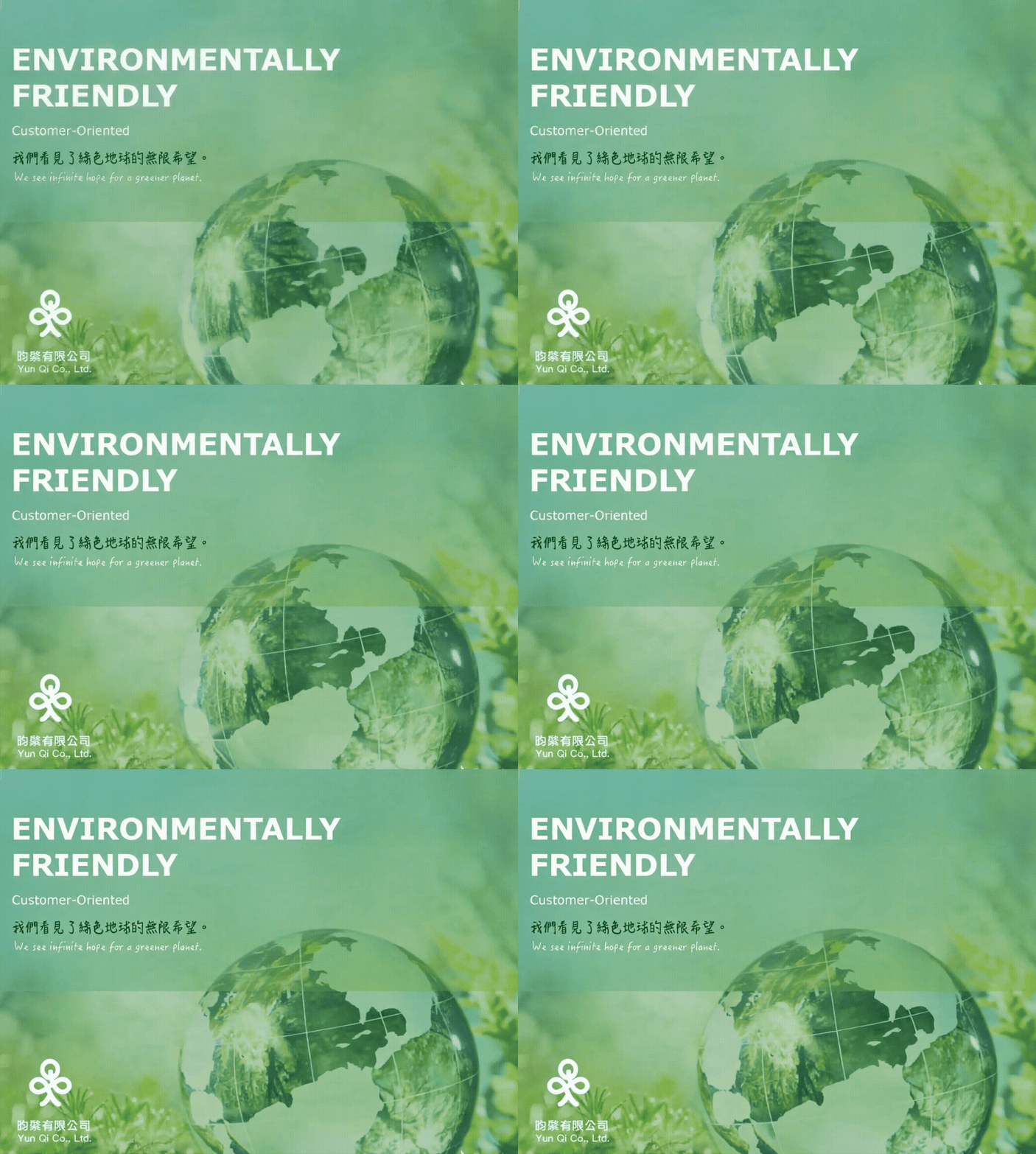
Yunqi Enterprise|Seeing Infinite Hope for the Earth|Corporate Website Design

Yunqi Enterprise is a factory specializing in eco-friendly plastic pellets. Although the company is not large in scale, the clean, stable, and professional corporate website design helped present the brand with the confidence and structure of a larger company. Built around the message “Seeing Infinite Hope for the Earth,” the website organizes the company’s environmental materials, resource recycling concept, and services into a clear digital structure. The focus of this website design project was to transform a factory-based and relatively technical industry into a brand communication experience that clients could understand more easily. Through advantage highlights, process explanation, icon design, and a clean visual rhythm, the website became more than a company profile. It became an important entry point for building trust, presenting professionalism, and improving the company’s corporate image.
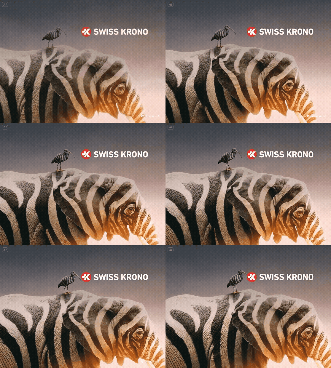
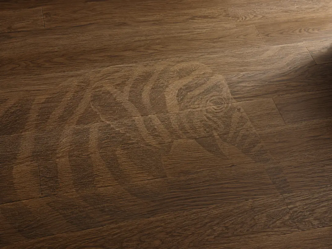
Swiss Krono|A Century of European Heritage

We created the website design and content presentation for Swiss Krono’s Taiwan representative, building a clear and refined digital experience based on the brand’s original European wood-based material identity and existing VI direction. Instead of creating a separate visual identity, the design respects Swiss Krono’s established brand style and translates it into a website structure with stronger consistency, recognition, and professional presence in the Taiwan market. The website was planned around clear product browsing and information delivery. Product details such as large-format boards, single boards, and full-surface panels are organized in a more accessible way, while the series-based classification system helps users quickly understand and compare collections such as Milo, Sigma, and Exclusive. Through a consistent visual rhythm, European-inspired layout style, and well-structured product information, the website strengthens Swiss Krono’s brand recognition while making the browsing experience clearer, more intuitive, and more aligned with the brand’s original identity.

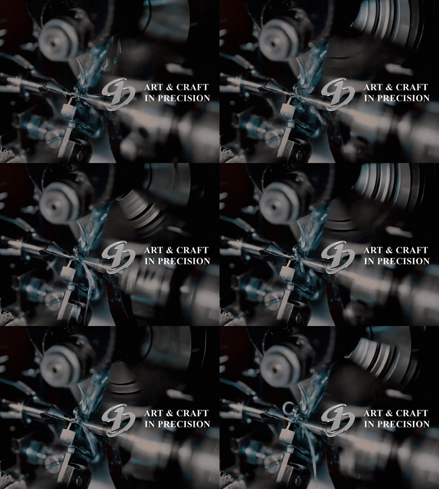
Jiandian Precision|ART & CRAFT IN PRECISION

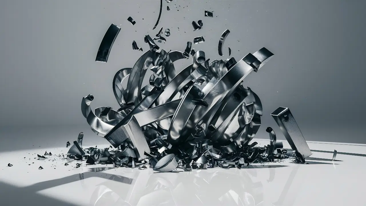
Jiandian Precision website design centers on “ART & CRAFT IN PRECISION,” translating precision manufacturing, component processing, and craftsmanship into a clear and trustworthy digital brand image. MASOU DESIGN used clean layouts, steady visual rhythm, and structured content to help this B2B manufacturing brand present its technical capability, services, and professional value.

JS Logistics|Bear-Hearted Appliance Installation|Brand Identity Design

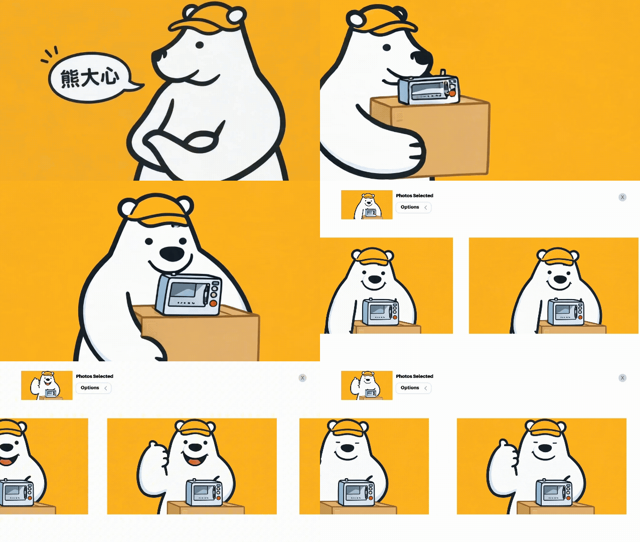
A memorable bear identity that turns appliance installation into a warmer and more trustworthy service experience. MASOU DESIGN created the brand identity and visual system for JS Logistics by transforming the founder’s friendly, steady, and thoughtful personality into “Bear Heart,” a character-based brand symbol. Through the bear logo, warm yellow brand color, appliance installation service icons, vehicle applications, and animated visuals, the brand message was simplified into one clear and recognizable image. Instead of trying to communicate every service detail at once, the identity helps customers remember JS Logistics through a sense of friendliness, reliability, and care.

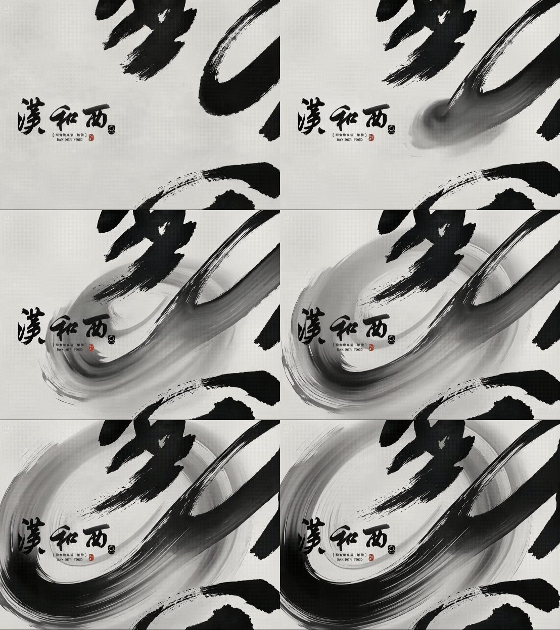
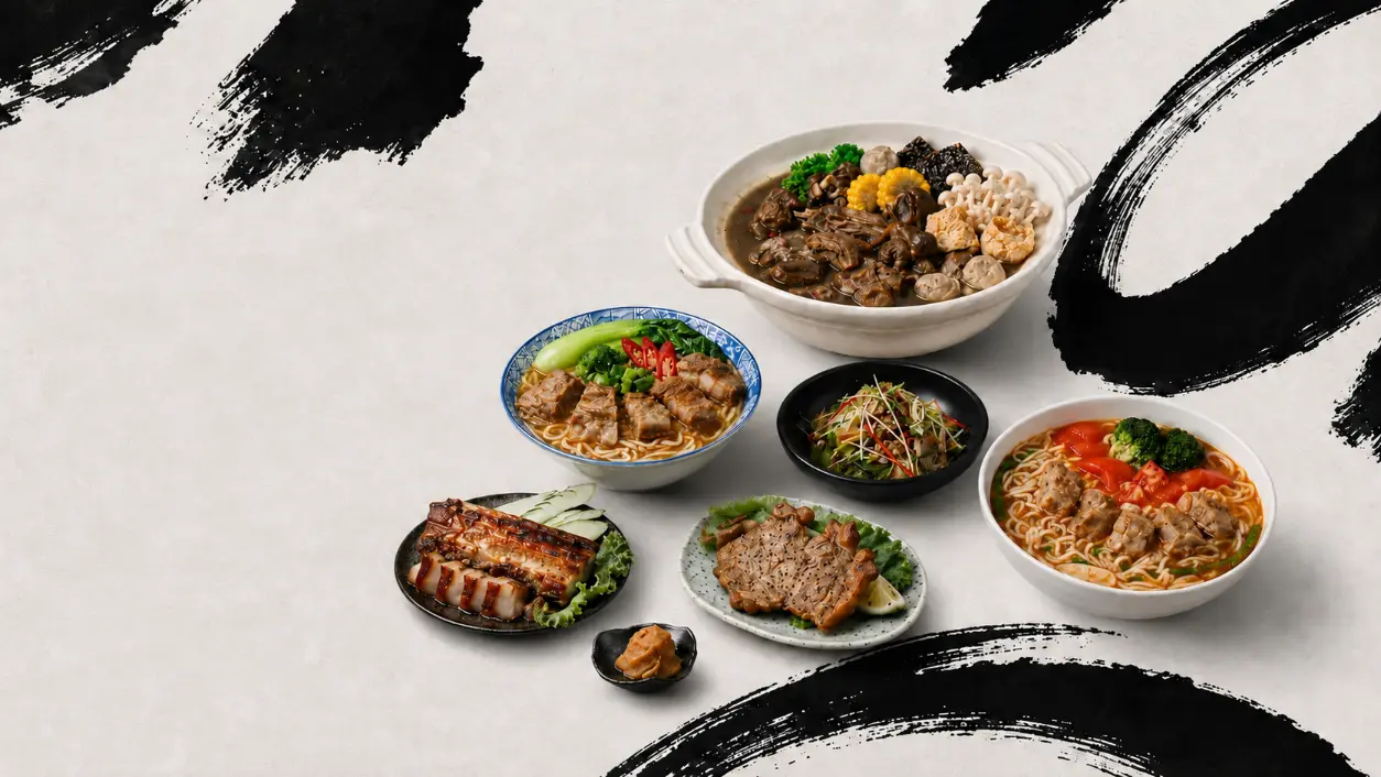
Han He Xi Instant Cuisine|Tainan Banquet Heritage|Brand Identity and Packaging Design

At a time when many brands pursue modified typography and geometric logos, calligraphy became one of Han He Xi’s most distinctive brand assets. MASOU DESIGN created the brand identity and packaging design for Han He Xi Instant Cuisine, starting from Tainan banquet culture, the craftsmanship of a traditional Taiwanese banquet chef, and family recipe memories. Through a calligraphic wordmark, portrait illustration, handwritten recipe elements, and modern layout design, the brand communicates not only warmth and story, but also stronger recognition, product appeal, and brand personality in the frozen ready-to-eat food market.

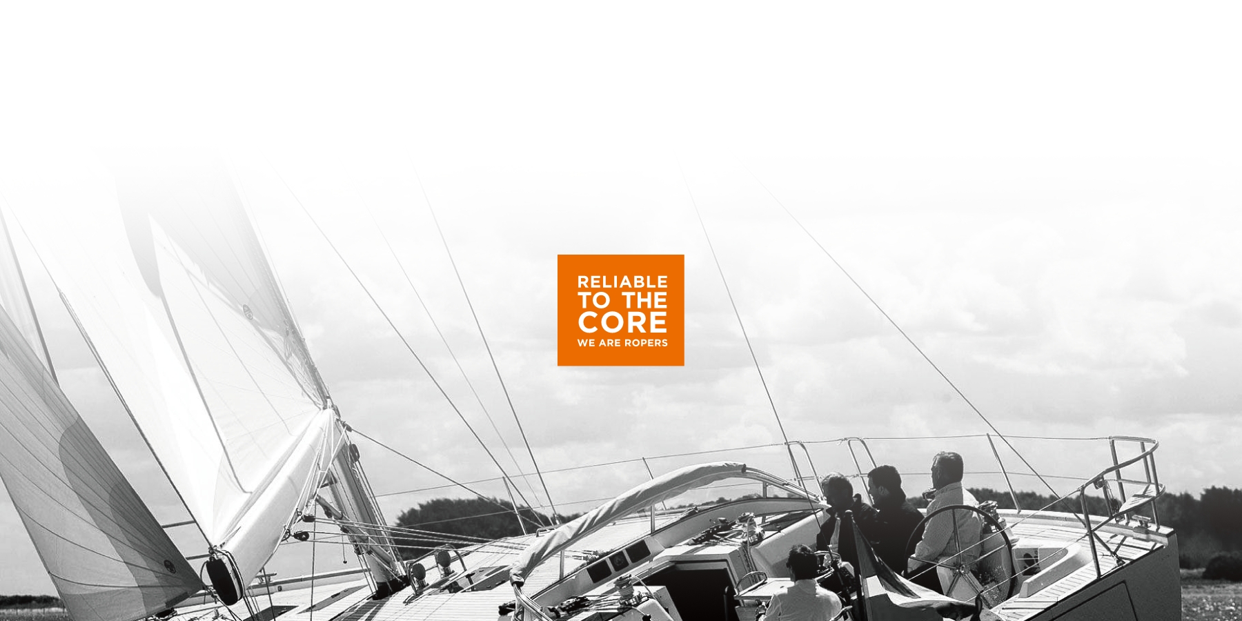
ROPERS | RELIABLE TO THE CORE

ROPERS is a Taiwan-based professional rope brand founded in 1981, specializing in the manufacturing, assembly, and global supply of high-quality rope products. Its applications span outdoor leisure, commercial marine, industrial safety, fishery, aviation, and mining. The brand statement “RELIABLE TO THE CORE” communicates not only the strength and durability of its ropes, but also the brand’s commitment to precision manufacturing, material quality, and long-term reliability. For this project, we extended the ROPERS brand identity across business cards, product catalog design, and corporate stationery applications. The visual system centers on the logotype, preserving the brand’s industrial and professional character while using a striking fluorescent orange as the key visual color. The target-like “O” in the logo also reinforces the ideas of precision, reliability, and control. Through spot color printing, silver foil stamping, and transparent foil details, the printed materials give ROPERS a sharper, more refined, and more memorable presence in the B2B industrial market.

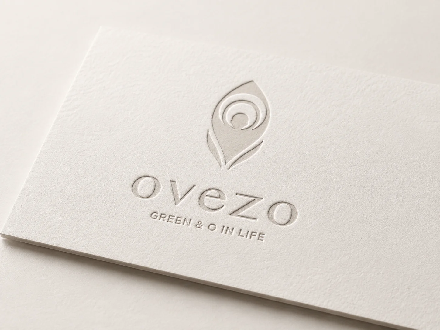
Ovezo|Eco Yoga Mat Lifestyle Brand Design

Ovezo is a lifestyle brand centered on eco-friendly materials, active living, and pure aesthetics. Starting from material choices, the brand explores how sports and wellness products can support a healthier lifestyle while reducing reliance on plastics and chemical materials, offering a more earth-friendly and everyday alternative. The visual identity is built around the symbol “O,” extending into ideas of breathing, circulation, reset, oxygen, the earth, and a more mindful material cycle. Through minimal design, white space, paper texture, embossing, and refined layout details, Ovezo presents sustainability not as a loud slogan, but as a quiet and deliberate lifestyle expression across its products, website, and everyday use.

Da Dun Huang|Hot Pot Branding and Eastern Food Therapy Visual Identity

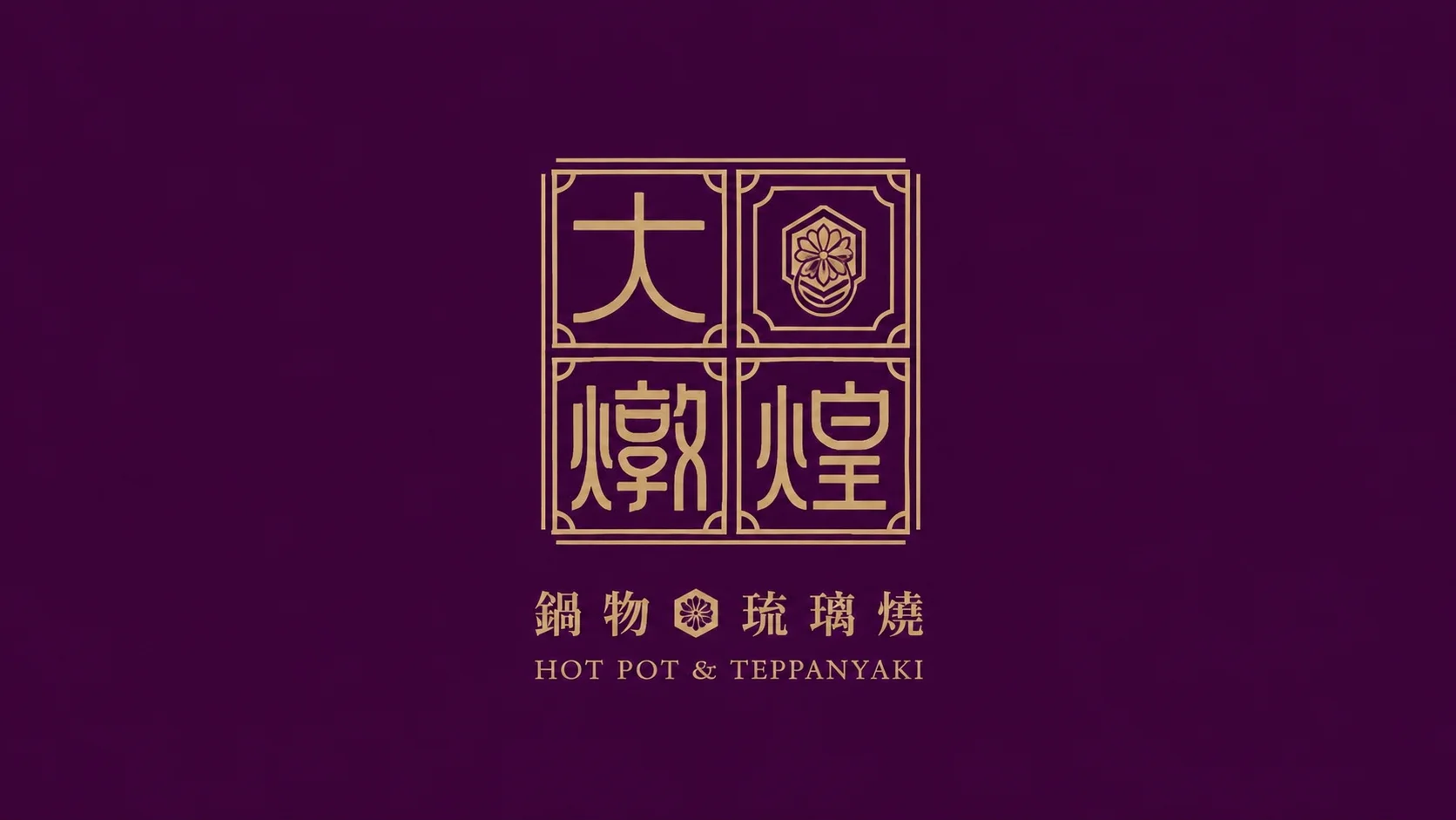
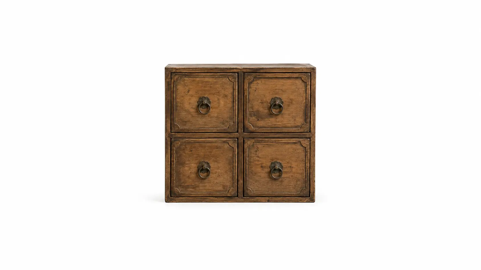
Da Dun Huang is a hot pot brand built around Eastern food therapy culture, precious ingredients, nourishment, and a refined dining experience. The visual identity combines symbolic elements such as the “ingredient treasure cabinet,” the hexagonal Black Tortoise pattern, and the twelve-petal chrysanthemum, transforming ideas of longevity, wellness, premium ingredients, and Eastern aesthetics into a distinctive brand language. The overall design uses a palette of golden brown, deep reddish purple, and warm ivory, supported by delicate linework, lattice patterns, custom brand typography, and extended restaurant applications. From the identity system to storefront visuals, menu design, packaging, and brand touchpoints, Da Dun Huang presents a calm, elegant, and premium hot pot brand image rooted in Eastern culinary culture.

Chunghwa Telecom InventAI|Dream Mover|Brand Design

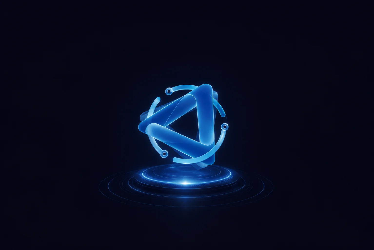
InventAI is an AI brand design project built around the concept of “intelligent flow.” Through visual languages such as orbital movement, circulation, and an energy core, the identity redefines how an artificial intelligence brand can be expressed within the technology industry. The system uses dynamic geometry, a futuristic color palette, and a modular identity structure to create an AI brand with strong recognition, flexibility, and an international visual presence. Starting from the main brand identity, the project extends into sub-brand systems, ecosystem applications, brand guidelines, exhibition visuals, outdoor billboards, bus stop advertising, posters, roll-up banners, and digital interface applications. With “Dream Mover” as the central spirit, InventAI translates the movement, energy, and future imagination of AI technology into a more complete and scalable visual identity system.