
2026.05.28
Miss seesaw|Beauty Superpower|Brand Advertising Visual and Motion Banner Design
Making product features visible in a fun and memorable way. MASOU DESIGN created the “Beauty Superpower” visual series and banner designs for Miss seesaw, transforming product features into creative elements such as cars, fire extinguishers, watering cans, and protective shields. Without directly claiming product effects, the visuals use a more intuitive and playful approach to communicate product impressions and make the brand experience more memorable.
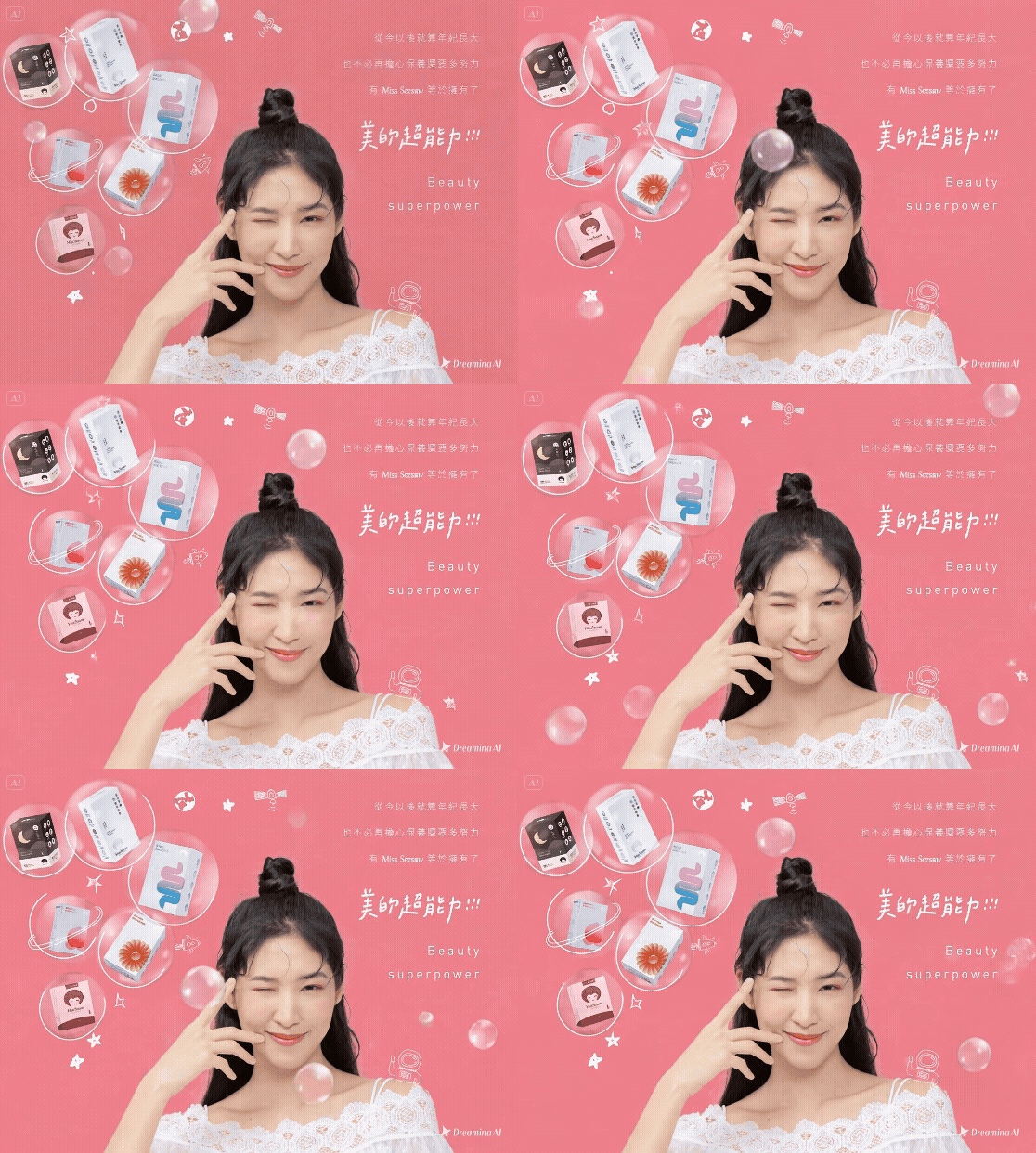
Miss seesaw|Beauty Superpower|Brand Advertising Visual and Motion Banner Design
“Beauty Superpower” is a brand advertising visual and motion banner series created for Miss seesaw. MASOU DESIGN transformed product impressions into playful creative elements such as cars, fire extinguishers, moons, protective bubbles, and watering cans, helping consumers understand each product in a more intuitive and memorable way.
For health and beauty brands, advertising communication often needs to be creative while staying away from direct product effect claims. Instead of relying on literal descriptions, this project uses illustration, motion design, visual metaphors, and e-commerce banner applications to translate product features into clear, playful, and memorable brand visuals.
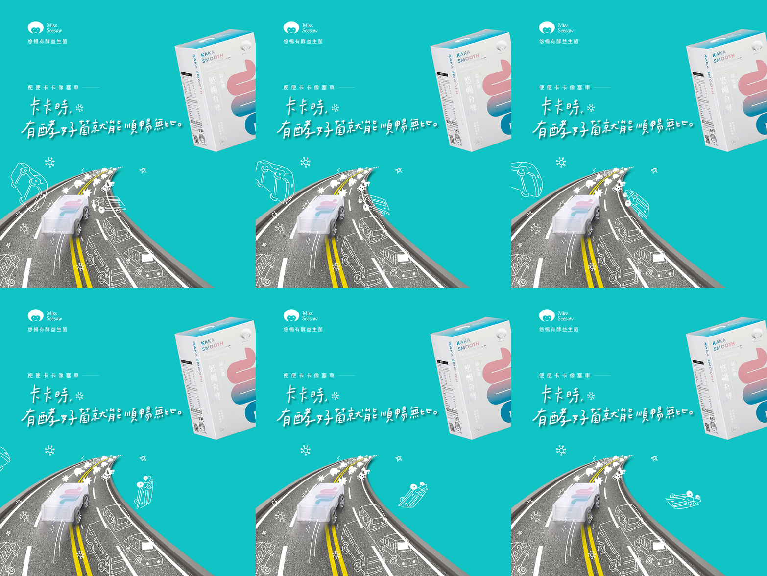
Turning Product Features into a Cute Car for a More Intuitive Probiotic Visual
The probiotic visual needed to communicate the product impression without directly describing physiological effects. We used a traffic jam as the scene and transformed the product packaging into a small car moving forward, creating a playful and easy-to-understand metaphor through motion.
This motion banner design turns a product feature into a visual story. Instead of relying only on copy, the product becomes a character that can move, interact, and leave a stronger impression across social media, e-commerce pages, and campaign banners.
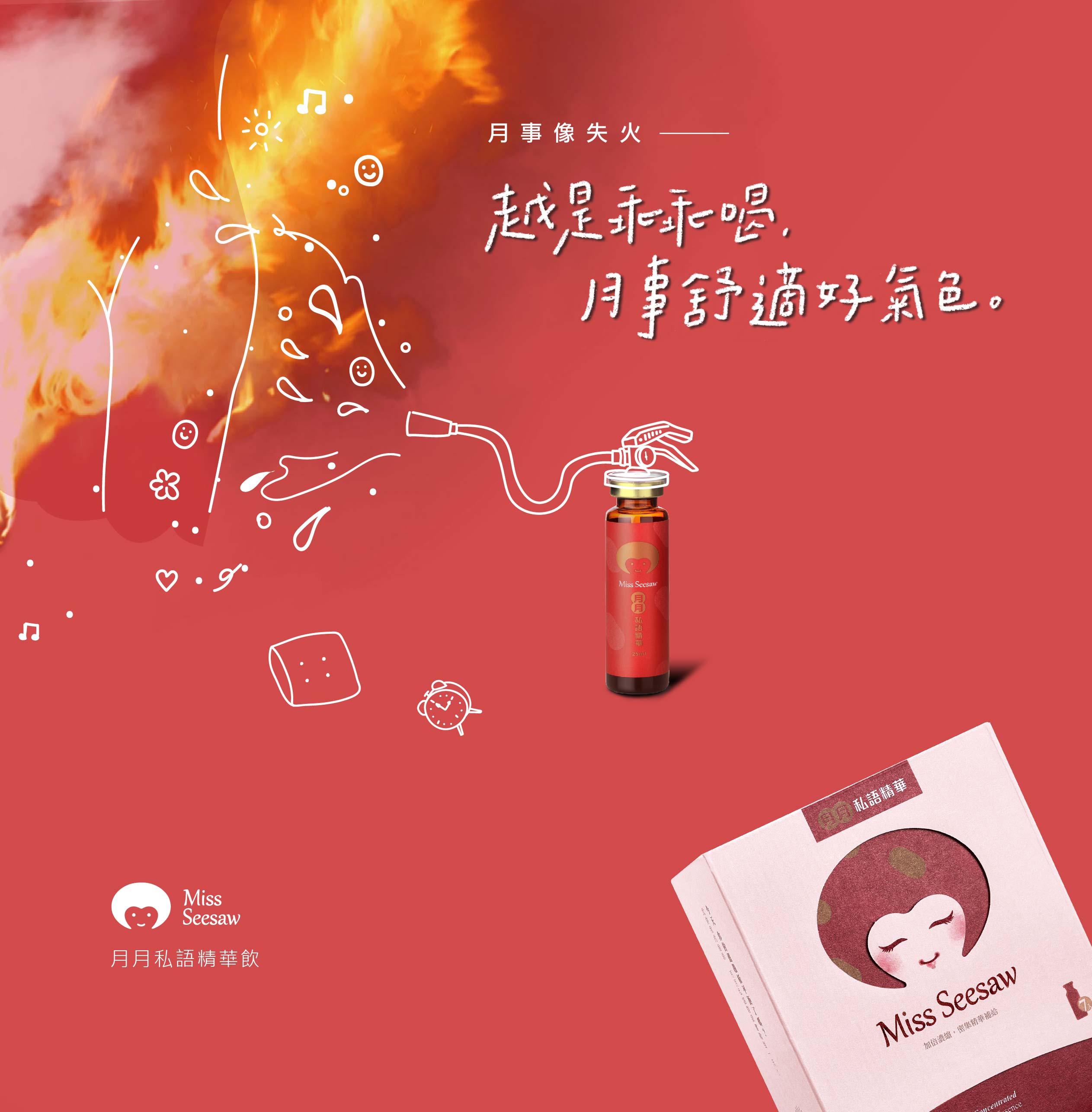
Using a Fire Extinguisher Metaphor to Make the Visual More Memorable
For the feminine care product visual, we transformed the bottled product into a fire extinguisher spraying toward flames. The design avoids direct product claims and instead uses a clear visual metaphor to create a more playful and memorable product impression.
Through this brand advertising visual, the product communication feels less rigid and more engaging. It also helps the product stand out in campaign pages, e-commerce banners, and social media applications.
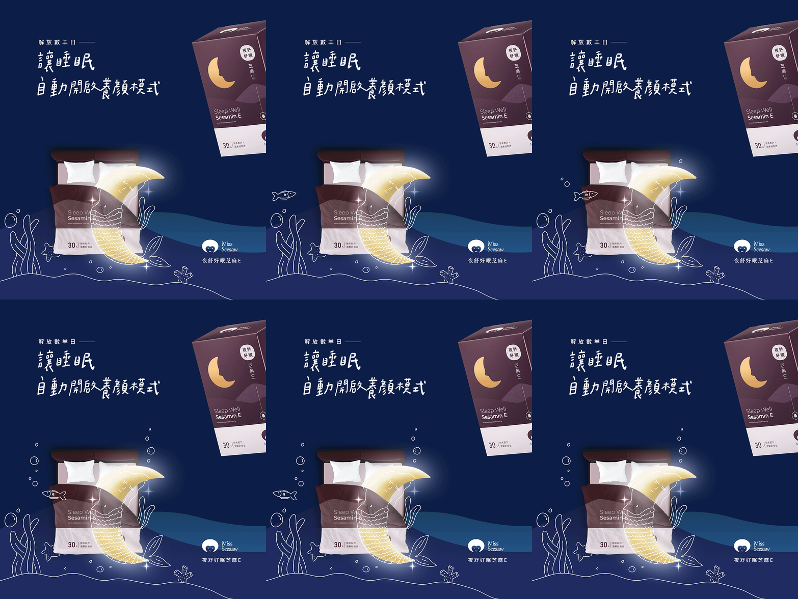
Letting the Moon Fall Asleep to Create a Gentle Nighttime Impression
The Sesame E visual uses a moon sleeping in bed as the main character, connecting nighttime, rest, and beauty-related impressions through a soft and easy-to-understand scene. The product feature is translated into a simple emotional moment rather than a direct explanation.
Motion design makes the visual more memorable and helps the product impression stay in the viewer’s mind. With a simple character, gentle rhythm, and clear theme, the banner becomes more emotional within the e-commerce page experience.
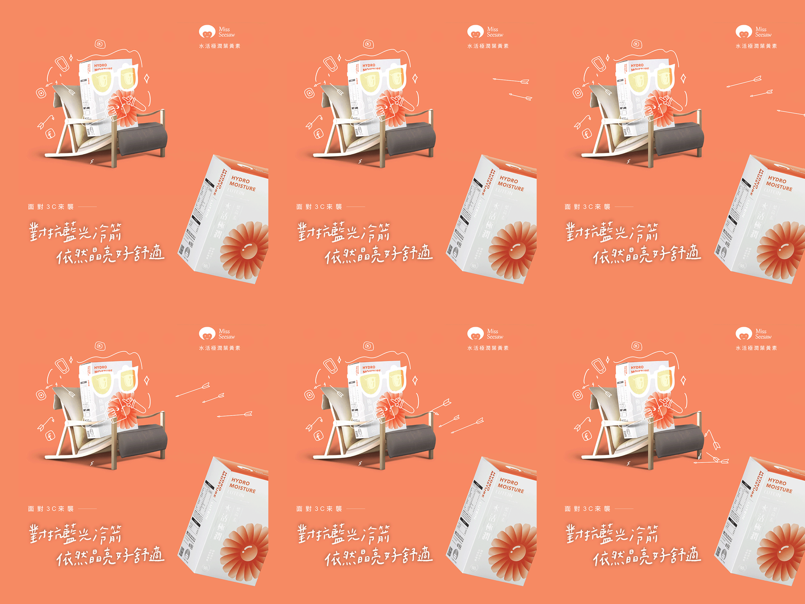
Using a Phone and Falling Arrows to Make the Lutein Product Feel Daily
This lutein product visual uses phone usage as the everyday scene. The product character stands in the center while arrows fall away in front of it, creating a humorous way to connect the product with modern 3C device usage.
By turning the product into a character, the banner becomes more narrative than a standard product image. This makes the visual easier to remember across e-commerce campaigns and social communication.
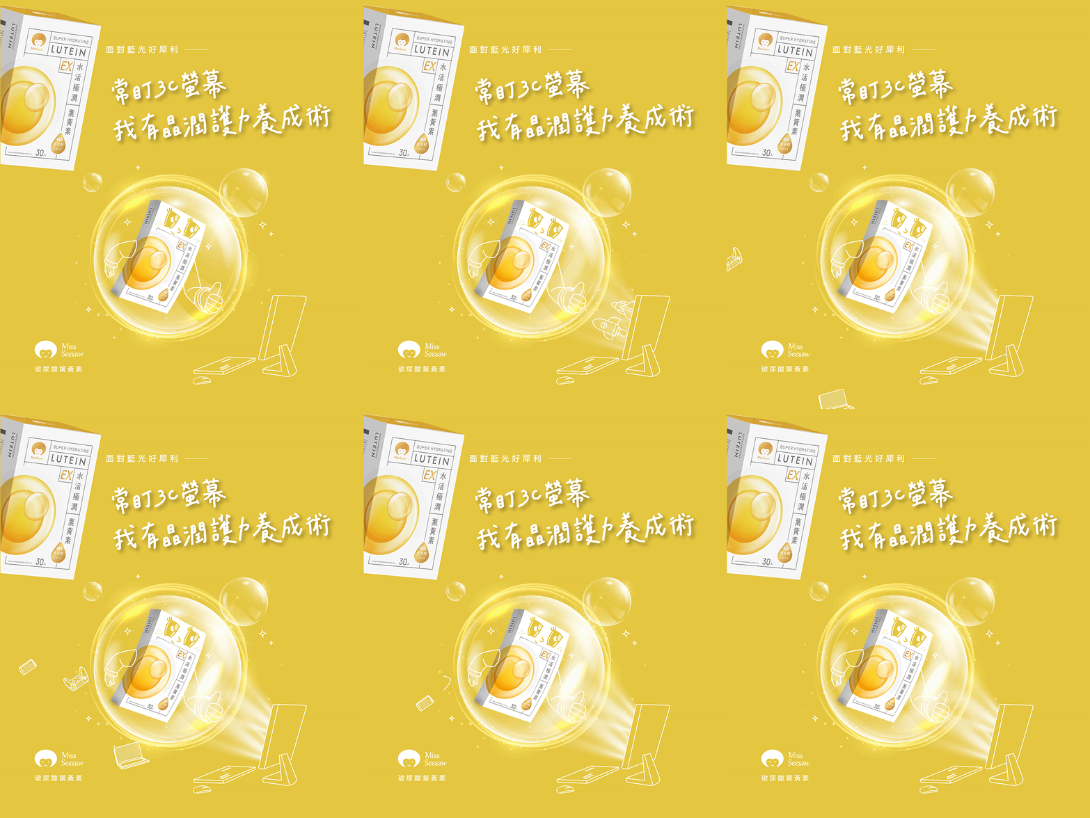
Creating a Protection Impression with a Transparent Bubble
For the hyaluronic acid lutein product, we used a transparent bubble as the main creative element. The product character is protected inside the bubble while 3C-related objects and outside interference appear around it.
By breaking down the product impression into simple visual ideas such as bubble, coverage, protection, and external interference, the banner makes a more complex product concept easier to understand and more entertaining to watch.
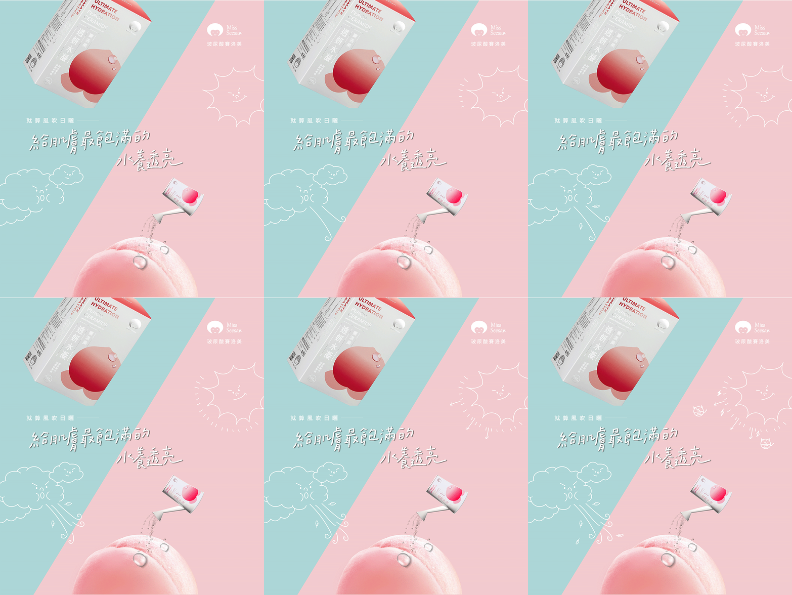
Bringing a Fairy-Tale Story into the Banner for a Cute Peach Visual
This visual is inspired by the fairy-tale idea of the wind and the sun competing with each other. The product packaging is transformed into a watering can that cares for a peach character, creating a playful and story-driven way to express the product impression.
When a product advertisement becomes a small story, consumers see more than the packaging. They see a brand scene that is easier to remember. This is the core idea of the Beauty Superpower series: making product impressions easier to understand through playful and intuitive visual metaphors.
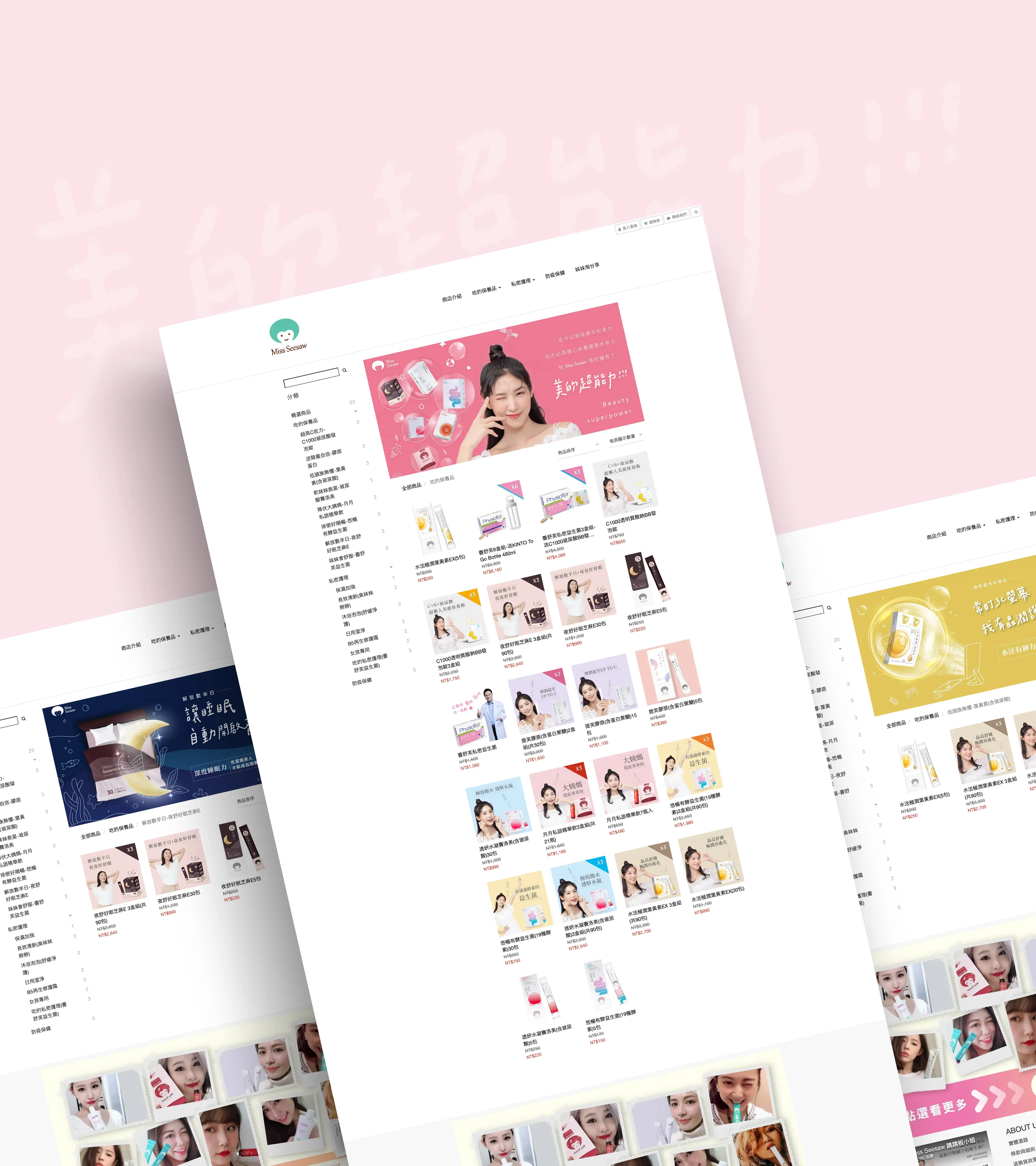
Building a Complete Campaign Visual from Banners to E-Commerce Pages
The Beauty Superpower series is not just a set of individual advertising images. It is a visual system that can extend into e-commerce pages, campaign banners, social content, and brand communication. Each product has its own metaphor, while all visuals share the same playful illustration style and product-character logic.
Through this brand advertising visual and motion banner design project, Miss seesaw’s product features are transformed from product page copy into clearer, more vivid, and more memorable visual experiences within the e-commerce environment.
✦ Planning brand advertising visuals, e-commerce banner design, or motion visual design? Talk to us about your brand project.
✦ Browse our portfolio to see more brand design, advertising visual, and website design projects.
✦ Return to the homepage to learn how we help brands build clearer visual identity and digital experiences.