2026.05.27
Logo Evolution: Lessons from Google, Starbucks, and Coca-Cola
Explore the evolution of famous logos from Coca-Cola, Starbucks, and Google, and discover how great brands refine their visual identity over time. This article explains why logos change, how small design adjustments shape brand recognition, and what businesses can learn from iconic logo evolutions.
The history of trademarks can be traced back to ancient civilizations. Long before modern branding existed, people were already using marks, symbols, and signs to distinguish goods, property, and services from one another.
In ancient times, people often used seals to mark ownership. These seals might include a family name, a personal symbol, or a distinctive mark that identified the maker or supplier of a specific product.
As commerce developed, the idea of trademarks became more structured. During the Middle Ages in Europe, guilds began to register and protect marks used by craftsmen and merchants. These marks helped establish trust, protect reputation, and make it easier for customers to recognize reliable producers.
Over time, trademarks became more than simple identification marks. They became part of how brands build recognition, trust, and cultural meaning. The evolution of famous logos offers many interesting stories and design lessons.
-
1. Coca-Cola
By the 19th century, trademarks had become increasingly important in the commercial world. One of the most well-known examples is the Coca-Cola logo. In 1886, pharmacist John Pemberton created a new soda formula and named it “Coca-Cola.” His bookkeeper and friend, Frank Robinson, designed the original wordmark using elegant script lettering. He believed that the two capital C’s would look effective in advertising.
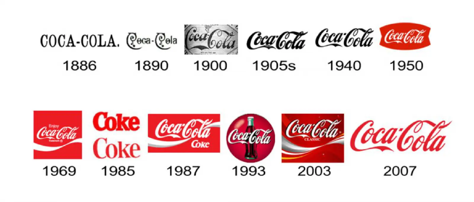
(Image source: Internet)
Although the Coca-Cola logo has gone through several refinements over the years, its core visual identity has remained remarkably consistent. The script lettering, red and white color palette, and energetic visual rhythm have helped the logo become one of the most recognizable brand marks in the world.
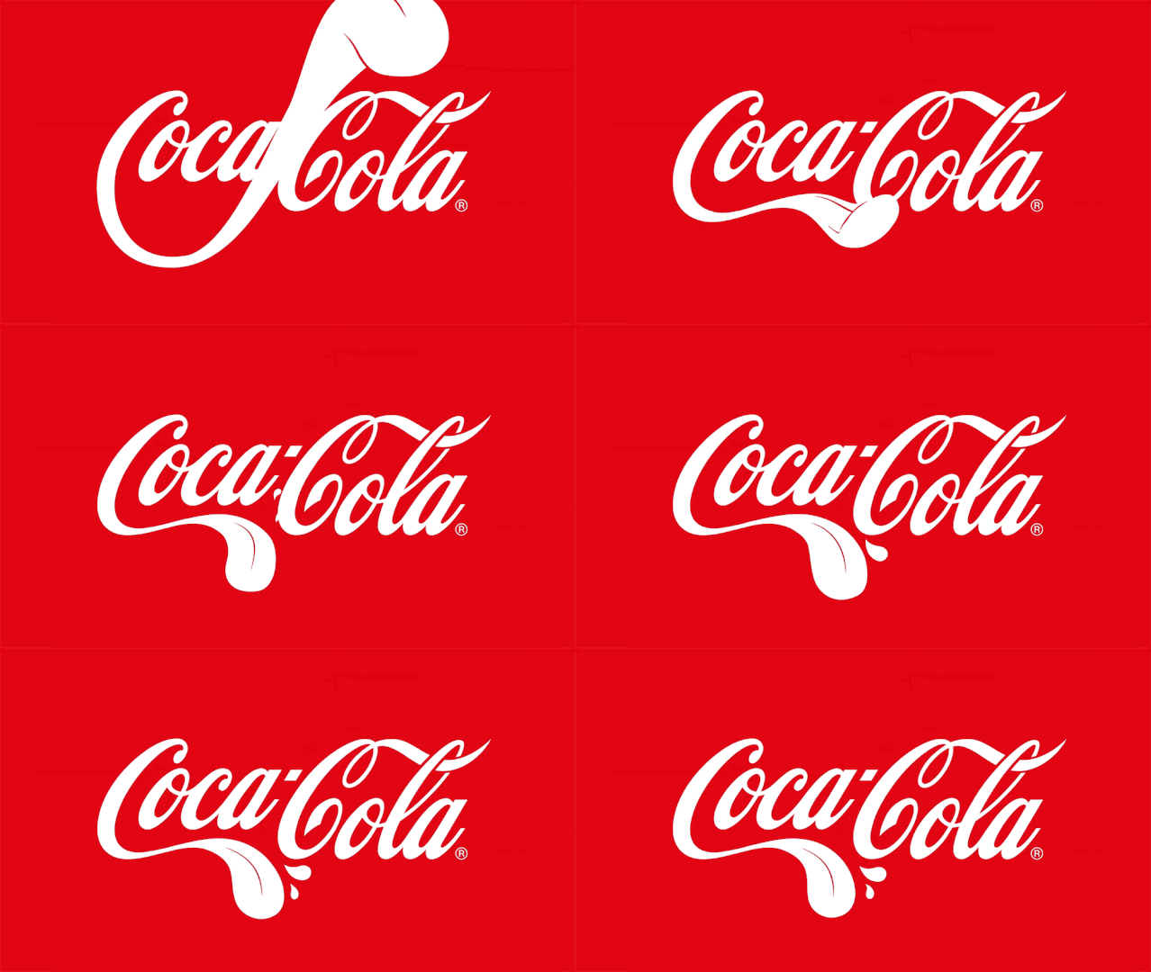
The Coca-Cola “Tongue” Logo: Playful, Strange, and Full of Meaning
In 2019, Coca-Cola launched a campaign in Spain featuring a playful visual idea: after taking a sip of Coca-Cola, the character’s tongue leads her toward joyful memories and meaningful moments.
The campaign was aimed at younger audiences, using humor and surreal imagery to connect Coca-Cola with personal memories, happiness, and the everyday search for belonging.
This kind of campaign shows how a brand can go beyond its logo and use visual storytelling to build emotional connection. By transforming a familiar logo into something unexpected, Coca-Cola created a younger, more playful brand expression while still keeping its identity recognizable.
The goal was not only to promote a product, but to create a feeling. This is a common strategy in branding: when consumers connect a brand with positive memories or emotions, the brand becomes part of their personal experience rather than just another product on the shelf.
2. Starbucks
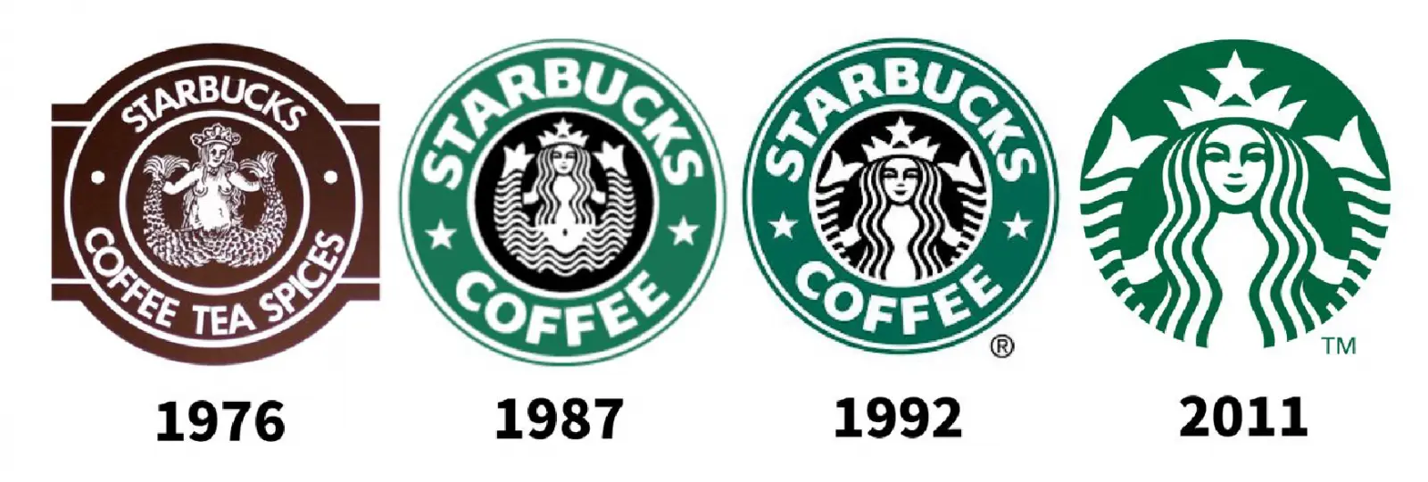
Starbucks was founded in Seattle in 1971. Its first logo featured a two-tailed siren with the words “Starbucks Coffee, Tea, Spices.” At the time, the illustration was much more detailed and visually complex than the version we know today.
In 1987, the company went through a major brand update. Howard Schultz, one of the key figures behind Starbucks’ growth, worked with designer Terry Heckler to redesign the logo. The new identity introduced a green circular mark with the siren at the center and the words “Starbucks Coffee” around it.
As the company expanded, the logo continued to evolve. In 2011, Starbucks simplified its logo again, removing the surrounding text and focusing entirely on the siren symbol. This allowed the brand to move beyond coffee and become more flexible across products, spaces, packaging, and global markets.
The siren itself is connected to maritime mythology, which fits the brand’s Seattle origin and its early association with the port city. Over time, the Starbucks logo became not just a coffee shop mark, but a global symbol of lifestyle, routine, and urban culture.
The evolution of the Starbucks logo shows how a brand can gradually simplify its visual identity while keeping the core symbol intact. A strong identity does not always need more detail. Sometimes, removing unnecessary elements makes the brand more powerful and easier to recognize.
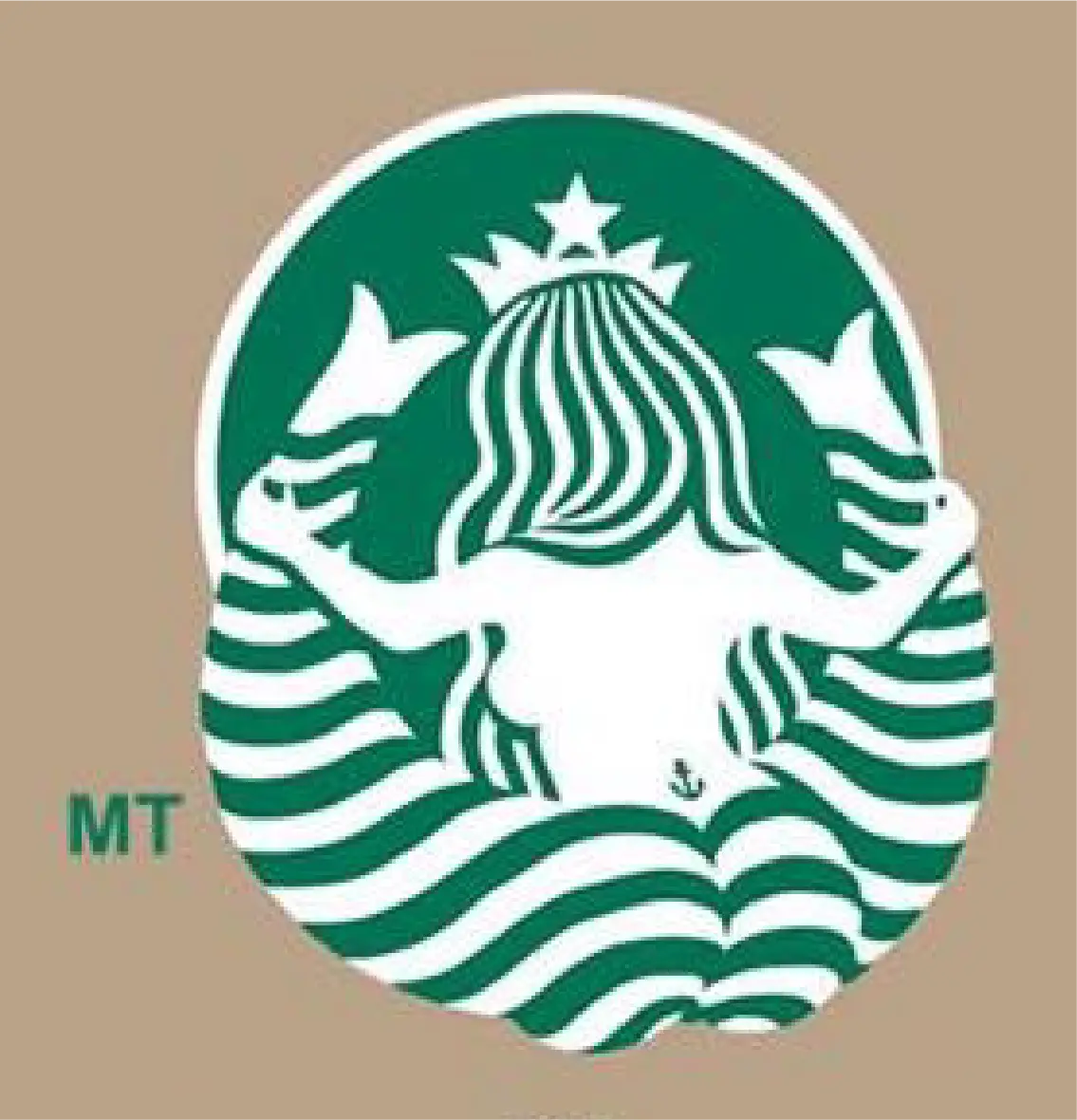
The Back View of the Starbucks Siren: A Humorous Reinterpretation
Although the Starbucks logo has changed several times, the siren and her two tails have always remained part of the identity. This humorous image, originally created by a foreign designer in 2012 for a fictional visual project, gives people a playful “back view” of the famous siren.
The reason the siren has two tails comes from mythological imagery. The original siren figure is connected to ancient stories of half-human, half-fish creatures, and similar two-tailed siren sculptures can also be found in historical art collections.
3. Google
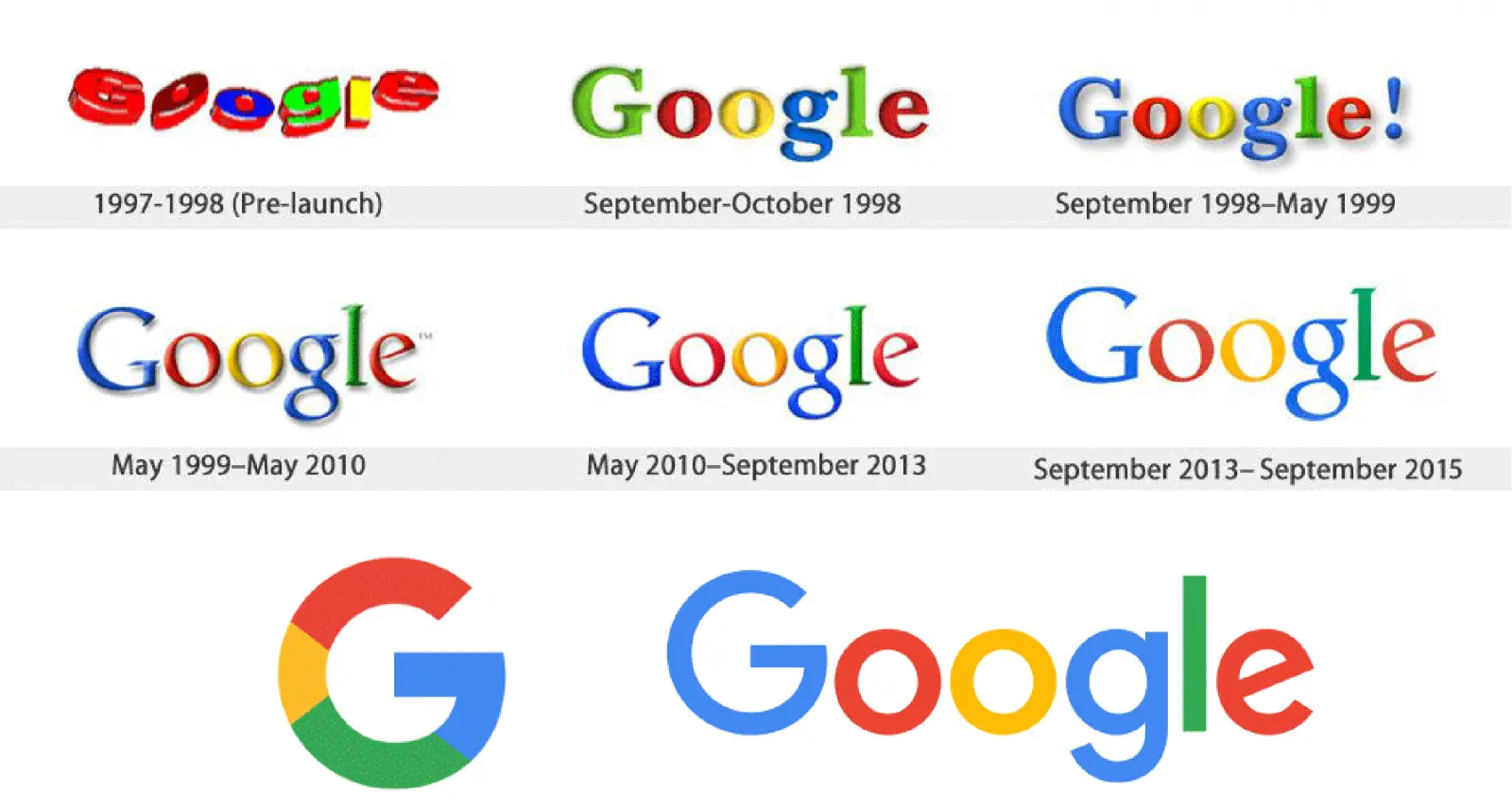
When Google first appeared in the late 1990s, its logo was a colorful wordmark with a playful and slightly childlike feeling. It looked bright, casual, and very different from the polished identity we see today.
Over the years, the Google logo went through several refinements. The spacing between letters became more balanced, the letterforms became smoother, and the overall appearance became cleaner and easier to read.
Around 2013, Google moved toward a flatter design style, removing the earlier three-dimensional effects and shadows. The colors remained vivid, but the logo became simpler and more suitable for digital screens.
In 2015, Google introduced a more modern sans-serif wordmark. The new logo had simpler shapes, softer color tones, and better readability across different devices, screen sizes, and digital interfaces.
The evolution of the Google logo reflects the growth of the company itself. From a playful early identity to a clean and highly adaptable digital brand system, Google’s logo changes show how design must respond to technology, user experience, and global brand recognition.
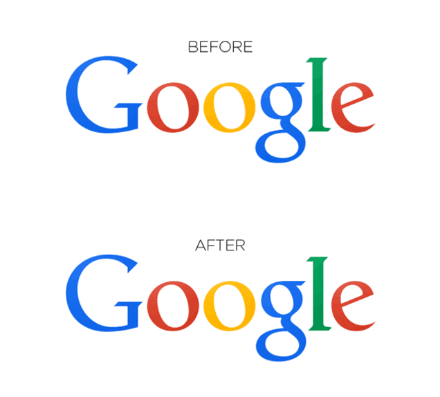
A 1pt Adjustment: Tiny Changes That Most People Never Notice
In 2014, Google made a very small adjustment to its logo. For most people, the change was almost impossible to notice. But for designers, it was a meaningful refinement.
This adjustment reflected Google’s attention to detail and visual balance. Even when a logo already looks complete, small changes in spacing, alignment, or optical balance can make it feel more polished and stable.
For the general audience, these details may not stand out. But for a global brand used across countless screens, products, apps, and interfaces, even a tiny visual improvement can help create a better and more consistent user experience.
This is also why logo design is not only about making something beautiful. It is about making something precise, adaptable, and reliable across every possible brand touchpoint.
-
Logo changes are usually influenced by many factors, including market needs, technology, cultural shifts, design trends, designer decisions, and consumer expectations.
1. Market needs: A logo is part of a brand’s identity and market competition. As markets change, brands may need to adjust their logos to stay relevant to their target audience and maintain a stronger connection with consumers.
2. Technology: New technology creates new possibilities for logo design. Digital platforms, animation, responsive interfaces, and interactive media all influence how logos are created and used.
3. Cultural and visual trends: Logos often reflect the time they belong to. As design styles and aesthetic preferences change, brands may update their logos to feel more current and aligned with modern expectations.
4. Design decisions: Designers play an important role in shaping logo evolution. They consider brand goals, market positioning, visual standards, and long-term application needs when refining a logo.
5. Consumer perception: A logo ultimately needs to be understood and accepted by people. Consumer feedback, emotional response, and brand recognition all influence whether a logo should be adjusted or preserved.
When a design studio creates or updates a logo, many details need to be considered carefully.
1. Target audience: A logo should be designed with the audience in mind. Understanding their needs, preferences, and expectations helps define the right visual direction.
2. Brand values and personality: A logo should reflect the core values, positioning, and personality of the brand. It should feel connected to the brand story rather than exist as a decorative graphic.
3. Simplicity and recognizability: A strong logo should be clear, memorable, and easy to recognize across different sizes and formats.
4. Flexibility and application: A logo needs to work across many different situations, from business cards and packaging to websites, social media, signage, and digital interfaces.
5. Color and typography: Color and type choices strongly affect the personality and recognition of a brand. A good logo uses these elements with intention.
6. Memorability: A logo should leave a clear impression. Distinct shapes, symbols, or typographic details can help people remember the brand more easily.
7. Competitor analysis: A logo should be different enough from competitors to avoid confusion and help the brand build its own visual position.
8. Print and digital usability: A logo must remain clear in print materials such as business cards, posters, packaging, and advertising. It also needs to work well on websites, apps, social media, and screens of different sizes and resolutions.
In other words, a good logo is not only visually attractive. It must be usable, adaptable, recognizable, and strong enough to support the brand as it grows.