
2026.07.30
Xi Ding Construction|Corporate Website Design
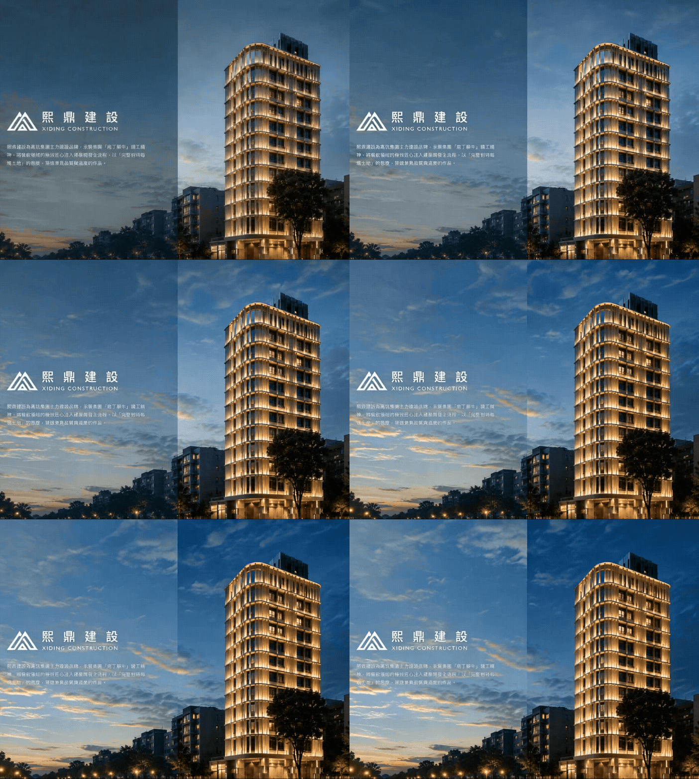
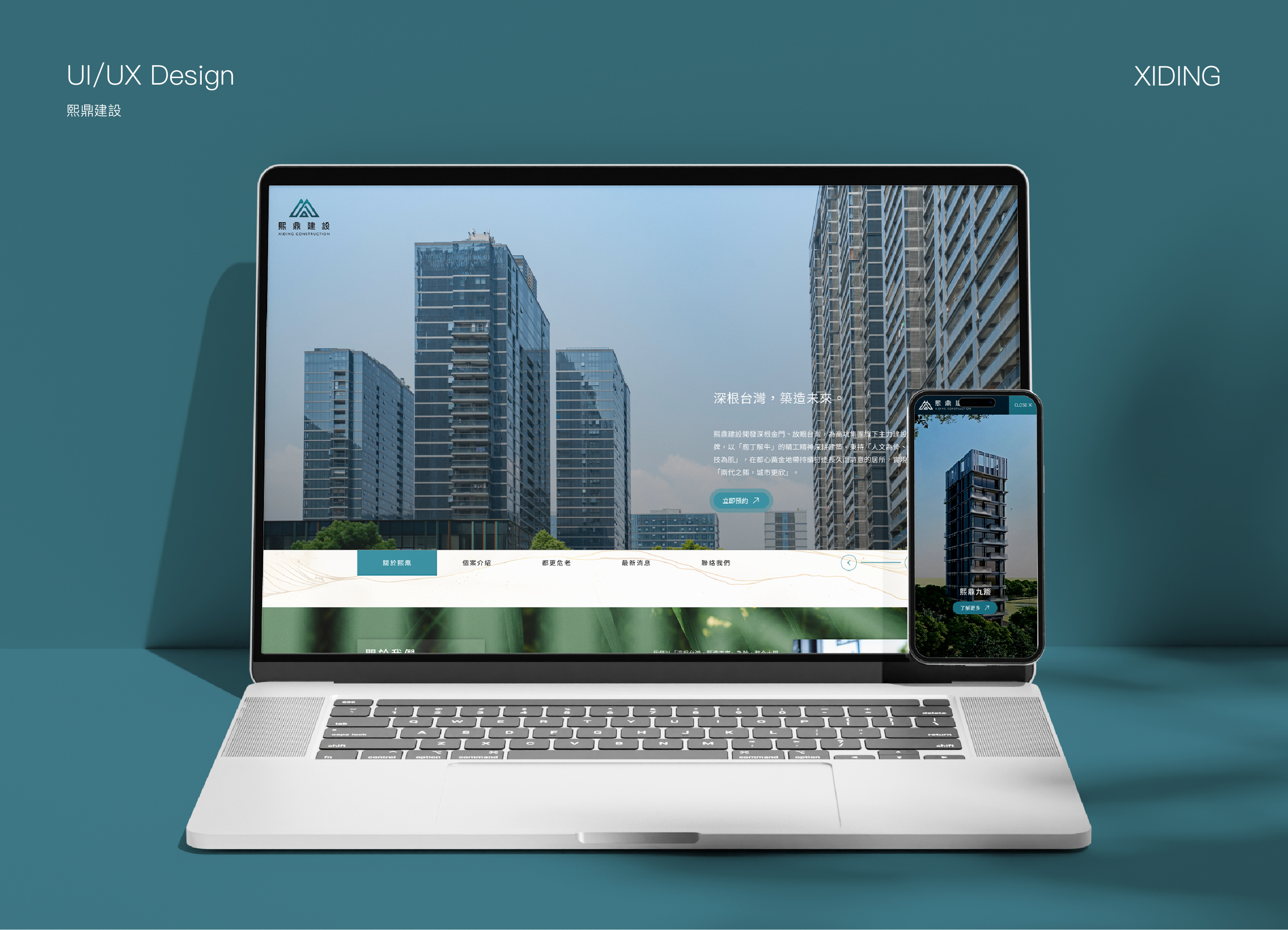
Xiding Construction focuses on land development, architectural planning, and urban renewal. The website brings together its brand story, professional team, projects, and services to create a refined corporate presence with both expertise and human warmth. Built around the concept “Rooted in Taiwan, Building the Future,” Masou Design used calm colors, architectural geometry, natural imagery, and editorial layouts to shape a sophisticated yet understated digital experience.
➜ View Project
Elevating the Brand Through Architecture
作品Xi Ding Construction begins with the land itself—carefully considering site conditions, architectural planning, and construction quality to shape a thoughtful relationship between buildings and the urban environment. Through professional integration, craftsmanship, and a human-centered perspective, each project responds to the unique character of its site and the needs of everyday life. The result is architecture that goes beyond physical space, carrying daily experiences, preserving local memory, and creating lasting value for the city.
Building a Clear Narrative from Brand Philosophy to Completed Projects
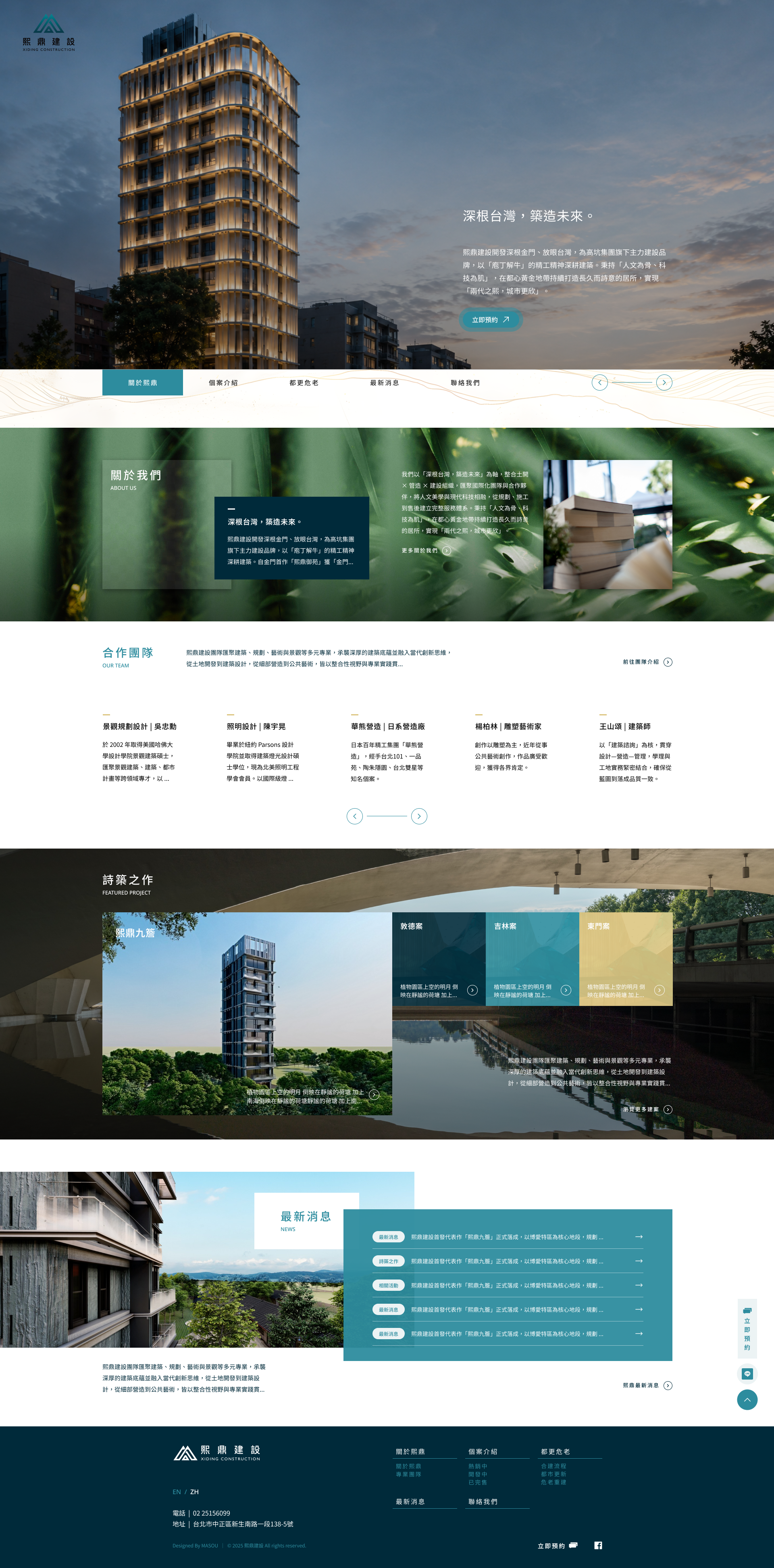
The homepage is structured to guide visitors through Xi Ding’s philosophy, brand story, collaborative team, architectural projects, latest news, and contact information. This allows users to first understand the company’s values and expertise before exploring its developments and services.
The layout combines large-scale imagery, information cards, horizontal navigation, and generous whitespace to create an editorial experience inspired by architectural publications. Rather than following the promotional and information-heavy style often seen on construction websites, the design adopts a calmer, more refined rhythm to build trust through clarity and restraint.
Natural elements, books, material details, and architectural photography are woven throughout the site, presenting not only the finished buildings but also the knowledge, craftsmanship, and human involvement behind them.
Creating the Right Expression for Architecture While Maintaining Brand Consistency
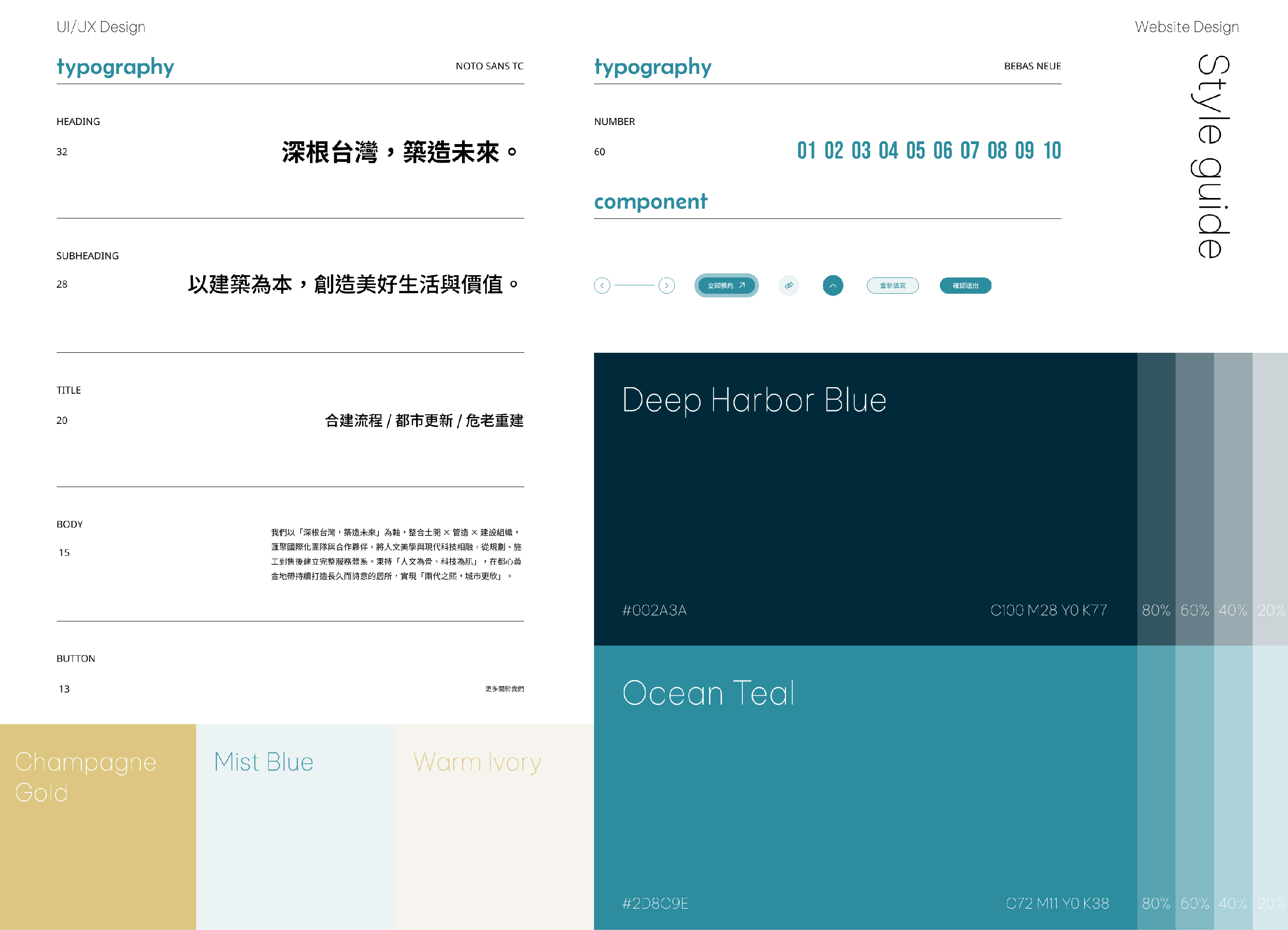
The Xi Ding Construction website balances architectural precision with a sense of human warmth. Deep blue and teal communicate professionalism and an urban perspective, while champagne gold and warm-toned imagery introduce the character of land, craftsmanship, and everyday life.
Through a consistent system of color, typography, geometric lines, photography, and UI components, the brand philosophy, team introduction, project portfolio, and urban renewal services are all brought together within one cohesive visual language. More than a platform for showcasing developments, the website serves as a long-term digital foundation for building brand image, professional trust, and lasting value.
➜ More Projects
➜ Contact Us