WORKS

透過平面視覺與宣傳設計,看見品牌溝通被重新整理後的樣貌。 我們從型錄、包裝、海報、展場與行銷素材出發,協助品牌梳理資訊重點,將內容轉化為更具辨識度的視覺表現。

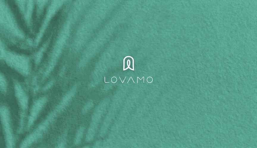
LOVAMO 柔墨 | 眼目到指尖的美學

Lovamo 柔墨以「沙龍文化」作為品牌核心,定位為融合美睫、藝術感與生活美學的高質感美學品牌。品牌不只提供眼部妝點服務,更希望將每一次細緻修飾,轉化為一段被理解、被呵護,並重新感受自信的身心體驗。 我們為 Lovamo 建立完整品牌視覺系統,從商標、標準字到整體形象,重新詮釋美睫沙龍的識別語言。商標以捲翹眼睫、指甲輪廓與中央人物姿態作為核心意象,象徵「眼目到指尖」的美學延伸,也呼應品牌對細節、姿態與自我照顧的重視。 整體設計打破傳統美睫品牌過於制式、商業化的印象,注入藝術、SPA 與居家般的溫柔氛圍,讓 Lovamo 呈現出專業卻不疏離、細膩而具溫度的品牌性格。透過柔和的視覺語彙與富有感官層次的品牌形象,Lovamo 讓美不只是外在修飾,而是一種從眼神、指尖到內在狀態的自信回歸。 Lovamo is built around the idea of salon culture, positioned as a refined beauty brand that combines eyelash styling, artistic expression, and lifestyle aesthetics. More than offering eye beauty services, the brand aims to turn every delicate detail into an experience of care, comfort, and renewed confidence. The brand identity system reinterprets the visual language of an eyelash salon through a more complete and distinctive design approach. The logo combines the curve of lifted eyelashes, the outline of a fingernail, and a central human figure, symbolizing the extension of beauty from the eyes to the fingertips. It also reflects the brand’s focus on details, posture, and self-care. The overall design moves away from the overly commercial and standardized image often seen in eyelash brands. Instead, it brings in a softer atmosphere inspired by art, spa culture, and the warmth of home. Through gentle visual elements and a layered sensory brand image, Lovamo presents a professional yet approachable personality. Beauty is no longer only an outer touch-up, but a quiet return of confidence from the eyes, fingertips, and inner self.

OVEZO|回到呼吸與原質生活

Ovezo 是一個以自然環保材質、運動生活與純粹美學為核心的生活品牌。 品牌創辦人長期投入運動用品與健康產業,卻也逐漸意識到,許多看似促進健康的產品,背後仍可能仰賴塑料與化學材料,成為影響環境與生活品質的來源。因此,Ovezo 希望從產品材質開始,為運動用品提出一種更友善地球、更貼近日常生活的選擇。 鮭魚設計協助 Ovezo 進行品牌工程、品牌語彙、視覺識別與網站設計,將「環境永續」與「健康運動」轉化為一套極簡、克制且具一致性的品牌系統。 在品牌精神上,我們以「O」作為核心符號,延伸出呼吸、循環、歸零、有氧、地球與友善循環的概念。它象徵人在運動中回到身體本質,也象徵品牌對環境與材質選擇的重視。 整體品牌應用以極簡減法為方向,幾乎不依賴強烈色彩或多餘裝飾,而是透過留白、紙張質感、打凸工藝與細膩版面秩序,讓品牌在觸感、光影與材質變化中建立記憶點。 Ovezo 的品牌設計不是用口號訴說環保,而是讓永續理念以更安靜、更純粹的方式融入日常,成為一種低調卻堅定的生活選擇。

AROS | JUST ENJOY

AROS 是一款結合台灣在地水果與英式雞尾酒精神的調酒品牌。 鮭魚設計從品牌企劃、品牌語彙、視覺識別到整體形象規劃,協助 AROS 建立一套兼具時尚感、浪漫氣息與英倫貴族精神的品牌系統。品牌不只是呈現酒品風味,更希望透過視覺與文字語氣,傳達「輕鬆開瓶、盡興享受」的飲酒態度。 在品牌語彙上,我們以「台灣鮮採水果」與「英式調酒文化」作為核心對比。前者代表新鮮、酸甜、奔放與在地風土;後者則帶有尊貴、優雅、嚴謹與經典品味。兩者交會後,形成 AROS 獨有的品牌個性:既有台灣水果的鮮明風味,也有英倫調酒的優雅輪廓。 視覺設計則延續這樣的精神,透過浪漫、剔透、精緻且帶有派對感的設計語言,打造出具備國際時尚感的酒品形象。從品牌標誌、色彩、包裝視覺到整體溝通語氣,皆圍繞著「不流俗的浪漫」、「輕盈卻有記憶點的風味」與「讓人想即刻開瓶的情緒感」展開。 AROS 的品牌設計不只是包裝一款調酒,而是替產品建立一個可被感受、可被想像、也可被記住的飲酒場景。讓消費者在第一眼看見品牌時,就能感受到它的時尚、甜美、微醺與盡興。 AROS is a cocktail brand that brings together fresh Taiwanese fruits and the spirit of British cocktail culture. Masou Design worked on the brand planning, verbal identity, visual identity, and overall brand image for AROS, shaping a brand system that feels fashionable, romantic, refined, and slightly aristocratic. Rather than simply presenting the flavor of the drink, the brand was designed to communicate a lifestyle attitude: open the bottle freely, enjoy the moment fully. For the brand language, we built the concept around the contrast between “freshly harvested Taiwanese fruits” and “classic British cocktail culture.” The former represents freshness, sweetness, acidity, richness, and local character; the latter carries a sense of elegance, precision, nobility, and timeless taste. Together, they create the unique personality of AROS: vivid and fruity, yet polished and elegant. The visual identity follows this same spirit. Through romantic details, refined curves, translucent colors, and a lively party atmosphere, AROS was shaped into a cocktail brand with a strong sense of fashion and memorability. From the logo and color system to packaging visuals and brand tone, every detail was designed around the ideas of effortless romance, distinctive flavor, and the desire to open a bottle right away. AROS is not just a packaged cocktail product. It is a brand experience that creates a mood, a drinking scene, and a memorable first impression — fresh, elegant, playful, and made for moments of celebration.

ACETECK|KEEP GOING WELL

ACETECK 是專注於油壓缸製造的工業品牌,產品應用於物流設備、產業機械與各類工業系統。對這類 B2B 製造品牌而言,品牌識別不只是外觀造型,更需要承載產品技術、品質信任與產業專業度。 在這次品牌設計中,我們以 ACETECK 的品牌字首「A」作為核心出發點,將字母結構轉化為油壓缸的解剖意象。A 字中央的軸心,象徵油壓缸內部的活塞桿與精密結構;外部輪廓則呼應缸體、機械結構與穩定支撐,讓商標不只是品牌名稱的縮寫,也成為產品技術的視覺化表現。 整體識別語言以「精密、動力、穩定」作為設計核心。透過俐落的幾何切面、向前延伸的速度感與工業感線條,營造出油壓缸推動、伸縮與持續運作的動態印象,呼應 ACETECK 在製造品質、測試標準與技術支援上的專業態度。 我們希望這個品牌識別能讓客戶在第一眼看見 ACETECK 時,就感受到它與油壓缸產業之間的高度連結。商標不只是好看,而是能說明品牌所代表的產品特性:精密製造、穩定輸出、嚴格測試,以及值得信任的工業品質。 透過這次品牌重塑,ACETECK 的視覺形象從傳統製造廠的功能性溝通,轉化為更具辨識度的 B2B 工業品牌系統,讓品牌在型錄、網站、產品應用、展覽與國際市場溝通中,都能維持一致且專業的品牌印象。 ACETECK is a B2B industrial brand specializing in hydraulic cylinder manufacturing, serving logistics equipment, industrial machinery, and various mechanical applications. In this brand identity project, we transformed the initial letter “A” into a visual interpretation of a hydraulic cylinder cross-section. The central axis represents the piston rod and precision internal structure, while the outer form echoes the cylinder body, mechanical support, and industrial strength. Built around the ideas of precision, power, and stability, the logo uses sharp geometric cuts and forward-moving lines to express the motion, extension, and continuous operation of a hydraulic cylinder. Rather than creating a purely decorative symbol, we designed the identity as a product-related visual code — one that helps customers immediately connect ACETECK with hydraulic cylinder manufacturing, strict quality testing, and reliable industrial performance. Through this brand identity system, ACETECK gains a clearer and more professional visual language for use across its website, catalog, exhibitions, and international market communication.

大燉煌鍋物|東方食材寶櫃

大燉煌鍋物以東方食補文化為核心,結合「食材寶櫃」、「六角玄武紋」與「十二瓣菊」等象徵元素,建立出兼具珍貴食材、長壽寓意與高級餐飲質感的品牌識別系統。整體視覺以金棕、深紫紅與米白色調鋪陳,透過細緻線條、窗櫺圖騰與品牌應用延伸,呈現出沉穩、典雅且具有文化記憶點的鍋物品牌形象。

中華電信 InventAI |夢想轉動者

InventAI 是一套以「智能流動」為核心概念所延伸的 AI 品牌設計計畫。 整體視覺以軌道、循環、能量核心作為主要語言,重新定義人工智慧品牌在科技產業中的形象表現。 本次品牌設計透過動態幾何、未來感色彩系統與模組化識別架構,建立出具有延展性與辨識度的 AI 品牌系統。 除了主品牌識別外,也同步規劃了系列子品牌、生態應用、展場視覺、品牌物件與數位介面延伸,使整體品牌更具系統化與國際化的視覺體驗

漢和西 | 把一桌辦桌菜,留進日常餐桌

漢和西

鉅生物流 | 熊大心的家電安裝

Miss Seesaw | 速食保養美學

美的超能力

美的超能力

EUMER|綻放肌膚的植萃光澤

當保養品不只是成分與功效的說明,視覺也成為品牌感受的一部分。 Eumer 以植萃、保濕與日常修護為核心,透過更簡約、柔和且具有高級感的設計語言,重新整理產品資訊與品牌氛圍,讓保養品的純淨感與精緻度被更清楚地呈現。 整體視覺以留白、細緻線條、柔霧色彩與自然花植作為主要語彙,搭配產品靜物構圖與柔光背景,降低資訊的擁擠感,讓每一款產品都能在清楚的閱讀節奏中展現特色,也讓 DM 更貼近高端保養品的形象。 Skincare design is not only about explaining ingredients and benefits. It is also about creating a feeling that helps people understand the brand at first glance. Eumer focuses on botanical care, hydration, and daily skin recovery. Through a softer and more refined visual language, the product information is reorganized into a clean, elegant, and premium brochure style. The overall design uses open white space, delicate lines, soft colors, natural flowers, and product still-life compositions. These elements reduce visual clutter and create a smoother reading experience, allowing each product to stand out clearly while presenting a more high-end skincare image.

VELO OEM Products Guide