
2026.05.28
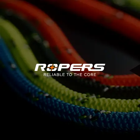
ROPERS | RELIABLE TO THE CORE
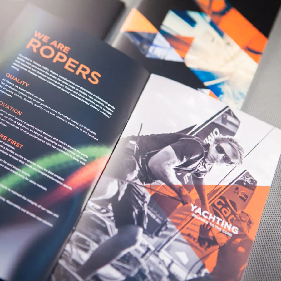
ROPERS is a Taiwan-based professional rope brand founded in 1981, specializing in the manufacturing, assembly, and global supply of high-quality rope products. Its applications span outdoor leisure, commercial marine, industrial safety, fishery, aviation, and mining. The brand statement “RELIABLE TO THE CORE” communicates not only the strength and durability of its ropes, but also the brand’s commitment to precision manufacturing, material quality, and long-term reliability. For this project, we extended the ROPERS brand identity across business cards, product catalog design, and corporate stationery applications. The visual system centers on the logotype, preserving the brand’s industrial and professional character while using a striking fluorescent orange as the key visual color. The target-like “O” in the logo also reinforces the ideas of precision, reliability, and control. Through spot color printing, silver foil stamping, and transparent foil details, the printed materials give ROPERS a sharper, more refined, and more memorable presence in the B2B industrial market.

Building a Memorable Identity with Fluorescent Orange
ROPERS is a Taiwan-based professional rope brand founded in 1981, specializing in the manufacturing, assembly, and global supply of high-quality rope products. Its applications span outdoor leisure, commercial marine, industrial safety, fishery, aviation, and mining. The brand statement “RELIABLE TO THE CORE” communicates not only the strength and durability of its ropes, but also the brand’s commitment to precision manufacturing, material quality, and long-term reliability.
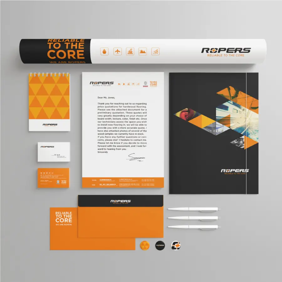
For this project, we extended the ROPERS brand identity across business cards, product catalog design, and corporate stationery applications. The visual system centers on the logotype, preserving the brand’s industrial and professional character while using a striking fluorescent orange as the key visual color. The target-like “O” in the logo also reinforces the ideas of precision, reliability, and control. Through spot color printing, silver foil stamping, and transparent foil details, the printed materials give ROPERS a sharper, more refined, and more memorable presence in the B2B industrial market.
Communicating Precision and Reliability Through the Logotype
The ROPERS identity is built around a logotype as its primary visual element. For a professional rope brand, a logotype is not only a name mark. It also needs to communicate stability, industrial professionalism, and product trust. The “O” in “RO” carries a target-like core concept, symbolizing precision, quality control, and attention to manufacturing detail while connecting directly to the brand statement “RELIABLE TO THE CORE.”
In the brand application design, we used the logotype, fluorescent orange brand color, and print finishing as the main visual anchors. With a clean and direct design language, ROPERS can express a clear professional image across business cards, catalogs, and stationery without relying on unnecessary decoration.
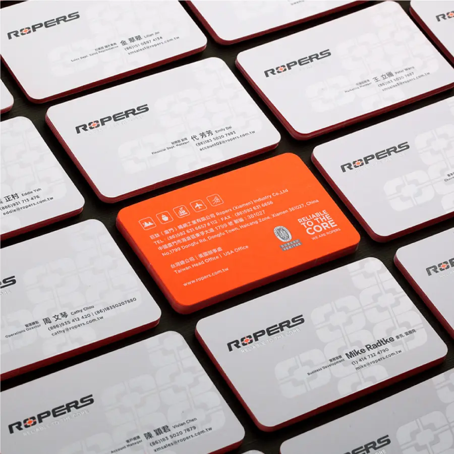
Enhancing Brand Presence with Spot Color and Print Finishing
Fluorescent orange is one of the most important visual elements in the ROPERS brand identity. To accurately reproduce the vividness of this color in printed materials, we used spot color printing for business cards and stationery applications instead of replacing it with standard CMYK printing. This allows the brand color to remain more saturated, brighter, and closer to the intended identity.
In addition to the fluorescent spot color, we applied silver foil stamping and transparent foil details to add visual and tactile depth. For a B2B industrial brand, print finishing is not merely decorative. It becomes an important detail that helps the brand leave a stronger impression during physical contact.
Extending a Consistent Industrial Brand Image from Cards to Catalogs
This design extension included business card design, catalog design, and corporate stationery applications. Each medium has a different usage scenario, but the overall visual system needed to remain consistent so that every brand touchpoint could communicate the same sense of clarity, professionalism, and reliability.
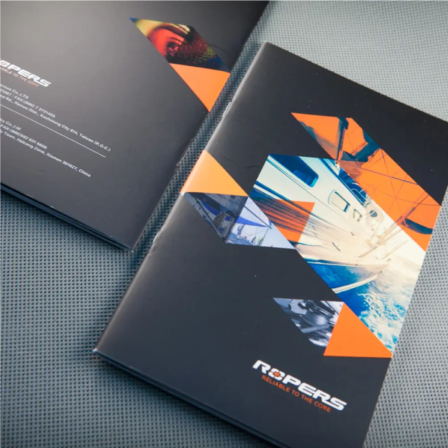
In the product catalog design, we continued the fluorescent orange, logotype-based visual identity, and rational layout style to make product information, brand introduction, and application fields easier to read. For an industrial brand with multiple product types and application scenarios, a catalog is more than a collection of information. It is an important communication tool that helps customers understand the brand’s capabilities and product value.
Making a Professional Brand Memorable Through Detail
The focus of the ROPERS brand identity project was not to create an image unrelated to the industry, but to extend a more complete brand application system from the existing logotype, brand color, and product professionalism. Through the strong recognition of fluorescent orange, the precision of the logotype, and the print details applied to business cards, catalogs, and stationery, the brand becomes easier to notice and remember in the professional industrial market.
For a B2B brand, good identity design does not need to be overly complex. It should make every touchpoint clear, consistent, and memorable. From business cards to catalogs, from spot color to foil finishing, this project turns “RELIABLE TO THE CORE” from a brand statement into a visual and tactile brand experience.
✦ Talk to us about your brand identity idea.
✦ View more works in brand, website, and graphic design.
✦ Back to home to learn how we help brands build clearer visual communication.