
2026.05.28
NuSkin|338 Event Key Visual Extension Design
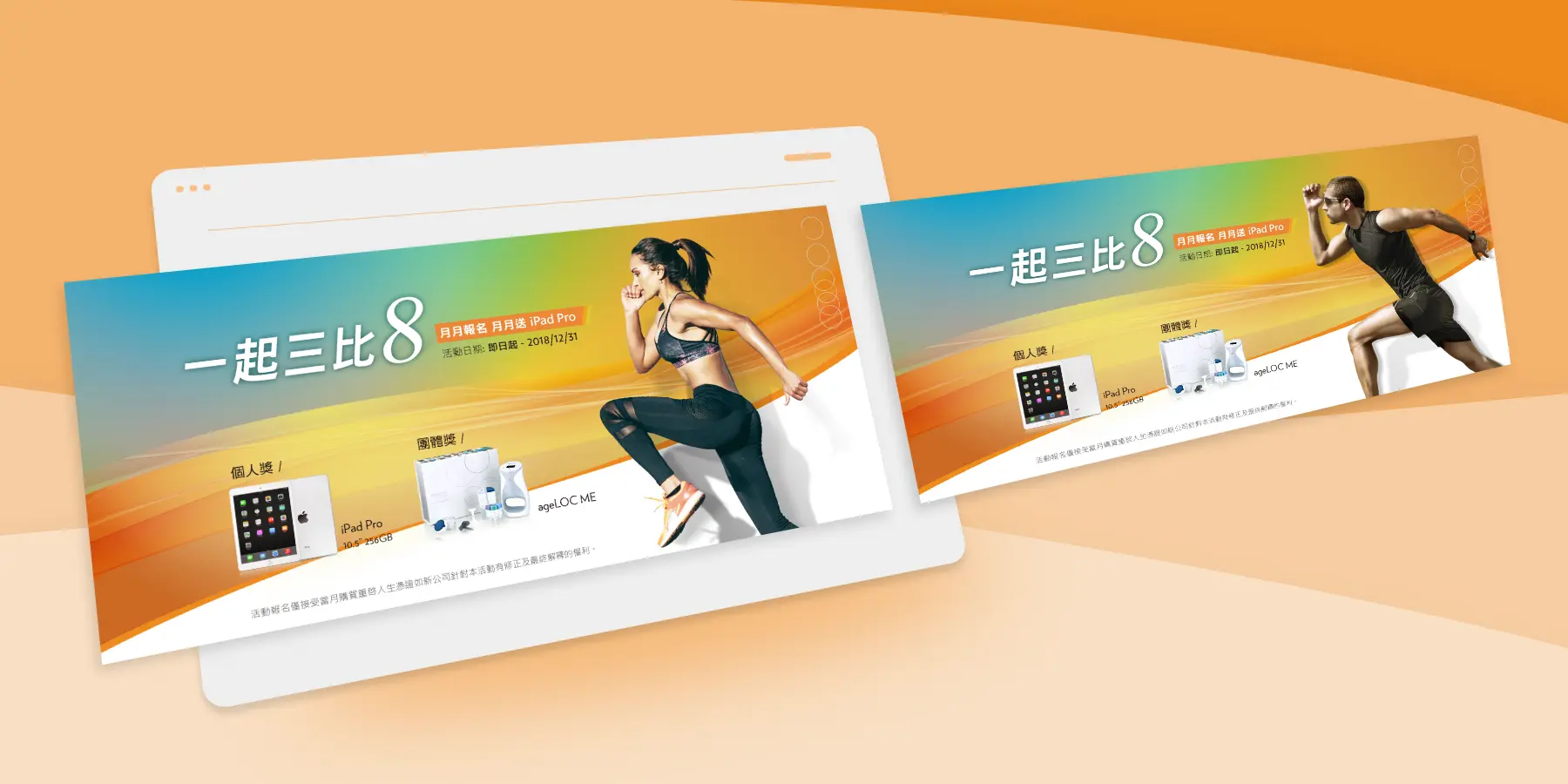
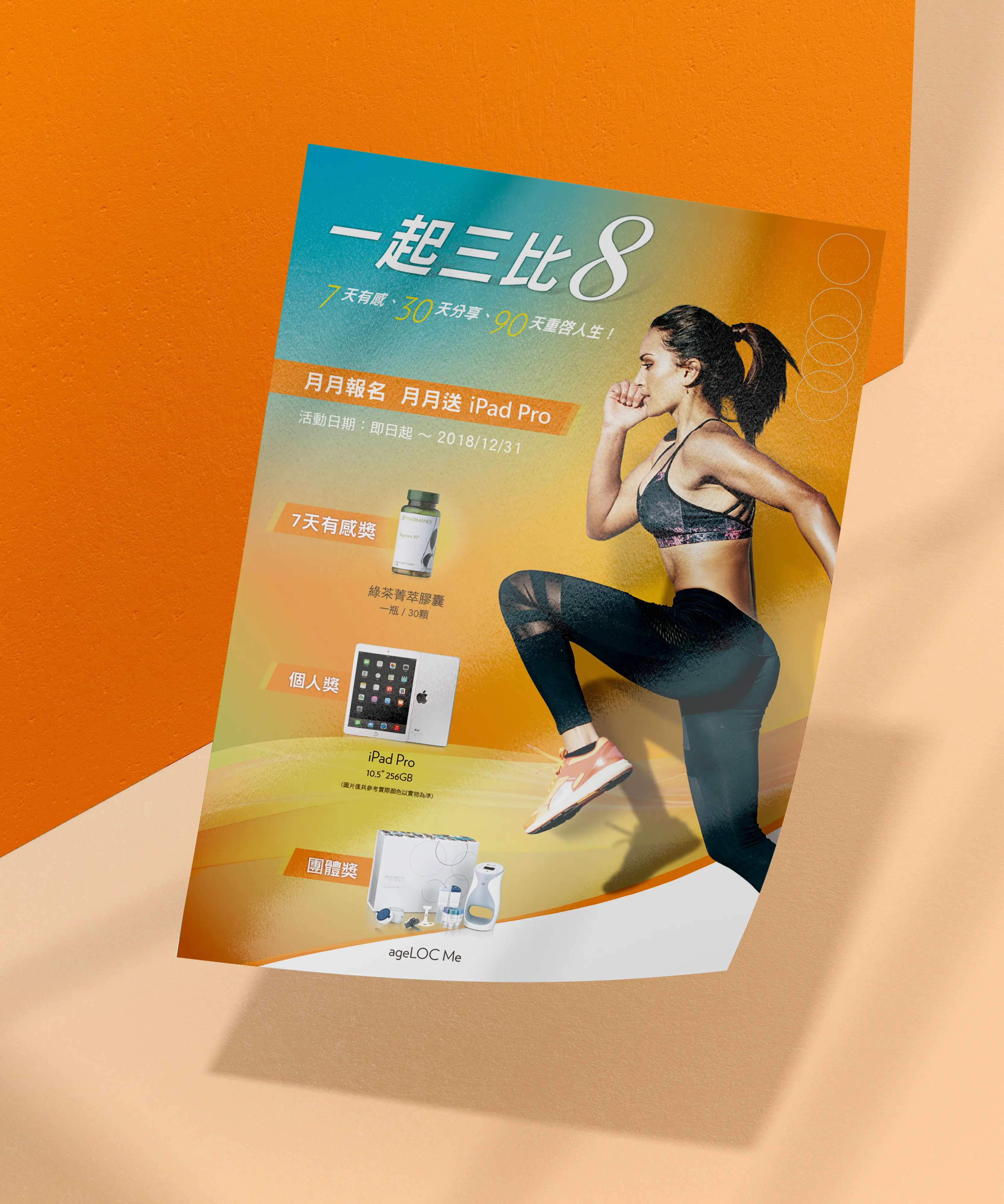
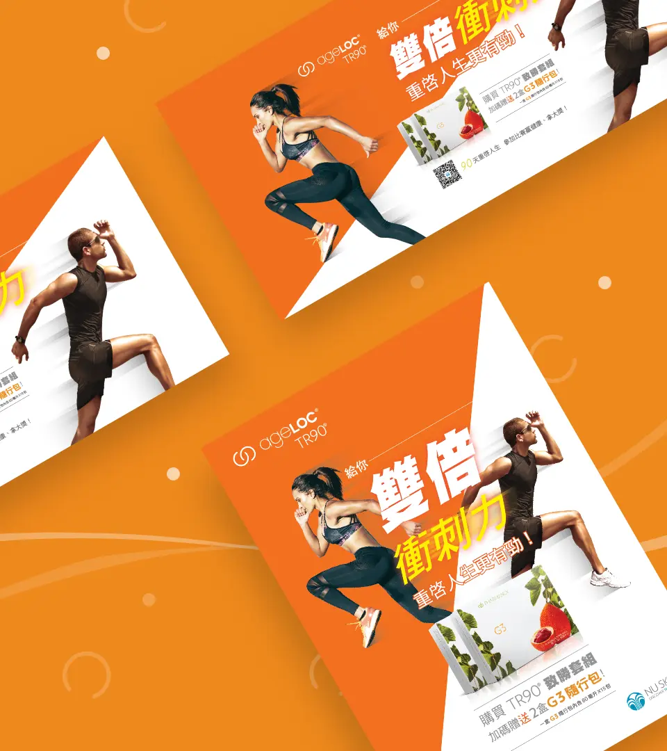
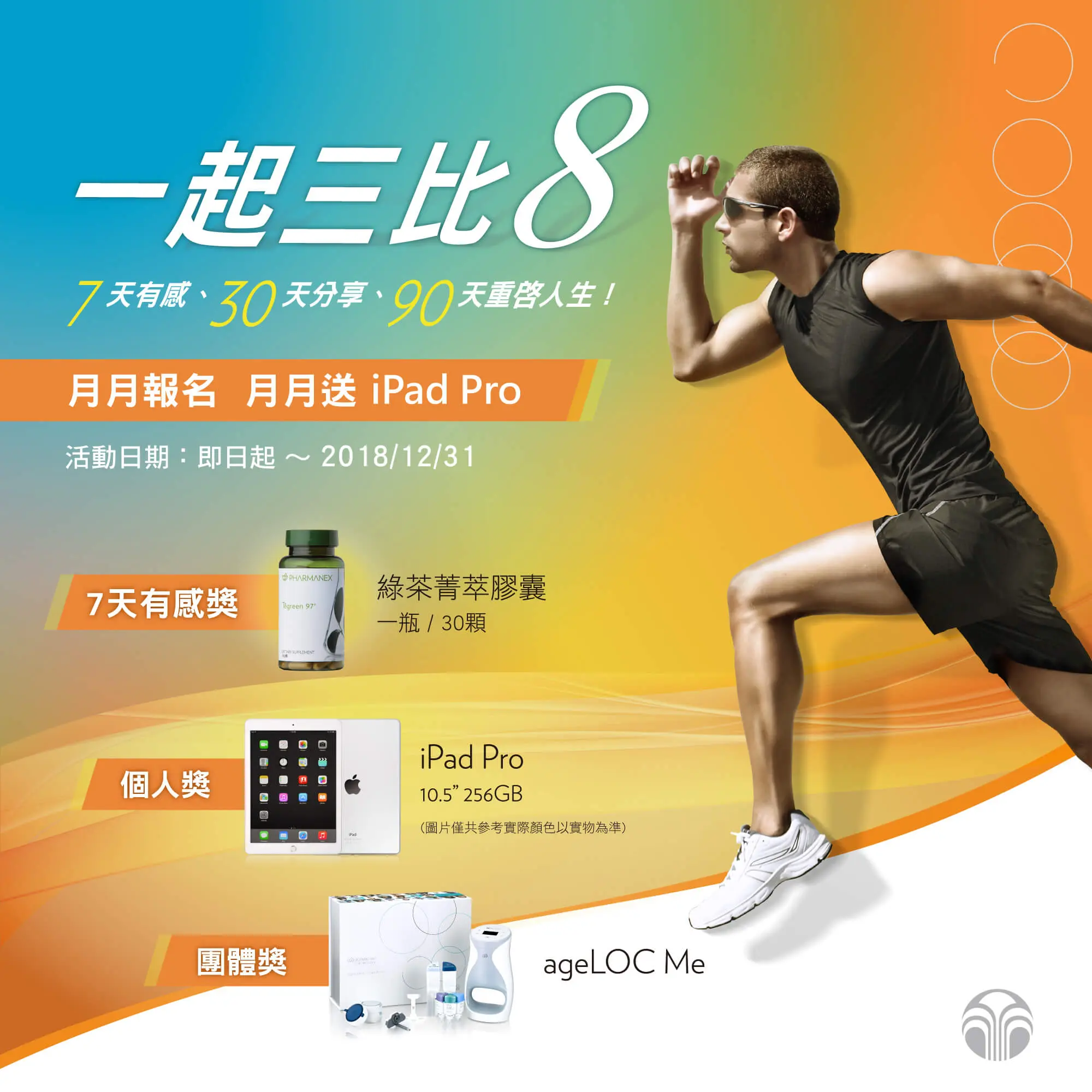
NuSkin’s “338 Event” was a key visual extension design project following the TR-90 Restart Your Life Plan campaign. The name “338” plays with a Taiwanese phonetic expression that suggests “getting slimmer together,” giving the campaign a lighter, friendlier, and more memorable tone while still connecting to the theme of health management and body transformation. The focus of this project was to extend the campaign key visual across different media and on-site applications, including promotional banners, DM materials, flags, table displays, and hanging posters. Through consistent color usage, model selection, layout rhythm, and campaign visual language, the “338 Event” maintained clear brand recognition and a lively campaign atmosphere across different formats and touchpoints.

Extending a Campaign Key Visual into a Clear and Memorable Brand Communication System
NuSkin’s “338 Event” was a key visual extension design project following the TR-90 Restart Your Life Plan campaign. The name “338” plays with a Taiwanese phonetic expression that suggests “getting slimmer together,” giving the campaign a lighter, friendlier, and more memorable tone while still connecting to the theme of health management and body transformation.
The focus of this project was to extend the campaign key visual across different media and on-site applications, including promotional banners, DM materials, flags, table displays, and hanging posters. Through consistent color usage, model selection, layout rhythm, and campaign visual language, the “338 Event” maintained clear brand recognition and a lively campaign atmosphere across different formats and touchpoints.
Maintaining Campaign Recognition from Online Banners to Physical Materials
For campaign visual design, the goal is not only to create one good-looking image. It is to make sure the campaign can be recognized across different media. For NuSkin’s “338 Event,” the visual system was extended from online promotional banners to DM materials, flags, table displays, and hanging posters, allowing the campaign to maintain a consistent brand tone in both digital and on-site environments.
The visual direction continued the healthy, bright, and energetic feeling of the TR-90 related campaign. Through dynamic human imagery, product placement, color proportion, and headline rhythm, the design created a memorable campaign impression. Across different touchpoints, users could quickly understand that the campaign was connected to health management, body transformation, and collective participation.
Turning the Playful Campaign Name into a Complete Visual Language
The name “338” carries a light, conversational, and memorable tone. Because of this, the visual design could not feel overly serious or become only a stack of promotional messages. Through bright colors, clear headlines, energetic human imagery, and product visuals, the playful nature of the campaign name was transformed into a more complete brand communication experience.
This kind of campaign visual extension allows different materials to remain consistent while also adapting to different sizes and contexts. Whether used for social media exposure, website banners, table displays, or large hanging posters, the campaign message stays clear while maintaining the professional and energetic tone of a NuSkin brand activity.
A Good Campaign Visual Should Keep the Same Brand Feeling Across Different Sizes
The challenge of campaign key visual extension design is that every medium has a different proportion, viewing distance, and information need. Online banners need to attract clicks quickly, DM materials need to carry more complete campaign information, and flags or hanging posters need to be seen clearly from a distance in physical spaces. The design therefore cannot simply be resized. It needs to adjust layout focus and information hierarchy for each format.
NuSkin’s “338 Event” visual extension used a consistent campaign language and flexible layout structure to maintain recognition across different media applications. This is the core value of campaign graphic design: helping a brand activity not only be seen, but also be remembered clearly at every touchpoint.

✦ Talk to us about your campaign visual design idea.
✦ View more works in brand, graphic, and campaign visual design.
✦ Back to home to learn how we help brands build clearer visual communication.