2026 臺北美術獎徵件|從當代藝術創作看視覺文化與設計靈感

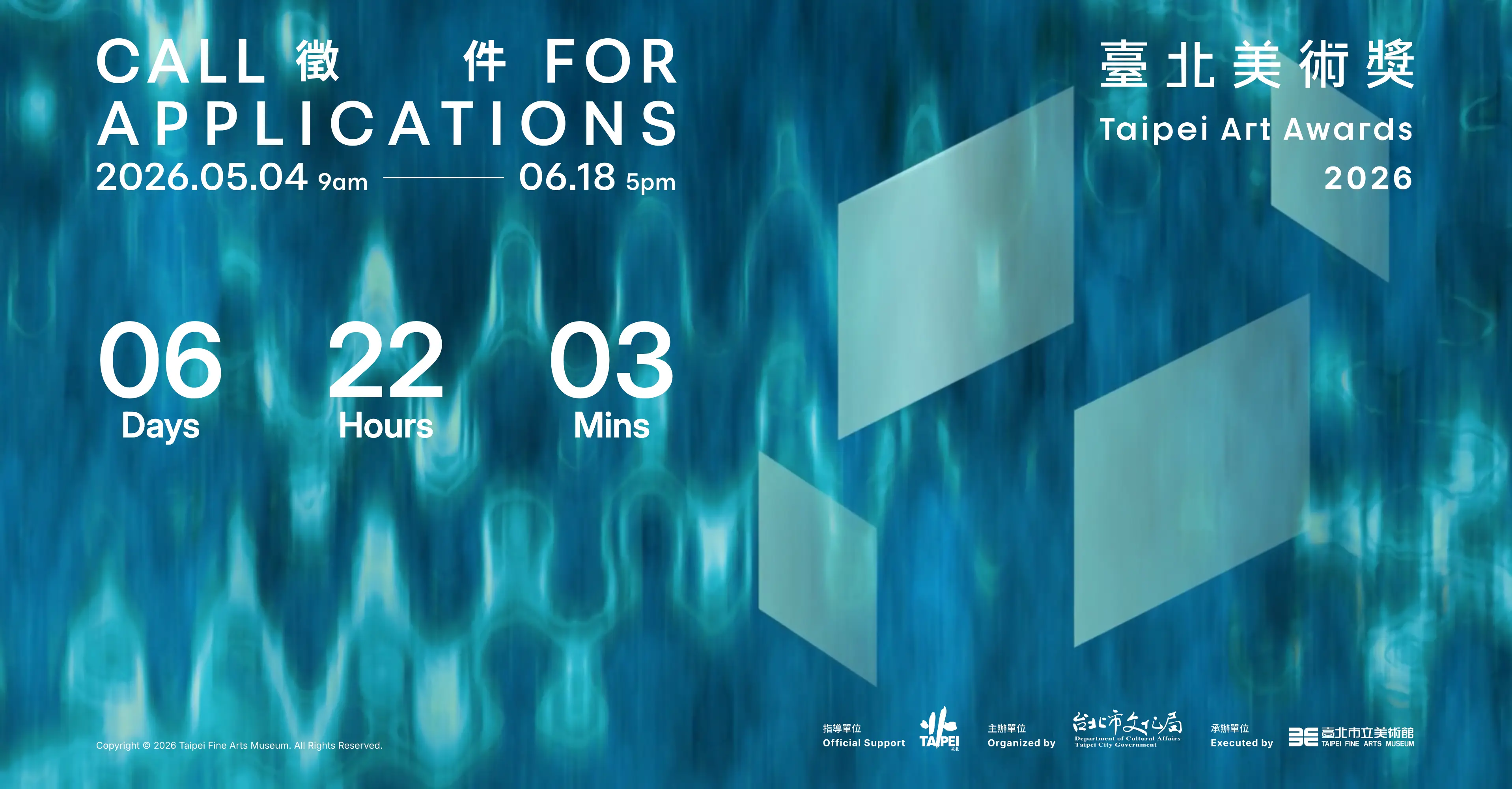
臺北美術獎是由臺北市立美術館主辦的當代藝術獎項,2026 年徵件宗旨為鼓勵富有獨特性與時代精神的當代藝術創作。參賽作品不限媒材與尺寸,展出日期暫定自 2026 年 10 月 24 日起至 2027 年 2 月 14 日,展出地點為臺北市立美術館。
2026 臺北美術獎徵件|從當代藝術創作看視覺文化與設計靈感

臺北美術獎是由臺北市立美術館主辦的當代藝術獎項,2026 年徵件宗旨為鼓勵富有獨特性與時代精神的當代藝術創作。參賽作品不限媒材與尺寸,展出日期暫定自 2026 年 10 月 24 日起至 2027 年 2 月 14 日,展出地點為臺北市立美術館。

老實說,第一次看到臺北美術獎時,對做商業設計的人來說,可能會有一點距離感。它不是我們平常常討論的品牌設計獎、包裝設計獎,也不是那種一看就知道可以拿來放作品集的設計競賽。但如果把設計看成一種「讓人產生共鳴的溝通方法」,當代藝術其實離設計並不遠。

品牌設計、平面設計、包裝設計很多時候都不是單純在處理好不好看,而是在處理一個概念怎麼被理解、一段文化怎麼被轉譯、一種情緒怎麼被看見。這些事情,剛好也是當代藝術經常在回應的問題。差別只是在於,藝術創作更自由,商業設計則多了一層品牌、受眾與市場溝通的任務。

所以我們看臺北美術獎,不只是看它什麼時候徵件、獎金多少,而是把它當成一個觀察視覺文化的入口。對設計公司來說,這類藝術獎項能提醒我們:好的設計不只是在畫面上成立,也要在概念上站得住,甚至能和人文、歷史、地方文化或時代情緒產生連結。

順帶一提,查資料時看到官方網站還保留著 ASP 時代的技術痕跡,身為網站設計公司真的會忍不住停頓三秒。現在新網站當然很少會這樣做,但在公部門、學術機構或大型舊系統裡,這種「網站活得比很多品牌還久」的情況其實不算少見。某種程度上也滿符合這篇觀察:視覺會更新,內容會更新,但系統有時候真的會很有自己的時代精神。

活動名稱|2026 臺北美術獎

活動類型|當代藝術創作徵件

活動主題|鼓勵富有獨特性與時代精神之當代藝術創作

徵件期間|2026 年 5 月 4 日上午 9 時起至 2026 年 6 月 18 日下午 5 時止

展出日期|2026 年 10 月 24 日起至 2027 年 2 月 14 日,暫定

展出地點|臺北市立美術館

關鍵字|美術獎、徵件、當代藝術、視覺文化、臺北美術獎

活動主題

2026 臺北美術獎以鼓勵富有獨特性與時代精神之當代藝術創作為宗旨。參賽作品不限媒材與尺寸,適合以視覺藝術、裝置、影像、聲音、複合媒材、空間創作或其他當代藝術形式進行提案的創作者參與。


參賽資格

參賽作品須為 2024 年之後完成之單件或系列創作。具中華民國國籍或持中華民國居留證之個人皆可參加;若以團體名義參賽,其成員須有二分之一,含二分之一以上具中華民國國籍。

同一參賽者可採個人或團體名義參賽,但以各分別報名一次為限。也就是說,參賽者可以用不同身份提出報名,但仍需符合個人與團體參賽的相關資格規範。


活動時程

徵件時間|2026 年 5 月 4 日上午 9 時起至 2026 年 6 月 18 日下午 5 時止

決審結果公布|2026 年 10 月

展出日期|2026 年 10 月 24 日起至 2027 年 2 月 14 日,暫定


報名方式與投稿資料

本活動採線上報名。投稿期限為 2026 年 5 月 4 日上午 9 時起至 2026 年 6 月 18 日下午 5 時止。參賽者須至臺北美術獎網站進行線上登錄,報名網站為 https://taa.TFAM.museum

線上登錄資料包含:

個人資料,包括最高學歷、展歷、獲獎紀錄等。

創作理念,1000 字,含以內。

作品資料,包括名稱、媒材、尺寸、創作年代與作品檔案。

作品展示構想。

靜態圖檔每張大小以 3MB 為限,檔案格式為 JPG,上傳檔案共計 10 個為限。若為數位作品、影片或聲音檔,請透過 Vimeo 或 YouTube 網路空間,將連結登錄至報名網站,mp3 與 mp4 兩種格式皆可。附件資料則包含展場平面圖。


評審流程與規範

臺北美術獎評審分為初審、複審與決審。初審由評審團進行書面審查,並於臺北市立美術館官網公布複審入選名單;未獲入選者,館方將不另行通知。

複審階段,館方將於複審書面通知時提供場地尺寸予參賽者進行空間規劃,並擇期進行口頭簡報。參賽者需說明作品與執行理念、展出空間設置規劃,以及其他參考作品,至多 3 件。複審時評審團會進行現場提問,參賽者說明至多 5 分鐘,委員詢答 8 分鐘。

決審則依決審作品之現場展出進行評選,最終決審將選出首獎「臺北美術獎」1 名、「優選獎」至多 5 名,以及「入選」數名。

決賽者須於指定時間內完成佈展與卸展。

展出空間由館方負責整合協調,並依不同展出計畫及現場狀況進行調整。

館方提供決賽者上限新臺幣 15 萬元之展覽製作費,含稅,包含木作、油漆等項目。

涉及展覽呈現之視聽器材設備,由決賽者自行準備。

館方負責展出作品之運輸與保險,出險責任依保單條款為準。

所有展出作品於展出期間不得提借。

基於宣傳與教育推廣目的,臺北市立美術館對決賽作品有展出、研究、攝影、報導、印製,以及在相關文宣與媒體上刊登之權利。


活動獎勵

總獎金|最高新臺幣 115 萬元整

最高獎金|新臺幣 55 萬元整

首獎|獲臺北美術獎首獎者,頒發獎金新臺幣 55 萬元整,含稅,獎座乙只、獎狀乙紙及專輯 10 冊,並得由館方邀請舉辦個展。

優選獎|獲優選獎者,頒發獎金新臺幣 12 萬元整,含稅,獎狀乙紙及專輯 5 冊。

入選|獲入選者,頒發獎狀乙紙及專輯 5 冊。


注意事項

凡參賽者於完成線上報名後,即視為同意遵循簡章各項規定。若參賽作品曾在國內公開競賽中獲得獎項,或涉及抄襲他人作品,將不得參賽;違反者將取消資格及獎金。

參賽作品如涉及第三人之智慧財產權或其他權益,參賽者應自行取得授權同意,並承擔一切法律責任。展出作品須符合館方規劃之條件、空間範圍與安全規範,且不得破壞臺北市立美術館硬體結構。

團體獲獎者須由團體代表人領取獎金,並負責扣稅相關事宜。如有未盡事宜,主辦單位得依實際狀況修訂並公告。


鮭魚設計觀點|為什麼設計公司也該關注臺北美術獎?

從商業設計的角度來看,臺北美術獎不一定是品牌設計師、包裝設計師或平面設計師會直接投稿的獎項。但如果把設計理解為一種與人產生共鳴的溝通方法,那麼當代藝術所處理的時代議題、材料實驗、敘事方法與視覺語言,對設計公司其實具有很高的參考價值。

品牌設計與商業設計並不只是把資訊排得漂亮。許多有記憶點的品牌概念,往往來自人文、歷史、藝術、地方文化與社會觀察。藝術創作和商業設計的差異,更多時候是在表現目的、媒介條件與溝通對象上的不同,而不是完全無關的兩個世界。

因此,臺北美術獎這類當代藝術獎項,適合放在「視覺文化觀察」或「設計靈感觀察」的脈絡中理解。它不只是徵件資訊,也是一個觀察臺灣當代創作如何回應時代精神的入口。對設計產業來說,這類內容能幫助我們從純商業需求之外,重新思考視覺如何引起共鳴、如何承載觀點,以及如何讓作品不只是好看,而是有更深的文化連結。


相關單位與聯絡方式

主辦單位為臺北市政府文化局。聯絡電話為 02-2595-7656 轉 206、215。相關資訊可參考臺北市立美術館官網與臺北美術獎報名網站。活動內容、日期與規範可能依主辦單位公告調整,實際資訊仍以官方公告為準。

臺北市立美術館官網:https://www.TFAM.museum
臺北美術獎網站:https://taa.TFAM.museum
FEATURED WORKS

LOVAMO 柔墨 | 眼目到指尖的美學

Lovamo 柔墨以「沙龍文化」作為品牌核心,定位為融合美睫、藝術感與生活美學的高質感美學品牌。品牌不只提供眼部妝點服務,更希望將每一次細緻修飾,轉化為一段被理解、被呵護,並重新感受自信的身心體驗。 我們為 Lovamo 建立完整品牌視覺系統,從商標、標準字到整體形象,重新詮釋美睫沙龍的識別語言。商標以捲翹眼睫、指甲輪廓與中央人物姿態作為核心意象,象徵「眼目到指尖」的美學延伸,也呼應品牌對細節、姿態與自我照顧的重視。 整體設計打破傳統美睫品牌過於制式、商業化的印象,注入藝術、SPA 與居家般的溫柔氛圍,讓 Lovamo 呈現出專業卻不疏離、細膩而具溫度的品牌性格。透過柔和的視覺語彙與富有感官層次的品牌形象,Lovamo 讓美不只是外在修飾,而是一種從眼神、指尖到內在狀態的自信回歸。 Lovamo is built around the idea of salon culture, positioned as a refined beauty brand that combines eyelash styling, artistic expression, and lifestyle aesthetics. More than offering eye beauty services, the brand aims to turn every delicate detail into an experience of care, comfort, and renewed confidence. The brand identity system reinterprets the visual language of an eyelash salon through a more complete and distinctive design approach. The logo combines the curve of lifted eyelashes, the outline of a fingernail, and a central human figure, symbolizing the extension of beauty from the eyes to the fingertips. It also reflects the brand’s focus on details, posture, and self-care. The overall design moves away from the overly commercial and standardized image often seen in eyelash brands. Instead, it brings in a softer atmosphere inspired by art, spa culture, and the warmth of home. Through gentle visual elements and a layered sensory brand image, Lovamo presents a professional yet approachable personality. Beauty is no longer only an outer touch-up, but a quiet return of confidence from the eyes, fingertips, and inner self.

福氣社區|客製化電商網站設計

有些電商網站,賣的不只是商品,而是一種被支持的理由。 福氣社區的網站比較特別,除了食品販售、會員系統與購物車流程之外,也把「捐款」放進整體網站體驗中。這代表使用者進入網站時,不一定只是為了買東西,也可能是想理解這個品牌在做什麼、支持什麼,或透過一筆訂單、一筆捐款參與其中。 因此,這次網站規劃的重點不只是把食品分類、購物車、會員系統與綠界第三方支付串接完成,而是讓「購買」與「捐款」兩種行為在同一個網站裡自然共存。使用者可以依照商品分類選購食品,也能透過清楚的捐款流程完成支持;對品牌來說,這個網站不只是交易平台,更像是一個把商品、理念、會員與支持者關係串起來的客製化電商系統。 Some e-commerce websites are not only built to sell products. They are built to give people a reason to support something. Fortune Community is a special custom e-commerce website project because it combines food product sales, membership, shopping cart functions, and online donations in one platform. Users may visit the website to purchase food products, but they may also come to understand the brand’s purpose and support the community through a donation. For this reason, the website structure needed to balance two different actions: shopping and giving. Product categories, cart flow, member system, and ECPay third-party payment integration were organized around a clear user journey, allowing people to browse products, complete purchases, or make donations through the same digital experience. Rather than being only a transaction tool, the website becomes a platform that connects products, purpose, members, and supporters.

Xerowheel|會員電商網站與保固服務平台設計

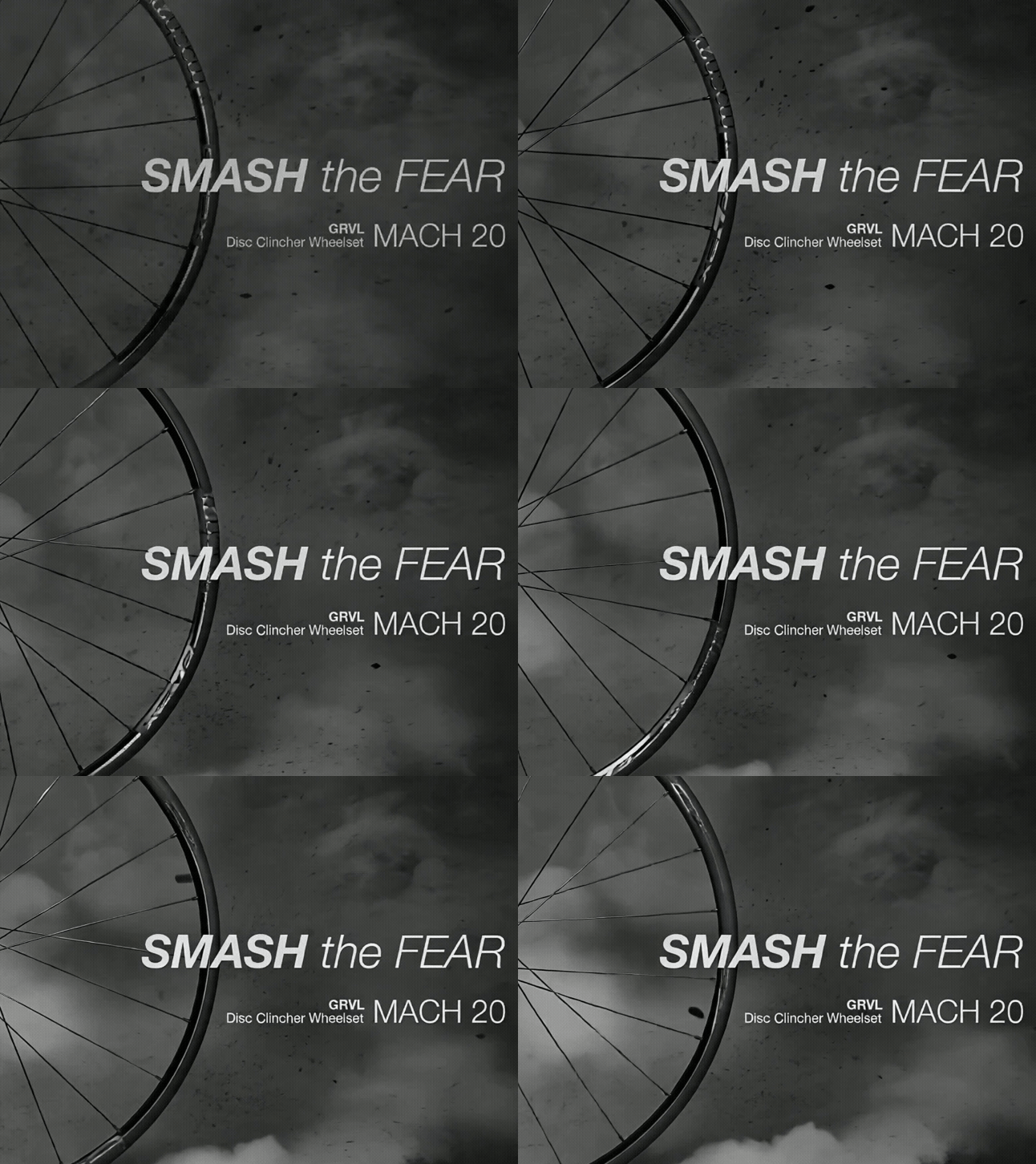
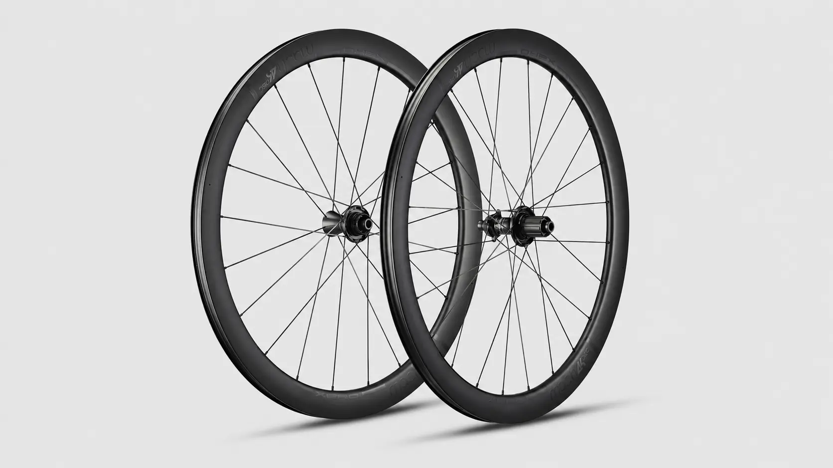
Xerowheel 是自行車輪組品牌,網站設計以「BORN TO BE QUICK」的品牌精神為核心,整合會員註冊、會員促銷、優惠資訊、產品保固與售後支援等功能。這次網站設計的重點,不只是建立商品展示與購買入口,而是協助品牌打造一個能與會員持續互動的數位服務平台。 在網站規劃上,我們將會員專區、促銷活動、優惠碼機制與保固資訊整理成清楚的使用流程,讓消費者能更直覺地完成註冊、瀏覽優惠、了解保固條件與取得產品支援。透過響應式網站設計、清楚的內容層級與符合自行車品牌速度感的視覺語氣,讓 Xerowheel 不只呈現產品專業,也能在線上建立更完整的會員經營與售後服務體驗。 Xerowheel is a bicycle wheelset brand. Built around the brand spirit “BORN TO BE QUICK,” the website design integrates member registration, member promotions, special offers, product warranty, and after-sales support into one digital platform. The focus of this project was not only to create a product display or shopping entry point, but to help the brand build a service-driven platform for ongoing member engagement. In the website planning process, we organized the member area, promotional campaigns, coupon code mechanism, warranty information, and product support into a clearer user flow. Through responsive website design, structured content hierarchy, and a visual tone that reflects the speed and performance of the cycling industry, the Xerowheel website presents both product professionalism and a more complete membership and warranty service experience online.

TEKTRO|官方網站設計

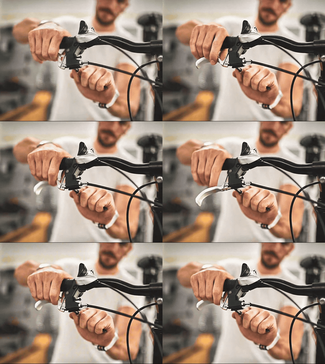
大品牌的官方網站設計,困難不一定在於畫面有多複雜,而是如何把龐大的產品資訊、不同部門的意見與使用者的瀏覽需求,整理成一個清楚、可管理、也能被長期使用的網站架構。 TEKTRO 作為自行車煞車系統與零組件領域的重要品牌,官網需要承載的不只是品牌形象,也包含大量產品型號、產品系列與不同使用情境的資訊。這次網站設計製作的重點,是協助 TEKTRO 重新整理產品資訊架構,讓使用者能依照產品類型、系列需求與應用方向進行瀏覽。 當時在規劃產品架構時,最大的挑戰之一是「多重分類」的整理。產品不只屬於單一類別,也可能同時對應不同系列、不同規格與不同用途,因此網站需要有足夠彈性的資訊架構,讓產品在後台管理與前台瀏覽時都能被清楚歸納。 另一個更困難的部分,是如何透過外部專案團隊的角色,協助整合企業內部不同部門的意見。大型品牌官網往往牽涉產品、業務、行銷與管理端的需求,每個單位都有各自重視的資訊與呈現方式。設計團隊不只是執行畫面,而是需要協助整理需求、釐清優先順序,並將內部意見轉化為可以被使用者理解的網站結構。 對產品型品牌來說,官方網站不只是形象展示,更是使用者理解產品線、比較型號與建立品牌信任的重要入口。TEKTRO 官網設計的核心,就是讓龐大的產品內容與企業內部需求被更有秩序地整合,讓品牌專業不只存在於產品本身,也能透過網站被清楚感受到。

NuSkin 如新|一起三比八活動主視覺延伸設計

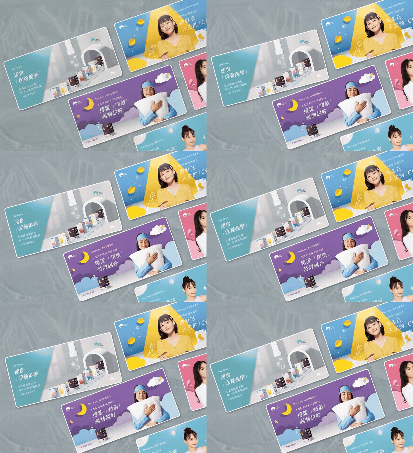
NuSkin 如新「一起三比八」是延續 TR-90 重啟人生計畫後的活動視覺延伸設計。「一起三比八」運用台語諧音,帶出「一起瘦下來」的輕鬆語感,讓活動在健康管理與體態改變的主題之外,也保有更親近、活潑且容易被記住的溝通方式。 這次設計重點,是將活動主視覺延伸到不同媒介與現場應用中,包含促銷 Banner、DM、旗幟、桌板與掛軸等視覺素材。透過一致的色彩、人物選擇、版面節奏與活動識別語言,讓「一起三比八」在不同尺寸、不同使用情境中,都能維持清楚的品牌辨識度與活動氛圍。 NuSkin’s “338 Event” was a key visual extension design project following the TR-90 Restart Your Life Plan campaign. The name “338” plays with a Taiwanese phonetic expression that suggests “getting slimmer together,” giving the campaign a lighter, friendlier, and more memorable tone while still connecting to the theme of health management and body transformation. The focus of this project was to extend the campaign key visual across different media and on-site applications, including promotional banners, DM materials, flags, table displays, and hanging posters. Through consistent color usage, model selection, layout rhythm, and campaign visual language, the “338 Event” maintained clear brand recognition and a lively campaign atmosphere across different formats and touchpoints.

彥豪智能科技 TEKTRO|集團企業形象網站設計

彥豪智能科技 TEKTRO 長期深耕自行車煞車系統與零組件製造,從單一產品品牌逐步發展為更完整的集團型企業。這次網站設計並不是單純的官網視覺改版,而是因應企業名稱、品牌架構與集團形象的重新整理,協助 TEKTRO 以更完整的企業高度,呈現其在自行車煞車技術、產品研發與全球市場中的專業定位。 在網站規劃上,我們將原本偏產品品牌的網站思維,重新整理為更符合集團企業形象的數位架構。透過品牌敘事、產品技術、國際獎項、企業實力與瀏覽動線的重整,讓網站不只展示自行車煞車產品,也能傳達彥豪智能科技作為集團企業的規模、研發能力與長期市場信任。這次合作也延續了 TEKTRO 對鮭魚設計的信任,讓我們能再次協助品牌完成重要階段的網站重寫與形象升級。 TEKTRO has long focused on bicycle brake systems and component manufacturing, gradually evolving from a product-focused brand into a more complete group-level enterprise. This website design project was not simply a visual redesign of the official website. It responded to the company’s updated name, brand structure, and group-level corporate image, helping TEKTRO present its expertise in bicycle brake technology, product development, and the global market from a broader corporate perspective. In the website planning process, we reorganized the original product-brand website approach into a digital structure more suitable for a group corporate image. Through refined brand storytelling, product technology content, international awards, corporate strengths, and browsing flow, the website presents not only bicycle brake products, but also the scale, R&D capability, and long-term market trust of TEKTRO as a group-level company. This collaboration also reflects TEKTRO’s continued trust in MASOU DESIGN, allowing us to support the brand again through an important stage of website reconstruction and image upgrading.

Petour|寵物社交與友善生活探索 App 設計

當寵物不只是陪伴,也成為人與人之間互動的起點。 Petour 以寵物交友、寵伴探索與寵物友善生活為核心,將社群互動與生活資訊整合在同一個 App 體驗中,讓使用者能更輕鬆地認識新的寵物朋友,也能發現更多適合與毛孩一起前往的場所。 整體介面以明亮、可愛且輕鬆的視覺語言為主,透過柔和色彩、寵物元素與清楚的操作流程,降低使用門檻,讓探索、配對、分享與互動都能在愉快的節奏中完成。從功能架構到畫面細節,Petour 不只是寵物交友工具,也是一個連結寵物愛好者生活圈的數位平台。 Pets are more than companions. They can also become a natural starting point for people to connect, interact, and explore life together. Petour is a pet social and lifestyle exploration app centered around pet matching, companion discovery, and pet-friendly places. By integrating social interaction with everyday lifestyle information, the app helps users meet new pet friends while discovering more places they can enjoy with their pets. The overall interface uses a bright, playful, and friendly visual language. Soft colors, pet-inspired elements, and a clear user flow create an easy and enjoyable experience for users of different levels. From exploration and matching to sharing and interaction, Petour is not only a pet social tool, but also a digital platform that connects pet lovers with a more engaging pet-friendly lifestyle.

LOVAMO 柔墨 | 眼目到指尖的美學

Lovamo 柔墨以「沙龍文化」作為品牌核心,定位為融合美睫、藝術感與生活美學的高質感美學品牌。品牌不只提供眼部妝點服務,更希望將每一次細緻修飾,轉化為一段被理解、被呵護,並重新感受自信的身心體驗。 我們為 Lovamo 建立完整品牌視覺系統,從商標、標準字到整體形象,重新詮釋美睫沙龍的識別語言。商標以捲翹眼睫、指甲輪廓與中央人物姿態作為核心意象,象徵「眼目到指尖」的美學延伸,也呼應品牌對細節、姿態與自我照顧的重視。 整體設計打破傳統美睫品牌過於制式、商業化的印象,注入藝術、SPA 與居家般的溫柔氛圍,讓 Lovamo 呈現出專業卻不疏離、細膩而具溫度的品牌性格。透過柔和的視覺語彙與富有感官層次的品牌形象,Lovamo 讓美不只是外在修飾,而是一種從眼神、指尖到內在狀態的自信回歸。 Lovamo is built around the idea of salon culture, positioned as a refined beauty brand that combines eyelash styling, artistic expression, and lifestyle aesthetics. More than offering eye beauty services, the brand aims to turn every delicate detail into an experience of care, comfort, and renewed confidence. The brand identity system reinterprets the visual language of an eyelash salon through a more complete and distinctive design approach. The logo combines the curve of lifted eyelashes, the outline of a fingernail, and a central human figure, symbolizing the extension of beauty from the eyes to the fingertips. It also reflects the brand’s focus on details, posture, and self-care. The overall design moves away from the overly commercial and standardized image often seen in eyelash brands. Instead, it brings in a softer atmosphere inspired by art, spa culture, and the warmth of home. Through gentle visual elements and a layered sensory brand image, Lovamo presents a professional yet approachable personality. Beauty is no longer only an outer touch-up, but a quiet return of confidence from the eyes, fingertips, and inner self.

福氣社區|客製化電商網站設計

有些電商網站,賣的不只是商品,而是一種被支持的理由。 福氣社區的網站比較特別,除了食品販售、會員系統與購物車流程之外,也把「捐款」放進整體網站體驗中。這代表使用者進入網站時,不一定只是為了買東西,也可能是想理解這個品牌在做什麼、支持什麼,或透過一筆訂單、一筆捐款參與其中。 因此,這次網站規劃的重點不只是把食品分類、購物車、會員系統與綠界第三方支付串接完成,而是讓「購買」與「捐款」兩種行為在同一個網站裡自然共存。使用者可以依照商品分類選購食品,也能透過清楚的捐款流程完成支持;對品牌來說,這個網站不只是交易平台,更像是一個把商品、理念、會員與支持者關係串起來的客製化電商系統。 Some e-commerce websites are not only built to sell products. They are built to give people a reason to support something. Fortune Community is a special custom e-commerce website project because it combines food product sales, membership, shopping cart functions, and online donations in one platform. Users may visit the website to purchase food products, but they may also come to understand the brand’s purpose and support the community through a donation. For this reason, the website structure needed to balance two different actions: shopping and giving. Product categories, cart flow, member system, and ECPay third-party payment integration were organized around a clear user journey, allowing people to browse products, complete purchases, or make donations through the same digital experience. Rather than being only a transaction tool, the website becomes a platform that connects products, purpose, members, and supporters.

Xerowheel|會員電商網站與保固服務平台設計

Xerowheel 是自行車輪組品牌,網站設計以「BORN TO BE QUICK」的品牌精神為核心,整合會員註冊、會員促銷、優惠資訊、產品保固與售後支援等功能。這次網站設計的重點,不只是建立商品展示與購買入口,而是協助品牌打造一個能與會員持續互動的數位服務平台。 在網站規劃上,我們將會員專區、促銷活動、優惠碼機制與保固資訊整理成清楚的使用流程,讓消費者能更直覺地完成註冊、瀏覽優惠、了解保固條件與取得產品支援。透過響應式網站設計、清楚的內容層級與符合自行車品牌速度感的視覺語氣,讓 Xerowheel 不只呈現產品專業,也能在線上建立更完整的會員經營與售後服務體驗。 Xerowheel is a bicycle wheelset brand. Built around the brand spirit “BORN TO BE QUICK,” the website design integrates member registration, member promotions, special offers, product warranty, and after-sales support into one digital platform. The focus of this project was not only to create a product display or shopping entry point, but to help the brand build a service-driven platform for ongoing member engagement. In the website planning process, we organized the member area, promotional campaigns, coupon code mechanism, warranty information, and product support into a clearer user flow. Through responsive website design, structured content hierarchy, and a visual tone that reflects the speed and performance of the cycling industry, the Xerowheel website presents both product professionalism and a more complete membership and warranty service experience online.

TEKTRO|官方網站設計

大品牌的官方網站設計,困難不一定在於畫面有多複雜,而是如何把龐大的產品資訊、不同部門的意見與使用者的瀏覽需求,整理成一個清楚、可管理、也能被長期使用的網站架構。 TEKTRO 作為自行車煞車系統與零組件領域的重要品牌,官網需要承載的不只是品牌形象,也包含大量產品型號、產品系列與不同使用情境的資訊。這次網站設計製作的重點,是協助 TEKTRO 重新整理產品資訊架構,讓使用者能依照產品類型、系列需求與應用方向進行瀏覽。 當時在規劃產品架構時,最大的挑戰之一是「多重分類」的整理。產品不只屬於單一類別,也可能同時對應不同系列、不同規格與不同用途,因此網站需要有足夠彈性的資訊架構,讓產品在後台管理與前台瀏覽時都能被清楚歸納。 另一個更困難的部分,是如何透過外部專案團隊的角色,協助整合企業內部不同部門的意見。大型品牌官網往往牽涉產品、業務、行銷與管理端的需求,每個單位都有各自重視的資訊與呈現方式。設計團隊不只是執行畫面,而是需要協助整理需求、釐清優先順序,並將內部意見轉化為可以被使用者理解的網站結構。 對產品型品牌來說,官方網站不只是形象展示,更是使用者理解產品線、比較型號與建立品牌信任的重要入口。TEKTRO 官網設計的核心,就是讓龐大的產品內容與企業內部需求被更有秩序地整合,讓品牌專業不只存在於產品本身,也能透過網站被清楚感受到。

NuSkin 如新|一起三比八活動主視覺延伸設計

NuSkin 如新「一起三比八」是延續 TR-90 重啟人生計畫後的活動視覺延伸設計。「一起三比八」運用台語諧音,帶出「一起瘦下來」的輕鬆語感,讓活動在健康管理與體態改變的主題之外,也保有更親近、活潑且容易被記住的溝通方式。 這次設計重點,是將活動主視覺延伸到不同媒介與現場應用中,包含促銷 Banner、DM、旗幟、桌板與掛軸等視覺素材。透過一致的色彩、人物選擇、版面節奏與活動識別語言,讓「一起三比八」在不同尺寸、不同使用情境中,都能維持清楚的品牌辨識度與活動氛圍。 NuSkin’s “338 Event” was a key visual extension design project following the TR-90 Restart Your Life Plan campaign. The name “338” plays with a Taiwanese phonetic expression that suggests “getting slimmer together,” giving the campaign a lighter, friendlier, and more memorable tone while still connecting to the theme of health management and body transformation. The focus of this project was to extend the campaign key visual across different media and on-site applications, including promotional banners, DM materials, flags, table displays, and hanging posters. Through consistent color usage, model selection, layout rhythm, and campaign visual language, the “338 Event” maintained clear brand recognition and a lively campaign atmosphere across different formats and touchpoints.

彥豪智能科技 TEKTRO|集團企業形象網站設計

彥豪智能科技 TEKTRO 長期深耕自行車煞車系統與零組件製造,從單一產品品牌逐步發展為更完整的集團型企業。這次網站設計並不是單純的官網視覺改版,而是因應企業名稱、品牌架構與集團形象的重新整理,協助 TEKTRO 以更完整的企業高度,呈現其在自行車煞車技術、產品研發與全球市場中的專業定位。 在網站規劃上,我們將原本偏產品品牌的網站思維,重新整理為更符合集團企業形象的數位架構。透過品牌敘事、產品技術、國際獎項、企業實力與瀏覽動線的重整,讓網站不只展示自行車煞車產品,也能傳達彥豪智能科技作為集團企業的規模、研發能力與長期市場信任。這次合作也延續了 TEKTRO 對鮭魚設計的信任,讓我們能再次協助品牌完成重要階段的網站重寫與形象升級。 TEKTRO has long focused on bicycle brake systems and component manufacturing, gradually evolving from a product-focused brand into a more complete group-level enterprise. This website design project was not simply a visual redesign of the official website. It responded to the company’s updated name, brand structure, and group-level corporate image, helping TEKTRO present its expertise in bicycle brake technology, product development, and the global market from a broader corporate perspective. In the website planning process, we reorganized the original product-brand website approach into a digital structure more suitable for a group corporate image. Through refined brand storytelling, product technology content, international awards, corporate strengths, and browsing flow, the website presents not only bicycle brake products, but also the scale, R&D capability, and long-term market trust of TEKTRO as a group-level company. This collaboration also reflects TEKTRO’s continued trust in MASOU DESIGN, allowing us to support the brand again through an important stage of website reconstruction and image upgrading.

Petour|寵物社交與友善生活探索 App 設計

當寵物不只是陪伴,也成為人與人之間互動的起點。 Petour 以寵物交友、寵伴探索與寵物友善生活為核心,將社群互動與生活資訊整合在同一個 App 體驗中,讓使用者能更輕鬆地認識新的寵物朋友,也能發現更多適合與毛孩一起前往的場所。 整體介面以明亮、可愛且輕鬆的視覺語言為主,透過柔和色彩、寵物元素與清楚的操作流程,降低使用門檻,讓探索、配對、分享與互動都能在愉快的節奏中完成。從功能架構到畫面細節,Petour 不只是寵物交友工具,也是一個連結寵物愛好者生活圈的數位平台。 Pets are more than companions. They can also become a natural starting point for people to connect, interact, and explore life together. Petour is a pet social and lifestyle exploration app centered around pet matching, companion discovery, and pet-friendly places. By integrating social interaction with everyday lifestyle information, the app helps users meet new pet friends while discovering more places they can enjoy with their pets. The overall interface uses a bright, playful, and friendly visual language. Soft colors, pet-inspired elements, and a clear user flow create an easy and enjoyable experience for users of different levels. From exploration and matching to sharing and interaction, Petour is not only a pet social tool, but also a digital platform that connects pet lovers with a more engaging pet-friendly lifestyle.

LOVAMO 柔墨 | 眼目到指尖的美學

Lovamo 柔墨以「沙龍文化」作為品牌核心,定位為融合美睫、藝術感與生活美學的高質感美學品牌。品牌不只提供眼部妝點服務,更希望將每一次細緻修飾,轉化為一段被理解、被呵護,並重新感受自信的身心體驗。 我們為 Lovamo 建立完整品牌視覺系統,從商標、標準字到整體形象,重新詮釋美睫沙龍的識別語言。商標以捲翹眼睫、指甲輪廓與中央人物姿態作為核心意象,象徵「眼目到指尖」的美學延伸,也呼應品牌對細節、姿態與自我照顧的重視。 整體設計打破傳統美睫品牌過於制式、商業化的印象,注入藝術、SPA 與居家般的溫柔氛圍,讓 Lovamo 呈現出專業卻不疏離、細膩而具溫度的品牌性格。透過柔和的視覺語彙與富有感官層次的品牌形象,Lovamo 讓美不只是外在修飾,而是一種從眼神、指尖到內在狀態的自信回歸。 Lovamo is built around the idea of salon culture, positioned as a refined beauty brand that combines eyelash styling, artistic expression, and lifestyle aesthetics. More than offering eye beauty services, the brand aims to turn every delicate detail into an experience of care, comfort, and renewed confidence. The brand identity system reinterprets the visual language of an eyelash salon through a more complete and distinctive design approach. The logo combines the curve of lifted eyelashes, the outline of a fingernail, and a central human figure, symbolizing the extension of beauty from the eyes to the fingertips. It also reflects the brand’s focus on details, posture, and self-care. The overall design moves away from the overly commercial and standardized image often seen in eyelash brands. Instead, it brings in a softer atmosphere inspired by art, spa culture, and the warmth of home. Through gentle visual elements and a layered sensory brand image, Lovamo presents a professional yet approachable personality. Beauty is no longer only an outer touch-up, but a quiet return of confidence from the eyes, fingertips, and inner self.

福氣社區|客製化電商網站設計

有些電商網站,賣的不只是商品,而是一種被支持的理由。 福氣社區的網站比較特別,除了食品販售、會員系統與購物車流程之外,也把「捐款」放進整體網站體驗中。這代表使用者進入網站時,不一定只是為了買東西,也可能是想理解這個品牌在做什麼、支持什麼,或透過一筆訂單、一筆捐款參與其中。 因此,這次網站規劃的重點不只是把食品分類、購物車、會員系統與綠界第三方支付串接完成,而是讓「購買」與「捐款」兩種行為在同一個網站裡自然共存。使用者可以依照商品分類選購食品,也能透過清楚的捐款流程完成支持;對品牌來說,這個網站不只是交易平台,更像是一個把商品、理念、會員與支持者關係串起來的客製化電商系統。 Some e-commerce websites are not only built to sell products. They are built to give people a reason to support something. Fortune Community is a special custom e-commerce website project because it combines food product sales, membership, shopping cart functions, and online donations in one platform. Users may visit the website to purchase food products, but they may also come to understand the brand’s purpose and support the community through a donation. For this reason, the website structure needed to balance two different actions: shopping and giving. Product categories, cart flow, member system, and ECPay third-party payment integration were organized around a clear user journey, allowing people to browse products, complete purchases, or make donations through the same digital experience. Rather than being only a transaction tool, the website becomes a platform that connects products, purpose, members, and supporters.

Xerowheel|會員電商網站與保固服務平台設計

Xerowheel 是自行車輪組品牌,網站設計以「BORN TO BE QUICK」的品牌精神為核心,整合會員註冊、會員促銷、優惠資訊、產品保固與售後支援等功能。這次網站設計的重點,不只是建立商品展示與購買入口,而是協助品牌打造一個能與會員持續互動的數位服務平台。 在網站規劃上,我們將會員專區、促銷活動、優惠碼機制與保固資訊整理成清楚的使用流程,讓消費者能更直覺地完成註冊、瀏覽優惠、了解保固條件與取得產品支援。透過響應式網站設計、清楚的內容層級與符合自行車品牌速度感的視覺語氣,讓 Xerowheel 不只呈現產品專業,也能在線上建立更完整的會員經營與售後服務體驗。 Xerowheel is a bicycle wheelset brand. Built around the brand spirit “BORN TO BE QUICK,” the website design integrates member registration, member promotions, special offers, product warranty, and after-sales support into one digital platform. The focus of this project was not only to create a product display or shopping entry point, but to help the brand build a service-driven platform for ongoing member engagement. In the website planning process, we organized the member area, promotional campaigns, coupon code mechanism, warranty information, and product support into a clearer user flow. Through responsive website design, structured content hierarchy, and a visual tone that reflects the speed and performance of the cycling industry, the Xerowheel website presents both product professionalism and a more complete membership and warranty service experience online.

TEKTRO|官方網站設計

大品牌的官方網站設計,困難不一定在於畫面有多複雜,而是如何把龐大的產品資訊、不同部門的意見與使用者的瀏覽需求,整理成一個清楚、可管理、也能被長期使用的網站架構。 TEKTRO 作為自行車煞車系統與零組件領域的重要品牌,官網需要承載的不只是品牌形象,也包含大量產品型號、產品系列與不同使用情境的資訊。這次網站設計製作的重點,是協助 TEKTRO 重新整理產品資訊架構,讓使用者能依照產品類型、系列需求與應用方向進行瀏覽。 當時在規劃產品架構時,最大的挑戰之一是「多重分類」的整理。產品不只屬於單一類別,也可能同時對應不同系列、不同規格與不同用途,因此網站需要有足夠彈性的資訊架構,讓產品在後台管理與前台瀏覽時都能被清楚歸納。 另一個更困難的部分,是如何透過外部專案團隊的角色,協助整合企業內部不同部門的意見。大型品牌官網往往牽涉產品、業務、行銷與管理端的需求,每個單位都有各自重視的資訊與呈現方式。設計團隊不只是執行畫面,而是需要協助整理需求、釐清優先順序,並將內部意見轉化為可以被使用者理解的網站結構。 對產品型品牌來說,官方網站不只是形象展示,更是使用者理解產品線、比較型號與建立品牌信任的重要入口。TEKTRO 官網設計的核心,就是讓龐大的產品內容與企業內部需求被更有秩序地整合,讓品牌專業不只存在於產品本身,也能透過網站被清楚感受到。

NuSkin 如新|一起三比八活動主視覺延伸設計

NuSkin 如新「一起三比八」是延續 TR-90 重啟人生計畫後的活動視覺延伸設計。「一起三比八」運用台語諧音,帶出「一起瘦下來」的輕鬆語感,讓活動在健康管理與體態改變的主題之外,也保有更親近、活潑且容易被記住的溝通方式。 這次設計重點,是將活動主視覺延伸到不同媒介與現場應用中,包含促銷 Banner、DM、旗幟、桌板與掛軸等視覺素材。透過一致的色彩、人物選擇、版面節奏與活動識別語言,讓「一起三比八」在不同尺寸、不同使用情境中,都能維持清楚的品牌辨識度與活動氛圍。 NuSkin’s “338 Event” was a key visual extension design project following the TR-90 Restart Your Life Plan campaign. The name “338” plays with a Taiwanese phonetic expression that suggests “getting slimmer together,” giving the campaign a lighter, friendlier, and more memorable tone while still connecting to the theme of health management and body transformation. The focus of this project was to extend the campaign key visual across different media and on-site applications, including promotional banners, DM materials, flags, table displays, and hanging posters. Through consistent color usage, model selection, layout rhythm, and campaign visual language, the “338 Event” maintained clear brand recognition and a lively campaign atmosphere across different formats and touchpoints.

彥豪智能科技 TEKTRO|集團企業形象網站設計

彥豪智能科技 TEKTRO 長期深耕自行車煞車系統與零組件製造,從單一產品品牌逐步發展為更完整的集團型企業。這次網站設計並不是單純的官網視覺改版,而是因應企業名稱、品牌架構與集團形象的重新整理,協助 TEKTRO 以更完整的企業高度,呈現其在自行車煞車技術、產品研發與全球市場中的專業定位。 在網站規劃上,我們將原本偏產品品牌的網站思維,重新整理為更符合集團企業形象的數位架構。透過品牌敘事、產品技術、國際獎項、企業實力與瀏覽動線的重整,讓網站不只展示自行車煞車產品,也能傳達彥豪智能科技作為集團企業的規模、研發能力與長期市場信任。這次合作也延續了 TEKTRO 對鮭魚設計的信任,讓我們能再次協助品牌完成重要階段的網站重寫與形象升級。 TEKTRO has long focused on bicycle brake systems and component manufacturing, gradually evolving from a product-focused brand into a more complete group-level enterprise. This website design project was not simply a visual redesign of the official website. It responded to the company’s updated name, brand structure, and group-level corporate image, helping TEKTRO present its expertise in bicycle brake technology, product development, and the global market from a broader corporate perspective. In the website planning process, we reorganized the original product-brand website approach into a digital structure more suitable for a group corporate image. Through refined brand storytelling, product technology content, international awards, corporate strengths, and browsing flow, the website presents not only bicycle brake products, but also the scale, R&D capability, and long-term market trust of TEKTRO as a group-level company. This collaboration also reflects TEKTRO’s continued trust in MASOU DESIGN, allowing us to support the brand again through an important stage of website reconstruction and image upgrading.

Petour|寵物社交與友善生活探索 App 設計

當寵物不只是陪伴,也成為人與人之間互動的起點。 Petour 以寵物交友、寵伴探索與寵物友善生活為核心,將社群互動與生活資訊整合在同一個 App 體驗中,讓使用者能更輕鬆地認識新的寵物朋友,也能發現更多適合與毛孩一起前往的場所。 整體介面以明亮、可愛且輕鬆的視覺語言為主,透過柔和色彩、寵物元素與清楚的操作流程,降低使用門檻,讓探索、配對、分享與互動都能在愉快的節奏中完成。從功能架構到畫面細節,Petour 不只是寵物交友工具,也是一個連結寵物愛好者生活圈的數位平台。 Pets are more than companions. They can also become a natural starting point for people to connect, interact, and explore life together. Petour is a pet social and lifestyle exploration app centered around pet matching, companion discovery, and pet-friendly places. By integrating social interaction with everyday lifestyle information, the app helps users meet new pet friends while discovering more places they can enjoy with their pets. The overall interface uses a bright, playful, and friendly visual language. Soft colors, pet-inspired elements, and a clear user flow create an easy and enjoyable experience for users of different levels. From exploration and matching to sharing and interaction, Petour is not only a pet social tool, but also a digital platform that connects pet lovers with a more engaging pet-friendly lifestyle.