
2026.05.28
Swiss Krono|A Century of European Heritage
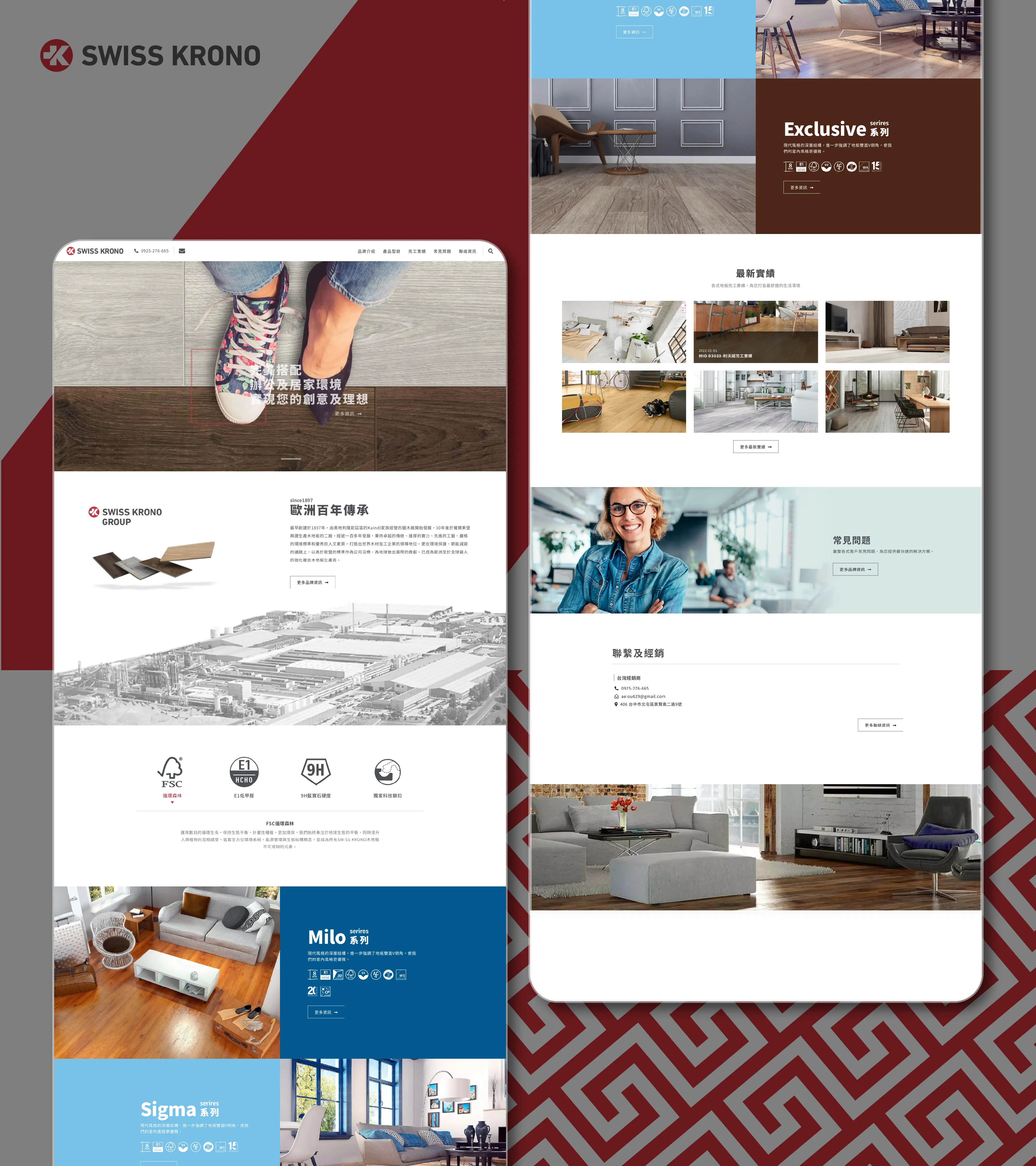
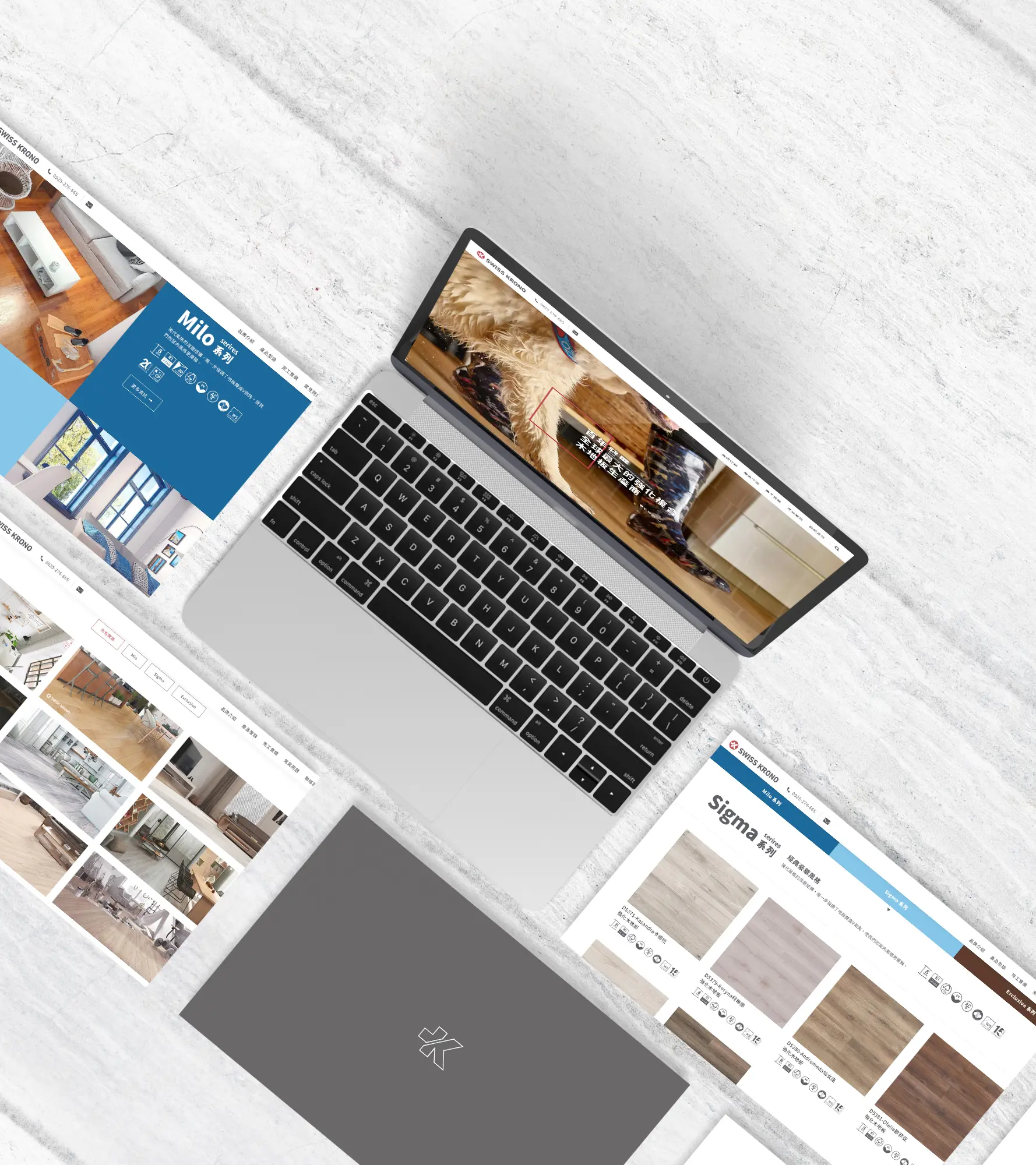
We created the website design and content presentation for Swiss Krono’s Taiwan representative, building a clear and refined digital experience based on the brand’s original European wood-based material identity and existing VI direction. Instead of creating a separate visual identity, the design respects Swiss Krono’s established brand style and translates it into a website structure with stronger consistency, recognition, and professional presence in the Taiwan market. The website was planned around clear product browsing and information delivery. Product details such as large-format boards, single boards, and full-surface panels are organized in a more accessible way, while the series-based classification system helps users quickly understand and compare collections such as Milo, Sigma, and Exclusive. Through a consistent visual rhythm, European-inspired layout style, and well-structured product information, the website strengthens Swiss Krono’s brand recognition while making the browsing experience clearer, more intuitive, and more aligned with the brand’s original identity.

Building a Clear Website Design Based on the Brand’s European Identity
We created the website design and content presentation for Swiss Krono’s Taiwan representative. Instead of building a completely separate visual identity, the design respects Swiss Krono’s original brand style and VI direction, translating the calm, professional, and structured qualities of a European wood-based materials brand into the website interface and information architecture.
Built around the theme “A Century of European Heritage,” the website uses clear layout rhythm, product imagery, brand color proportion, and series-based classification to maintain visual consistency with Swiss Krono’s existing identity. The goal was to strengthen brand recognition in the Taiwan market while making the website feel like a natural extension of the original brand, rather than a disconnected visual system.
Making Product Information Clearer and Easier to Compare
Swiss Krono’s product information includes different application needs, such as large-format boards, single boards, and full-surface panels. For this reason, the website needed to do more than look refined. It also had to help users quickly understand product differences and find the right browsing direction. We reorganized the product presentation so that different material types could be clearly categorized and easier to understand.
For the product pages and collection structure, we used a rational, clean, and orderly design approach commonly associated with European brands. Through stable content blocks, clear image proportions, and consistent information hierarchy, the product information feels organized and easy to read, even when the website contains a large amount of technical and product-related content.
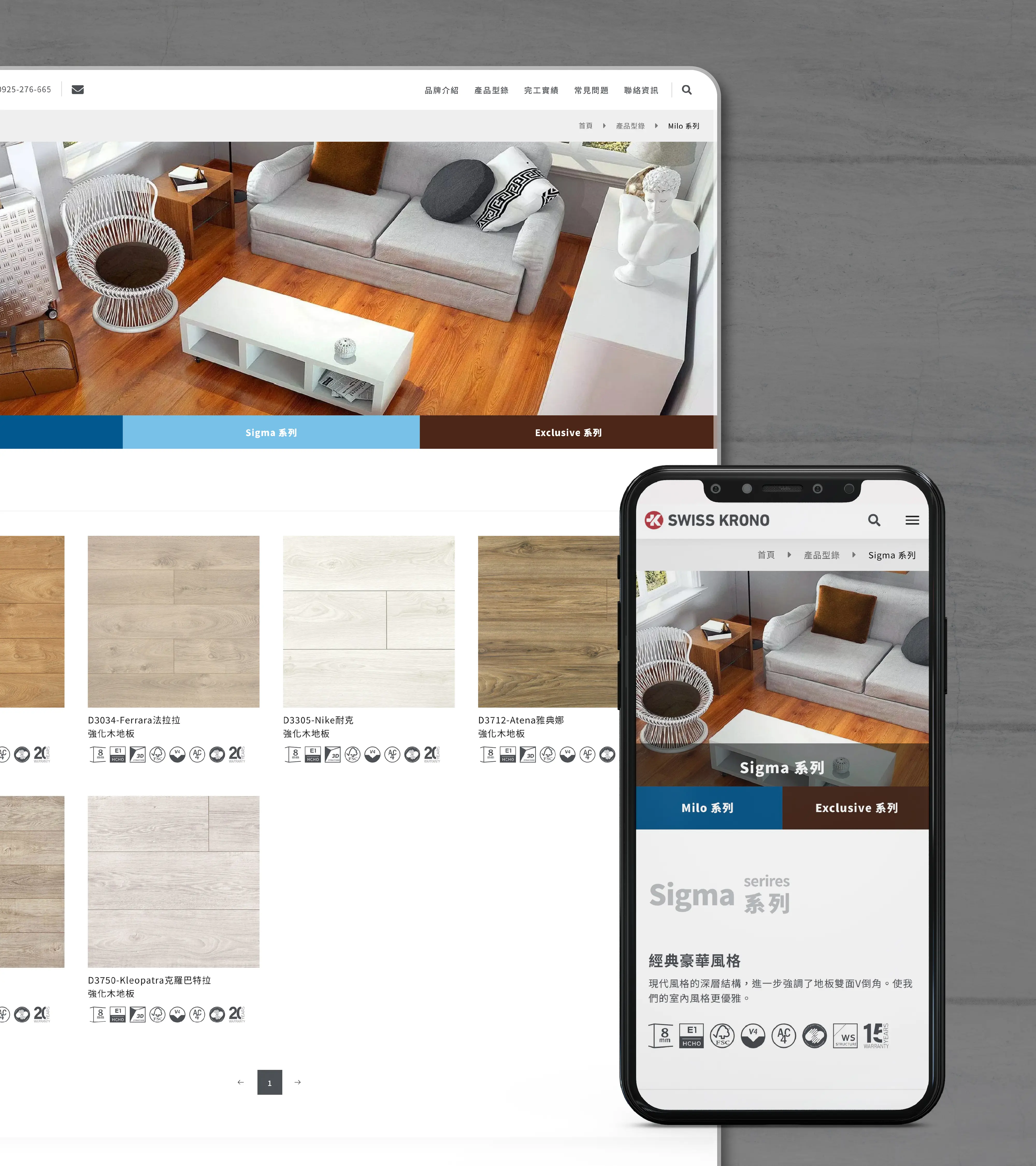
Strengthening Brand Recognition Through Series-Based Classification
In this website project, we placed strong emphasis on the classification logic between product series. Each series needed to be easy to recognize, while the overall website still had to remain consistent with Swiss Krono’s brand identity. Through consistent layout rules, color proportions, and visual language, the series pages and product information were organized into a more systematic digital experience.
A good brand website is not simply about placing information online. It should allow users to feel the brand’s order, professionalism, and consistency as they browse. Through clear product classification, European-inspired visual rhythm, and a design direction aligned with the original VI, the Swiss Krono Taiwan website supports both brand recognition and practical browsing needs.
A Brand Website Should Make the Brand Look More Like Itself
The most important goal of this project was to make the Swiss Krono Taiwan website feel like a natural digital extension of the brand itself, rather than a generic website template placed on top of the brand. By organizing the brand style, product logic, and user browsing needs, the website became more visually consistent and easier to understand.
From website visual direction and product information structure to series-based classification, the entire design was built on respect for Swiss Krono’s original identity. At the same time, the website improves clarity, professionalism, and recognition, helping users quickly sense the brand’s European character and find the wood-based material information they need more intuitively.
✦ Talk to us about your website idea.
✦ View more works in website, UI/UX, and brand design.
✦ Back to home to learn how we help brands build clearer digital experiences.