
WORKS

透過不同形式的設計作品,看見品牌被整理後的樣貌。 每一個品牌都有不同的產業背景、產品特性與發展階段。我們從品牌設計、網站設計、包裝與平面視覺出發,協助客戶梳理品牌定位、內容架構、產品資訊與溝通重點,將分散的想法與需求,轉化為更清楚、更具信任感,也更容易被市場理解的設計成果。

設計作品集|品牌、網站、電商與 UI/UX 設計案例

Ovezo|環保瑜珈墊生活品牌設計

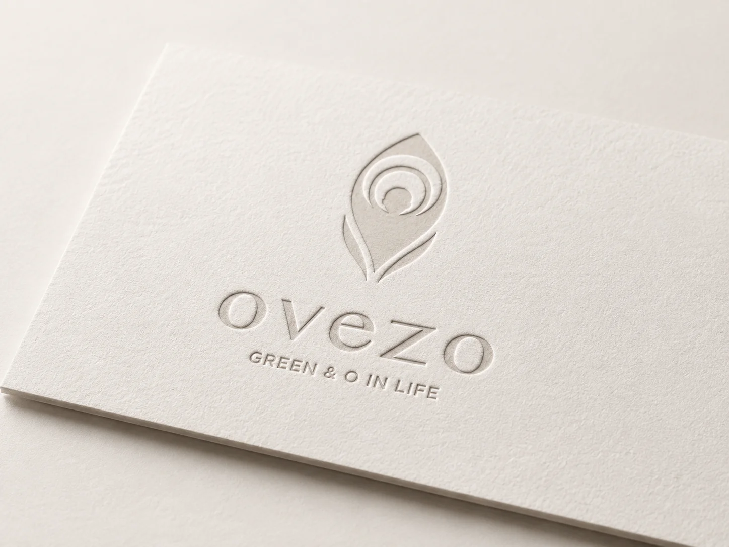
Ovezo 是一個以自然環保材質、運動生活與純粹美學為核心的生活品牌。品牌從產品材質出發,思考運動用品如何在促進健康的同時,也減少對塑料與化學材料的依賴,提出一種更友善地球、更貼近日常生活的選擇。 整體品牌設計以「O」作為核心符號,延伸出呼吸、循環、歸零、有氧、地球與友善循環的概念。視覺應用則以極簡減法、留白、紙張質感、打凸工藝與細膩版面秩序為主要語彙,讓永續理念不只是口號,而是以更安靜、更純粹的方式融入產品、網站與日常使用情境。 Ovezo is a lifestyle brand centered on eco-friendly materials, active living, and pure aesthetics. Starting from material choices, the brand explores how sports and wellness products can support a healthier lifestyle while reducing reliance on plastics and chemical materials, offering a more earth-friendly and everyday alternative. The visual identity is built around the symbol “O,” extending into ideas of breathing, circulation, reset, oxygen, the earth, and a more mindful material cycle. Through minimal design, white space, paper texture, embossing, and refined layout details, Ovezo presents sustainability not as a loud slogan, but as a quiet and deliberate lifestyle expression across its products, website, and everyday use.

大燉煌鍋物|東方食材寶櫃|鍋物品牌設計

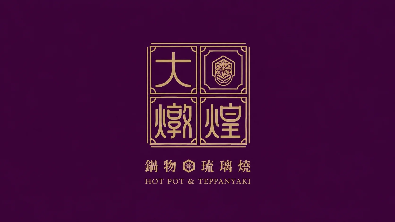
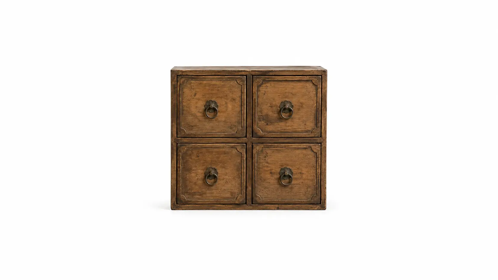
大燉煌鍋物以東方食補文化為品牌核心,從珍貴食材、滋補養生與高級餐飲體驗出發,建立一套具有文化記憶點的鍋物品牌識別系統。品牌視覺結合「食材寶櫃」、「六角玄武紋」與「十二瓣菊」等象徵元素,將食補、長壽、珍饌與東方美學轉化為更具辨識度的視覺語言。 整體設計以金棕、深紫紅與米白色調鋪陳,搭配細緻線條、窗櫺圖騰、品牌標準字與餐飲應用延伸,呈現沉穩、典雅且帶有高級感的品牌氛圍。從識別系統到店面、菜單、包裝與視覺應用,大燉煌不只是鍋物品牌,也是一種把東方食補文化重新整理成現代餐飲體驗的品牌設計案例。 Da Dun Huang is a hot pot brand built around Eastern food therapy culture, precious ingredients, nourishment, and a refined dining experience. The visual identity combines symbolic elements such as the “ingredient treasure cabinet,” the hexagonal Black Tortoise pattern, and the twelve-petal chrysanthemum, transforming ideas of longevity, wellness, premium ingredients, and Eastern aesthetics into a distinctive brand language. The overall design uses a palette of golden brown, deep reddish purple, and warm ivory, supported by delicate linework, lattice patterns, custom brand typography, and extended restaurant applications. From the identity system to storefront visuals, menu design, packaging, and brand touchpoints, Da Dun Huang presents a calm, elegant, and premium hot pot brand image rooted in Eastern culinary culture.

中華電信 InventAI|夢想轉動者|品牌設計

InventAI 是一套以「智能流動」為核心概念延伸的 AI 品牌設計計畫,透過軌道、循環與能量核心等視覺語言,重新整理人工智慧品牌在科技產業中的形象表現。整體識別以動態幾何、未來感色彩系統與模組化架構為基礎,建立具有延展性、辨識度與國際化視覺感的 AI 品牌系統。 本次品牌設計從主識別出發,延伸至系列子品牌、生態應用、企業識別規範、展場視覺、戶外看板、公車站廣告、海報、易拉展與數位介面等不同品牌接觸點。以「夢想轉動者」作為精神軸線,InventAI 將 AI 科技的流動感、能量感與未來想像,轉化為一套更完整且可持續延展的品牌視覺系統。 InventAI is an AI brand design project built around the concept of “intelligent flow.” Through visual languages such as orbital movement, circulation, and an energy core, the identity redefines how an artificial intelligence brand can be expressed within the technology industry. The system uses dynamic geometry, a futuristic color palette, and a modular identity structure to create an AI brand with strong recognition, flexibility, and an international visual presence. Starting from the main brand identity, the project extends into sub-brand systems, ecosystem applications, brand guidelines, exhibition visuals, outdoor billboards, bus stop advertising, posters, roll-up banners, and digital interface applications. With “Dream Mover” as the central spirit, InventAI translates the movement, energy, and future imagination of AI technology into a more complete and scalable visual identity system.