WORKS

這裡收錄鮭魚設計的網站設計作品,包含品牌官網、企業網站、產品型網站、形象網站、活動網站與數位平台等案例。 我們在規劃網站設計時,會從品牌定位、資訊架構、內容層級、目標客群與 UI/UX 使用者體驗一起思考,協助品牌建立清楚、好閱讀且能支援溝通的網站架構。 網站設計不只是做出漂亮版面,而是讓品牌在形象呈現、服務介紹、產品資訊、詢問流程與搜尋曝光中,都能形成一致且有信任感的數位體驗。

網站設計作品|品牌官網、企業網站與數位體驗案例

福氣社區|客製化電商網站設計

福氣社區網站整合食品販售、會員系統、購物車與線上捐款,讓「購買」與「支持」能在同一個平台中自然發生。 透過清楚的商品分類、會員流程、綠界付款與捐款機制,網站不只是交易工具,也成為連結品牌理念、會員與支持者的數位平台。 Fortune Community is a custom e-commerce website that combines food sales, membership, shopping cart functions, and online donations in one platform. A clear shopping, payment, and donation flow allows the website to support both transactions and community engagement, connecting products, purpose, members, and supporters.

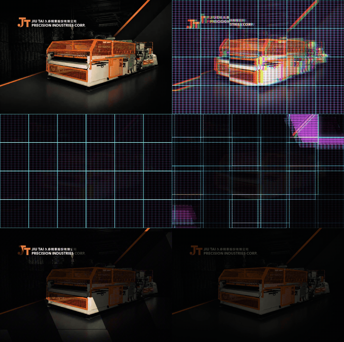
久泰精業|鋼網製造與機械設備電商網站設計

久泰精業股份有限公司專注於鋼網製造與機械設備製造。鮭魚設計協助品牌規劃一套結合企業形象、產品展示與電商查找功能的網站,透過清楚的內容架構、產品分類、圖片與視覺設計,完整呈現久泰精業的專業製造能力與品牌價值。 此案特別針對鋼網產品的尺寸與規格需求,設計出可依照橫目、縱目與交錯條件查找產品的功能,讓客戶能更快速找到符合需求的鋼網與機械設備。網站不只是產品展示平台,也成為品牌與 B2B 客戶之間更直覺、更有效率的線上溝通工具。 Jiu Tai Precision Industries Corp. specializes in wire mesh manufacturing and industrial machinery production. MASOU DESIGN helped the brand create an e-commerce website that combines corporate image, product presentation, and product search functionality. Through clear content structure, product categorization, imagery, and visual design, the website presents Jiu Tai’s manufacturing expertise and professional brand value. A key feature of this project is the product search function designed for wire mesh specifications. Customers can search products based on horizontal mesh, vertical mesh, and intersecting conditions, making it easier to find the right wire mesh or machinery for their needs. The website is not only a product showcase, but also a more intuitive and efficient communication tool between the brand and its B2B customers.

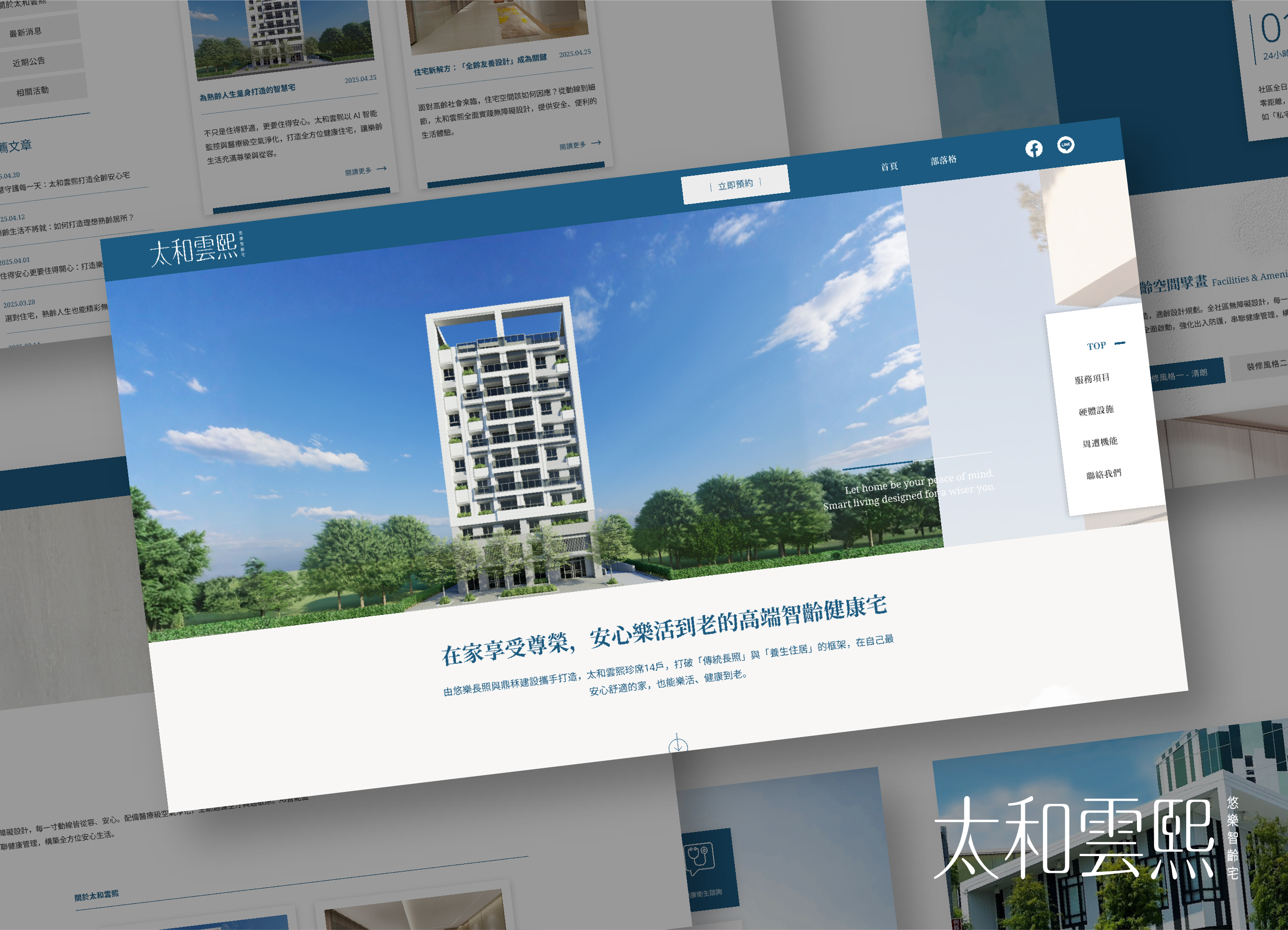
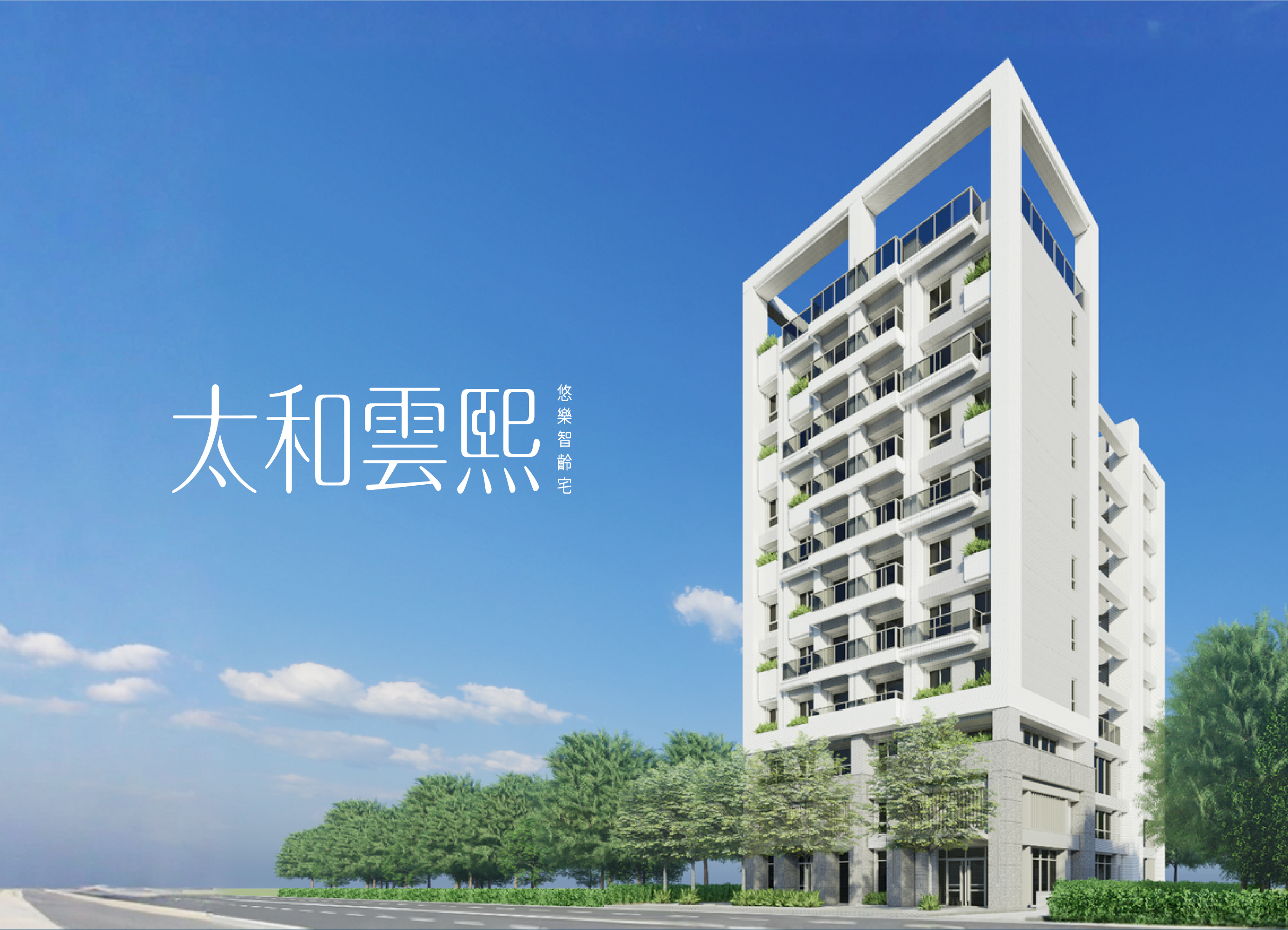
太和雲熙|樂齡健康宅網站設計

鮭魚設計為太和雲熙規劃樂齡健康宅網站,從品牌定位、內容架構、視覺設計到響應式介面,重新整理住宅、智慧科技與專業照護之間的關係。透過天空、自然光、藍綠色系與生活化影像,建立兼具建築質感、健康專業與人文溫度的數位體驗,讓網站不只是建案資訊平台,也成為傳達熟齡生活理念與品牌價值的重要媒介。 MASOU DESIGN created a Senior Living & Wellness Website for New Life Residence, integrating residential quality, smart healthcare, and professional care into a clear and welcoming digital experience. Through natural imagery, blue-green tones, structured content, and responsive design, the website presents a modern vision of senior living centered on comfort, wellbeing, and quality of life.

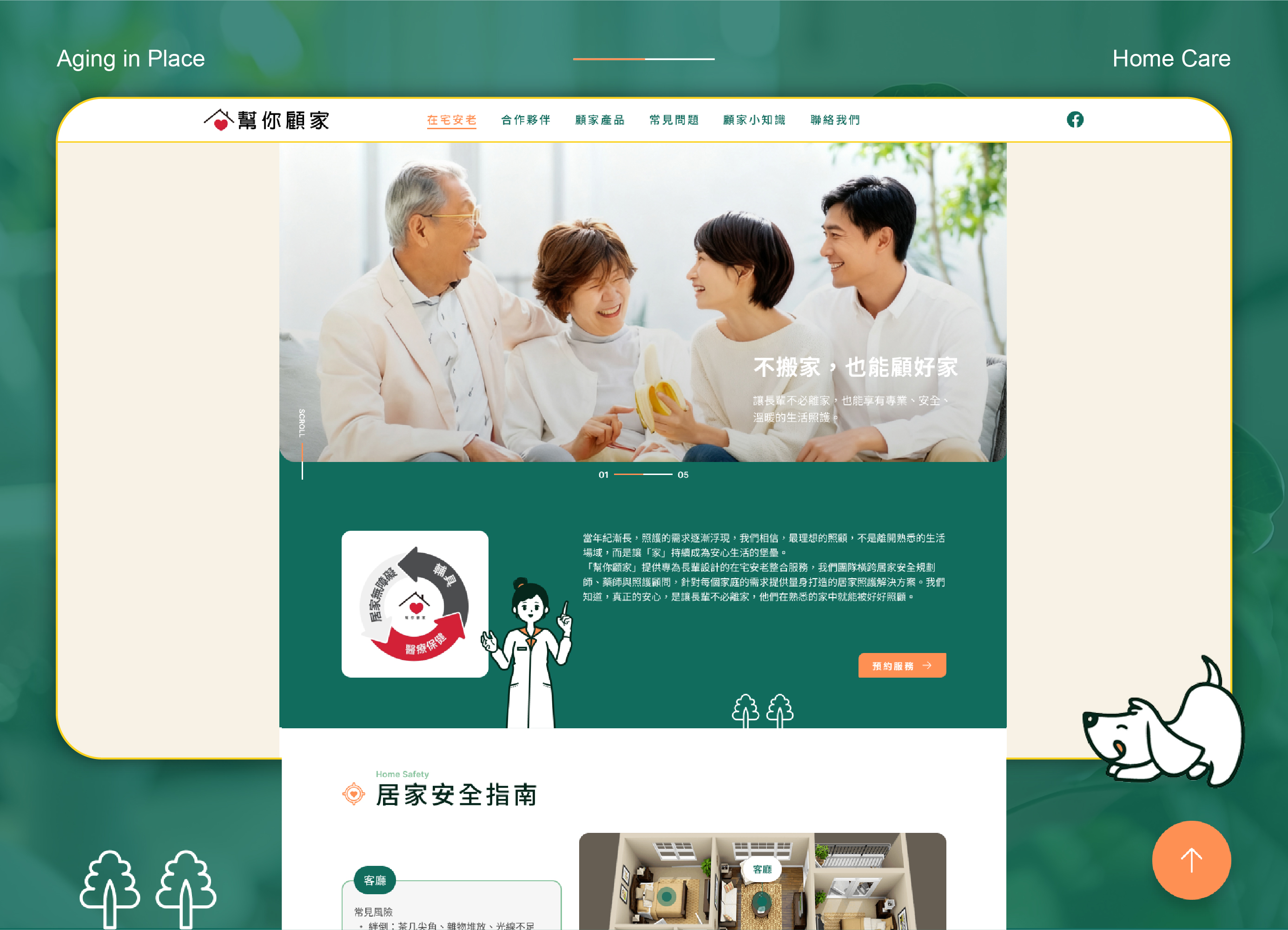
幫你顧家|在宅安老網站設計

打造一個更容易理解與使用的高齡照護品牌網站 「幫你顧家」以在宅安老為核心,整合居家無障礙、智慧輔具、醫療保健與居家安全產品等服務,希望讓長輩即使留在熟悉的家中,也能擁有更安全、安心的生活環境。 鮭魚設計從品牌溝通、網站資訊架構、UI/UX、插圖角色到 SEO 內容規劃重新整理整體數位體驗,將原本跨越不同專業領域的照護資訊,轉化為更容易理解、搜尋與採取行動的網站內容。 Building a Senior Care Brand Website That’s Easier to Understand and Use Centered on the concept of aging in place, Here For You brings together home accessibility solutions, smart assistive devices, healthcare services, and home safety products—helping older adults continue living in familiar surroundings with greater safety and peace of mind. MASOU Design restructured the overall digital experience through brand communication, information architecture, UI/UX design, character illustration, and SEO content planning. By organizing information across multiple areas of senior care into a clearer and more intuitive system, the website makes it easier for users to understand their options, find relevant information, and take the next step.

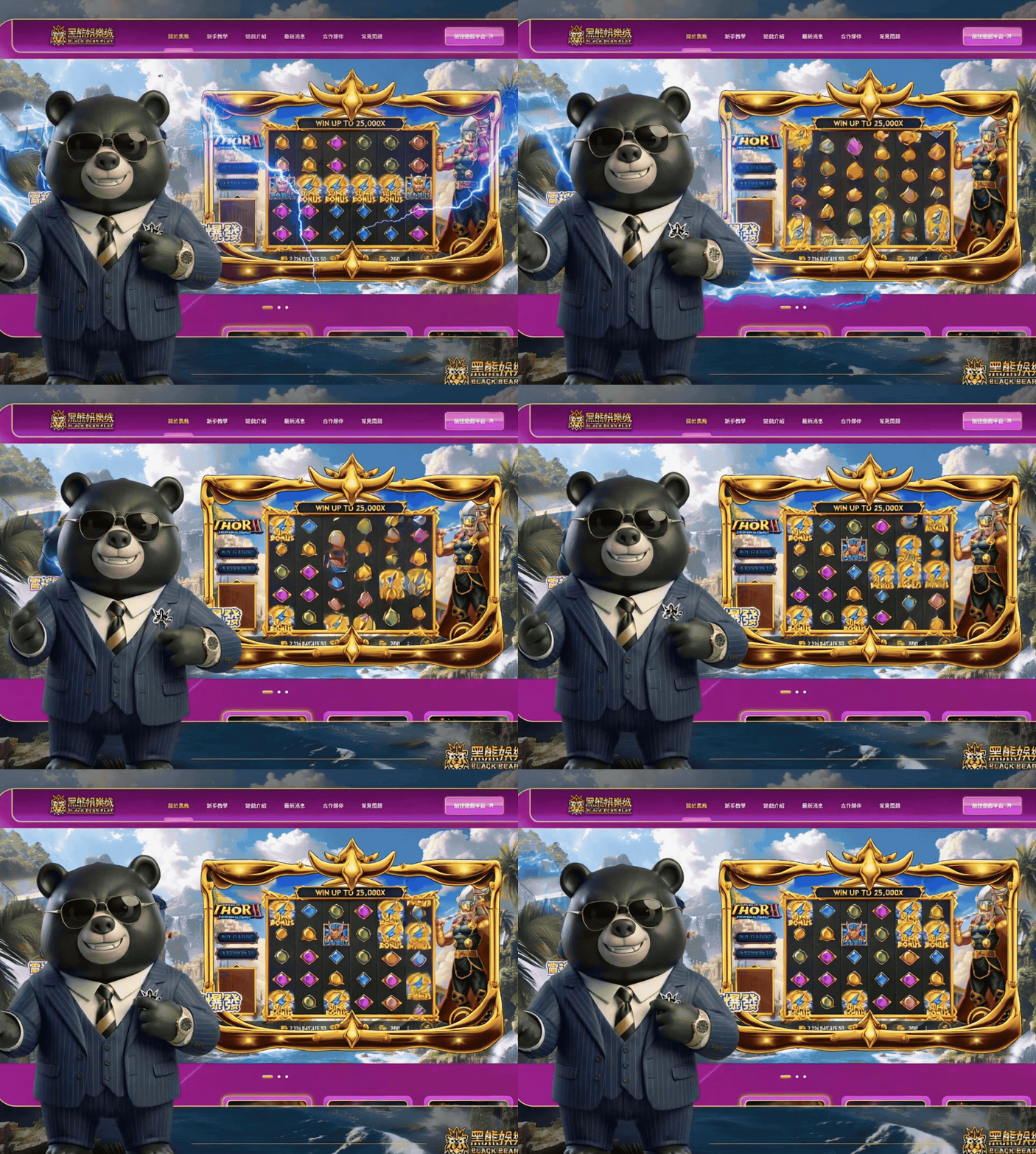
黑熊娛樂城|品牌角色IP、UI/UX 與視覺系統整合

黑熊娛樂城是一個整合電子遊戲、真人視訊、遊戲介紹、攻略與遊戲供應商資訊的娛樂平台。這次鮭魚設計的任務,不只是完成一個遊戲網站介面,而是從品牌識別、角色 IP 設計、網站視覺到 UI 元件系統,建立一套能被持續辨識與延伸的品牌世界。 我們以「黑熊領地」作為品牌核心概念,進一步發展「豪客霸總」與「悍熊老大」兩個具有不同性格與任務的角色 IP。一個代表智慧、策略與格局;另一個則象徵力量、秩序與守護。透過一文一武的雙角色架構,讓原本功能導向的娛樂平台,擁有更鮮明的品牌人格與完整故事線。 網站設計延續黑熊娛樂的紫色、黑色與金色視覺語彙,結合遊戲卡片、資訊區塊、光影、角色與娛樂元素,在高資訊量的網站中重新整理視覺層級,建立兼具娛樂感、品牌辨識度與閱讀效率的 UI/UX 體驗。 目前網站內容涵蓋電子遊戲、真人視訊、體育賽事、捕魚遊戲、遊戲攻略與多家遊戲供應商資訊。 Black Bear Play is a gaming and entertainment platform built around a distinctive brand world. MASOU Design developed the project from brand IP strategy and character design to website visual direction and UI/UX. Centered on the concept of “Black Bear Territory,” the brand features two core characters — The Boss and The Guardian — representing strategy, confidence, strength, and protection. The website extends this identity through a purple, black, and gold visual system, combining character-driven imagery, gaming elements, cards, and modular UI components to create a bold and recognizable digital experience.

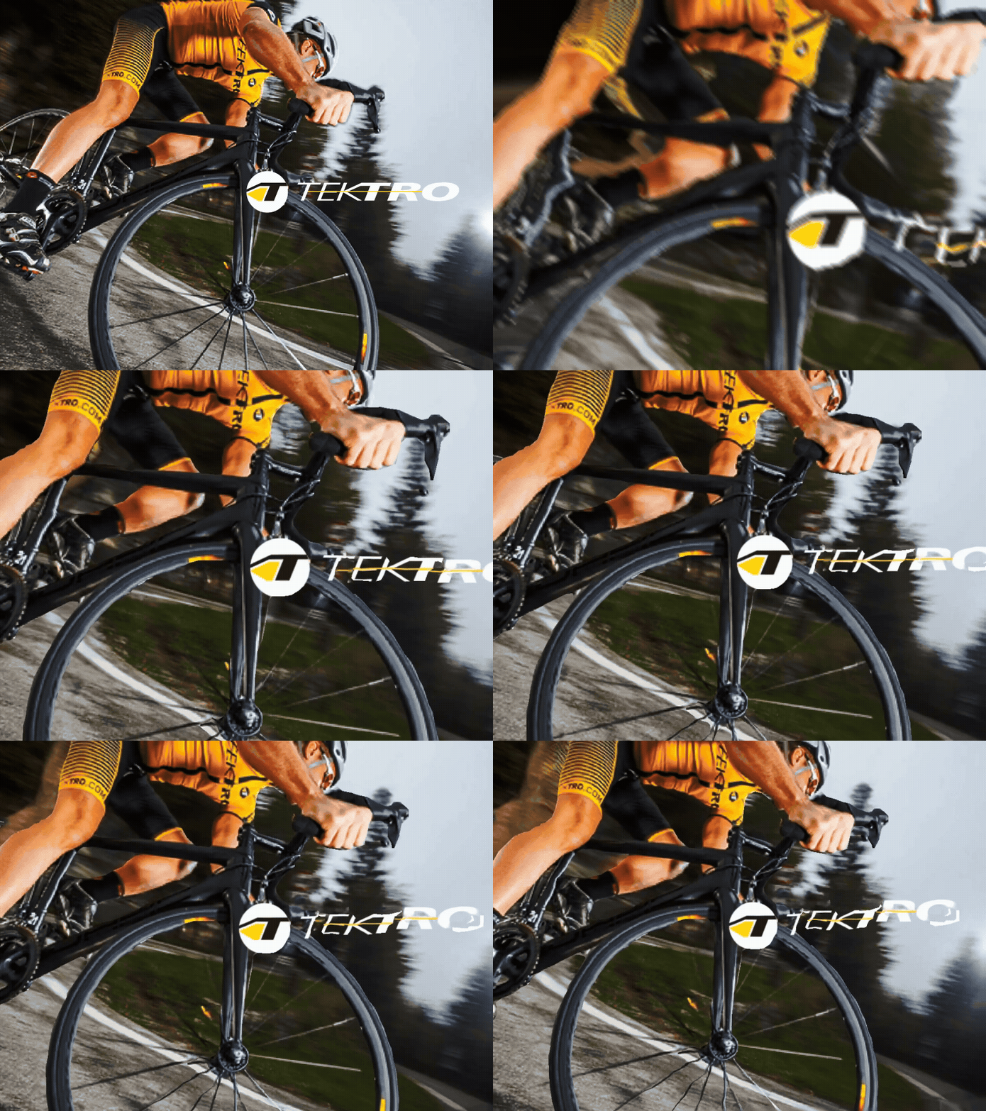
彥豪智能科技 TEKTRO|集團企業形象網站設計

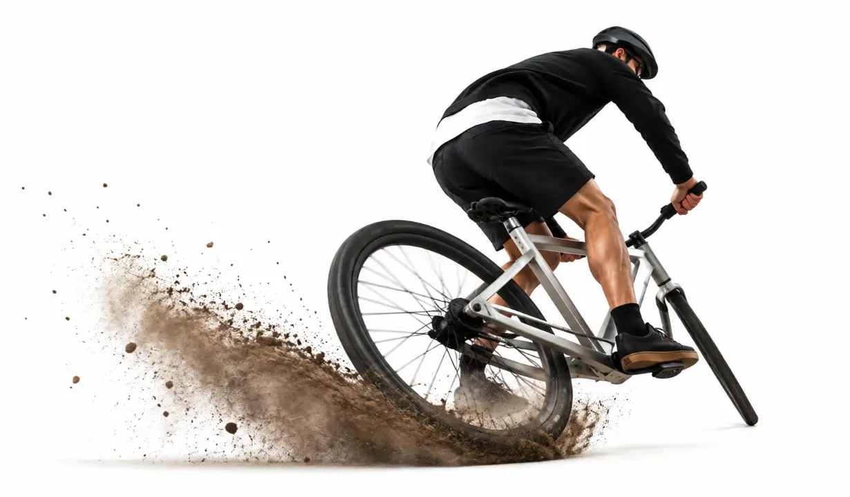
彥豪智能科技 TEKTRO 長期深耕自行車煞車系統與零組件製造,從單一產品品牌逐步發展為更完整的集團型企業。這次網站設計並不是單純的官網視覺改版,而是因應企業名稱、品牌架構與集團形象的重新整理,協助 TEKTRO 以更完整的企業高度,呈現其在自行車煞車技術、產品研發與全球市場中的專業定位。 在網站規劃上,我們將原本偏產品品牌的網站思維,重新整理為更符合集團企業形象的數位架構。透過品牌敘事、產品技術、國際獎項、企業實力與瀏覽動線的重整,讓網站不只展示自行車煞車產品,也能傳達彥豪智能科技作為集團企業的規模、研發能力與長期市場信任。這次合作也延續了 TEKTRO 對鮭魚設計的信任,讓我們能再次協助品牌完成重要階段的網站重寫與形象升級。 TEKTRO has long focused on bicycle brake systems and component manufacturing, gradually evolving from a product-focused brand into a more complete group-level enterprise. This website design project was not simply a visual redesign of the official website. It responded to the company’s updated name, brand structure, and group-level corporate image, helping TEKTRO present its expertise in bicycle brake technology, product development, and the global market from a broader corporate perspective. In the website planning process, we reorganized the original product-brand website approach into a digital structure more suitable for a group corporate image. Through refined brand storytelling, product technology content, international awards, corporate strengths, and browsing flow, the website presents not only bicycle brake products, but also the scale, R&D capability, and long-term market trust of TEKTRO as a group-level company. This collaboration also reflects TEKTRO’s continued trust in MASOU DESIGN, allowing us to support the brand again through an important stage of website reconstruction and image upgrading.


昀棨有限公司|我們看見了地球的無限希望|官方網站設計

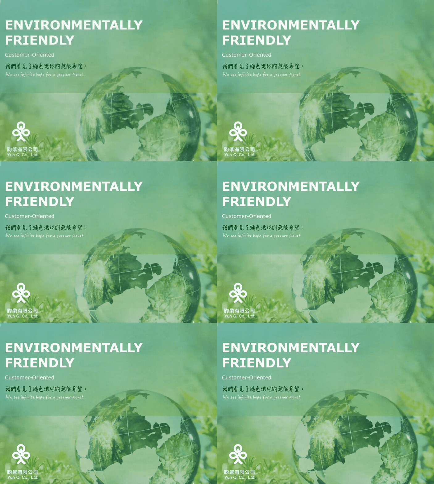
昀棨企業是一間專注於環保塑料粒子的工廠,雖然企業規模不大,但透過乾淨、穩定且具有專業感的企業網站設計,讓品牌在數位形象上呈現出更完整的大公司格局。網站以「我們看見了地球的無限希望」作為核心精神,將環保材料、資源再生與企業服務內容整理成清楚易懂的網站架構。 這次網站設計製作的重點,是協助昀棨企業把原本偏工廠型、較專業的產業內容,轉化成更容易被客戶理解的品牌溝通。透過優勢整理、流程說明、icon 圖示設計與簡潔的版面節奏,讓網站不只是公司介紹,也成為建立信任感、呈現專業度與提升企業形象的重要入口。 Yunqi Enterprise is a factory specializing in eco-friendly plastic pellets. Although the company is not large in scale, the clean, stable, and professional corporate website design helped present the brand with the confidence and structure of a larger company. Built around the message “Seeing Infinite Hope for the Earth,” the website organizes the company’s environmental materials, resource recycling concept, and services into a clear digital structure. The focus of this website design project was to transform a factory-based and relatively technical industry into a brand communication experience that clients could understand more easily. Through advantage highlights, process explanation, icon design, and a clean visual rhythm, the website became more than a company profile. It became an important entry point for building trust, presenting professionalism, and improving the company’s corporate image.

Swiss Krono|歐洲百年傳承

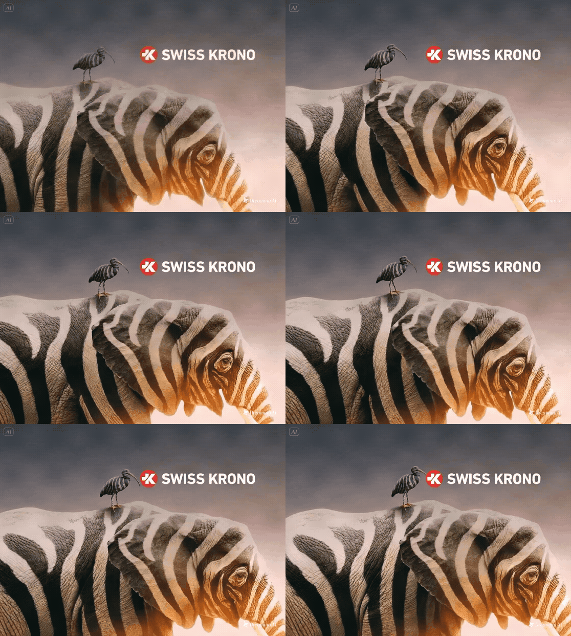
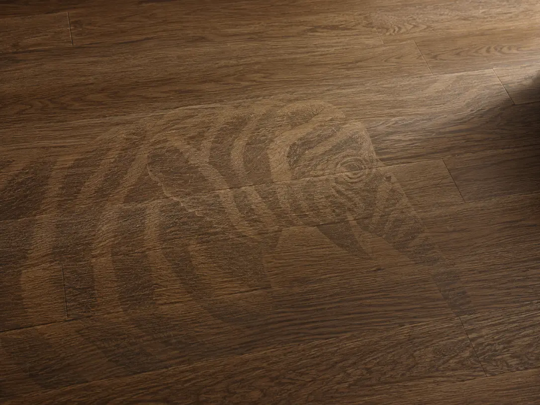
我們為 Swiss Krono 台灣代理網站規劃網站設計與內容呈現,延續品牌本身的歐洲木質建材形象與既有 VI 語彙,建立一套清楚、沉穩且具有歐洲品牌感的網站視覺方向。設計上並不是重新創造另一套識別,而是尊重 Swiss Krono 原有的品牌氣質,透過版面節奏、色彩比例、產品圖片與分類架構,強化品牌在台灣市場的專業感與辨識度。 網站內容以使用者查找產品為核心,清楚整理大板、單板與整面板材等產品資訊,並透過系列化分類設計,讓 Milo、Sigma、Exclusive 等不同產品系列能被快速理解與比較。整體網站在維持品牌一致性的同時,也讓產品資訊更明確、閱讀動線更直覺,協助使用者從品牌背景、產品特色到實際應用案例,建立對 Swiss Krono 的信任感與選購判斷。 We created the website design and content presentation for Swiss Krono’s Taiwan representative, building a clear and refined digital experience based on the brand’s original European wood-based material identity and existing VI direction. Instead of creating a separate visual identity, the design respects Swiss Krono’s established brand style and translates it into a website structure with stronger consistency, recognition, and professional presence in the Taiwan market. The website was planned around clear product browsing and information delivery. Product details such as large-format boards, single boards, and full-surface panels are organized in a more accessible way, while the series-based classification system helps users quickly understand and compare collections such as Milo, Sigma, and Exclusive. Through a consistent visual rhythm, European-inspired layout style, and well-structured product information, the website strengthens Swiss Krono’s brand recognition while making the browsing experience clearer, more intuitive, and more aligned with the brand’s original identity.

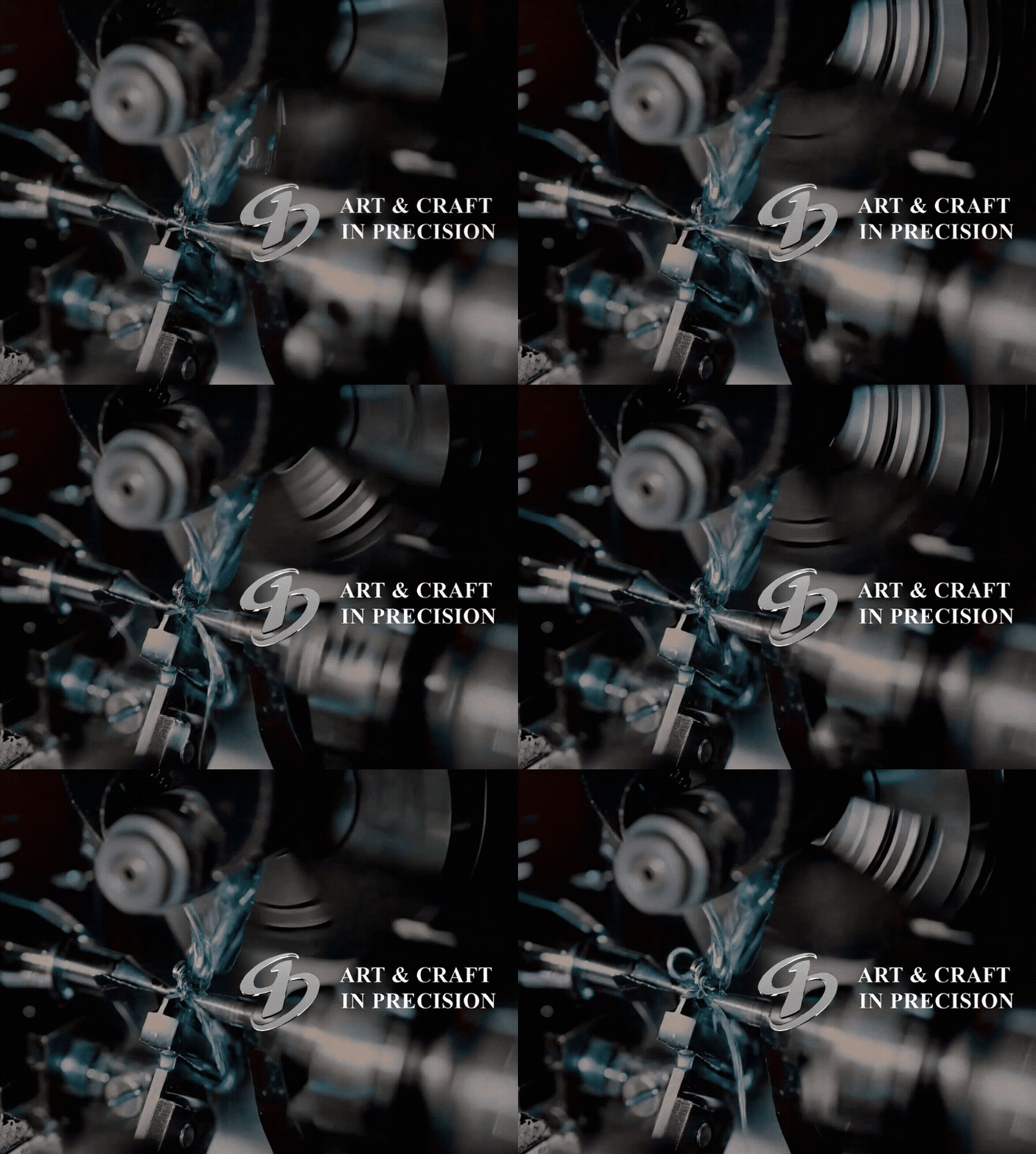
建典精密|ART & CRAFT IN PRECISION

建典精密網站設計以「ART & CRAFT IN PRECISION」為核心,將精密製造、零件加工與工藝精神轉化為清楚且具信任感的數位品牌形象。鮭魚設計透過乾淨版面、穩定視覺節奏與清楚內容架構,協助 B2B 製造品牌展現技術實力、服務項目與企業專業性,讓網站成為客戶理解品牌與評估合作的第一個入口。 Jiandian Precision website design centers on “ART & CRAFT IN PRECISION,” translating precision manufacturing, component processing, and craftsmanship into a clear and trustworthy digital brand image. MASOU DESIGN used clean layouts, steady visual rhythm, and structured content to help this B2B manufacturing brand present its technical capability, services, and professional value.