WORKS

透過不同類型的設計作品,看見設計如何真正落地。這裡整理鮭魚設計在品牌識別、網站、電商、平面視覺與 UI/UX 等不同專案的成果。每個品牌都有不同的產業背景、產品特性與發展階段,我們從實際需求出發,整理品牌方向、內容架構與視覺溝通,將想法轉化為清楚、有辨識度且能實際使用的設計成果。

設計作品集|品牌、網站、電商與 UI/UX 設計案例

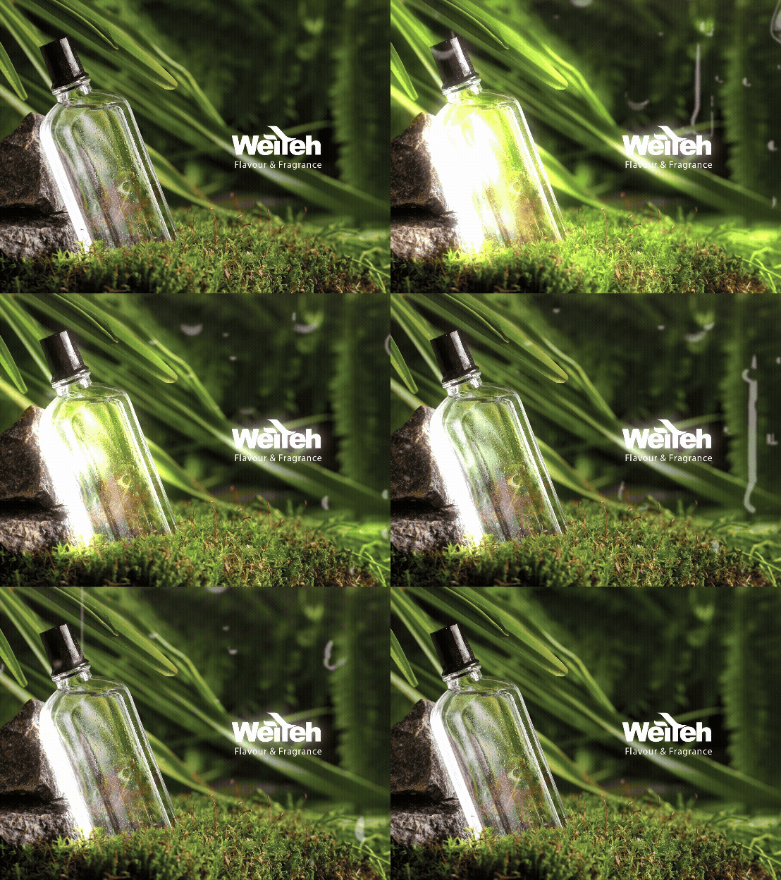
WEITEH | 一滴入魂的深奧提香

為亞洲前三大香精製造商,整理出更清楚的網站專業形象。 鮭魚設計協助味特生物科技進行網站設計與網站文案企劃,從「亞洲前三大香精製造商」的產業定位出發,整理半世紀香精研發經驗、專業調香技術、客製化服務與國際市場優勢。透過「一滴入魂的深奧提香」這句網站標語,將香精研發中專注、敏銳與精準提煉的精神,轉化為更有記憶點的網站溝通語言,協助企業在 B2B 網站中呈現專業高度與信任感。 Helping one of Asia’s top three flavor manufacturers communicate its professional expertise through website design and copywriting. MASOU DESIGN created the website design and website copy for Vete Biotech, organizing the company’s half-century of flavor research experience, professional flavor development, customized services, and international market position into a clearer digital presentation. Through the website slogan “A Deeper Sense of Flavor in Every Drop,” we translated the precision, sensitivity, and craftsmanship behind flavor manufacturing into a more memorable communication language, helping the B2B website express stronger professionalism, clarity, and trust.

福氣社區|客製化電商網站設計

福氣社區網站整合食品販售、會員系統、購物車與線上捐款,讓「購買」與「支持」能在同一個平台中自然發生。 透過清楚的商品分類、會員流程、綠界付款與捐款機制,網站不只是交易工具,也成為連結品牌理念、會員與支持者的數位平台。 Fortune Community is a custom e-commerce website that combines food sales, membership, shopping cart functions, and online donations in one platform. A clear shopping, payment, and donation flow allows the website to support both transactions and community engagement, connecting products, purpose, members, and supporters.

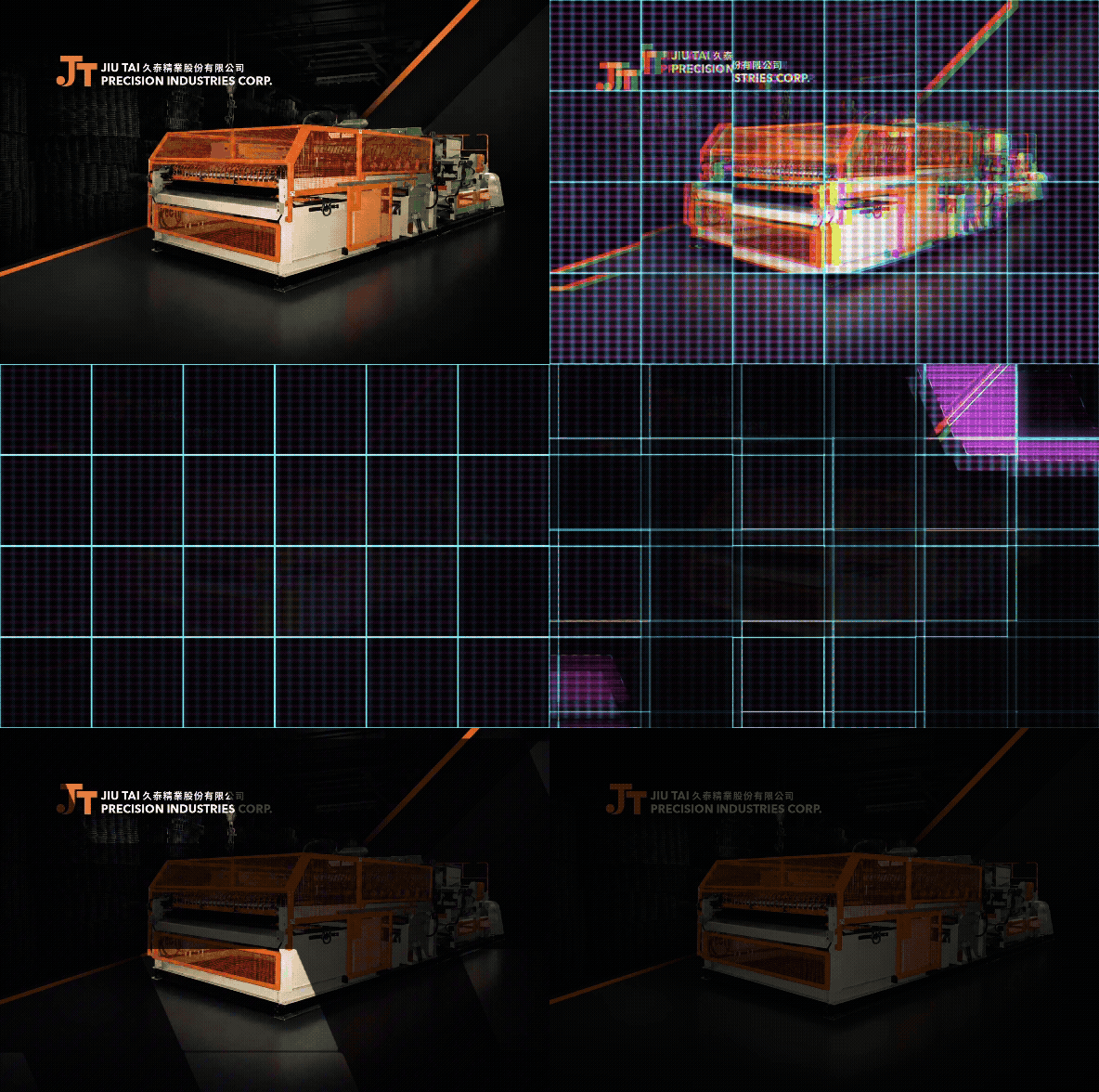
久泰精業|鋼網製造與機械設備電商網站設計

久泰精業股份有限公司專注於鋼網製造與機械設備製造。鮭魚設計協助品牌規劃一套結合企業形象、產品展示與電商查找功能的網站,透過清楚的內容架構、產品分類、圖片與視覺設計,完整呈現久泰精業的專業製造能力與品牌價值。 此案特別針對鋼網產品的尺寸與規格需求,設計出可依照橫目、縱目與交錯條件查找產品的功能,讓客戶能更快速找到符合需求的鋼網與機械設備。網站不只是產品展示平台,也成為品牌與 B2B 客戶之間更直覺、更有效率的線上溝通工具。 Jiu Tai Precision Industries Corp. specializes in wire mesh manufacturing and industrial machinery production. MASOU DESIGN helped the brand create an e-commerce website that combines corporate image, product presentation, and product search functionality. Through clear content structure, product categorization, imagery, and visual design, the website presents Jiu Tai’s manufacturing expertise and professional brand value. A key feature of this project is the product search function designed for wire mesh specifications. Customers can search products based on horizontal mesh, vertical mesh, and intersecting conditions, making it easier to find the right wire mesh or machinery for their needs. The website is not only a product showcase, but also a more intuitive and efficient communication tool between the brand and its B2B customers.

台中海岸線永續漁業|活動毛巾視覺設計

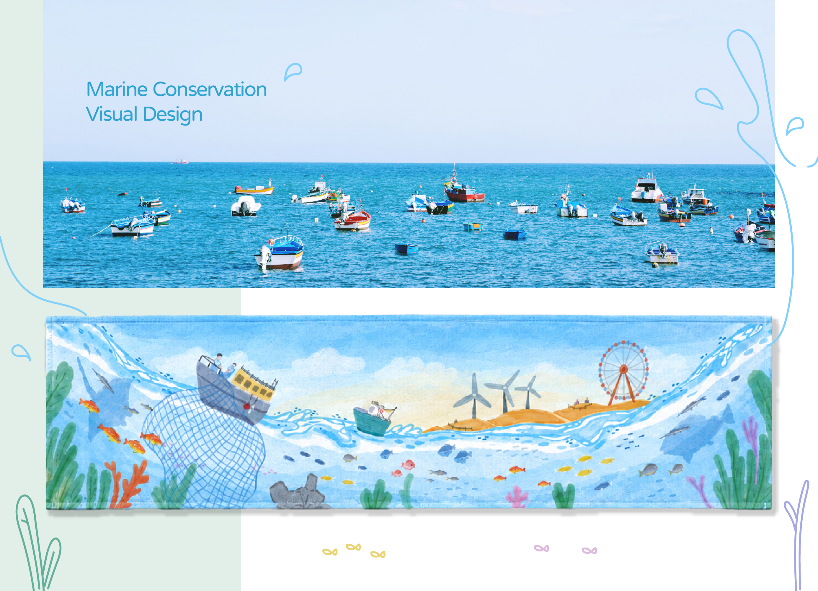
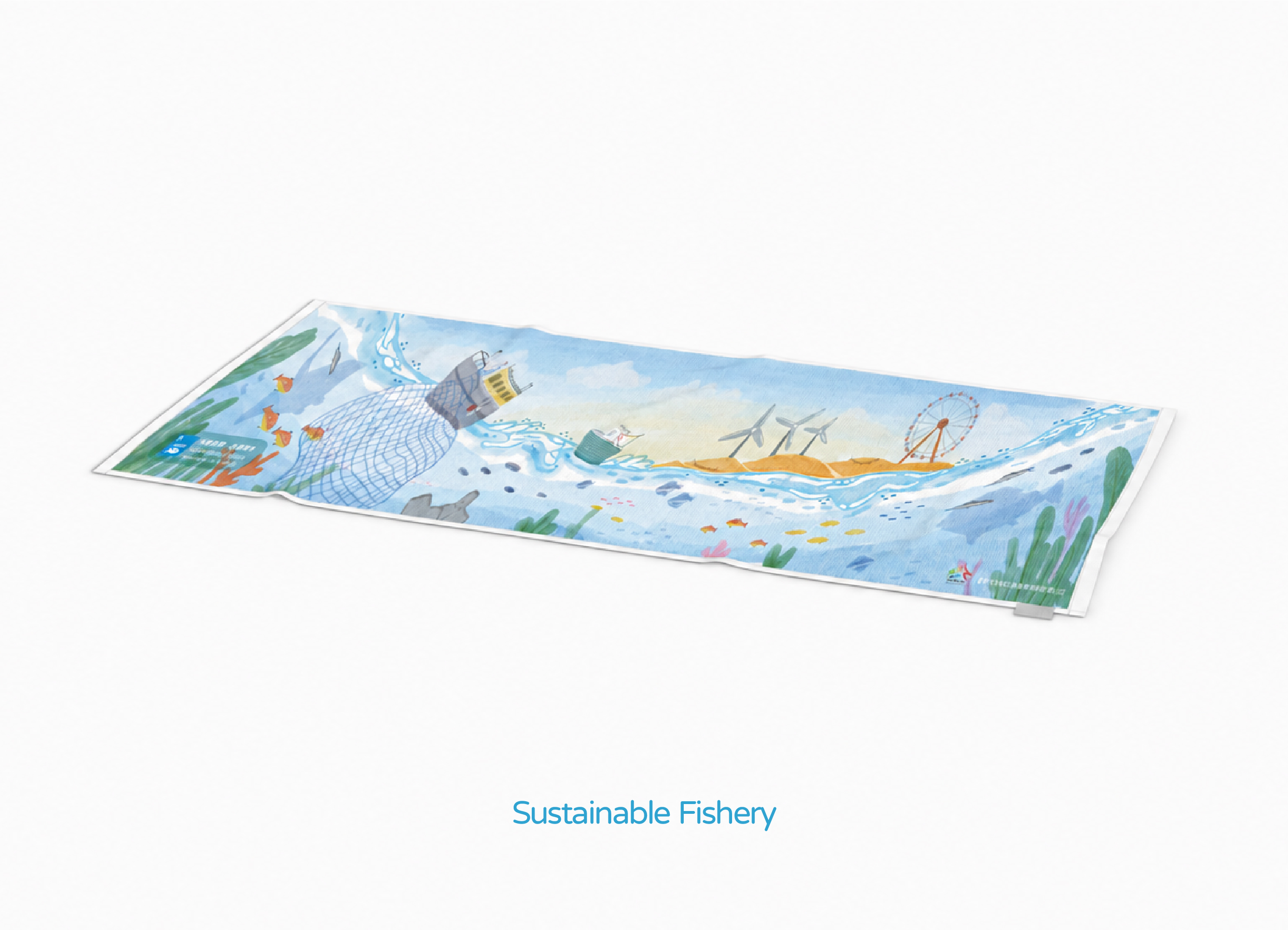
以「台中海岸線的永續漁業風景」為核心,將漁船作業、海底生態、高美濕地、綠能風機與摩天輪觀光地標整合進同一幅毛巾主視覺。透過連續海浪、水彩插畫與柔和配色,串聯漁業產業、海洋保育、綠能發展與地方觀光,讓活動毛巾不只是紀念品,也成為承載台中海線特色與永續理念的視覺作品。 Inspired by the sustainable fisheries and coastal landscape of Taichung, the towel design brings together fishing activities, marine ecosystems, Gaomei Wetlands, wind turbines, and coastal tourism landmarks. Through watercolor illustration and a soft color palette, the project creates a distinctive Event Towel Design that combines local identity, marine conservation, and sustainability.

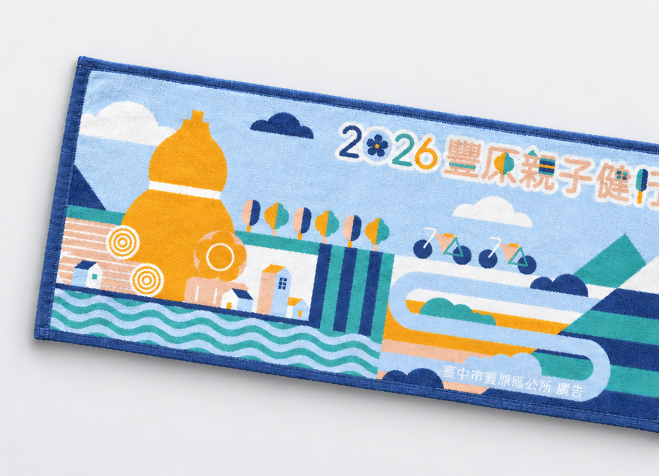
2026 豐原親子健行|活動主視覺與毛巾設計

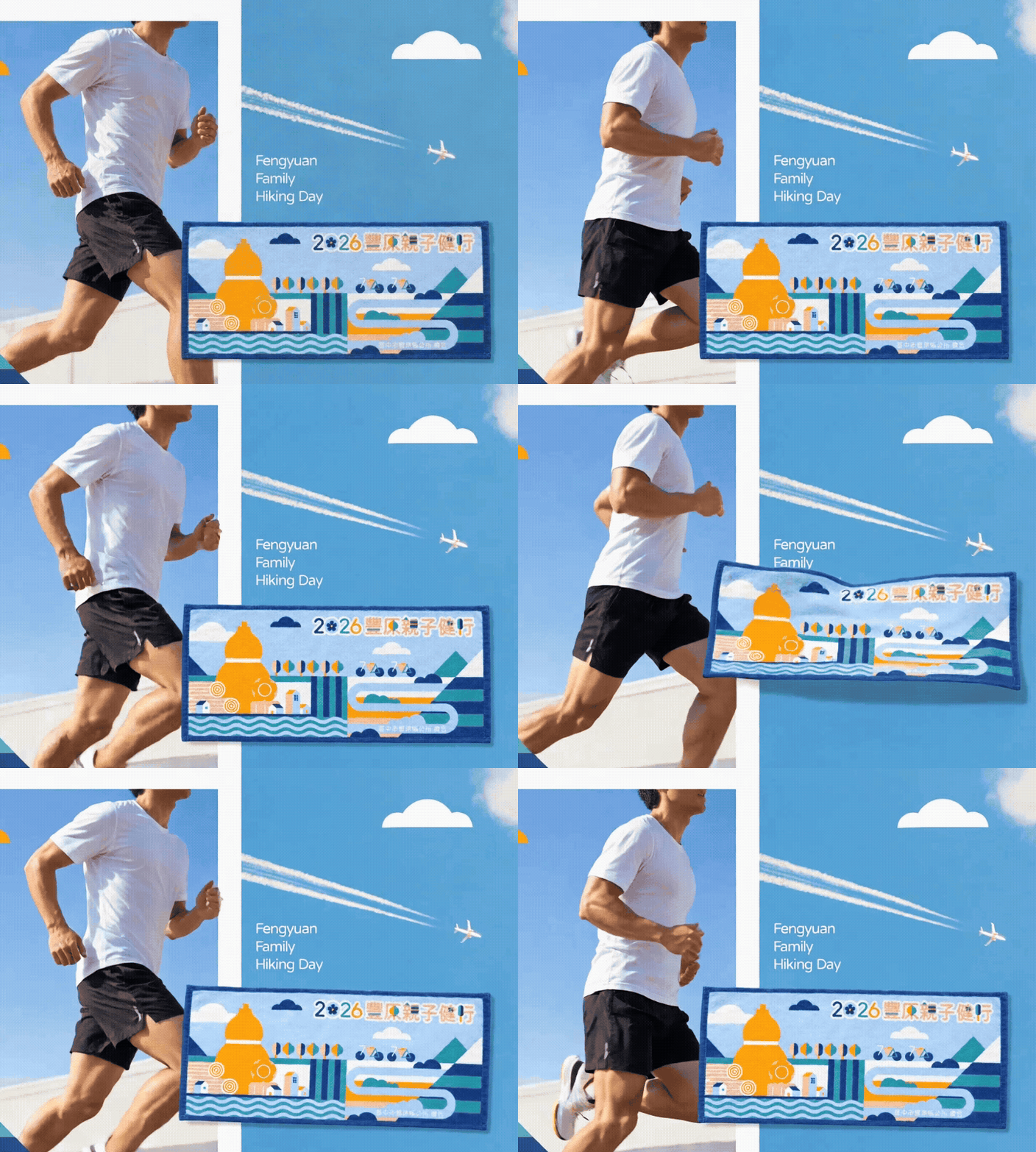
鮭魚設計以豐原在地文化與自然景觀為核心,規劃「2026 豐原親子健行」活動主視覺與活動識別設計。將葫蘆墩、木業、糕餅、丘陵溪流與自行車等地方特色融入毛巾設計,搭配親和標準字與鮮明配色,打造兼具在地識別、親子氛圍與戶外感的活動視覺形象。 MASOU DESIGN created the event visual identity and key visual design for the 2026 Fengyuan Family Hiking Day. Inspired by Fengyuan’s local culture and natural landscape, the design incorporates Huludun, the wood industry, traditional pastries, hills and streams, and cycling to create a distinctive, family-friendly outdoor event identity.

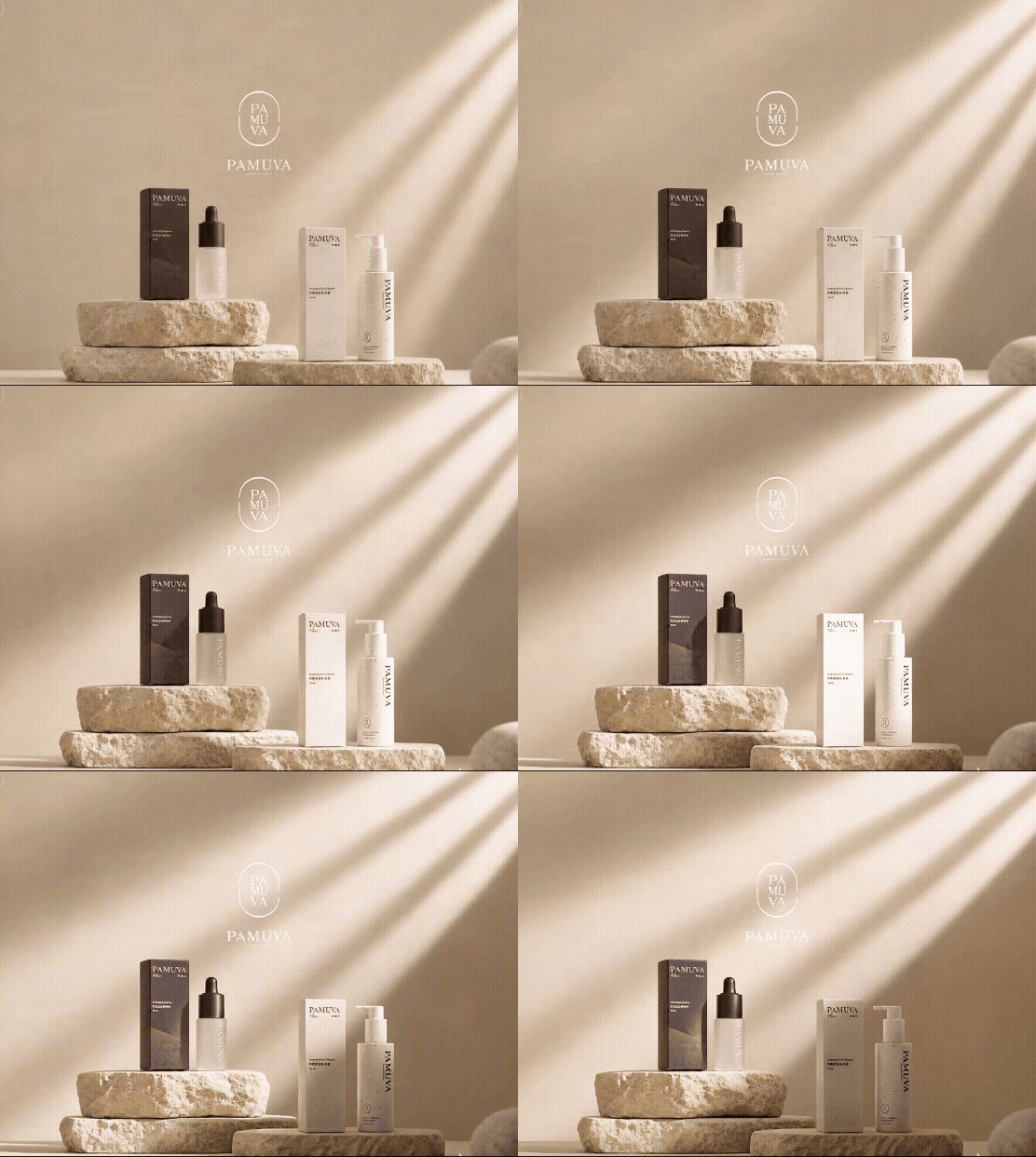
PAMUVA | 肌膚最溫柔的力量 | 產品EDM設計與包裝攝影

PAMUVA 保養品系列以敏弱肌膚的日常保養需求為核心,透過產品主視覺、使用情境與 EDM 資訊設計,建立兼具專業感、品牌質感與產品辨識度的視覺系統。 鮭魚設計從產品定位、成分特色與使用感受出發,重新整理資訊層級,將複雜的保養成分與作用機制,轉化為容易閱讀、理解與記憶的內容。兩支產品分別發展獨立色彩與視覺語言,同時透過一致的光影、材質、留白與攝影風格,維持 PAMUVA 系列的整體品牌調性。 The PAMUVA skincare series is designed around the daily needs of sensitive skin, combining product visuals, usage scenarios, and EDM design to create a refined and recognizable brand experience. MASOU DESIGN simplified complex ingredients and skincare benefits into clear, engaging content. Each product has its own color palette and visual identity, while consistent lighting, materials, and photography maintain a cohesive series.

培力藥品 | 保健食品包裝設計

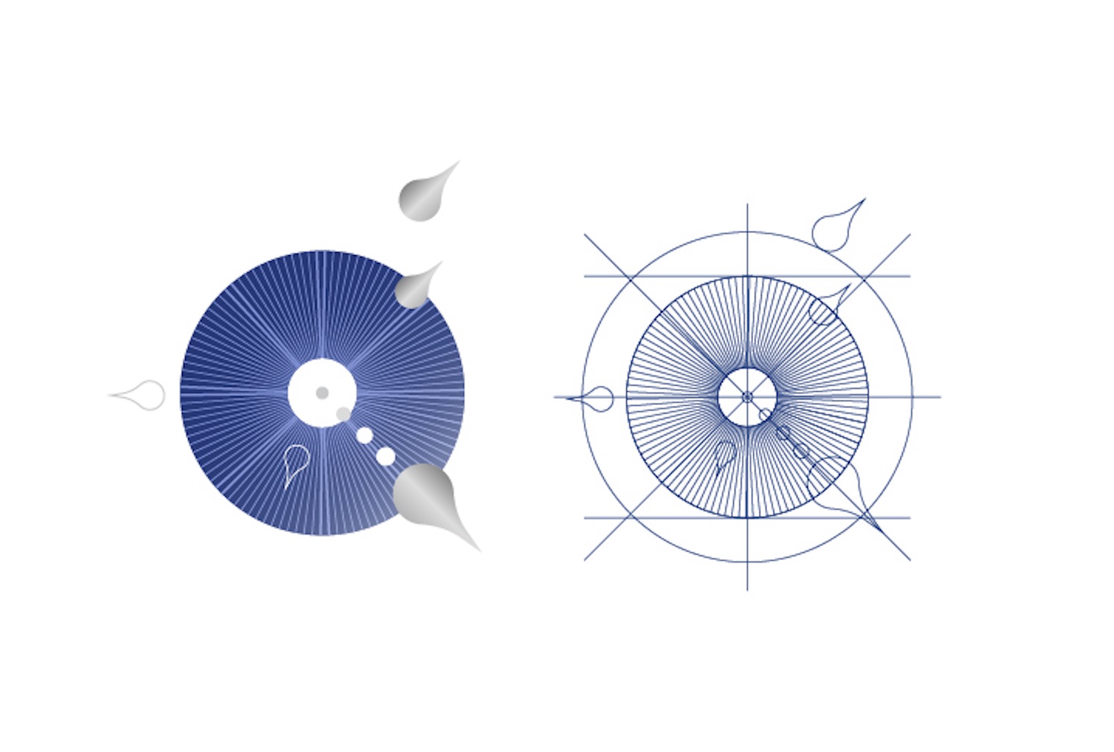
培力藥品保健系列以不同機能需求為出發點,規劃 培力壯 Peili Men Power Capsule 與 培力明 Peili Lutein Capsule 兩款產品包裝。鮭魚設計在延續培力既有品牌識別的基礎上,重新思考保健食品如何兼顧醫藥專業、產品機能與現代消費市場的視覺需求。 兩款包裝以一致的版型架構與圓形幾何語彙建立系列辨識,再依產品特性發展不同視覺個性:培力壯以深藍色與向心放射圖形傳達能量、活力與機能補給;培力明則以明亮黃色、晶透圓形與植萃意象呈現晶亮、水潤與視覺保健。透過色彩、圖形與資訊層級的整合,讓專業保健產品在保有可信度的同時,也展現更年輕、精緻且容易辨識的品牌形象。 PeiLi’s Pharm includes Peili Men Power Capsule and Peili Lutein Capsule, each designed around a distinct wellness need. MASOU Design created a unified packaging system with circular visual elements and clear information hierarchy. Deep blue expresses energy and vitality for Peili Men Power, while bright yellow and translucent forms convey clarity and eye care for Peili Lutein, balancing pharmaceutical credibility with a modern, refined brand image.

上睦中醫品牌設計|現代中醫品牌識別與診所空間形象

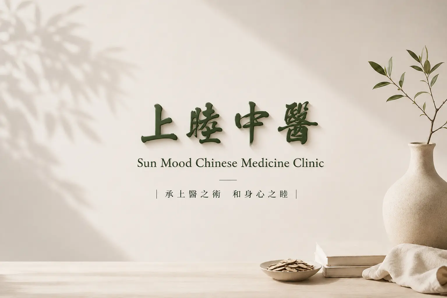
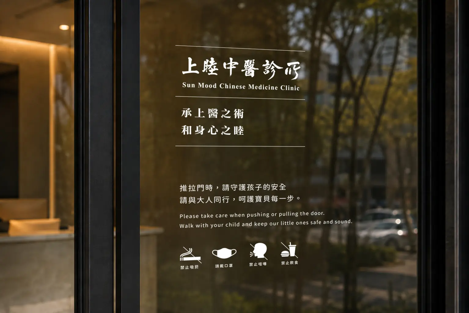
上睦中醫以「現代中醫」為品牌設計核心,將傳統醫療的文化底蘊轉化為更符合當代生活的視覺語言。從品牌識別、名片、藥包與藥袋,到診所外觀與空間體驗,透過沉穩墨綠、溫潤米色、留白與細緻排版,建立一致而完整的品牌系統,在專業、安定與親和之間取得平衡,形塑更具辨識度的現代中醫形象。 Sun Mood Chinese Medicine Clinic is built around a contemporary interpretation of traditional Chinese medicine, translating its cultural depth into a refined and modern visual language. From brand identity and printed applications to medicine packaging, clinic exterior, and spatial experience, deep green tones, warm neutrals, generous whitespace, and refined typography create a cohesive brand system that balances professionalism, calmness, and approachability.

Miss seesaw|速食保養美學|保健品牌廣告視覺設計

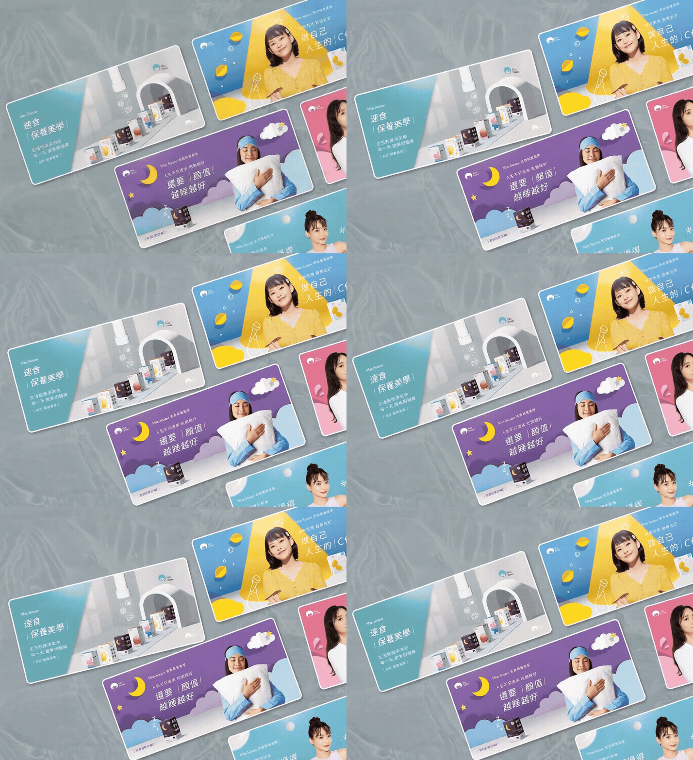
生活態度,決定每一天變美的幅度。 鮭魚設計為 Miss Seesaw 規劃年度系列主視覺,以「速食保養美學」作為核心概念,協助品牌在電商網站、產品頁與數位行銷素材中,建立更鮮明的視覺溝通方式。設計上將保養品與機能食品的產品特色,轉化為年輕、輕盈且具有動態感的視覺語言,透過剪紙風格背景、鮮明色彩、產品情境與創意圖像轉譯,在不直接宣稱產品成效的前提下,讓商品特色更容易被理解,也讓電商情境中的品牌印象更有記憶點。 Lifestyle shapes the way beauty grows every day. MASOU DESIGN created the annual key visual series for Miss Seesaw under the concept of “Fast Beauty Aesthetics,” helping the brand build a stronger visual communication system for its e-commerce website, product pages, and digital marketing materials. The project transformed product features from skincare and functional food into a younger, lighter, and more dynamic visual language. Through paper-cut style backgrounds, vivid colors, product scenarios, and creative visual metaphors, the series communicates product impressions in a playful and approachable way without directly claiming product effects, making the brand more memorable in an e-commerce context.

EUMER|綻放肌膚的植萃光澤|保養品品牌平面設計

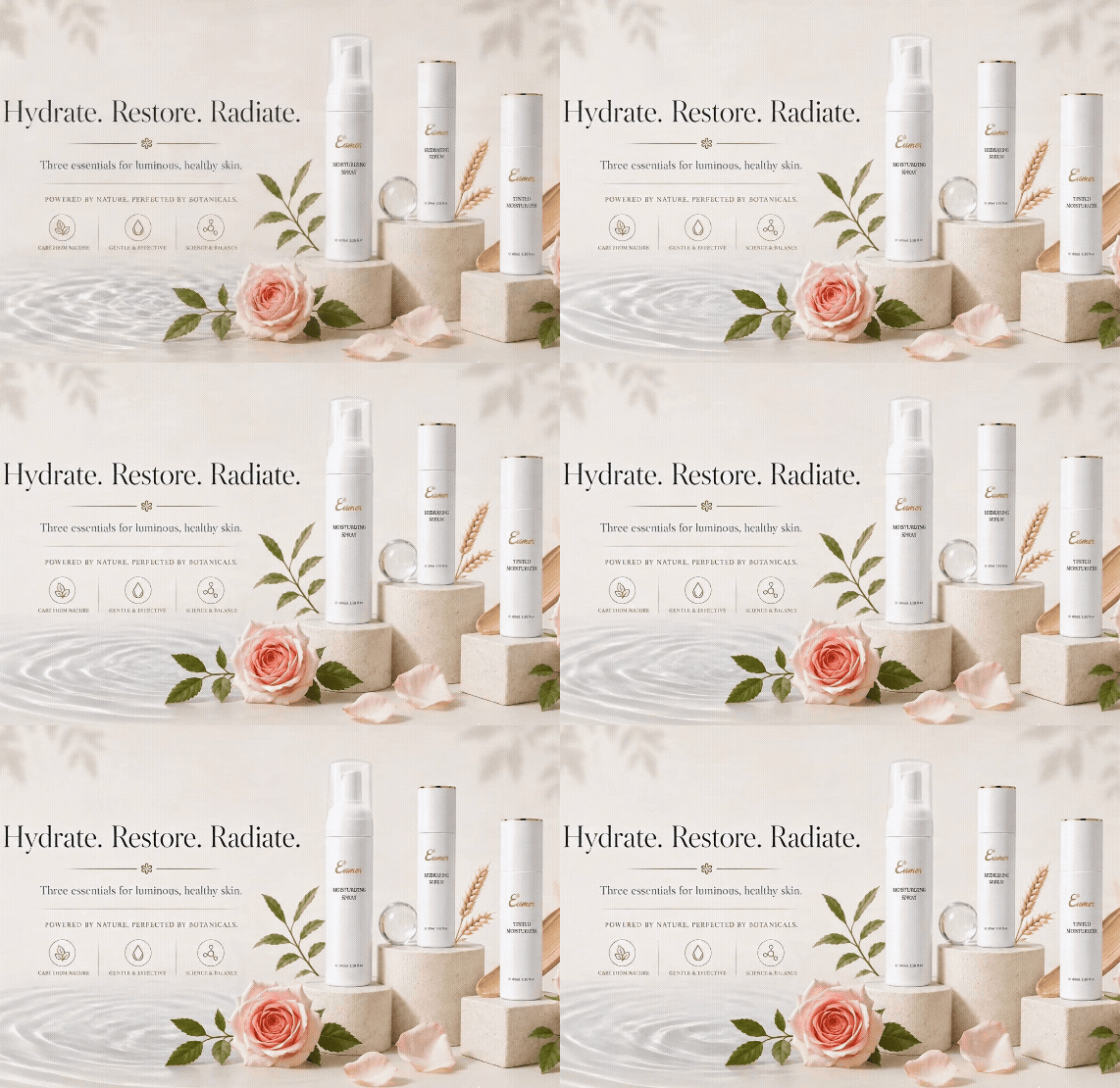
當保養品不只是成分與功效的說明,視覺也成為品牌感受的一部分。 Eumer 以植萃、保濕與日常修護為核心,透過更簡約、柔和且具有高級感的設計語言,重新整理產品資訊與品牌氛圍,讓保養品的純淨感與精緻度被更清楚地呈現。 整體視覺以留白、細緻線條、柔霧色彩與自然花植作為主要語彙,搭配產品靜物構圖與柔光背景,降低資訊的擁擠感,讓每一款產品都能在清楚的閱讀節奏中展現特色,也讓 DM 更貼近高端保養品的形象。 Skincare design is not only about explaining ingredients and benefits. It is also about creating a feeling that helps people understand the brand at first glance. Eumer focuses on botanical care, hydration, and daily skin recovery. Through a softer and more refined visual language, the product information is reorganized into a clean, elegant, and premium brochure style. The overall design uses open white space, delicate lines, soft colors, natural flowers, and product still-life compositions. These elements reduce visual clutter and create a smoother reading experience, allowing each product to stand out clearly while presenting a more high-end skincare image.

NuSkin 如新|一起三比八活動主視覺延伸設計

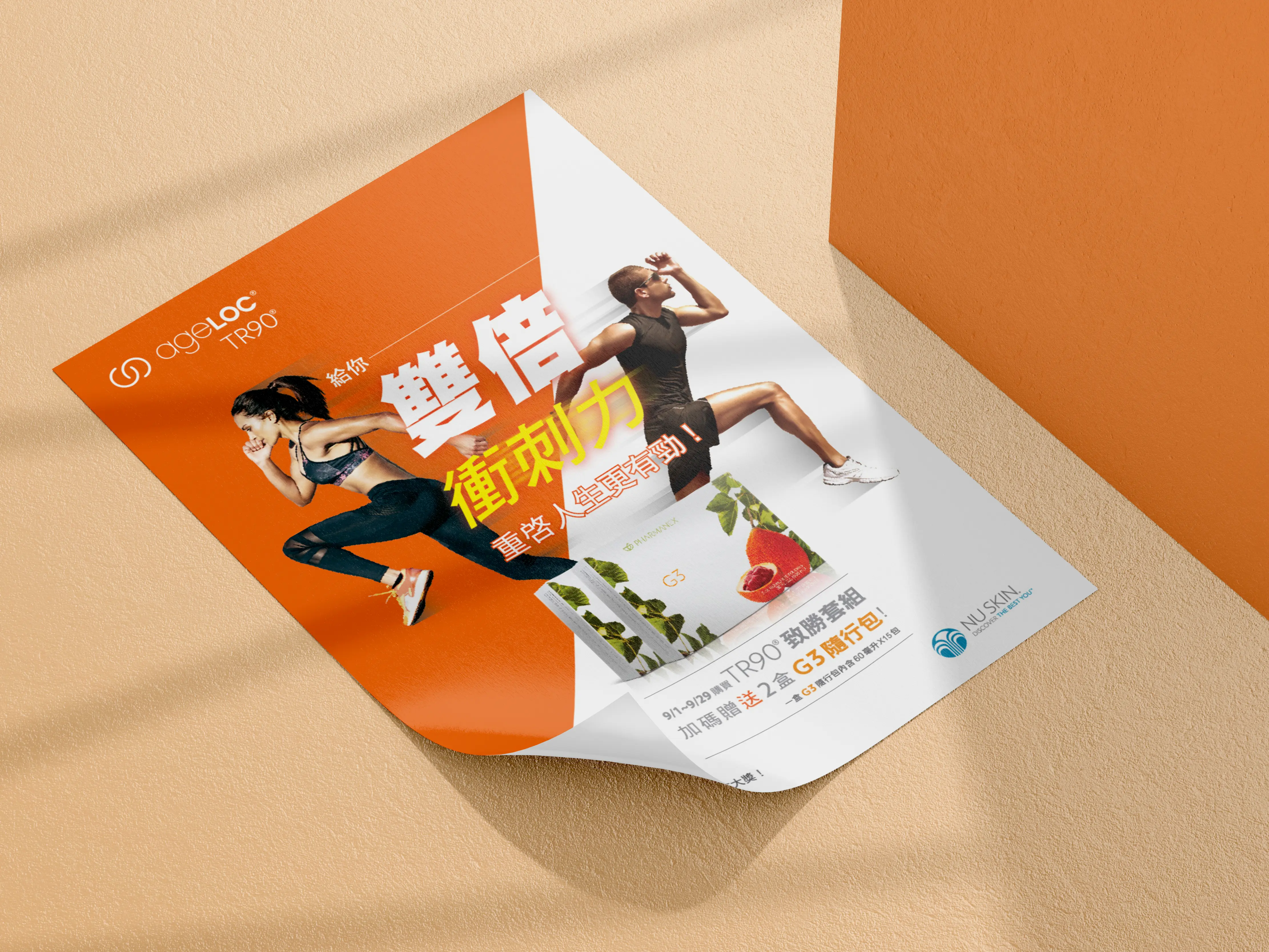
NuSkin 如新「一起三比八」是延續 TR-90 重啟人生計畫後的活動視覺延伸設計。「一起三比八」運用台語諧音,帶出「一起瘦下來」的輕鬆語感,讓活動在健康管理與體態改變的主題之外,也保有更親近、活潑且容易被記住的溝通方式。 這次設計重點,是將活動主視覺延伸到不同媒介與現場應用中,包含促銷 Banner、DM、旗幟、桌板與掛軸等視覺素材。透過一致的色彩、人物選擇、版面節奏與活動識別語言,讓「一起三比八」在不同尺寸、不同使用情境中,都能維持清楚的品牌辨識度與活動氛圍。 NuSkin’s “338 Event” was a key visual extension design project following the TR-90 Restart Your Life Plan campaign. The name “338” plays with a Taiwanese phonetic expression that suggests “getting slimmer together,” giving the campaign a lighter, friendlier, and more memorable tone while still connecting to the theme of health management and body transformation. The focus of this project was to extend the campaign key visual across different media and on-site applications, including promotional banners, DM materials, flags, table displays, and hanging posters. Through consistent color usage, model selection, layout rhythm, and campaign visual language, the “338 Event” maintained clear brand recognition and a lively campaign atmosphere across different formats and touchpoints.

Nu Skin 美商如新|TR-90 重啟人生計畫

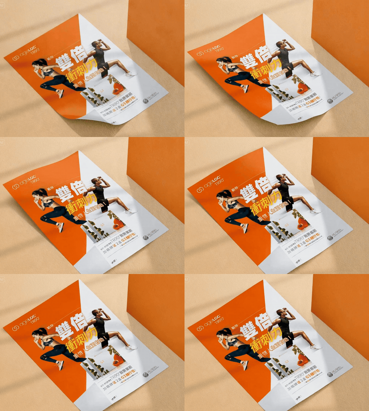
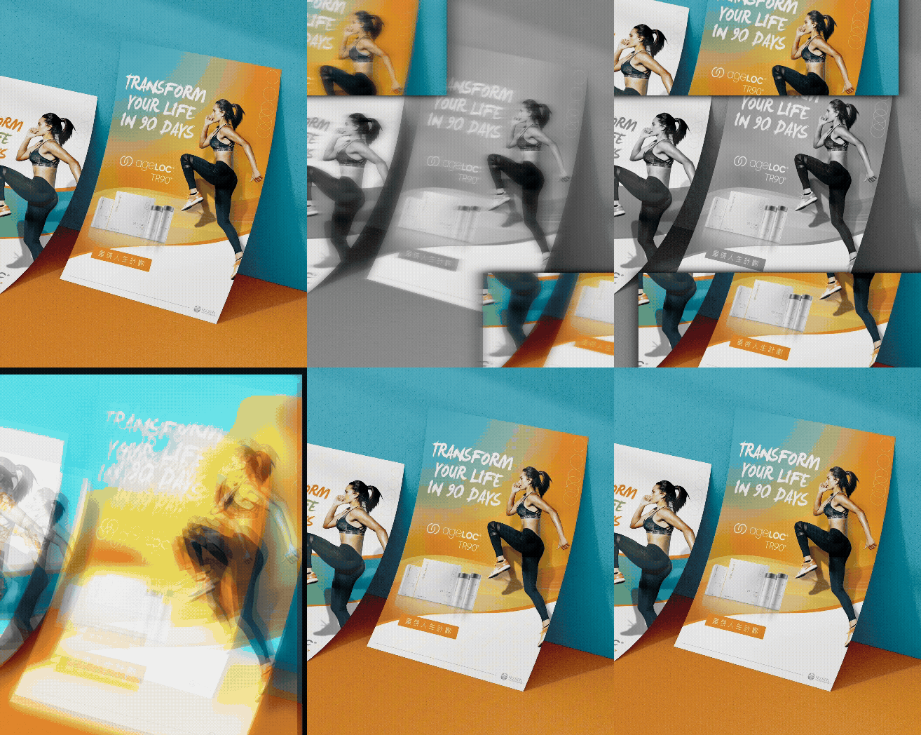
活動主視覺,不只是做一張漂亮的主圖,而是要讓整個活動在不同媒介中都被清楚記住。 我們為美商如新 Nu Skin「TR-90 重啟人生計畫」規劃活動主視覺設計,從活動主題、品牌調性、人物形象、色彩語言到延伸應用,建立一套能夠被完整套用在 DM、旗幟、桌板、掛軸與活動現場素材上的視覺系統。 「重啟人生計畫」本身帶有改變、行動與重新開始的意涵,因此這次主視覺設計不只是單純呈現產品或活動資訊,而是希望透過更鮮明的畫面節奏、清楚的視覺焦點與一致的品牌語氣,讓參與者在第一眼就能感受到活動所傳達的積極能量。 在大型品牌活動中,視覺一致性非常重要。每一個接觸點,無論是紙本 DM、現場旗幟、桌面輸出或大型掛軸,都需要看起來屬於同一場活動,也要符合 Nu Skin 國際品牌本身的專業形象。因此這次設計的重點,不只是完成單一主視覺,而是讓活動視覺在不同尺寸、不同材質與不同使用情境中,都能維持清楚、統一且具有記憶點的品牌表現。 對我們來說,這次與 Nu Skin 的合作不只是活動主視覺設計案例,也是一個關於品牌規範、專案節奏與大型活動視覺延伸的實務經驗。好的主視覺設計,應該能讓活動在被看見的瞬間,就傳達出品牌想說的話。 Some event key visuals are not only created to look attractive. They need to help the entire campaign stay recognizable across different media. MASOU DESIGN created the event key visual design for Nu Skin’s “TR-90 Restart Your Life Plan,” developing a visual system that could be extended across DM materials, flags, table boards, banners, and on-site event applications. From the campaign theme and brand tone to model selection, color direction, and visual consistency, the design was built to support a clear and unified event identity. The idea of “Restart Your Life” carries a sense of change, action, and a new beginning. For this reason, the key visual was not only about presenting product or campaign information. It was designed to create a stronger visual rhythm, a clear focal point, and a positive brand atmosphere that could immediately communicate the energy of the event. For large-scale brand events, visual consistency is especially important. Every touchpoint, whether printed DM, event flags, table displays, or large-format banners, needs to feel like part of the same campaign while staying aligned with Nu Skin’s international brand image. The focus of this project was therefore not just to create one key visual, but to build a flexible visual direction that could remain clear, consistent, and memorable across different formats and applications. For us, this collaboration with Nu Skin was not only an event key visual design project, but also an important experience in brand guideline application, project management, and campaign visual extension. A strong key visual should allow an event to communicate its message the moment it is seen.