2026.05.26
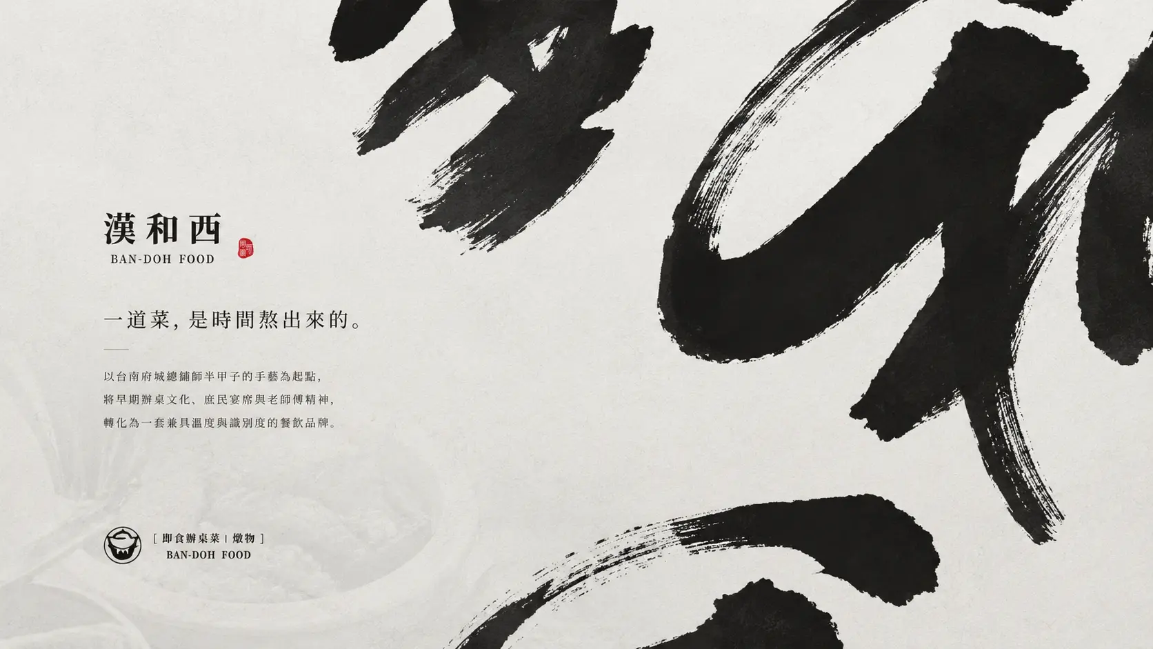
漢和西 | 把一桌辦桌菜,留進日常餐桌
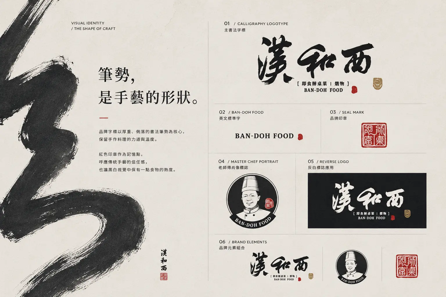
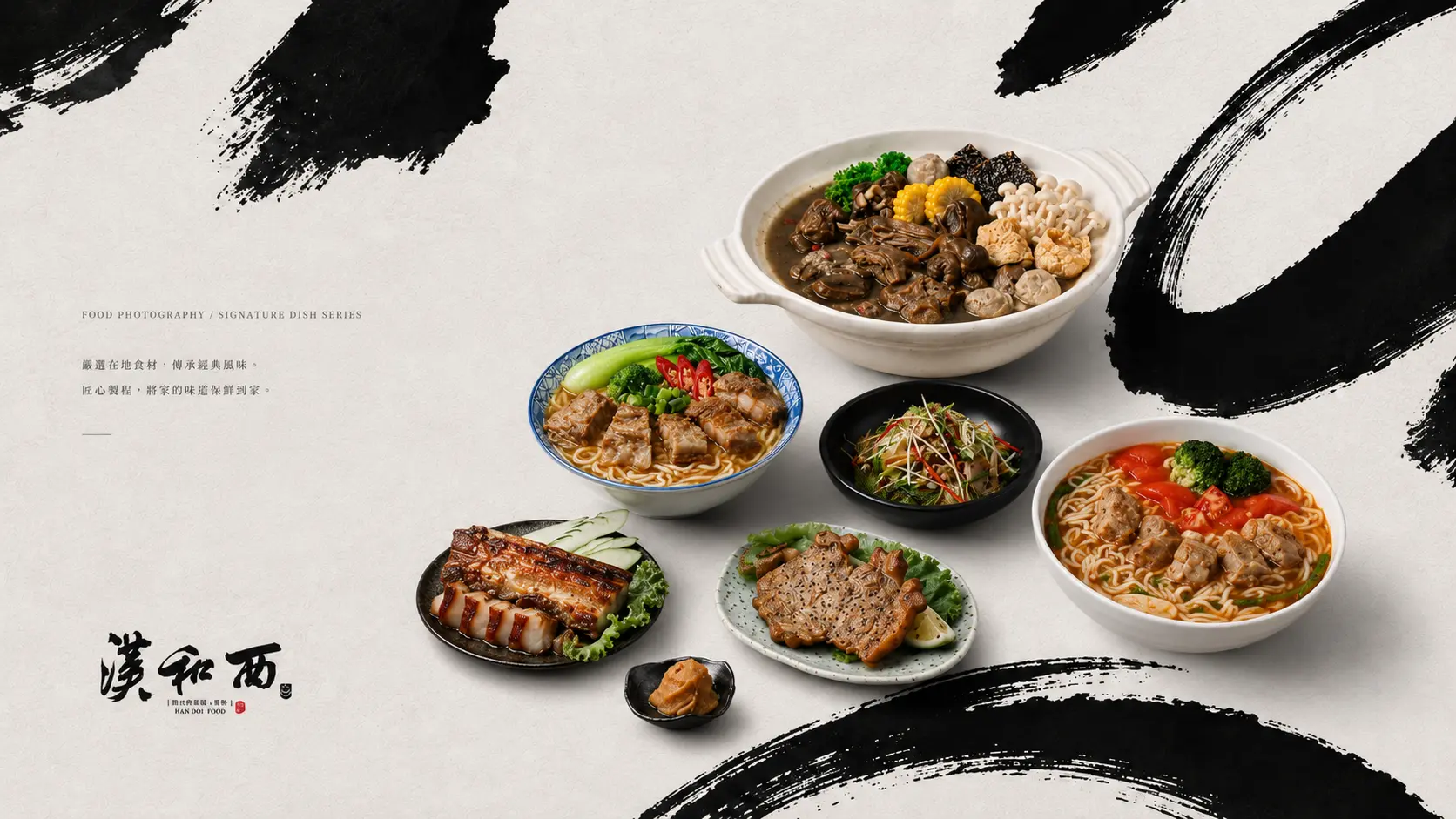
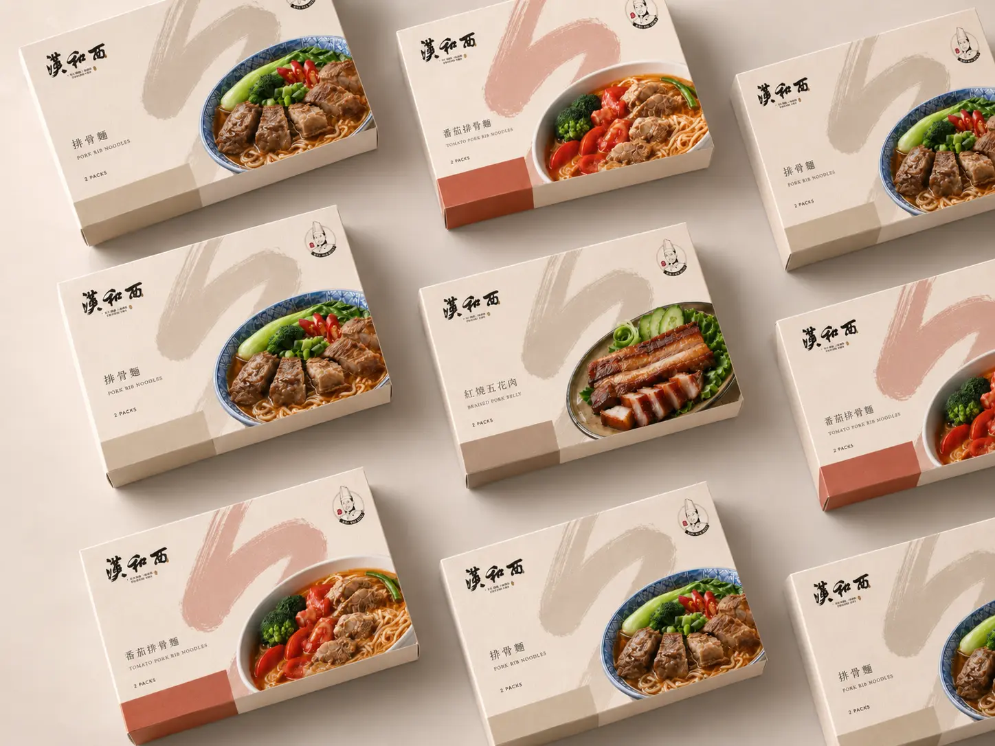
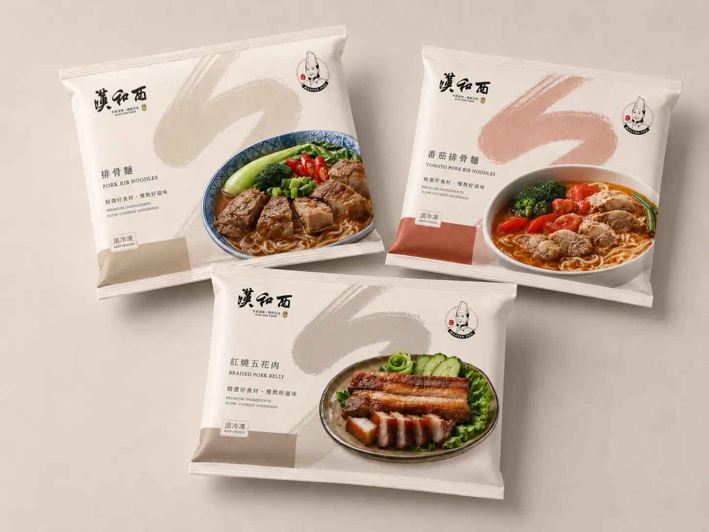
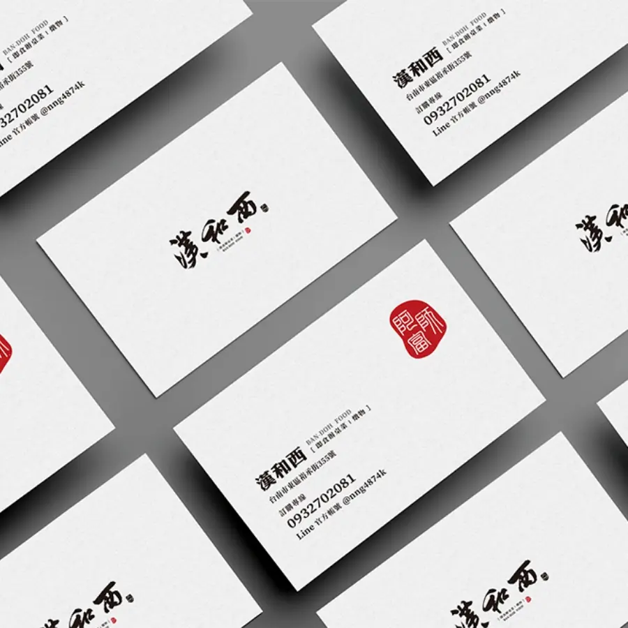
在多數品牌追求變體字與幾何標誌的時代,書法字反而成為漢和西最有辨識度的品牌資產。 鮭魚設計為「漢和西即時料理」規劃品牌識別與包裝設計,從台南辦桌文化、老總鋪師手藝與家傳料理記憶出發,建立一套兼具傳統感與現代通路感的食品品牌視覺系統。透過書法字標、人物肖像、手寫食譜感與現代版面編排,品牌不只是傳達溫度與故事,也在冷凍即食食品市場中建立出更清楚的識別度、商品感與品牌個性。 At a time when many brands pursue modified typography and geometric logos, calligraphy became one of Han He Xi’s most distinctive brand assets. MASOU DESIGN created the brand identity and packaging design for Han He Xi Instant Cuisine, starting from Tainan banquet culture, the craftsmanship of a traditional Taiwanese banquet chef, and family recipe memories. Through a calligraphic wordmark, portrait illustration, handwritten recipe elements, and modern layout design, the brand communicates not only warmth and story, but also stronger recognition, product appeal, and brand personality in the frozen ready-to-eat food market.